U.S. Economy Recession End, Recovery and Interest Rate Forecast
Economics / Recession 2008 - 2010 Jul 13, 2009 - 01:09 AM GMTBy: Paul_L_Kasriel
 When We Get "There", Will We Know It?- Back in April, our forecast update commentary was entitled, "Are We There Yet?" The "there" referred to a resumption of real growth in the overall economy. Our answer in April was "no," which also happens to be our answer in July. When will we get there? Our answer in April was the fourth quarter of this year, which also happens to be our answer now. Assuming we get there in the fourth quarter, would most households and businesses in America know it if they were not so informed by the media? Probably not. We anticipate another "jobless recovery," which implies a relatively feeble one. We would not be surprised to hear terms early in 2010 such as "double dip."
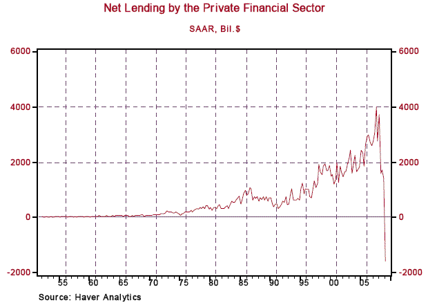
Why do we anticipate a feeble recovery? Firstly, we believe that although the private financial sector has stabilized, it still is a long way from functioning in a normal fashion. Net lending by the private financial sector contracted in the first quarter of this year at an annualized rate of $1.6 trillion (see Chart 1) - the first quarterly contraction on record since the 1952 inception of this series. The combination of inadequate capital to increase net lending along with deteriorating credit quality on the part of potential borrowers led to the most severe credit crunch in the post-WWII era.
Although a number of financial institutions have bolstered their capital positions in the first half of this year, some of that newly-raised capital is likely to "depreciate" significantly in the second half of this year and into 2010 as losses are incurred in connection with commercial mortgages and household debt - residential mortgages along with credit card and auto-loan debt. So, anything like normal net lending by the private financial system is unlikely to commence until 2011, at the earliest. History suggests that although economic recoveries can occur with a crippled financial system, those recoveries tend to be muted - witness the 1991 recovery.
Chart 1
Another reason why we expect a subdued recovery is that we believe the economy is in a transition phase with less emphasis on household spending and more emphasis on exports and business capital/R&D spending to support export production. This transition will not occur instantly or seamlessly, hence the relatively weak recovery. Why do we expect relatively less household spending - personal consumption and residential investment expenditures? Chart 2 shows that real household spending as a percent of real GDP has been consistently well above its post-war median level of 71.5% since the early 2000s. Coincident with this elevated relative real household spending since the early 2000s has been elevated relative mortgage-related (first mortgages plus home-equity loans) borrowing by households (see Chart 3).
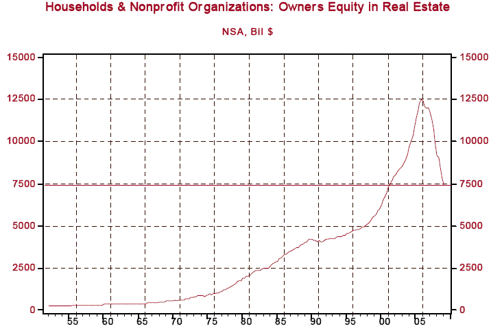
This elevated mortgage borrowing not only stimulated residential investment expenditures, but also personal consumption expenditures via the tapping of rising home equity to finance consumer purchases. Chart 4 shows that there has been a sharp tightening in lending standards with regard to residential mortgages. And Chart 5 shows that homeowners' equity as of Q1:2009 had dropped back to a level about equal to that of Q1:2001. That is, almost all of the increase in home equity in the latest housing boom has evaporated. With tightened residential mortgage lending standards and with the sharp decline in home equity, both residential investment and personal consumption expenditures are currently and will continue to be negatively affected. This is not to say that household expenditures will not grow in the next 12 months. Rather, they are unlikely to grow robustly.
Chart 2
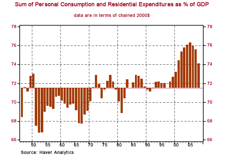
Chart 3

Chart 4

Chart 5
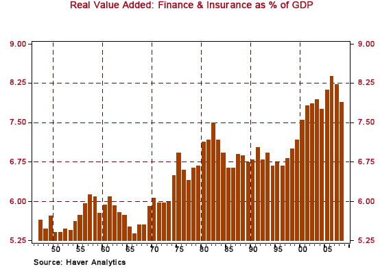
Switching gears from the spending side of the economy to the producing side, we see the financial services sector as having entered a transition period, too. Chart 6 shows that at about the same time that household spending and residential mortgage borrowing were reaching record highs, so too was the relative size of the finance and insurance sector of the economy. Part of this increase in the relative size of the financial sector was related to the surge in household borrowing. Although there can be honest debate as to whether the securitizing of debt truly adds value to the economy, there is no debate that massive amounts of debt securitization took place in the past cycle and the financial sector's role in this securitization was counted in GDP.
Again, we believe that household borrowing will be more muted in the next five years and, thus, so will securitization of debt. Therefore, this aspect of the financial services sector is bound to shrink, at least on a relative basis. We also believe that some of the more "exotic" activities in the financial sector can only be highly profitable when risk is under-priced and regulation is light. Risk is now much more appropriately priced - some might argue, over-priced - and more regulation is in the works. Thus, because of reduced profitability, these exotic financial sector activities are destined to shrink in size.
Chart 6
Why do we believe that exports will play an even bigger role in the U.S. economy than they have? (As an aside, in 2008, U.S. exports of goods, both in absolute as well as relative terms, reached a record high, as can be seen in Chart 7). With expected continuing growth in developing economies, their residents will be able to afford increased purchases of agricultural products. This means that U.S. agricultural exports will increase. In turn, U.S. producers of farm machinery and fertilizer will see their order books increase. With continued rising incomes in developing economies will come increased effective demand for health care. Thus, U.S. producers of health-care equipment, pharmaceuticals and health-care technologies will see their orders rising over time. Of course, there still are many roads, bridges and dams to be constructed in developing economies. So, U.S. producers of earth-moving equipment and engineering services will experience increased demand for their products and services.
Chart 7

We also believe that the U.S. stands to capture export market share in the next ten years from some developed economies. Chart 8 shows that both Japan and Germany are experiencing outright declines in population. Over the next ten years, the working-age populations will be declining. Thus, it will be difficult for Japanese and German export growth to be maintained with their reduced labor forces. The U.S. faces less severe demographic trends and, therefore, should be able to capture export market share from developed economies.
Chart 8

To summarize, we are arguing that for both cyclical and structural reasons, the unemployment rate is likely to continue rising even as the economic recovery takes hold and that it is unlikely to fall quickly. The principal cyclical factor is a still-ailing financial sector. The structural factor is a shift in the composition of U.S. output in the coming years. Thus, if the economic recovery commences in the fourth quarter of this year as we expect and continues into 2010, some American households and businesses will doubt it even though various reliable economic reports will confirm it.
That's our view from 30,000 feet. Now, let's descend for a view closer to the deck. When we were on the chicken-and-peas circuit at the beginning of this year, we were telling anyone who would listen that although there was no evidence of it at the time, we thought that an economic recovery would begin late in 2009 in large part because of the aggressive combination of monetary and fiscal policies being implemented. Now that we are on the mid-year chicken-and-peas circuit, there is evidence that an economic recovery is within sight.
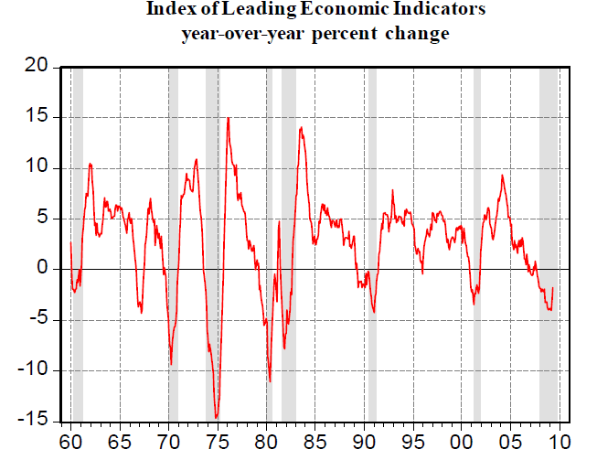
Early in the year, we told audiences to keep an eye on the index of Leading Economic Indicators (LEI). The LEI foreshadowed the current recession and would likely foreshadow the next recovery. That is exactly what it is doing now. As Chart 9 shows, there has been a decided moderation in the year-over-year decline in the LEI as of May. On a month-to-month basis, the LEI has increased in both April and May. Of its components that we have a handle on now, a June LEI increase also is likely.
Chart 9
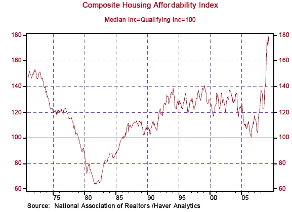
The catalyst for our current economic problems was the biggest housing sector bust in the post-war era. There are now signs that home sales have bottomed and housing production is nearing a bottom. The National Association of Realtors (NAR) calculates an affordability index for home purchases that is a function of house prices, household income and the level of mortgage rates. After reaching a record high in 2005, the ratio of house prices-to-household income has plunged due to the sharp decline in house prices. And although mortgage rates have crept up in the past month, they still remain quite low in an historical perspective.
As Chart 10 shows, the NAR's index of Housing Affordability has skyrocketed to record highs in recent months. Of course, this index does not take into consideration the tightening in residential mortgage lending standards that have occurred in the past two years. It is only slightly hyperbolic to say that in the last housing boom, the only qualification to obtain a mortgage from many lenders was a pulse on the part of the loan applicant. Today, in order to qualify, it helps to be employed, to be able to make a downpayment and to have a clean credit record.
Chart 10
For the first time since the mid 1960s, the "yield" on owner-occupied housing is above the mortgage rate (see Chart 11). We calculate the yield on owner-occupied housing by dividing the implicit rent on stationary owner-occupied housing (published by the Bureau of Economic Analysis) into the market value of owner-occupied housing (published by the Federal Reserve Board). In the first quarter of this year, the yield on housing was 6.02% and the contract mortgage rate for the purchase of an existing single-family home was 5.07%. Thus, in the first quarter, the purchase of a house in terms of its implicit yield relative to the cost of financing was the most attractive since the mid 1960s. Another way of putting this is that for the first time since the mid 1960s, there was positive "carry" on owner-occupied housing.
Chart 11

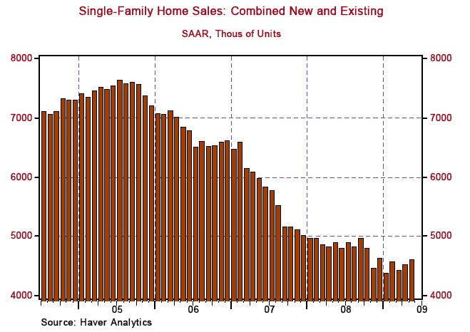
Given the record high Housing Affordability index and the positive carry on owner-occupied housing, have home sales picked up? Yes. As Chart 12 shows, combined sales of new and existing single-family homes appear to have bottomed in January of this year.
Chart 12
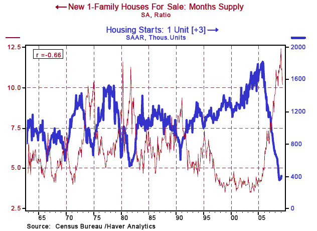
What about the production of housing? Any reason to believe that a bottom is near for production? Yes. Chart 13 shows that the annualized sales rate of new single-family homes is now near parity with starts of single-family homes. In fact, the ratio of single-family housing starts-to-sales of new single-family homes is the lowest in 45 years. Although production and demand for new single-family homes are near parity, the inventory of new homes for sale remains quite elevated relative to the current sales pace (see Chart 14). However, the inventory-to-sales ratio for new single-family homes appears to have peaked. Historically, this inventory-to-sales ratio leads housing starts by about three months. So, if history is any guide, then the high-but-declining inventory-to-sales ratio for new homes suggests that a bottom in housing starts is near, if not already here.
Chart 13
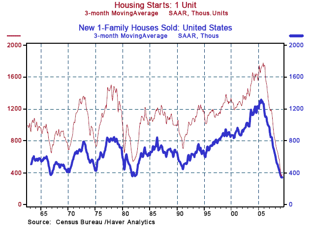
Chart 14
Although the sales of cars and trucks have plummeted, the production of them has fallen even faster (see Chart 15). This extremely low ratio of production-to-sales along with the extremely high median age of cars and trucks on the road implies that the low in light motor vehicle sales is behind us. Do not, however, look for a return to annual sales of 16 million to18 million units for light motor vehicles any time in the next several years.
Chart 15

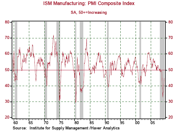
Another good sign for the economy in general and the factory sector in particular is that the ISM Manufacturing Composite index has experienced a sharp trend reversal to the upside (see Chart 16). Although yet to penetrate the magic 50-level, the historical record shows that the 50-level is typically not reached until after the recovery has begun.
Chart 16
Although the hiring of workers has yet to begin, there is evidence that the rate of firing has abated. This evidence is found in the behavior of initial claims for unemployment insurance. As Chart 17 shows, there has been a sharp slowing in the rate of decline in the year-over-year change in unadjusted initial jobless claims. And historically, this behavior has typically occurred at or near the end of recessions.
Chart 17

We are double counting a bit here inasmuch as initial jobless claims are a component of the LEI, the behavior of which we mentioned earlier as a reason for expecting the current recession to end soon. The reason we bring up initial jobless claims is that we believe they are a better measure of the state of the labor market than the monthly nonfarm payroll data. The monthly payroll data are subject to large revisions months, even years, after the first release of the data. The payroll data are estimated from a sample of the data. Not only are the data seasonally adjusted, but payrolls are adjusted for estimated net additions to payrolls resulting from the start-up of new businesses and the shut-down of old businesses. In other words, there is a lot of "massaging" of raw data to get to the headline of the change in nonfarm payrolls. In contrast, the initial jobless claims data are not "blown up" from a sample but represent the universe of these data.
The reported initial jobless claims data represent real people standing in real lines, who have an incentive to get into those lines and be counted. Although there are revisions to the data, the revisions are small compared to those of nonfarm payrolls. We prefer to look at the unadjusted initial jobless claims data on a year-over-year basis because we believe that seasonal adjusting still is an art rather than a science. We are continually amazed at market reactions and talking-head reactions to nonfarm payroll reports and the relative lack of reactions to initial jobless claims data, the latter of which have more accurately reflected the future behavior of the economy than the former.
When will the Fed begin to implement its "exit" strategy, whatever that strategy may be? We believe that the earliest the Fed will begin to drain liquidity/raise its policy interest rate will be mid-year 2010. And if then, the initial tightening steps will be tentative. As we stated at the outset, this recovery is likely to muted and uneven, creating fears of a relapse into recession. Mind you, there is overwhelming evidence that once in motion, the U.S. economy tends to stay in motion until acted on by a tightening in monetary policy.
So, fears of a double-dip would be overblown. Bernanke, a student of the economic history of the 1930s, is mindful that the Fed helped push the economy back into a recession in the spring of 1937 as a result of Fed tightening starting in 1936. (The Fed doubled banks' reserve requirement ratios between 1936 and 1937 in order to neutralize high levels of banks' excess reserves.) So, the Fed will want to be sure that the economy has entered a sustained growth path before beginning to tighten policy. Because of data lags and because of the expected uneven performance of the economy early in the recovery period, the Fed is unlikely to have the confidence to begin tightening policy until the late-June 2010 FOMC meeting - and even then it still may be lacking in confidence to pull the tightening trigger.
Paul Kasriel is the recipient of the 2006 Lawrence R. Klein Award for Blue Chip Forecasting Accuracy
By Paul L. Kasriel & Asha Bangalore
The Northern Trust Company
Economic Research Department - Daily Global Commentary
Copyright © 2009 Paul Kasriel
Paul joined the economic research unit of The Northern Trust Company in 1986 as Vice President and Economist, being named Senior Vice President and Director of Economic Research in 2000. His economic and interest rate forecasts are used both internally and by clients. The accuracy of the Economic Research Department's forecasts has consistently been highly-ranked in the Blue Chip survey of about 50 forecasters over the years. To that point, Paul received the prestigious 2006 Lawrence R. Klein Award for having the most accurate economic forecast among the Blue Chip survey participants for the years 2002 through 2005.
The opinions expressed herein are those of the author and do not necessarily represent the views of The Northern Trust Company. The Northern Trust Company does not warrant the accuracy or completeness of information contained herein, such information is subject to change and is not intended to influence your investment decisions.
Paul L. Kasriel Archive |
© 2005-2022 http://www.MarketOracle.co.uk - The Market Oracle is a FREE Daily Financial Markets Analysis & Forecasting online publication.
Comments
|
Deepak
13 Jul 09, 16:36 |
dollar and sterling
fab article. love your work. How will currencies survive this little escapade ? |


