Gold Against the Dow - The Forest
Commodities / Gold & Silver 2009 Oct 22, 2009 - 11:04 AM GMTBy: Adam_Brochert
 Those who have read my rants are probably tired of hearing about the Dow to Gold ratio, yet my realization of the significance of this ratio and my desire to spread its message began my blogging journey. Please excuse me if I continue the theme. If you are not familiar with the Dow to Gold ratio, start with this link for background information.
Ratio charts get into an important concept of relative value and relative gains. These things are extremely important in a paper currency world where the value of money itself is constantly changing. In 95% of cases, this is due to a loss of value in the currency, as all paper money (i.e. fiat) systems are abused until the currency becomes worthless and is replaced with a new currency. No historical exceptions actually.
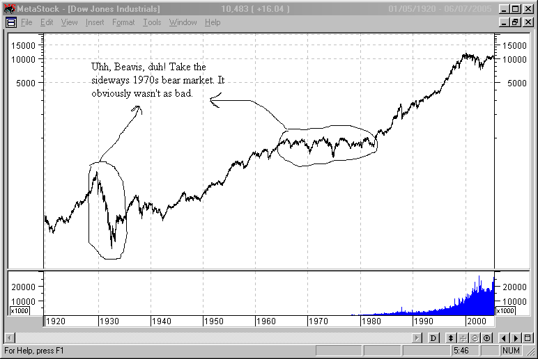
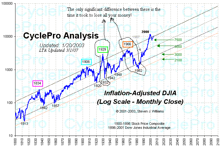
In other words, breaking even when investing may mean you are losing money and potentially lots of it. An example of this concept can be found using a nominal versus an inflation-adjusted chart of the Dow Jones to show two very seemingly dissimilar bear markets - the 1930s and the 1970s. Deflation versus inflation. The worst bear market of the last century (the 1929-1932 bear, during which the Dow Jones lost 89% of its value) versus the choppy 1966-1982 bear market where the Dow Jones stayed in the 600-1000 range. First is a nominal (i.e. non-inflation adjusted) chart (courtesy of chartsrus.com) of these two bear markets:

Next, an inflation-adjusted chart of those same bear markets (courtesy of Steven J. Williams at CyclePro):

Once you understand the significance of these two different charts, you understand the reason for the significance of ratio charts. The Dow has been at 10,000 a few times over the past decade and each time it gets there, that 10,000 is worth less in purchasing power. Ultimately, money is a means to an end and its value must be determined by what it can purchase. An investment that gains 10% a year when inflation is 20% a year is a terrible investment. In other words, nominal gains must be put into context versus the value of the currency in which the gains are denominated.
Anyway, the reason the Dow to Gold ratio is important is because Wall Street is selling and marketing the wrong investment plan. Many working age people put the bulk of their savings in the stock market because it is what everyone else is doing and what conventional mainstream financial "analysts" preach over and over again. Dollar-cost-averaging, stocks for the long haul, etc., etc.
But what the ratio chart comparing the Dow Jones to Gold tells us is that there are actually multi-year periods where a piece of shiny metal is a better investment than the stock market! In fact, it has been resoundingly true over the past decade. How smart does Wall Street seem now?
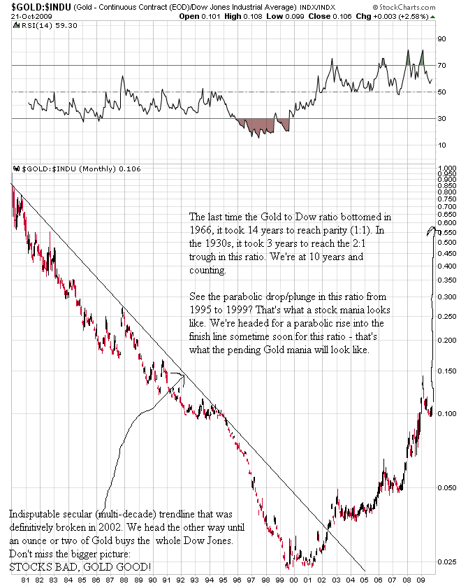
We are in a long-term secular stock bear market in inflation-adjusted terms that is far from over and we are in a long-term Gold bull market in stock market terms that is far from over. In other words, forget the nominal prices of Gold and the Dow Jones (or S&P 500, etc.) for a minute. Concentrate on the ratio of Gold to the Dow Jones and take a peek at this tremendously bullish 29 year monthly chart of the Gold price divided by the "price" of the Dow Jones Industrial Average:

We are headed back towards parity in this ratio. If you don't believe this, ask yourself why history cannot repeat. It happened with inflation and it happened with deflation. Our financial system is now more out of control than ever and I personally don't think it is an unreasonable prediction that it may take even less than one ounce of Gold to buy the entire Dow Jones Industrial Average once this mess is over. Now if you'll indulge my premise that we are going to get back to a ratio of 2 (I think one or less, but I'll use the conservative figure of 2 for now), let's say that based on yesterday's closing prices you sold all your stocks and immediately bought Gold with the proceeds (ignoring the tax implications of doing so for now).
This means that within 5 years, which is as long as it should take for this ratio to reach its target range, you will be able to buy 5 times the number of stocks you can afford today. This is a relative increase in stock market wealth of 400% in 5 years or less. And if we get to 1 in this ratio, we are talking about a relative increase in stock market wealth of 900% from current levels. If I told you about an investment that would gain 400-900% within the next 5 years, wouldn't you be interested? This is a massive shift of relative wealth for those who hold physical Gold instead of general U.S. stocks (in aggregate). Cash is king during a bear market, but only if one holds the right form of cash (hint: it ain't the U.S. Dollar and it's yellow and shiny).
It is also important to remember that it is at the end of bull markets where things get frantic and crazy to the upside. We are not there yet in the Gold bull market, but we are now getting close. The break above $1000/ounce was important psychologically to this Gold bull market. Do not lose the forest through the trees in this long-term bull market. All real risk is to the upside in Gold. There will be corrections all along the way, but we are rapidly approaching the mania phase that will undoubtedly develop in the Gold sector.
When one thinks in terms of Gold versus Dow, the inflation versus deflation debate becomes much less meaningful in a practical sense. We have reached the stage where Gold is doing well because of loss of confidence in Wall Street and government policies. This loss of confidence, which will reach critical mass during the next leg down in the stock market, is what will continue to fuel the Gold bull market.
Visit Adam Brochert’s blog: http://goldversuspaper.blogspot.com/
Adam Brochert
abrochert@yahoo.com
http://goldversuspaper.blogspot.com
BIO: Markets and cycles are my new hobby. I've seen the writing on the wall for the U.S. and the global economy and I am seeking financial salvation for myself (and anyone else who cares to listen) while Rome burns around us.
© 2009 Copyright Adam Brochert - All Rights Reserved
Disclaimer: The above is a matter of opinion provided for general information purposes only and is not intended as investment advice. Information and analysis above are derived from sources and utilising methods believed to be reliable, but we cannot accept responsibility for any losses you may incur as a result of this analysis. Individuals should consult with their personal financial advisors.
© 2005-2022 http://www.MarketOracle.co.uk - The Market Oracle is a FREE Daily Financial Markets Analysis & Forecasting online publication.


