


Gold Potentially Bullish Falling Wedge Pattern, But Momentum is Bearish
Commodities / Gold and Silver 2010 Feb 14, 2010 - 05:58 AM GMTBy: Merv_Burak

 The weekly action has been primarily to the up side but still we’ve gone no place. Since Dec gold has formed a downward sloping wedge pattern which usually breaks to the up side BUT the Penny Arcade Index is starting to give us a different warning.
GOLD LONG TERM
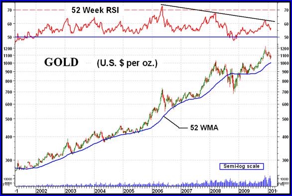
It’s always interesting and instructive every so often to look back at a long term historical price chart. The one of gold from the start of the bull market in 2001 to the present is such a chart. Here we see that the price action from the start of the bull to about mid-2006 had been pretty mild and consistent. After mid-2006 things have gotten far more volatile. So, what happened in mid-2006?
Technically, mid-2006 was when the long term momentum indicator showed the greatest strength behind the price move, so great that the indicator went into its long term overbought zone. This usually indicates a long term reversal of trend or a relaxation of trend. What we did get was over a year of sideways movement with the price going nowhere. Since then every new major high in gold price was accompanied by a reduction is strength behind such move. As the strength reduced the volatility seemed to have increased. The question now is if the new price high will lead to another major decline such as the one in 2008, or even worse?
I don’t like the looks of the momentum indicator. This seems to indicate a major deterioration in upside strength that has been on going for a few years now. Such strength decrease cannot continue and all too often, with the indicated negative divergence in the indicator versus price action, results in a major downside move ahead. The previous reaction to a new price high (2008) took the indicator into negative territory for the first time since the bull started, a further indication of the price strength deteriorating. What will happen this time? (See my commentary for week ending 15 Jan 2009 for another view of this chart.)
Looking at the charts from a long term, actually from a very long term, perspective is interesting but does not lend one towards any real action. It just provides a warning as to the potential ahead. I go to an evaluation of my normal indicators and chart patterns for more immediate action.
Last week the long term P&F chart had turned bearish but as noted in last week’s commentary it was not all that potentially serious. Although the direction of P&F trend had reversed to the up side there has been no change in the message of the P&F chart.
As for the usual indicators, the price of gold has been toying with its long term moving average line but this week most of the action has been above the line and the line continues to point upward. The long term momentum indicator remains in its positive zone but is slightly below its negative sloping trigger line. The volume indicator is trending very slightly lower although one might call it more of a lateral trend. The indicator is slightly below its trigger line although the trigger is still sloping upward. All in all, the long term rating is still BULLISH.
At this point in time we seem to have a disagreement between the P&F chart and the normal indicators. This is not unusual at times. Which is the best one to bet on? I’m not totally sure which one is more accurate. Let’s call the normal indicators as the more accurate but with a very strong warning from the P&F. In other words, this is probably not the time to be thinking of new purchases until the two are back in sync.
INTERMEDIATE TERM
The intermediate term daily chart shows at least three downward sloping wedge patterns since the start of the latest bull move from late 2008. In the first two the break-out was to the up side and this is also what the odds say will be the break-out direction of this latest wedge. Of course nothing is 100% certain so there is always a chance that THIS TIME will be different but the odds say otherwise.
Just a little lesson in volume analysis. The common criteria on volume is that increasing volume while the price is advancing is bullish. NOT ALWAYS SO.
This criteria is very often correct at the start of new moves. However, after a move has been advancing for some time and then the volume starts to build up more than before, THIS is often an indication you are very close to a TOP. This we see on the chart. The volume was building up slowly as the price rose during the later part of 2009. However, the volume suddenly rose far more than normal just before the price topped out. This volume action is not unusual and should be something to watch out for in stocks as well as commodities. Someone is getting out under the cover of price strength.
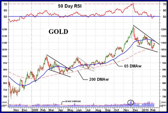
Looking at the normal indicators, despite the upside action during the week the price remains below its negative moving average line. The momentum indicator has broken above its neutral line into the positive zone and is now above its positive trigger line. One should be a little cautious on the momentum indicator as the move above its neutral line was not that strong and needs further confirmation. The volume indicator remains below its negative sloping trigger line for a still negative reading. At this time I would rate the intermediate term as – NEUTRAL, one level above a full bearish rating.
SHORT TERM
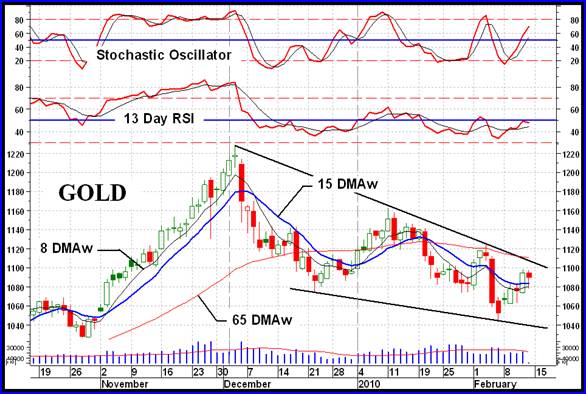
The short term should look more encouraging after the positive week but still it is not all that great. The action was still not sufficient to change things dramatically. We do have the price moving above its short term moving average line and the line has just turned upwards. The momentum indicator remains in its negative zone but is above its positive sloping trigger line. The daily volume action has not been impressive given that the week had seen mostly upside price action. Because of the volume action I cannot rate the short term as fully bullish but will give it a + NEUTRAL rating, one level short of a bullish rating. The very short term moving average line has not yet moved above the short term line and this may be confirmation that a full bullish rating, today, is not quite justified.
As for the immediate direction of least resistance, well one should look to the up side as everything seems to suggest that to be the prevailing direction. The price is above its positive sloping very short term moving average line and the Stochastic Oscillator is moving up very fast and is in its positive zone. We could also draw a very short term up trending channel using the past 6 days of activity. Go with the up side.
SILVER
Although silver had a slightly better week than gold, its performance over the past few weeks has weakened its recovery process. Unlike gold, silver is still below its short term moving average line and the line is still heading lower. This results in a bearish assessment for the silver short term rating as opposed to gold’s more positive + neutral rating. We’ll need more market action to see the technical picture improve for silver.
PRECIOUS METAL STOCKS
The thing that jumps out at you when you look at this week’s Table of Technical Information and Ratings is that, apart from the U.S. Dollar Index which usually goes opposite to the movement in gold, all the Indices had a positive week except for the Merv’s Penny Arcade Index. Where 77% of the universe stocks closed on the up side this past week only 37% of the Penny Arcade stocks did so. On the other hand 21% of the universe stocks closed lower while a full 53% of the Penny Arcade stocks closed lower. Is this what I have been cautioning about, the pennies collapsing ahead of any sign of a market turn around?
During the previous top in the market the Penny Arcade topped out a full year ahead of the universe. Although I think that was a little overdone I do think that the pennies will top out ahead of the universe but the only question would be by how long ahead.
At the present time I see the Penny Arcade in a seriously weakened condition but not yet confirmed in a reversal trend, either intermediate or long term. It is still far from a long term reversal confirmation. On the intermediate term it has moved below its intermediate term moving average line but the line is still in a positive trend. The Arcade intermediate term momentum is moving in a downward direction and has broken below serious support levels but has not yet moved into its negative zone. On the other hand, the overall BULL/BEAR rating for all stocks in the Penny Arcade Index is not so good. The Index has a BEAR rating of 70% for the short term and 58% for the intermediate term indicating most stocks are now acting bearish.
One interesting feature of the Penny Arcade Index chart is the mid-term rest period. Usually after the fact we see that half way from its bottom to its eventual top there was a significant rest period or reaction period in the Index (or stock). We seem to have exactly that in the Penny Arcade Index, assuming this is the top. In June we had a reaction period and that is located almost exactly mid way to this present top.
This may or may not be the top for penny stocks but one should take the present condition as a warning and have their exit strategies in full operation for any penny stocks in their portfolio. It is also very, very risky buying into the pennies at this time (it is always risky but more so now). At this time I would not yet be too worried about a major down turn in the universe stocks but that could change in the weeks ahead.
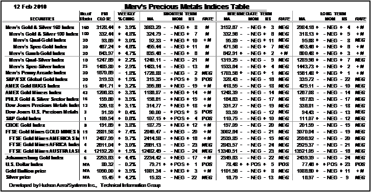
Merv’s Table of Precious Metals Indices
Well, that will be it for this week.
By Merv Burak, CMT
Hudson Aero/Systems Inc.
Technical Information Group
for Merv's Precious Metals Central
For DAILY Uranium stock commentary and WEEKLY Uranium market update check out my new Technically Uranium with Merv blog at http://techuranium.blogspot.com .
During the day Merv practices his engineering profession as a Consulting Aerospace Engineer. Once the sun goes down and night descends upon the earth Merv dons his other hat as a Chartered Market Technician ( CMT ) and tries to decipher what's going on in the securities markets. As an underground surveyor in the gold mines of Canada 's Northwest Territories in his youth, Merv has a soft spot for the gold industry and has developed several Gold Indices reflecting different aspects of the industry. As a basically lazy individual Merv's driving focus is to KEEP IT SIMPLE .
To find out more about Merv's various Gold Indices and component stocks, please visit http://preciousmetalscentral.com . There you will find samples of the Indices and their component stocks plus other publications of interest to gold investors.
Before you invest, Always check your market timing with a Qualified Professional Market Technician
Merv Burak Archive |
© 2005-2022 http://www.MarketOracle.co.uk - The Market Oracle is a FREE Daily Financial Markets Analysis & Forecasting online publication.