America’s long wave versus the Global long wave, Stocks Economy and Silver
Stock-Markets / Financial Markets 2010 Oct 31, 2010 - 12:16 PM GMTBy: Clif_Droke

 The stock market has always been a dynamic affair but until the turn of the century 10 years ago, there were always a few tried-and-true relationships you could always count on. For instance, in the 20th century it was almost always true that if the broad market as reflected by the Dow or the S&P was rallying and the gold and oil stocks were also rallying, the rise in the broad market was viewed as suspect and in most cases would soon reverse. It was said that “What’s good for gold/oil is bad for stocks.” Then along came the bull market of 2003-2007, which completely blew that relationship out of the water.
There was also a long cherished market bromide that if the S&P was rising while the semiconductors weren’t, the S&P rally should be viewed with extreme suspicion. And for the most part the semiconductors had to confirm a broad market rally lest the market was more or less on weak legs. But then along came the rally of late 2004-2005, following the 10-year cycle bottom of ’04 and once again another long-held truism was disproved as the S&P continued to rally without any help from the semiconductor stocks.
More recently another market truism has seemingly been destroyed, namely the relationship between the financial stocks and the S&P. It has always been said that if the stock market rallies for any length of time without participation from the bank stocks, the rally is almost certainly doomed to failure. This has been one of the longest and most firmly cherished market belief – and one that has rarely been wrong. Well once again we’re seeing that the old saying, “Nothing is as constant as change,” is coming to pass before our eyes.
In recent years we’ve talked about how many of the old stock market relationships and indicators that were true in the 20th century are no longer true in the 21st. What has been responsible for these changing relationships in recent years? The changes have largely been brought about by the forces of globalization. As the stronger, burgeoning B.R.I.C. countries (Brazil, Russia, India, China) flex their economic muscles and expand their industrial bases, the former leaders of the Western hemisphere have entered a long wave decline. This decline is attributable to demographic factors as well as major shifts in levels of industrial manufacturing. These changes can be summarized by the Kress series of long-term cycles, most of which are in the down phase for the U.S.
China, India, and the emerging market countries are operating with an entirely different series of long-term cycles and because of the reticular connections the U.S. enjoys with these countries the long wave upswing these countries are in the midst of will help in some measure to mitigate our country’s long wave demographic/economic downswing. This is one reason behind the crossing currents in the financial markets since any appearance of weakness (as with the 2008 credit crisis) tends to be mitigated by the upward currents in the emerging countries.
These crossing currents have also made financial forecasting a much more difficult endeavor than it was in the 20th century. With so many more global variables added to the mix, it’s difficult sometimes to get a decisive reading on where the markets are headed in the longer-term outlook. The forecast isn’t as cut-and-dried as it would be without the element of a highly integrated global economy. This is also why many of the market “truisms” of years past are no longer reliable.
Our strategy in recent years has been to focus more on the short-term outlook and let the longer-term market picture take care of itself. As the old saying goes, “Take care of the short-term and the long-term will follow.” The advent of the Exchange Traded Fund (ETF) has also made it easier to follow a wide array of foreign and domestic markets and affords investors with a truly global macro view of the markets. The Emerging Market ETF (EEM) is of tremendous value all by itself as showing us where the most important global markets are headed. This particular ETF has also been of tremendous value in leading and/or confirming the S&P 500 Index and has seemingly supplanted the old Dow Jones Transportation Average (DJTA) as the quintessential “Dow Theory” confirmation indicator.
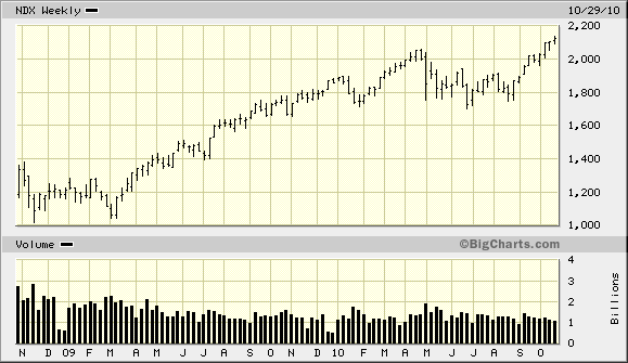
While many of the old market relationships we talked about may no longer hold true, one that still does hold some validity is the relationship between the tech stocks and the rest of the broad market. It’s interesting to note that the NASDAQ 100 Index (NDX) has recovered to a new high since the May “flash crash” while the other major indices, including the benchmark SPX, haven’t yet made a full recovery. The higher high recently made in the NDX should be viewed as a leading indicator for the broad market and is a positive sign that the recovery rally hasn’t run its course on an interim basis.

The fact that tech stocks have been the big winners this year is a major clue that any recovery in the jobless rate (see section below) will most likely come from the tech sector. As we saw in the previous commentary, the market hasn’t finished flushing out all of its near term internal weakness. By later this quarter, however, the market should be firing on all cylinders again as we head into 2011, a year that holds out the promise of being perhaps the last bull market year before the 60-year Kress cycle bottoms in 2014.
Employment Outlook
Probably the number one hot button issue of this election season has been the high level of unemployment. With the jobless rate hovering around 10 percent, pundits have focused on the fact that this is one of the longest high-unemployment rate trends in memory.
There is little in the way of optimism that this trend will reverse anytime soon. According to data provided by the Bureau of Labor Statistics, a record 30 percent, or 4.4 million, of the nation’s 14.7 million unemployed workers were out of work at least a year in August, up from 23 percent in December. As USA Today put it in a recent article, “A hefty share of the long-term unemployed – 71 percent – were out of work at least a year in August, up from 48 percent a year earlier.”
Temporary U.S. employment is showing signs of improvement, although experts agree that temporary work is no substitute for long-term employment. At this point, however, even temporary work is better than none at all. As we’re heading into the holiday season, we can expect to see an even bigger surge in temporary employment and the leading indicators are forecasting an increase in temp jobs.
One of the most useful benchmarks for gauging the strength or weakness in the labor market is Monster Worldwide (MWW). The stock price of MWW has proven to be a leading indicator for the rate of change in the employment rate in the short-to-intermediate-term outlook. All year long Monster’s stock price has languished in a downward sloping trading range, hitting a 52-week low as recently as August. Monster’s stock price slowly turned around in September and on Friday, Oct. 29, Monster’s stock price shot up an incredible 20% on an earnings-related announcement. Granted the stock has only just recovered its losses since the May “flash crash” but it’s nearing a 2-year high. Monster executives foresee improvement in job bookings, particularly for tech-related jobs, and the stock price is reflecting this.
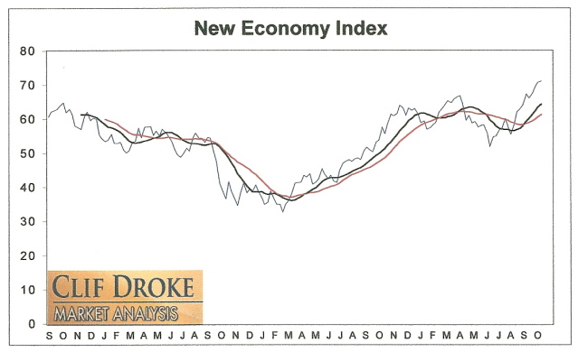
Monster is also a component of the New Economy Index (NEI), which measures the intermediate-term (6-9 month) strength in the U.S. economy. The latest rally in Monster helped push the NEI to its highest level in over three years. This is a positive omen for the intermediate-term economic outlook. It also suggests the upcoming holiday retail sales season should be a consensus-beating one.

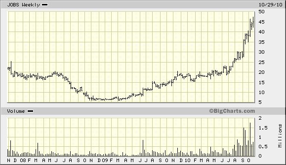
Now contrast the recent strength in Monster Worldwide with that of another leading employment stock, 51job.com (JOBS). JOBS is basically the equivalent of Monster Worldwide for China’s job market. If you want to know what the employment situation is like for China, just look at the stock chart for JOBS. Here’s what the 3-year price history of JOBS looks like.

As you can see, the U.S. employment outlook is inferior to that that of China, which fits with the assessment we made earlier in this commentary. While the U.S. jobs outlook is improving, it has much room for improvement compared to that of China’s healthier job market outlook.
Silver ETF
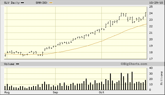
The iShares Silver Trust ETF (SLV) temporary succumbed to the selling pressure that had plagued the gold ETF and gold stocks a couple of weeks ago. SLV pulled back sharply on Oct. 21 at the same time that a Barron’s article appeared containing the headline, “Hi-Ho Silver! The White Metal’s Riding High.” This gave a clear indication of the inflated expectations on the white metal in the near term and the enthusiasm was duly corrected. While the article was hardly exuberant in its tone, it was optimistic enough to put a damper on the silver price, temporarily, from a contrarian standpoint.
Silver and the silver ETF have since shown relative strength versus the gold market and on Friday, Oct. 29, SLV closed to a new recovery high. SLV has remained above one of its most important short-term trend lines since the rally began in August, a testament to the strength of the uptrend.

There’s a lot of buying interest in silver right now from institutional players and this has been the number one driving force behind the rally in SLV. When silver shows relative strength vs. gold, the gold price typically follows silver’s lead in the near term. Accordingly, the yellow metal should be able to recover its high from earlier this month as it takes its cue from silver.
How to Trade the Most Profitable Chart Pattern
One of the most profitable chart patterns is also one that receives virtually no recognition from market technicians. The pattern I’m referring to is the “channel buster,” which can be either a bullish or a bearish pattern depending on how it manifests in the charts of actively traded stocks and commodities. This highly profitable pattern was aptly named by stock market veteran Don Worden, editor of Worden’s Weekly Reports. As its name implies, the channel buster involves a price breakout (or breakdown) either above or below the outer extremity of a trading channel.
The channel buster can be highly profitable if you know how to spot it. It’s a chart pattern that is commonly seen in bull markets and bear markets alike and is the ultimate “all weather” money maker for short-term oriented traders. In my book, “Channel Buster” How to Trade the Most Profitable Chart Pattern,” I explain the mechanics of this amazing chart pattern and how you can spot it an almost any actively traded stock or commodity. The book also provides rules for entering and exiting a trade based on the channel buster method. This is the only book available that deals exclusively with the channel buster. The channel buster is a breakthrough in the trend analysis of stocks and commodities.
The book was written so that retail traders might be able to understand and practically apply these useful methods of market analysis. The book is now available for sale at:
http://www.clifdroke.com/books/channelbuster.mgi
Order today to receive your autographed copy and a FREE 1-month trial subscription to the Junior Mining Stock Report newsletter. Published each week, the JMSR newsletter uses the method described in this book for making profitable trades among the actively traded junior mining shares.
By Clif Droke
www.clifdroke.com
Clif Droke is the editor of the daily Gold & Silver Stock Report. Published daily since 2002, the report provides forecasts and analysis of the leading gold, silver, uranium and energy stocks from a short-term technical standpoint. He is also the author of numerous books, including 'How to Read Chart Patterns for Greater Profits.' For more information visit www.clifdroke.com
Clif Droke Archive |
© 2005-2022 http://www.MarketOracle.co.uk - The Market Oracle is a FREE Daily Financial Markets Analysis & Forecasting online publication.


