


Fibonacci Gold
Commodities / Gold and Silver 2011 Apr 04, 2011 - 03:23 AM GMTBy: John_Townsend

 This article will examine the current up leg in gold price that originated in October 2008, present a study of the Fibonacci relationships of this price movement that are evident both in terms of price and time, and offer a projection of future price movement within the time frame suggested by the evidence.
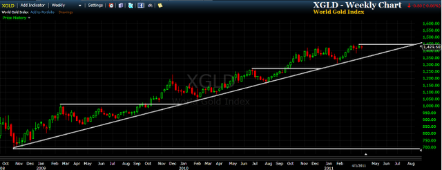
We will begin with a simple weekly chart of the World Gold Index (XGLD) and employ a diagonal support trend line and three horizontal lines identifying price breakout levels. No doubt you will notice that price movement has been subdivided into three completed stages, each separated by a new break higher through a horizontal resistance line. And, current price is contemplating a move higher that would take it into a fourth stage of the up leg.
This first chart gives us a general concept of the shape, size, stages and elapsed time of this massive up leg in gold. This will be important to keep in your mind as the following charts will add considerable visual complexity to this price history.
I am going to present three charts that have taken various Fibonacci measurements into consideration and identified their location on the gold price chart. This first chart observes the Fibonacci relationships of price movement. Measurements are taken from price movement that results in a low, a high or a breakout. The second chart observes the Fibonacci relationships of lows, highs and breakouts measured in terms of time. The third chart attempts to consolidate and simplify the most significant details of the two preceding charts. This chart details both Fibonacci price movement and time on a single chart and offers a possible future outcome for price movement within a specified time frame.
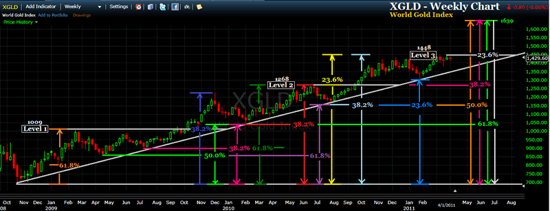
Each Fibonacci measurement uses the base price of $681 which was the price of gold when this up leg began in October 2008.
I have retained the white horizontal lines that subdivide price movement into three complete stages, though admittedly you will have to look carefully to find them. They are identified as Level 1, Level 2 and Level 3.
Level 1 concluded with a bullish breakout that rallied 38.2% while Level 2 concluded with a breakout that climbed 23.6%. Price is presently at the Level 3 horizontal resistance level and should it breakout and also rise 23.6%, gold would be taken to somewhere around the $1639 area.
I found it interesting that most lows (but not all) were in Fibonacci relationship with a high that followed it. Also, literally every time price reached the diagonal trend line it turned out to be a significant Fibonacci price level for either a future local high or a return to the trend line. Finally, the Level 2 and Level 3 price levels were each affirmed with a Fibonacci relationship.
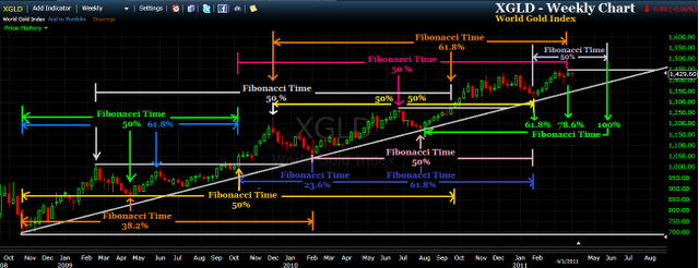
This next chart considers various price landmarks and their Fibonacci relationships observed in terms of time. Unlike the previous chart that uses the $681 price of Day 1 as the basis of all observations, this chart notes the Fibonacci time relationships that exist using many different starting points, each of which is associated with either a low, high or breakout of a resistance level.
My impression of this Fibonacci time data is that it may be an even stronger determinant of significant price turning points than we observed in the previous chart of Fibonacci price data. This suggests to me that gold does indeed has strong cyclical and seasonal characteristics.
Nearly every significant low, high and breakout had a Fibonacci time relationship with another price landmark that followed. I was truly amazed at the intricate time relationships I found and I am sure I did not find them all.
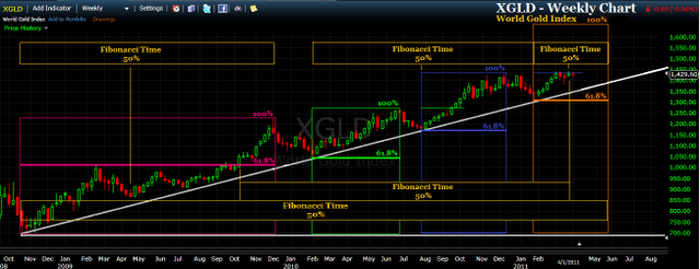
This final chart is my attempt to synthesize the preceding charts, simplify and offer an hypothesis on future price movement. But rather than use the previous model that included significant consideration of the horizontal price levels that separate the three concluded stages, I decided to take a fresh look at price action and made some interesting discoveries.
Here I have subdivided price movement into four stages which are identified using four different colored rectangular borders. Each stage has a singular similarity - that being significant price action occurring at the Fibonacci 61.8% level of the rectangle, as measured from the baseline price of $681 to the top of the rectangle. We note that the height on one rectangle become the identified break out level within the next rectangle. And, each rectangle is separated by a drop in price movement that rejoins the long term trend line before beginning the next rectangle.
Future price movement suggests the current rectangle will top at $1639.
Various Fibonacci 50% time relationships are illustrated. If the February 2010 low is of large scale significance, it would be the 50% midpoint of gold's beginning in October 2008 and somewhere around May 23, 2011. Also, if gold should break out this week within the fourth rectangle that would correlate nicely with the breakout within the first rectangle, as the midpoint of this time frame is the beginning of the third rectangle. Finally, we are presently at the 50% mark of the time frame contemplated for the current fourth rectangle.
If you have comments, questions or new insights about the Fibonacci relationship of the current gold up leg and want to share them with me, just send me an email.
I wish you a great week of trading and invite you to peruse my website, The TSI Trader, where you will find a focus on both the techniques of using the True Strength Index (TSI) indicator for accurate trading signals and the secular bull market for precious metals.
John Townsend mailto:TSItrader@gmail.com
© 2011 Copyright John Townsend - All Rights Reserved
Disclaimer: The above is a matter of opinion provided for general information purposes only and is not intended as investment advice. Information and analysis above are derived from sources and utilising methods believed to be reliable, but we cannot accept responsibility for any losses you may incur as a result of this analysis. Individuals should consult with their personal financial advisors.
© 2005-2022 http://www.MarketOracle.co.uk - The Market Oracle is a FREE Daily Financial Markets Analysis & Forecasting online publication.