Silver – An Historical Comparison
Commodities / Gold and Silver 2011 Aug 01, 2011 - 03:30 AM GMTBy: Willem_Weytjens
 In this article, we will describe both a bullish and a bearish view on silver. Some say Gold and Silver are huge bubbles about to pop (they say that silver already popped when it dropped from nearly $50 to nearly $30 in may). Gold however, is trading near an all-time high, so definitely, the gold bubble hasn’t popped (yet).
We are no silver bears. Nor are we silver bulls, but we always try to spot trend changes, and anticipate these changes by investing accordingly. It can be both on the long and the short side. Over the last 10 years, in general, we had a bullish view on commodities, although there were times when we took profits when prices rose too much, too quickly. Back in march, we anticipated a huge rise in silver prices, as we described in one of our articles (http://profitimes.com/...). Silver was trading around $37 back then, and we projected a rally towards $48 over the next couple of weeks. When silver hit our target at the end of April, our view was that silver rose too much, too quickly, and anticipated lower prices as we described in another article on our site (http://profitimes.com/...).
So once more, we are no silver bulls, nor silver bears, although from time to time we have a bearish/bullish view, depending on price action. Nothing goes straight up or down. That is an important fact to realize.
Enough talked now. Let’s have a look at some charts.
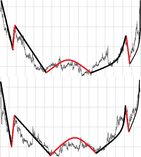
Do you think the following charts are similar? I drew red and black lines to show similar moves. If the answer to this question is YES, than you probably wonder what these charts represent. The upper chart represents the price action of silver from 1980 until today. The lower chart represents the price action of silver from today back to 1980 (I mirrored the current price action chart horizontally). Do you see the similarities?
If you don’t see the similarities, I posted one chart on top of the other to visualize it better:
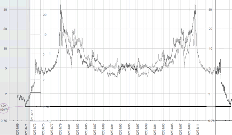
If history would be any guide, the silver “bubble” could indeed pop as the bears say. Based on this chart (and assuming the similarities will keep holding up), silver could fall back towards $1.29 over the next 9-10 years. I know that it’s hard to imagine, but just hold on silver bulls, your case will be explained now.
Compare the charts below. Again, do you see any similarities? The left chart is the CPI INFLATION ADJUSTED price chart of silver today, while the chart on the right represents the CPI INFLATION ADJUSTED price chart of silver from 1985 back to 1980 and earlier. Do you see the similarities?
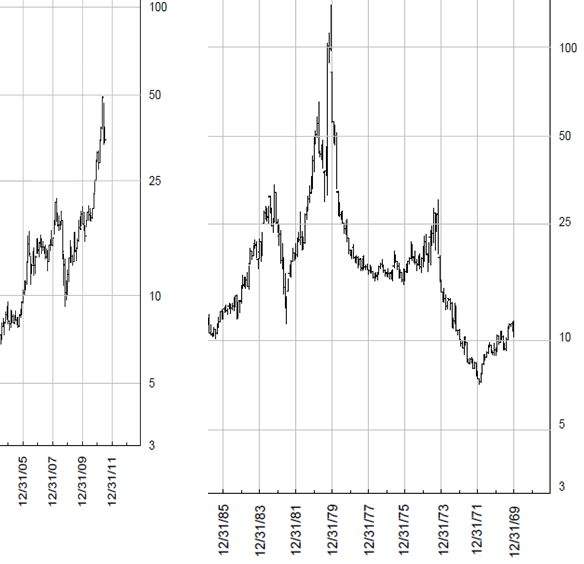
Just in case you don’t, I drew some colored lines to visualize similar moves. Also look at the horizontal red lines, which always show the same support and resistance levels. If history would be any guide, the current price would be around the red circle on the chart on the right.
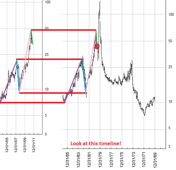
Again, I posted one chart on top of the other, to visualize what I mean. If history is any guide (and assuming the similarities keep holding up), silver could prices could see a dip towards $25 before exploding to $100 (like mr. Embry, mr. Sprott and others predict).

Comparing gold and silver to the highs of 1980 can also be done by using the US House Price to Gold and US House Price to Silver ratios.
As we can see in the charts below, the ratios are approaching the lows of 1980. Those who traded their house to precious metals 10 years ago, can now buy 4 or 5 houses with those precious metals. The US House Price to Gold Ratio is now around 174, which means that you can buy an average US House for 174 ounces of gold. In 1980, the ratio bottomed around 100. To get there, the gold price should increase towards $2750 per ounce assuming housing prices would stay flat, an average US House should drop towards $160.000 assuming gold to stay at $1600, or a mixture of both rising gold prices and falling home prices.
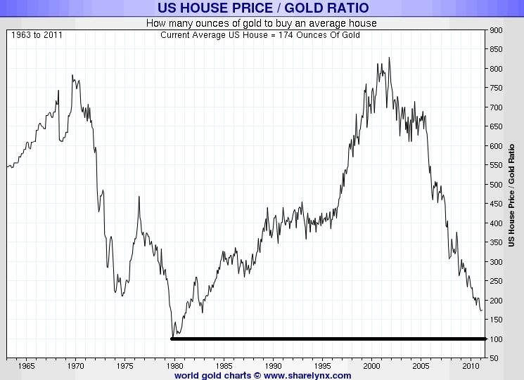
Chart courtesy www.sharelynx.com
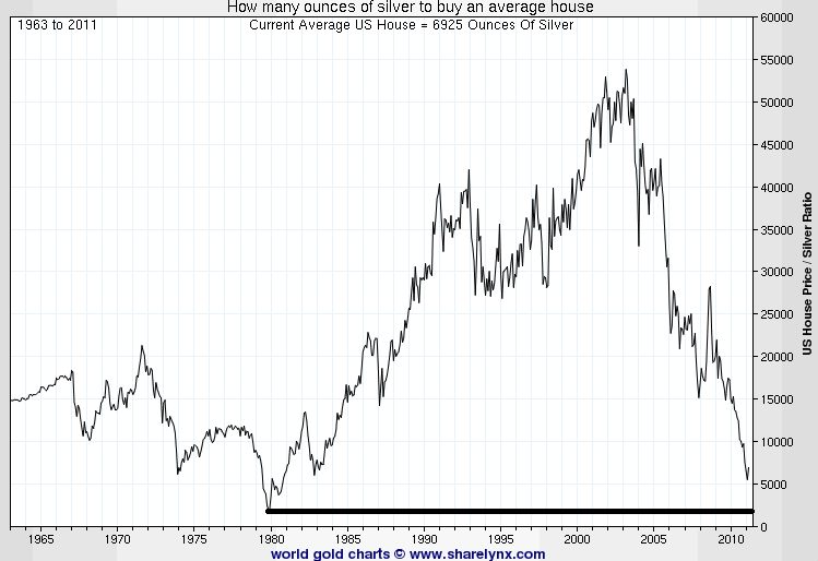
Chart courtesy www.sharelynx.com
For more analyses and trading updates, please visit www.profitimes.com
Willem Weytjens
www.profitimes.com
© 2011 Copyright Willem Weytjens - All Rights Reserved
Disclaimer: The above is a matter of opinion provided for general information purposes only and is not intended as investment advice. Information and analysis above are derived from sources and utilising methods believed to be reliable, but we cannot accept responsibility for any losses you may incur as a result of this analysis. Individuals should consult with their personal financial advisors.
© 2005-2022 http://www.MarketOracle.co.uk - The Market Oracle is a FREE Daily Financial Markets Analysis & Forecasting online publication.


