Stock Market Correction Remains Incomplete
Stock-Markets / Stock Markets 2011 Aug 01, 2011 - 05:47 AM GMTBy: Andre_Gratian
 Very Long-term trend - The continuing strength in the indices is causing me to question whether we are in a secular bear market or two consecutive, cyclical bull/bear cycles. In any case, the very-long-term cycles are down and, if they make their lows when expected, there will be another steep and prolonged decline into 2014-16 (no change).
Long-term trend - In March 2009, the SPX began a move which evolved into a bull market. Cycles point to a continuation of this trend for several more weeks (no change).
SPX: Intermediate trend - The SPX has met the downside projection for the latest distribution phase and, in doing so, may have completed the intermediate triangle correction pattern which started in February.
Analysis of the short-term trend is done on a daily basis with the help of hourly charts. It is an important adjunct to the analysis of daily and weekly charts which discusses the course of longer market trends.
Market Overview
In the Summary of my 7/24 letter, I stated: "The news from Washington on Friday could roil the markets on Monday if something more positive does not emerge before the week-end."
Apparently, the distribution process was not complete because the roiling did not start in earnest until late Tuesday. Since its 1356 top on 7/21, the SPX had a decline of 74 points before it found a low on Friday, 7/29. The good news is that the decline appears to be over -- for now. The distribution pattern which took place between 7/21 and 7/26 only gave us a downward projection to 1285 on the P&F chart, and the strong rally which took place after the index reached 1283 underscores the validity of that projection.
With the current chaotic condition of the U.S. Congress, and the dangerous game of political brinksmanship which is taking our nation right up to the edge of a potential fall into a financial precipice, along with last week's depressing economic news, it would be easy to make a dire forecast for the stock market. However, for the moment at least, objective technical analysis reveals a mixed bag of positive and negative factors, and these are what we will focus on and evaluate in this letter.
Here are some positives:
As mentioned above, the distribution phase at the 1356 level only had a projection down to 1285. The intensity of the decline took the SPX down to 1283, but it immediately rebounded with a 21-point rally. If the index goes up on Monday and surpasses Friday's 1304 intra-day high, it will most likely be back in "some sort" of an uptrend.
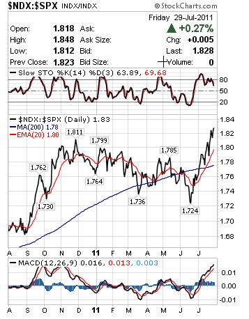
The QQQ's relative strength to the SPX is something which has historically accurately predicted the market trend. Since June, the QQQ has steadily improved its relative strength to the SPX and, at Friday's low, had the strongest relationship for that time period.
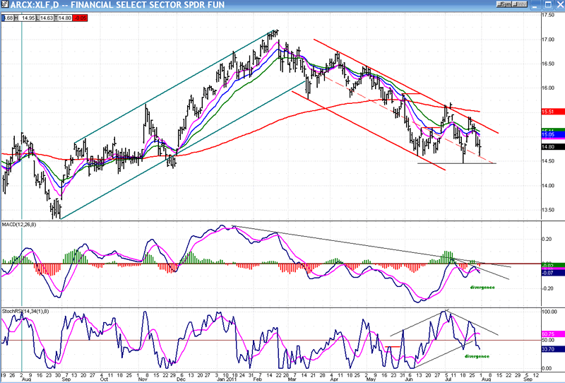
The weakness that the SPX experienced from 1356 was not shared by the XLF financial index, another important leading indicator. The XLF had been consistently weaker and in a steady downtrend since the February high. This non-confirmation of relative weakness by the XLF over the past week also argues for a potential end to the intermediate term correction which began in February.
The SentimenTrader, which had dipped into the red at the end of June, is now solidly back in the green.
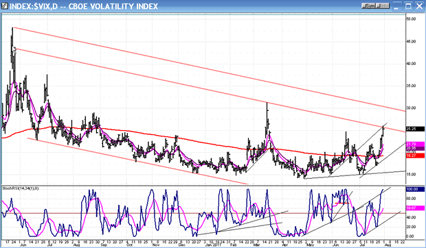
These positives are not enough to decisively forecast an important low in the market. The confirmation will have to come from the market action itself over the next week or two. There are some negatives as well, such as the VIX closing near its rally high on Friday.
Chart Analysis
We'll start by taking a look at the long term trend. In order to do this, I have placed the monthly and weekly charts side by side. My analysis tells me that we have not decisively arrived at a long-term top. Here is why:
In the Monthly Chart, the SPX is still trading well within the confines of its main (green) channel --roughly at the mid-point. It looks as if it is decelerating, perhaps due to the 3-yr cycle which, with its low due at the end of October, may be beginning to exert downward pressure. The new long-term trend is represented by the gray channel.
Next, look at the indicators. In the MACD, there was no divergence in the histogram at the recent top, and the blue line, although flattening, is not ready to cross over. It is true that in the lower indicators, the lines have just started to cross. It is normal for that indicator to have a correction when it has reached the top of its range, but I have written in green: "no divergence". This is important! If that indicator had made a lower high at this top, it would be a red flag. The MSO is always the first to signal weakness in the market but, at worst, it is only waving a very pale yellow flag right now.
One more thing: compare the position of the MAs between where they are today relative to each other and to price. They are not close to crossing and may not do so for some time. On this chart, remember that each bar stands for one month!
Based on these observations, especially after looking at the next chart, I think that the index could first make a new high, then roll over into the 3-yr cycle low. After having bottomed, the cycle should give the SPX another upward push for a few more weeks or months, and only then finally begin a prolonged decline into 2014-16.
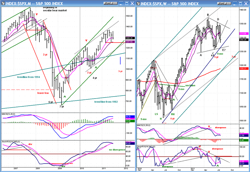
In the Weekly Chart, the indicators have been in a declining mode since February, correcting the uptrend which started in June 2010. The bottom one has already become oversold and has bounced to the 50% line before rolling over again. It is seeking a point from which to start a new uptrend. The MACD is doing the same thing except that it is not as volatile as the MSO, and not as good at identifying overbought/oversold conditions.
Although the wave structure is still not conclusively determined, my preferred thinking is that the index has been making a diagonal triangle consolidation since the February high, and is now coming down into the final "E" wave (which could have made its low on Friday at 1283). If that's the case, another uptrend is about to start, rising out of the triangle formation to make a new high.
The Daily and Hourly Charts are also side-by-side. The former shows that the price, once again, found support above the 200-DMA and the long-term uptrend line. Those two combined provide good support and, since we have filled the downside target of 1285, the odds are good that we have made some sort of a low which may turn out to be the low of the "E" wave of the triangle.
The lowest indicator (A/D) is the strongest of the lot and, by showing strong positive divergence on Friday, gives us another reason to expect that Friday might have been the low of the decline. However, it has not yet crossed the slower pink line and gone positive, and the other two indicators are still declining. This suggests that there may be more work to do before getting another short-term buy signal. Only when all the indicators have reversed, gone positive, and broken out of their downtrend lines can we start talking new uptrend.
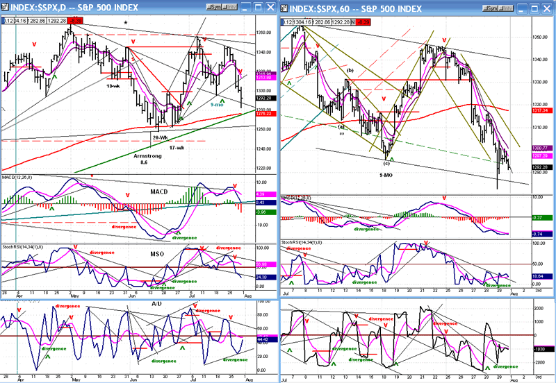
The hourly chart came very close to giving a buy signal on Friday, but the index could not close outside of its downtrend line. As soon as the index can close above 1304 on an hourly basis, we should have started a near-term uptrend.
This may seem a little far-fetched, but the two last two consolidation patterns look like a stretched-out H&S formation. The neckline is the same as the downtrend which must be broken to signal a potential break-out.
Because of the condition of the daily indicators it is going to be difficult to immediately go through the trend line which connects the two tops. Most likely we will pause and consolidate after touching it and, at worst, we may even need one more pull-back to test the 1283 low.
Cycles
Because the SPX went below its 1296 low, I have to consider the possibility that the 9-mo cycle may already have failed, which would be a strong negative. But it may also just now be making its low, one week late.
The next cycle will be the 13-wk cycle, due about 8/22. It will be closely followed by the 14-15-wk cycle due to make its high on 9/18.
The 3-yr cycle should bottom around the end of October and, if the economy continues to show signs of anemic growth, it is not inconceivable to see the market correction extend into that time frame. That would produce a choppy, essentially sideways market for the next three months.
Breadth
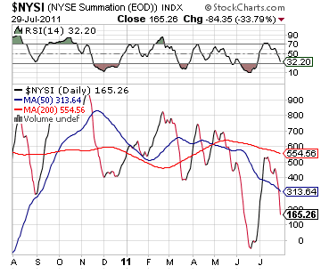
The long-term pattern of lower highs continues. Note that the 1295 low on the SPX only shows up on the Summation Index (courtesy of StockCharts.com) as a minute squiggle, and that the lower tops are coming in at lower and lower levels, giving an impression of downside acceleration. It would become a concern for the bulls if this index broke below its previous low.
Since this negative pattern is not supported by other indicators which are more bullish, it is not something to really worry about just yet, but we need to keep an eye on this index. If the SPX is going to make a new high, it needs to firm up and give us a more positive picture.
Sentiment:
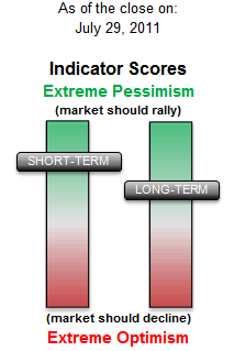
The SentimenTrader (courtesy of same) is one of the important indicators giving us a much more positive picture.
The short and long-term combo registered on Friday adds another dimension to the probability of having made a low -- at least a near-term low!
I mentioned earlier that the ratio of NDX to SPX had been improving steadily. Look at the graph below! It's rocket propelled! Does that look like the kind of a pattern that is made at a market top?
The VIX is one of the current negatives which must be acknowledged. Here is its Daily Chart. Over the past three months, it has been making a series of higher highs and higher lows. This is a bullish pattern for the VIX -- and a negative one for the market.
There are some minor positives (for the market): The VIX is overbought and at resistance, which could mean a near-term top. But it could subsequently make a new high before starting a bona fide decline. There are no signs that it is now ready for an important reversal.
Could the SPX make a new short-term low before making a new high? In order to remain objective, we need to weigh what all indicators are saying. Right now, they are presenting a mixed picture.
To expand our perspective, let's review two indices which have proven forecasting value.
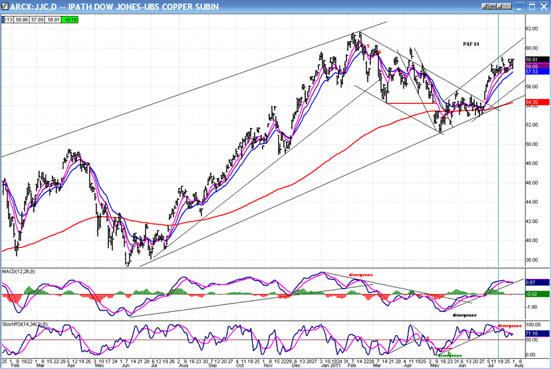
COPPER (daily chart)
There is no apparent weakness here! The index has ignored the entire decline and closed near a recovery high on Friday.
The bottom indicator does show some negative divergence, but it is not confirmed by the MACD and therefore not a decisive indication that a top is in the making.
The index also has a P&F target of 61 which, if reached, would signal a potential double-top - a more serious sign of topping.
For the moment, the Copper chart supports a bullish case for the market.
XLF - FINANCIAL SELECT SECTOR SPDR (daily chart)
The XLF chart is very interesting because it clearly and specifically identifies the market pattern. While we can argue about whether or not the SPX is in a triangle correction, this chart tells us, without ambiguity that the market top occurred in February (By the way, it also pin-pointed the market top in February 2007, several months ahead of the SPX).
It is also telling us that the market is at a critical point. If this index reverses its trend here, there is a good chance that we are witnessing the end of the intermediate trend which began in February. The chart indicators are both showing positive divergence, which gives hope to the bulls that this index has completed an intermediate downtrend. However, although positive divergence very often precedes a market reversal, there are times that it does not. We need to see a price reversal out of the down channel for confirmation.
The P&F chart favors a move to 18. It also tells us that, based on the distribution pattern that was created at the February top, the index has reached its downside projection. That gives a little more credibility to a completion of the decline from February.
I won't show its chart, but TLT is also a very good indicator of market trends. It works like the VIX, in inverse correlation to the SPX, and its chart and indicators are very similar to those of VIX.
On Friday, TLT touched 98 and closed a little bit below. It's P&F projects a high of 103. However, it also indicates that there could be a significant pause in the uptrend after it reaches 98.
Summary
The market indicators are a mixture of positive and negative signals. They probably exemplify a market which is in an incomplete corrective mode. The faction which eventually gains dominance will determine the direction in which the market emerges from this correction.
Near-term, a favorable resolution of the political crisis in Washington will probably favor the bulls, but that may not mark the end of the correction.
Patience! This too will pass!
FREE TRIAL SUBSCRIPTON
If precision in market timing for all time frames is something which is important to you, you should consider a trial subscription to my service. It is free, and you will have four weeks to evaluate its worth.
For a FREE 4-week trial. Send an email to: ajg@cybertrails.com
For further subscription options, payment plans, and for important general information, I encourage you to visit my website at www.marketurningpoints.com. It contains summaries of my background, my investment and trading strategies and my unique method of intra-day communication with Market Turning Points subscribers.
By Andre Gratian
MarketTurningPoints.com
A market advisory service should be evaluated on the basis of its forecasting accuracy and cost. At $25.00 per month, this service is probably the best all-around value. Two areas of analysis that are unmatched anywhere else -- cycles (from 2.5-wk to 18-years and longer) and accurate, coordinated Point & Figure and Fibonacci projections -- are combined with other methodologies to bring you weekly reports and frequent daily updates.
“By the Law of Periodical Repetition, everything which has happened once must happen again, and again, and again -- and not capriciously, but at regular periods, and each thing in its own period, not another’s, and each obeying its own law … The same Nature which delights in periodical repetition in the sky is the Nature which orders the affairs of the earth. Let us not underrate the value of that hint.” -- Mark Twain
You may also want to visit the Market Turning Points website to familiarize yourself with my philosophy and strategy.www.marketurningpoints.com
Disclaimer - The above comments about the financial markets are based purely on what I consider to be sound technical analysis principles uncompromised by fundamental considerations. They represent my own opinion and are not meant to be construed as trading or investment advice, but are offered as an analytical point of view which might be of interest to those who follow stock market cycles and technical analysis.
Andre Gratian Archive |
© 2005-2022 http://www.MarketOracle.co.uk - The Market Oracle is a FREE Daily Financial Markets Analysis & Forecasting online publication.


