


Stock Market Line In The Sand About To Be Tested
Stock-Markets / Stock Markets 2012 May 14, 2012 - 01:51 AM GMTBy: Andre_Gratian

 Current Position of the Market
SPX: Very Long-term trend - The very-long-term cycles are down and, if they make their lows when expected (after this bull market is over) there will be another steep and prolonged decline into late 2014. It is probable, however, that the steep correction of 2007-2009 will have curtailed the full downward pressure potential of the 120-yr cycle.
SPX: Intermediate trend - The intermediate uptrend is still intact and so is the extended short-term correction.
Analysis of the short-term trend is done on a daily basis with the help of hourly charts. It is an important adjunct to the analysis of daily and weekly charts which discusses the course of longer market trends.
Market Overview
The SPX is at a critical juncture which will determine whether it puts an end to its correction here and now, or if it extends its decline. On the Point & Figure chart, all the trading above 1398 looks like a distribution pattern which could have an ultimate count down to 1265, and perhaps even a little lower. A more conservative count would be satisfied at 1305. Since cycles determine the basic market rhythm, and cycles appear to be down into late May, and perhaps even mid-June, the amount of distribution established at the market top should give us an idea of how far the market will decline into those time periods.
The reason why the index has been holding so well above 1342 is because it represents a completed phase of the total count and it is normal that it should pause at this level and catch its breath. Furthermore, for those EW analysts who are looking at this correction as a wave 4 to be over, 1340 represents the ideal level at which it should end before starting wave 5.
The market is peculiar in that the top distribution pattern is normally confirmed by the next lower level of distribution. In this case, the SPX first declined to 1360 and had a strong rally before it declined further to 1344. That left all the activity between 1360 and 1415 as a secondary distribution phase which, on the P&F chart, does confirm the original counts. It gives us a conservative projection to about 1305, and a more liberal one to 1368. But the confirmation process does not stop there! It appears that we may have created another smaller distribution pattern between 1344 and 1365, which may now be complete.
On Friday, the SPX made what appears to be a final attempt at moving above the 1365 resistance for the third time. After an opening down-thrust and a sharp reversal, the index made it once more to 1365.66 and stalled. It then started retracing its advance under no apparent selling pressure - but even less buying -- drifting down past one level after another where it could (should) have reversed if its intention was to rise above 1365. By the end of the day, it had gone past what I considered to be the point of no return (1355) and closed near its low of the retracement at 1353.57.
That looks like bearish action, and it makes me think that the pause in the downtrend may be over. At the very least, 1344 is likely to be re-tested, with a strong possibility that the SPX is about to make a new low.
Earlier, I forgot to mention that the apparent re-distribution pattern between 1344 and 1365 (if complete) gives us another confirming count to about 1305! Needless to say, we should be curious to see what happens on Monday, perhaps getting a preview from the Globex futures on Sunday. If we decline below 1340 with appropriate confirmation from A/D and volume, the odds are very good that we are on our way to the next projection level of 1305.
Chart analysis
There is nothing positive about the SPX Daily Chart. If it does not break below 1340, you could say that the SPX has just started building a base above that level but, even so, it would not be ready to move higher until the indicators say it is and right now, they are saying the opposite. Last week, I showed the same chart and pointed out that the SPX was in the process of adjusting the angle of its trend from 1159. Then, it was just about ready to move out of its grey channel into a wider, blue one. The past week shows that this is precisely what it has started doing and there is no indication that it does not intend to penetrate deeper into it.
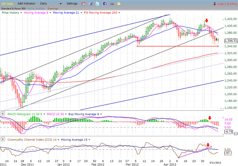
Looking at the MAs, the 21-DMA has been declining since shortly after the first sell signal at 1422. The 8-DMA, which had broken back above it when the SPX re-tested the high has just crossed back under at an even steeper angle than it did the first time. There is no indication of the deceleration which precedes a reversal in these indicators. Both oscillators are essentiallly saying the same thing. The MACD made a new low last week with the histogram still in a downtrend, and the more volatile CCI has just gone from positive to negative.
So far, the indicators are not contradicting the scenario that was laid out in the P&F and cycle analysis, above. Until they do, we should stay with the original forecast.
The Hourly Chart has the same negative look as the daily chart. The index has broken a former low after making a lower high. Technically, that puts it in a confirmed downtrend. To get out of it, it would have to move back above the 1415 top. There is no indication that it is ready to do that.
On the contrary, after making a 5-wave decline from 1415, the SPX consolidated in what appears to be a contracting triangle, which we know to be a continuation pattern. It also appears that the triangle was completed with Friday's thrust back up to 1365. Above, I described the behavior of the index after it had made that high as bearish. This is borne out by the MACD which has remained negative during the entire consolidation with the lines just about ready to make another bearish cross. The histogram is about to go red.
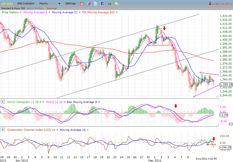
Below, the CCI has already turned down decisively in a bearish cross and has broken beneath the former low.
Since we know that a contracting triangle is a continuation pattern and that it was preceded by a 5-wave decline, this intimates that the next move will most likely be another 5-wave decline. Cycles say that they are still in a bottoming process, and P&F says that the next target is about 1305. The odds that the SPX is about to make a new low are pretty good right now.
Cycles
The market has been in a declining pattern for 6 weeks. This most likely means that the half-cycle of the 66wk cycle will be a low instead of a high this time. Since it tends to be fairly regular, we should expect it to bottom around 5/20.
Around the time that it makes its low, the 33-wk cycle will be joined by an 11-wk cycle.
The next dominant cycle is due in mid-June.
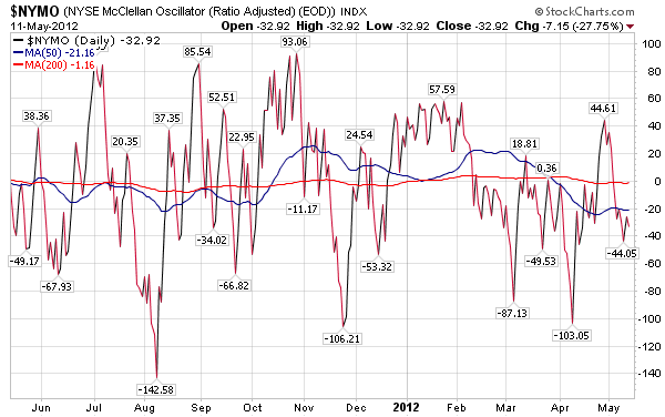
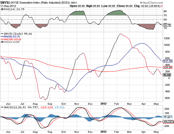
Breadth
The McClellan Oscillator and the Summation index (courtesy of StockCharts.com) are depicted below. The NYMO has been negative for more than three months, excepting for a couple of small blips in positive territory. The first one was a one-day affair which made no impression on the NYSI. The second was more recent and did turn it up for a brief moment. But when the NYMO dropped again below zero and stayed there to-date, the NYSI rolled over and continued its downtrend, making a slightly new low, on Friday. This is another reason why we should not expect the SPX to resume its uptrend right away. The selling pressure in the A/D has not abated and it must do so before equities can move back into a positive trend.
Sentiment Indicators
The VIX
In this hourly chart of the VIX, you can see how the index is replicating the pattern which was made by the SPX, except in reverse. Just as the SPX is trying to continue its decline, the VIX is attempting to remain in an uptrend. A break-out to a new high would mean that the SPX has made a new low and It looks as if this is what the VIX is ready to do.
First, let's look at the chart. When the SPX made a new low to 44, the VIX surpassed its former high, thereby being in sync with the equity index. One of the characteristics of the VIX is that it tends to let you know when it and the SPX are ready to make a significant reversal. If you look at the bottom of the chart where the word "divergence" is written, you can see that it was followed by a strong up-move in the VIX while, at the same time, the SPX went in the opposite direction. The green arrow marks the point where the SPX made its high at 1415 while the VIX had already made its low 2 weeks earlier. The same thing happened at the former low when the SPX reached 1422, except that there, the VIX gave us one month's lead.
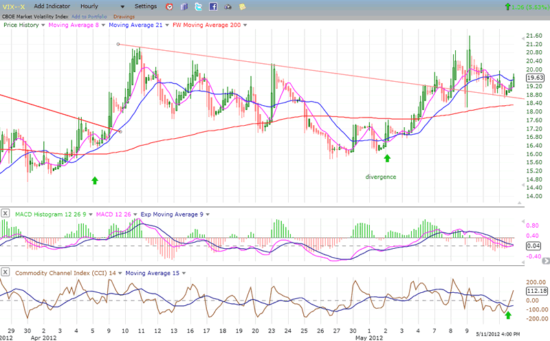
The point I am making is that there was no divergence at the last high, and this means that the VIX is probably not done with its uptrend and the SPX with its downtrend. On the chart, the VIX shows a normal consolidation which is a back-test of the broken trend line, and a bounce off that trend line on Friday. Now look at the bottom indicator: by moving above its former high point, and going past its blue MA with a thrust in the positive, there is a pretty good chance that the index is signaling the beginning of another up-move, and you know what that means for the SPX!
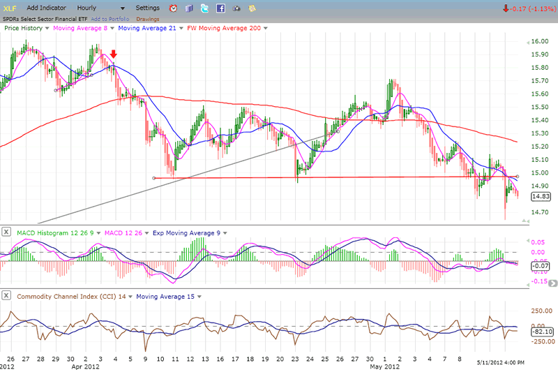
XLF (Financial SPDR)
The XLF was making the same pattern as the SPX until it got knocked for a loop on Friday by the J.P. Morgan Chase fiasco. Although it partially recovered when the market did, it closed well below its support line which had already been violated once before.
Here is another negative for the market: the XLF tends to match the SPX step for step on the short term until it starts deviating from it, as it did at the 1422 top. As I pointed out before, along with the VIX, it serves as a good lead indicator and Friday's action does not augur anything bullish for the SPX and other equity indices. And why should it? If it did something different, it would be going against what the above, larger picture scenario has forecast. The XLF is in sync with it, and this is as it should be.
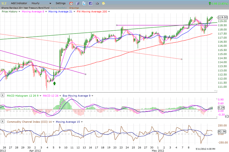
BONDS
Early April is when TLT stopped its corrective move from 125 -- about two weeks before the SPX made a high. (Geez! Another leading indicator.) And what did it do on Friday? It made a fractional recovery high while the SPX is still 4 points above its low. This index is in sync with the ones above!
After its sharp drop from 125, I thought that TLT had made a large distribution pattern and was bound for lower levels. Not yet! This may be turning out to be just a large consolidation pattern which the index is using as a springboard to make a new high. But that's only speculation. TLT may have started a short-term uptrend by overcoming a downtrend line, but it has another one to deal with about 4 points higher. That's the one which will decide whether it will be allowed to reach for the stratosphere or, like Icarus, its bullish wax will melt and it will swiftly head back to earth.
UUP (Dollar ETF) DailyChart.
The reason why I have chosen these specific charts to include in my weekly analysis is that each one tells me something about the condition of the market. When they all say the same thing, it makes the forecast more reliable.
Below is a daily chart of the index which spans a little over six months. It shows UUP completing the second phase of the break-out from its base in early August, and then consolidating for over 3 months. Now, it looks as if it is attempting to break out of its consolidation phase and is already challenging the last short-term high.
Its move of the past two weeks has had a material effect on the commodity index (gold and oil specifically) and the indicators show that the move is probably not over. The MACD has gone positive and its histogram is still rising. There is no deceleration indicative of a top! The CCI became overextended, but has corrected. It will probably have to show some negative divergence before the move comes to an end. The P&F chart shows that if it rises to 22.40, it will probably continue upward to challenge the former high of 22.85 which was reached in early January.
As long as UUP continues to move up, it will continue to put downward pressure on gold, oil and, most likely, the equity indices as well. UUP represents what the US dollar is doing, and we know that between May and September of last year, the dollar established a base which gives us a count to 90. All P&F projections represent a potential and not a guarantee but, as long as it does not start a significant decline, it can be expected to continue its move toward that objective and eventually reach it. Regarding the dollar, the P&F count of its re-accumulation base gives it a potential target of 85/86. If it is reached, it would put UUP at about 23.80. The re-accumulation pattern that you see on UUP also calls for a target of 23.80. That's the math! We'll see whether or not it materializes.
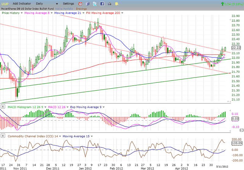
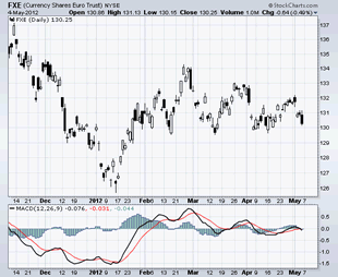
I have placed the chart of the Euro updated to Friday next to the one I showed a week earlier. It looks to me as if it has broken support and has a ways to go according to the pattern projection. Looking at this, it would not be unconceivable to see the dollar rise to 85/86 and UUP to 23.80.
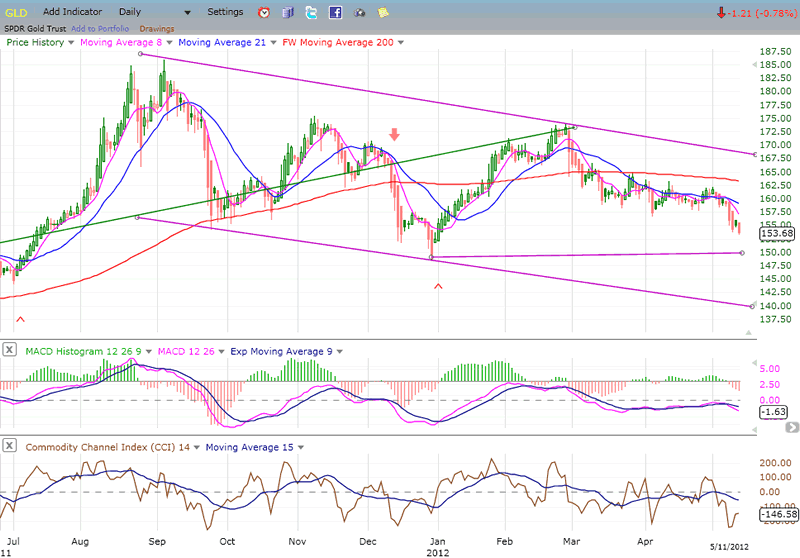
GLD (ETF for gold)
Since reaching its intermediate-long-term projection of 185, GLD has been in a consolidation. It has tried to rally twice, and both attempts have failed. Now, it seems to be ready to make a new low as it moves toward the time frame (mid-June) when the cycle, which averages about 25-wk, and which has been regulating its short-term moves, is due to make its low. Previous cycle bottom lows are marked on the chart by (^) and can be traced back to the beginning of its long-term trend in 2008.
It's possible that prices will find some temporary support at their former cycle low, but since, at 141, the correction would have retraced .382 of its advance, and that this is supported by a P&F count, it is probable that this is where the index will find itself in mid-June.
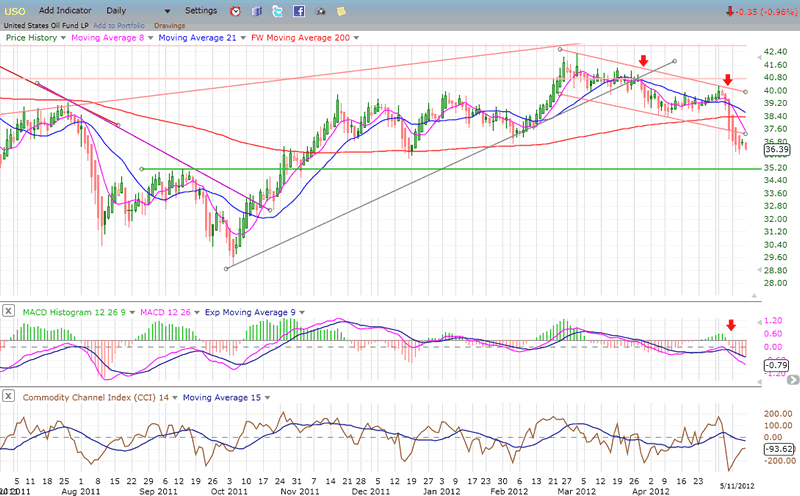
OIL (USO)
USO started to decline before the SPX and, recently, with the rise of the dollar and the general weakness in commodities, it has accelerated its down-trend.
The index is currently finding some minor support above a former low, but is likely to continue its decline until it reaches the green horizontal trend line where much stronger support exist. This is also corroborated by a P&F count to 35. A break below that level would be a big negative for USO and for the market.
WTIC (96.65), naturally, is making the same bearish pattern and is also likely to decline a little lower to its 94 P&F target.
Summary
The above charts uniformly show bearish patterns which portend lower prices over the next few days.
The cause of the downward pressure at this time is primarily the bottoming of the 33-wk cycle which is due to make its low around 5/20. Since that date falls on a Sunday, we might expect the decline to end either Friday or early the following week - or whenever the SPX reaches its next P&F projection.
While this could be the end of the correction from 1422, it is also possible that it might not be over until mid-June because of the current cyclical configuration.
FREE TRIAL SUBSCRIPTON
If precision in market timing for all time framesis something that you find important, you should
Consider taking a trial subscription to my service. It is free, and you will have four weeks to evaluate its worth. It embodies many years of research with the eventual goal of understanding as perfectly as possible how the market functions. I believe that I have achieved this goal.
For a FREE 4-week trial, Send an email to: ajg@cybertrails.com
For further subscription options, payment plans, and for important general information, I encourage
you to visit my website at www.marketurningpoints.com. It contains summaries of my background, my
investment and trading strategies, and my unique method of intra-day communication with
subscribers. I have also started an archive of former newsletters so that you can not only evaluate past performance, but also be aware of the increasing accuracy of forecasts.
Disclaimer - The above comments about the financial markets are based purely on what I consider to be sound technical analysis principles uncompromised by fundamental considerations. They represent my own opinion and are not meant to be construed as trading or investment advice, but are offered as an analytical point of view which might be of interest to those who follow stock market cycles and technical analysis.
Andre Gratian Archive |
© 2005-2022 http://www.MarketOracle.co.uk - The Market Oracle is a FREE Daily Financial Markets Analysis & Forecasting online publication.