The Gold Price Spike
Commodities / Gold and Silver 2012 Jun 02, 2012 - 05:54 PM GMTBy: Brian_Bloom
 Summary and Conclusion - The technical evidence suggests that today’s spike in the gold price was more probably a technical upward reaction within a secondary bear trend than the commencement of a strong up move.
Scanning today’s charts, the following P&F chart of the gold price (courtesy stockcharts.com) caught my eye:
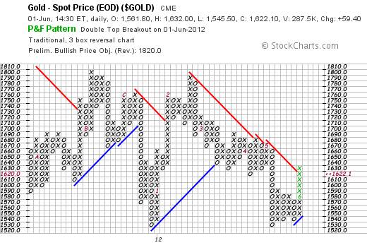
This chart is signalling an upside target for the gold price of $1820, with “timing” not possible to anticipate
With Point & Figure charting, there are two ways to estimate price destination following a breakout:
- Vertical count (flowing from prior volatility and the number of blocks in a vertical column move)
- Horizontal count (following a consolidation pattern and based on the maximum number of blocks in a horizontal line)
Over the years I have come to understand that the vertical count system works best with the trend and the horizontal count technique works best against the trend. So the question arises as to whether, on this particular occasion, the vertical count upside target is more relevant that the horizontal count upside target of $1630 that was reached today.
There is no question that gold is in a “primary” bull trend, but the question arising from the chart below is whether gold may have entered a secondary bear trend when it broke below the rising trend line four weeks ago.
Why is this important? Because, if gold is in a secondary bear trend, then the horizontal count target will be the more relevant target.
Chart #2
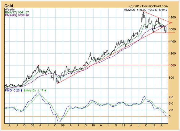
Looking at the chart formations above, we see:
- This week’s price ended below both its 17 week and 43 week Moving Averages
- A downward pointing 17 week MA
- A downward pointing 43 week MA
- A descending right angled triangle
If we look at the period from January to October 2008 on Chart #2 above, we see that facts 1-3 were precisely the same at that time, and that the PMO was even in negative territory, and that the gold price started to rise strongly in January/February 2009. It entered a rising trend after it broke up through resistance of an ascending right angled triangle.
The key difference between these two formations is as follows:
The “consolidation” during 2008 occurred in the form of a “pennant” pattern, which is typically bullish. By contrast, a descending right angled triangle is typically bearish.
Below is a chart reproduced from “Technical Analysis of Stock Trends, Edwards and Magee, 1977 at page 110. It shows a break down from a descending right-angled triangle, a pullback following the break, and then a continuation of the confirmed bear trend:
Chart #3
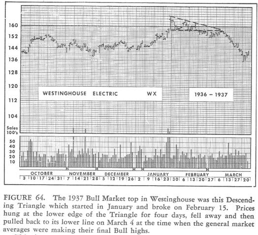
Given that it is typically bearish, it is quite possible that today’s strong rise in the gold price was a knee jerk trader’s reaction to events like the rattling sabres against Syria, or the feared breakup of the European Union. Alternatively, it might have manifested because the industrial market entered a Primary Bear Market a week ago according to Dow Theory.
Here is a quote from Richard Russell’s article today:
“Yes, we're in a primary bear market. I don't like it any more than my subscribers do. But my job is writing about what I know. I identified the bear signal on a site a week ago. To my knowledge, nobody else identified the bear signal -- and I emphasize NOBODY!”
Clearly, today’s strong rise in the gold price was mirrored by the strong fall in the Dow Jones Industrial Index and may also have been a knee jerk trader’s reaction to that fact.
Importantly, the MONTHLY chart below (courtesy DecisionPoint.com) shows that today’s rise in the gold price was really just a blip:
Chart #3
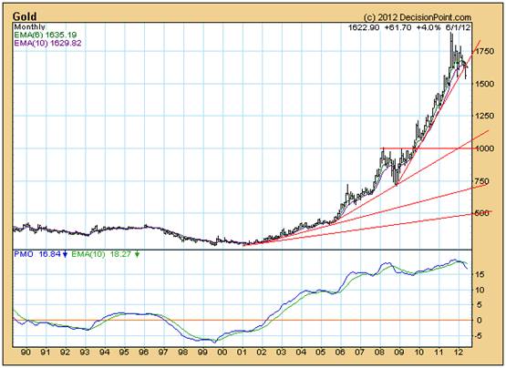
In addition to the downside penetration of the rising trend line, what seems most relevant about this chart is that the PMO has given a second sell signal from a double top. It follows that, for the gold price to rise to new highs in the foreseeable future, two strongly bearish signals will need to be overcome. Importantly, a “sell” signal on an oscillator does not necessarily mean that the price will fall. It might mean that the price will stop rising and churn sideways. But, as I see it, the “angle of incline” of the gold price’s rise (the rate at which it was rising) was so steep as to be unsustainable. The gold price had reached a point where it would either have had to enter an exponential blow-off phase or it would have had to consolidate for many months. The above chart points to consolidation – which is why the secondary trend is probably bearish; and which is why today’s sharp rise in the gold price was probably a knee jerk reaction.
This conclusion is validated by the less sensitive P&F chart below, which is showing that the $1109 target still prevails – within a Primary Bull Trend.
Chart #4
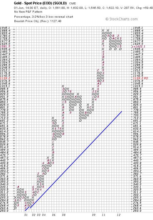
However, given that the Primary Trend is bullish, the horizontal count target (consolidation) is more relevant, and this implies that the target (following a break below $1535) will be $1320.
Now, the rise from $1076 to $1888 formed what is known as a “high pole”. The rule of thumb is that if the 50% retracement level holds then the primary bull trend will resume. If it is penetrated then the entire high pole will be retraced.
The 50% level is (1076+1888)/2 = $1482.
Unfortunately, a horizontal count target of $1320 is below $1482. Therefore, even if we are in a Primary Bull market and the price breaks below $1535, the high pole is likely to be fully retraced and, therefore, the vertical count move is likely to prevail. If the gold price falls below $1535, a target of $1109 per ounce will be eminently believable.
So the question arises: Given today’s strong rise in the gold price, what is the probability that the $1535 level will be penetrated on the downside?
Well, the answer to this will depend on the probability that a descending right-angled triangle will break out to the upside. It could happen, but the probability is very low.
For the purposes of confirmation (or non-confirmation) let’s have a look at what the ratio of gold shares prices/ gold price did today. Given that gold mining profits are highly leveraged to the gold price, if the market thinks that the gold price is about to explode upwards, then the share prices should be leading the gold price, and the ratio should be rising:
Chart #5
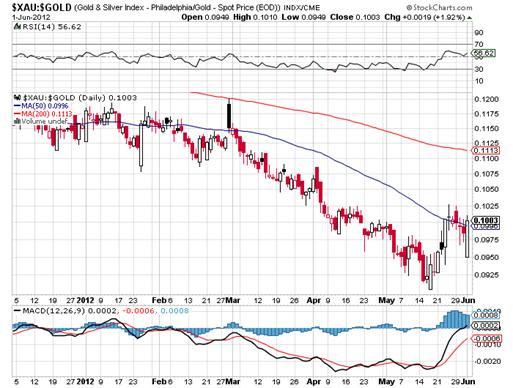
Well, there is no question that the gold shares rose very strongly today relative to gold and also in absolute terms. In fact, if you look at the $XAU chart on its own (see below), you will see that the shares rose to a new high.
Chart # 6
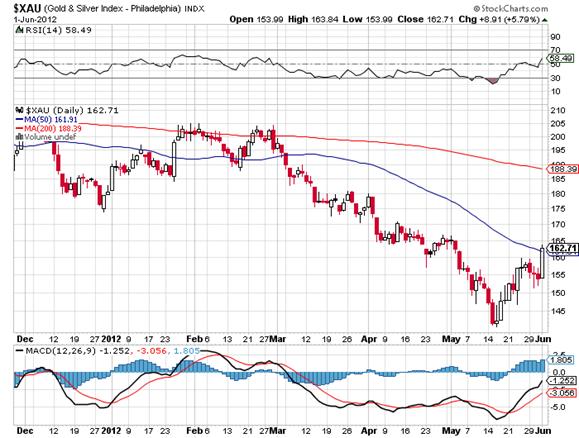
But the rise reflected on Chart #6 may turn out to be a deceptive move. First, the rise slowed at the descending 50 day moving average line, and second, the ratio of the share prices/gold price did not rise to a new high and also encountered resistance at the descending 50 day MA.
Conclusion
On a balance of probabilities, it would appear that today’s strong up move in the gold price was a technical upward reaction within a secondary bear trend, in a financial environment that is becoming increasingly skittish and volatile.
Author Note:
Because both of my factional novels were published in e-book format last week, I had both the time and the mind space to attempt to address the cognitive dissonance that has been brewing in my mind in respect of the world’s financial markets. There has been a “disconnect” between the prevailing mood of most media, advisory and blog commentators, and what the charts have been telling me. Technical analysts are trained to look for confirmations and non-confirmations and this disconnect was signalling a potentially serious non-confirmation. I therefore went to see a couple of friends who are at the coal face in the markets to get their views. Both are in relatively senior executive positions in substantial financial institutions. One spends most of his time networking on a face-to-face basis with central bankers in various countries, and the other is a gatekeeper between exceptionally large pools of investment funds that need to be managed (pension funds, insurance companies, other) and a broad spectrum of funds managers who are either managing some of those funds or who are seeking to manage some of those funds. Suffice it to say, their views can be taken as representative of the prevailing institutional investor mood. What these two men had to say was startling, to say the least, and it validated for me that we are living in exceptionally murky times.
Rather than rush in and “dump” this information on readers, I decided to cogitate on what they had told me. Over the course of the next two weeks I will be reporting on what they said and I will also try to place their views in context of the sure knowledge that most investors – both bull and bear – have a tendency to talk to their books.
Brian Bloom
Author, Beyond Neanderthal and The Last Finesse
In the global corridors of power, a group of faceless men is positioning to usurp control of one of the world’s primary energy resources. Climate change looms large. Can the world be finessed into embracing nuclear energy? Set in the beautiful but politically corrupt country of Myanmar, The Last Finesse, through its entertaining and easy-to-read storyline, examines the issues of climate change, nuclear energy, the rickety world economy and the general absence of ethical behaviour in today’s world. The Last Finesse is a “prequel” to Beyond Neanderthal, which takes a right-brain, visionary look at possible ways of addressing the same challenges. The Last Finesse takes a more “left brain” approach. It is being published in all e-book formats.
Copyright © 2012 Brian Bloom - All Rights Reserved
Disclaimer: The above is a matter of opinion provided for general information purposes only and is not intended as investment advice. Information and analysis above are derived from sources and utilising methods believed to be reliable, but we cannot accept responsibility for any losses you may incur as a result of this analysis. Individuals should consult with their personal financial advisors.
Brian Bloom Archive |
© 2005-2022 http://www.MarketOracle.co.uk - The Market Oracle is a FREE Daily Financial Markets Analysis & Forecasting online publication.


