Stock Market Elliott Wave Forecast for the Dow
Stock-Markets / Stock Markets 2012 Jun 18, 2012 - 04:50 AM GMTBy: Joseph_Russo
 Given the heightened sense of both fear and euphoria respectively associated with the outcome of Greek elections and the cartel of global central bankers pledging if need be, to do all that is necessary to further distort the price mechanism, we thought it appropriate to publically share our forecast for the Dow.
In our view, there is no better means by which to observe the rapidly changing state of global economic conditions than to grasp and interpret the clear inferences attained in accurately reading the price mechanism at work in real time.
Before we render our general forecast based on such, we will first explain the charts mark-ups, which slowly walk you through how we have arrived at our current conclusions.

Following last year's rollercoaster ride in response to similar concerns amid the Euro-zone along with the debt ceiling issues in the US, with the promise of QE3, and the further price mechanism distortions of several European bailout measures, the Dow embarked upon a rally that ultimately exceeded the highs rendered back in May of 2011.
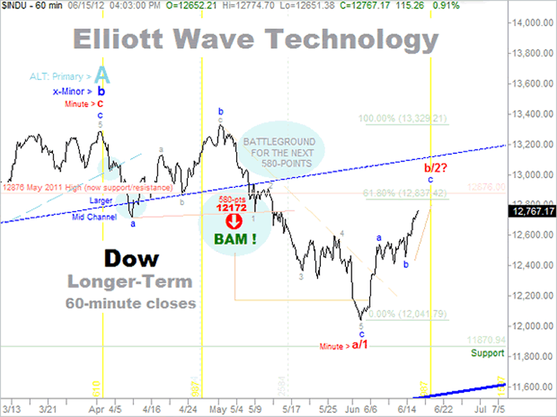
From left to right, the light-blue rising dashed trendline trajectory marked a clear boundary for this major advance in price. Nearly one year later in late May early April 2012, the Dow reached its peak and began its initial fall from grace.
Leading up to this crest, we had set a horizontal line in the sand at the previous price high, which is marked and illustrated in light red. The first light yellow vertical line was laying in wait from November 2011, and marked a timeframe for a high probability turn pivot in price. In this instance, it is clear to observe that our waiting vertical time line marked a near perfect timeframe for the end of the rally.
NOTE: To avoid scrolling back up to the chart for reference, we will intermittently replace the image as needed for your convenience.
We left off at the first vertical yellow turn-pivot crest in price, and observed thereafter what at first appeared just like any of the other recent moves to the downside.
Prior to its occurrence, we observed an initial distinction with this particular decline when it breached that dashed blue trendline trajectory we mentioned, which as you recall, had been providing a clear boundary for the long-running uptrend in price from the previous year's print lows.
From the previous year low, we had been patiently following the classic tenets of Elliott Wave Theory in counting four fractal degrees of subdividing wave structures.
Based largely upon human action or praxeology, Elliott Wave theory represents what one might consider a praxeological result of the inclination toward achieving forward progress by the means of enduring two steps back amid the overall successful achievement of progress in three steps forward.
In a progressing and growing stable economy is logical that the price mechanism adjusts in some form of this pattern, which telegraphs normal errors and adjustments made by economic agents as they try to best interpret the prevailing market conditions in order to make rational business decisions, which involves taking measured levels of risk.
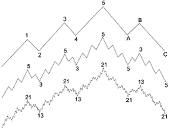
The Elliott Wave price patterns generally appear as follows:

The top line illustrates three steps forward (waves 1, 3, and 5) to the crest wave labeled -5-, which is comprised of five total waves of general progress that contain two corrective waves down (waves 2, and 4) to break the forward progress from one continuous stretch of perfect success.
The middle price pattern illustrates the fractal nature in which the price mechanism observes progress that typically evolves within a given time or business cycle regardless of its duration. Once five waves of non-overlapping progressive waves are complete, three corrective and overlapping waves typically follow. This observes the regressive or downward adjustment amid a corrective phase as agents readjust their perceptions of changing market conditions via the price mechanism.
The bottom line illustrates the fractal compounding nature of subdivisions within the nine degrees of trend lent by the theory, which in this graph shows 21 total progressive waves followed by 13 total corrective waves replicating to create the longer-term cycles that are illustrated in the two lines above.
With that brief tutorial out of the way, we can now get back to our study of the price mechanism via our chart of the Dow Jones Industrial average.
Continuing from left to right, from the point at which the Dow first breached its telling trendline boundary at the first small blue circle, we had in place two additional boundaries drawn from which to anticipate an attempt at bouncing back from corrective decline and returning to forward progress.
The first area of natural support was the 12876 level, which as you recall, was the high achieved from the prior year. The second area of support was not quite as obvious though it was resting in wait just the same.
Moving out of left-to-right sequence just for a moment, we draw your attention to the lower right hand corner of the chart where you will notice a thick blue line sloping in an upward trajectory pointing just north of the 11,600 mark on the price axis.
This line is far more critical than the thin dashed trendline the Dow breached following its peak in May/April of 2012. For this line, represents a critical support boundary, which defines the entire bailout rally from the depths of the bear market lows registered back in 2008.
Okay, back to our left-to-right sequence, relative to this critical boundary line of progress just noted, is a mid-channel boundary, which naturally has a large upper boundary to match even though it is not within visible range on this particular data series.
This mid-channel, which we note as the Larger Mid Channel, is from left to right identified near the pivot low in price that registered in early April 2012. As you can see at the second slightly larger blue circle, price dipped briefly beneath this standing mid channel then rapidly recovered and the price level again began to rise.
We suspect thus far that you would be inclined to agree that these forecasting tools are indeed a reliable means by which to accurately observe, confirm, or negate the level of success in which economic agents are succeeding or failing in their natural quest to correctly interpret and act upon the broader price mechanisms occurring throughout the economy.
If you do not yet think so, be patient and by the end of this dissertation, I trust you will be convinced of the value and utility in imparts in observing human action responding to the price mechanism in real time.
Where did we leave off? Ah yes, we left off at the attempted recovery from the initial pivot low. Take note that we labeled that low with the -a- tag, which is a corrective label suggesting that a more serious impulsive decline had not taken place.
This was an immediate and HUGE piece of valuable information, which suggested that a recovery rebound had better than fair odds of retesting or besting the standing chart high registered in early April 2012.
Still moving from left to right, take notice of the full recovery made by the Dow and the nature in which it did so as it crested once again in early May 2012. Again, the manner in which the Dow recovered to this secondary high was HUGE in its implication.
Why, because from the rise off the initial pivot low in the early part of April, the retest, or level of confidence reflected in the actions of economic agents as manifest in the corrective upward price action in route to the retest, suggested a distinct degree of uncertainty.
As you see in the very small grey tags, we labeled and interpreted that retest as a corrective, overlapping a-b-c advance. This allowed us to set into place the larger fractal labeled with the also small (but slightly larger) blue -b- tag, which naturally follows our initial and correct interpretation and labeling of the initial decline to the blue wave -a- located to the right of the mid channel notation.
To further validate the efficacy of these tools, note how the very small intervening -b- wave tagged in grey found solid support at the precise confluence of the 12876 horizontal support level, and the gently rising Mid-Channel boundary tightly dotted in dark blue.
I trust you are still with me because I am using painstaking patience in attempt to illustrate with the utmost in clarity what the majority of people fail to see or understand just what it is they should be looking for and what it implies when presented with the challenge of evaluating a price chart.
For those more attuned to these insights, please accept my apologies for taking much more care than would otherwise be necessary to share them effectually.
Okay, so now we have a secondary crest in place and the real fun is about to begin. With all of our trendline trajectories rooted in place for months on end, we observe the Dow resuming its descent.
In no time flat, the price level is once again flirting with breaching our two most recent trajectories of support. Again, from left to right, this is taking place in real time right around May 4 / May 9 on the time axis.
Upon careful observation of this secondary decline, we took immediate notice that upon price stabilizing somewhat following a breach of the larger Mid-Channel line and an attempt to bounce and reclaim trade back above the 12876 horizontal trajectory, that a five wave impulsive decline appeared to have comprised this breach.
Again, this is another HUGE piece of information. It describes the nature in which economic agents are reacting to the real-time decline in progress.
Those untagged downward waves containing no elements of corrective overlap suggest a regressive impulse, which implies that an even larger downturn is likely to manifest. Following the attempt to reclaim trade above 12876 around May 15, we immediately tagged that downward impulse with the small grey -1- tag, which allowed us to forecast a reasonable level of probability that waves 3, 4, and 5, would follow to produce a larger downturn reflecting error and the need for correcting economic agents' miscalculations.
We did something else, which was outside the purview of the Elliott Wave theory at the very same time. We drew a brand new trend line trajectory from the base of the initial wave -a- base, to the corresponding base of the newly implied wave -1-.
At the time, this new trendline trajectory was more than HUGE, for it allowed us to measure the approximate level to which the price level was likely to fall should it fail in its attempt to reclaim trade back above it.
Initially, all that we had noted relative to that line was placing a warning notation of "580-pts" directly above it. At the same time, we spelled out "BATTLEGROUND FOR THE NEXT 580-PTS," and placed a blue oval shade atop this text. Without further ado, the attempt to reclaim trade back above the 12876 level failed and the Dow reversed lower and breached this freshly draw 580-pt. sell trigger trajectory.
The next day when subscribers received their updates, we were then able to identify a specific price downside price-target of 12172. As evidenced by the price action below, thereafter, the Dow continued to decline.
Though it took a couple of weeks, in early June 2012, as projected in advance via the tools described, the Dow marginally exceeded our downside price, then in one session, suddenly shot up like a rocket from nowhere.
The day following the first powerful triple digit rally, you can see how we had labeled the preceding smallest of 5-waves down in grey, which according to our accounting of the Elliott Wave theory as we had been interpreting it, terminated a larger fractal blue -c- wave of a yet larger a/or 1 wave at the recent low. Which of the two (a or 1) is still arguably open to interpretation.
The initial rocket launch off the a/1 wave low in early June inferred that economic agents had become too averse to risk in overstating their fears relative to the price mechanism, and realized that perhaps a more lasting opportunity might be just around the corner. This resumption in such bold a confidence was manifesting despite the legitimate macro fears buzzing about a slowdown in China and the severe banking and credit problems in the Euro-zone.
Perhaps economic agents have been conditioned for such an instant resumption of bravado in light of the fact that for more than a century, and certainly in recent months, years, and decades, their associated cartel of central bankers are always close by to tilt the table in their favor just when they need it most.
Sadly, instead of rational human reaction to a free market price mechanism, it is painfully clear that economic agents have resigned themselves to the level of Pavlov's dogs as they are rewarded to respond almost exclusively to their guiding masters of statist command and control interventionism - the central bankers.
Well, that's just about it. We trust that you now realize the full value of various technical tools and their real time efficacy in observing and forecasting price levels despite the presence of statist intervention.
From here, we'll wrap up with our most recent forward looking forecast precisely as extracted from Friday nights Near Term Outlook. >> You may access the wrap up by clicking here.
Until then,
Trade Better/Invest Smarter
By Joseph Russo
Chief Publisher and Technical Analyst
Elliott Wave Technology
Email Author
Copyright © 2011 Elliott Wave Technology. All Rights Reserved.
Joseph Russo, presently the Publisher and Chief Market analyst for Elliott Wave Technology, has been studying Elliott Wave Theory, and the Technical Analysis of Financial Markets since 1991 and currently maintains active member status in the "Market Technicians Association." Joe continues to expand his body of knowledge through the MTA's accredited CMT program.
Joseph Russo Archive |
© 2005-2022 http://www.MarketOracle.co.uk - The Market Oracle is a FREE Daily Financial Markets Analysis & Forecasting online publication.


