Gold Price Stance - Evidence of link between rising gold price and unravelling world economy
Commodities / Gold and Silver 2012 Oct 05, 2012 - 05:50 AM GMTBy: Brian_Bloom
 Over the past few months I have been writing cautionary articles regarding the gold price. I have received so much “hate/derisory mail” in response to my last two articles – typically from people who have read them at a superficial level – that I concluded it will be constructive to clarify my assessment of the gold market in words that do not require anyone to read between the lines.
In simple English, I am not a bear on the gold price. The gold price is clearly and unarguably in a Primary Bull Trend. This can be seen from the chart below (courtesy DecisionPoint.com) which has been plotted on semi log scale to show percentage price movements. There is no sign whatsoever that the Primary Bull Market in gold is/may be under threat.
Chart #1 – Semi Log Scale chart of gold price (1976 – 2012)
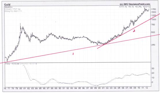
In the past few months I have been focusing on three specific issues, which is why I believe that a secondary technical downside reaction of the gold price will be a healthy development.
I have been focussing on:
1. … the unusually large distance of the gold price from trend lines 1 and 2, which fact shows that the gold price is technically overbought and “should” (if the market is to behave in a healthy manner) pull back towards trend line #2 – just as it did eleven times between 2001 and 2009. Technically speaking, the fact that the gold price has not pulled back toward trend line #2 since 2009 is an unhealthy development which has potentially sinister implications. Why sinister?
2. … the most likely reasons for the now steeply rising gold price, which are primarily related to the tidal wave of cash that has been flooding the world’s financial markets, courtesy of the Central Banks in general and the US Fed in particular. (Of course, there have been other reasons relating to the cultural attitude of Chinese, Indians and Arabs to gold, and their traditional distrust of fiat currency, but this is less significant given that these cultural attitudes have been there since time immemorial. What is different is that these people are now sitting on mountains of paper currency.)
3. .. the fact that one consequence of 2 above has been an explosion in the amount of sovereign debt of industrialised nations and that, because of this, the future of the European Union in particular – and the world economy in general – is now under threat.
That the world economy is under threat is validated by the technical formation that is emerging on the chart below of the S&P 1200 Global Index (courtesy http://www.google.com/finance?ci=10264130 ) which is up to date to October 4th 2012.
Chart #2 – S&P Global 1200 Industrial Index
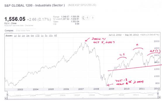
The index covers 31 countries and approximately 70 percent of global stock market capitalization. (http://en.wikipedia.org/wiki/S%26P_Global_1200 )
Three important facts are visible from this chart:
1. When the Global Financial Crisis hit, the index fell from a high of 2004.71 to a low of 745.13, or by some 63%. (Readers will remember that it was at that point in time that the world’s central banks opened the money spigots)
2. Following the point marked “H” in 2011 (at 1768.47) the index fell to a point on the red trend line, at a level of 1300.53 – which level happens to be below the point marked “LS”. An implication of this is that the red trend line may well be the neckline of a potential Head and Shoulders reversal pattern and, if so, “RS” might represent the formation of a right hand shoulder (still forming).
3. Notwithstanding all the various Quantitative Easings under their various guises, including “QE to Infinity” of the Fed, and including the recent commitment of the European Central Bank to purchase sovereign debt of countries like Greece, Spain and Italy amongst others, the S&P 1200 Global Index only managed to reach a high of 1768.47, which was 12% below the high that preceded the Global Financial Crisis.
Those gold bugs who believe that the world is sitting on the cusp of price hyperinflation would be well advised to reflect on these three facts, in particular #3 above.
Nevertheless, the above does not imply that the gold price will not rise. For this reason, again in very simple English: I have not been recommending that anyone should sell their gold related “investments”. In my mind, gold should be thought of as an insurance policy against systemic collapse and I unreservedly embrace the view that gold should represent 10% - 15% of any high net worth portfolio, “come hell or high water”.
By contrast, what I have been trying to communicate is that if the gold price – which is already technically overbought – “explodes” upwards, then this will likely imply a snowballing loss of confidence in the world’s financial system. In simple English, if the gold price explodes upwards and enters what may be described as an exponential blow-off phase, then the gold price might well rise to thousands of dollars an ounce, before it finally collapses as the world economy implodes.
In summary: Be very careful what you wish for; an exploding gold price will be very likely accompanied by a collapse of confidence in the financial system and an accompanying collapse of the world economy. This is not a new observation on my part. The same theme pervades all my articles dating back over more than ten years.
With this rising risk in mind, I have been examining the gold charts for months with a view to discovering if there is any technical evidence that the gold price might pull back towards trend line #2. Clearly, if that were to happen then the S&P 1200 might still fall to around 832 – but it might stop there. Such a development would be bearish but not catastrophic and it will also not be consistent with the expectation of a collapsing world economy. In short, it will be a healthy development within the context of an ongoing Primary Bull Market in Gold.
My in-depth analysis led me to conclude – wrongly – that the technically correcting gold price was correcting within the confines of a bearish descending right-angled triangle from which it had a high probability of breaking down. When the gold price reached the apex of that triangle it broke up rather than down, thus negating what I had been expecting. I got it wrong and my stress levels rose – not because I got it wrong, but because of the potential implications as described above. The world had moved one step closer to economic chaos.
So I took another look at the various gold price charts and the one on which I finally came to focus was the chart below – the 3% X 3 box reversal chart, which shows that the $1109 target is still the prevailing target and will remain the prevailing target until either it is reached or it is negated because the gold price rises above $1833.
Chart #3 – 3% X 3 box reversal Point & Figure Chart of the Gold Price
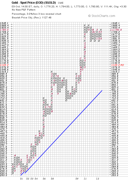
The above chart is unambiguous as at October 3rd 2012. Unless/until the gold price rises to $1833, the price objective of $1109.20 will remain the prevailing objective. If/when that changes my view will change.
Can I think of a scenario where the QE Infinity and the ECB policies might turn out to be less of a threat?
Well, to better understand the consequences of all the various QEs, it will be instructive to examine the long term chart of the S&P below, dating back to the 1920s.
Chart #4 – 88 year chart of the S&P 500 Industrial Index
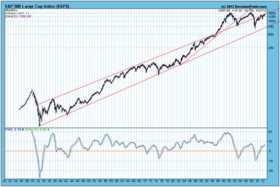
There will be those readers who will remember the lead-up to Y2K and Alan Greenspan’s decisions at that time – later to earn him the title of Knight of The Realm. Following the near collapse of the markets in 1987, the Fed (and other Central Banks around the world) loosened the purse strings, and at first is worked. Note how from 1987 to 1996 the S&P was bumping along the upper channel line as the economy went into overdrive.
Then, as Y2K approached, the dot.com era was facilitated by (now) “Sir” Alan Greenspan’s policies and actions, and the S&P broke above the upper channel line.
When it looked like the S&P would fall below that channel line in 2004, Mr Greenspan was still at the helm.
Quote: “On May 18, 2004, Greenspan was nominated by President George W. Bush to serve for an unprecedented fifth term as chairman of the Federal Reserve. He was previously appointed to the post by Presidents Reagan, George H. W. Bush, and Clinton.”
Quote: Greenspan's term as a member of the Board ended on January 31, 2006, and Ben Bernanke was confirmed as his successor. (Source: http://en.wikipedia.org/wiki/Alan_Greenspan )
Dr Bernanke continued to be as accommodative as Greenspan – if not more so –and the reader’s attention is drawn to Chart 1 of the gold price. It was in 2006 that the gold price started to move up, up and away from Trend Line #2.
Then came 2008 and the GFC and BOTH the S&P and the gold price fell. And a significant fact that needs to be born in mind is this: Despite all the subsequent monetary easing, even as the gold price has moved further away from trend line #2, the S&P 500 Index has been unable to climb above the upper channel line. This is evidence that the monetary easing is losing its potency.
There is another subtlety which many may not have spotted over the past few years. It has had to do with the P/E ratios.
The chart below shows that P/E ratios have fallen from around 20X in 2008 to around 15X.
Chart #5 – S&P Index relative to normal P/E Ratios 1998 - 2012
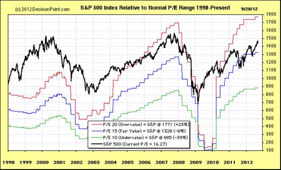
Those who are wearing rose coloured glasses will view this as a good thing and will argue that professional investors have become far more realistic in their expectations.
But one should consider this: All Dr Bernanke’s quantitative easings have occurred since 2008. More reasonably, the fall in the P/E ratios is indicative of the lack of conviction by investors that this quantitative easing will be able to continue to stimulate the economy.
If this interpretation is more realistic, then the question needs to be asked: What will happen to P/E ratios if underlying earnings begin to contract? Well, from the perspective of this analyst, they will likely fall – to 10X or even less.
Here is a quote from an article that appeared in this morning’s media:
“The Commerce Department said new orders for manufactured goods tumbled 5.2 percent - the biggest drop since the recession - dragged down by a slump in demand for transportation equipment that was telegraphed in last week's report on orders for long-lasting manufactured goods.” (Source: http://www.reuters.com/article/2012/10/04/us-factory-orders-idUSBRE8930V920121004 )
Also, for those who are of the view that hyperinflation is on the cards because of all the quantitative easing, below is a chart of the Producer Price Index: (Source: http://data.bls.gov/pdq/SurveyOutputServlet?request_action=wh&graph_name=WP_ppibrief )
Chart # 6 – Producer Price Index, USA 2002 to 2012
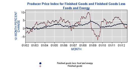
This begs the question: WHY are producer prices not rising in the face of all this monetary inflation? The answer is twofold:
1. Flowing from falling orders, there is excess manufacturing capacity and, from a manufacturer’s perspective, it is better to have orders that contribute to fixed overheads than to have no orders at all.
2. The velocity of money is very likely slowing in the economy – which, if it turns out to be the case, will exacerbate #1 above and GDP will come under pressure – leading to a fall in P/E ratios.
So, yes, the reason the gold price is rising is that some of the fiat money is being diverted into hard assets like gold. But what does this really mean?
Conclusion
Investing in gold in the current economic environment may be likened to someone suffering from an anxiety disorder taking Valium to calm himself. Absolutely, it makes you feel better to watch the gold price rising while everything around you is falling apart and, therefore, there is a lot to be said for buying gold. But, like swallowing Valium, owning gold is not going to solve any problems; to do that we have to face up to those problems and address them. Clearly, “monetary policy” is losing its potency and what is needed is a fresh look at the drivers of industrial and commercial activity. If the gold price were to pull back from its current level, that would be a sign that the world’s decision makers were making a genuine attempt to get the economic house in order. By contrast, if the gold price were to break to new highs and enter an exponential blow-off phase, then this would be a sign that the anxiety disorder was impacting on the sanity of the patient. i.e. It will be a sign that investors are losing faith in the ability of society’s decision makers to address the world’s economic problems.
Author note: Hopefully, the above article will inject some realism into the thought processes of those who think I have lost the plot by writing cautionary articles in respect of the gold price.
Author, Beyond Neanderthal and The Last Finesse
Beyond Neanderthal and The Last Finesse are now available to purchase in e-book format, at under US$10 a copy, via almost 60 web based book retailers across the globe. In addition to Kindle, the entertaining, easy-to-read fact based adventure novels may also be downloaded on Kindle for PC, iPhone, iPod Touch, Blackberry, Nook, iPad and Adobe Digital Editions. Together, these two books offer a holistic right brain/left brain view of the current human condition, and of possibilities for a more positive future for humanity.
Copyright © 2012 Brian Bloom - All Rights Reserved
Disclaimer: The above is a matter of opinion provided for general information purposes only and is not intended as investment advice. Information and analysis above are derived from sources and utilising methods believed to be reliable, but we cannot accept responsibility for any losses you may incur as a result of this analysis. Individuals should consult with their personal financial advisors.
Brian Bloom Archive |
© 2005-2022 http://www.MarketOracle.co.uk - The Market Oracle is a FREE Daily Financial Markets Analysis & Forecasting online publication.


