The Forces That Will Push Silver Over $100
Commodities / Gold and Silver 2013 Nov 19, 2012 - 02:29 AM GMTBy: Steve_St_Angelo
 There are tremendous forces at work that will push silver over $100 an ounce. Very few precious metal analysts understand all the forces that are at work. Some analysts focus on specific areas such as the gold-silver ratio and technical analysis, while others write about future investment and industrial demand. And then of course, we have the more unorthodox analysts who delve into the ongoing manipulation of gold and silver -- a realization shared by the author of this article.
However, one of the most important aspects of silver that most analysts are completely unaware is the availability (or lack of thereof) of future silver mine supply. I am simply amazed how some analysts can forecast lower silver prices due to a so-called future supply glut that is supposedly coming in the next few years.
As I have mentioned before in a previous article, analysts today are so specialized they have no idea what is going on in another industry. It is highly doubtful that the metal analysts who make these long term silver supply forecasts really comprehend the details of the energy market and industry. The failure of these metal analysts to understand the complexity of the global liquid supply system will render their future forecasts completely inaccurate. This will be discussed at the latter part of the article as it is one of the longer term forces to impact silver.
Silver Surplus-Deficit Explained Again
There still seems to be a misunderstanding about the so-called surplus-deficit of silver. Some analysts are pointing to the fact that increasing annual silver surpluses, without continued strong investment demand, can make the price of silver fall quite rapidly. I would like to repost this graph to show the surplus-deficit forces.
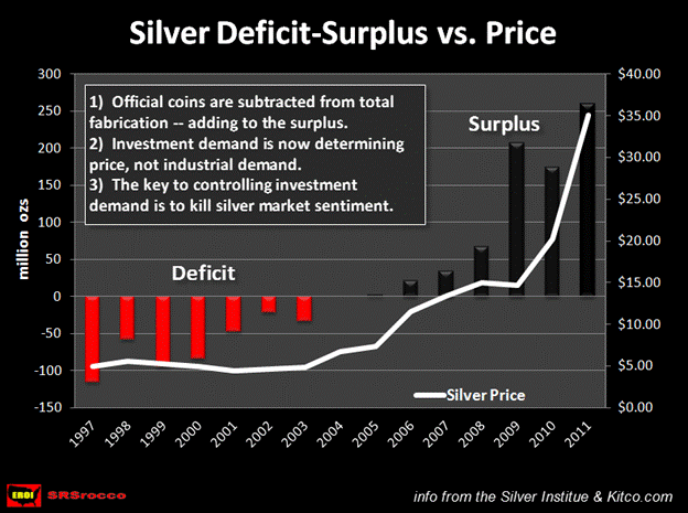
According to GFMS (now Thomas Reuters), there was a silver deficit until 2003. During this time of supposed deficits, the price of silver remained in the $4-$5 range. However, when the deficits disappeared and the surpluses began, the price of silver magically began to rise. The first year silver was no longer in a deficit (2004) it hit an average price of $6.67 an ounce. Then in 2005 it reached an average of $7.32, $11.54 in 2007, $13.38 in 2008, $14.98 in 2009 and so on and so forth.
The white line on the graph represents the average annual price of silver. As you can see the price is heading higher in parallel with the so-called rise of silver surpluses. These silver surpluses have been absorbed by institutional and retail investors. The notion that a structural deficit in the annual silver supply would push the market price of silver higher, failed to materialize prior to 2003 when actual deficits took place.
So, here we can see that the rise in the price of silver since 2004 has less to do with industrial demand and more a factor of increased silver investment.
Silver Investment Demand: Just Getting Started
Precious metal enthusiasts who are concerned about whether or not silver investment demand will remain strong in the future... shouldn't be. From the data I am gathering, we are just beginning to see how large of a force silver investment demand will be in the upcoming years.
One of the more notable gauges of increased silver investment over the past decade, has been the growing demand of official government coins. In 2002, total supply of official government coins and medals were 31.6 million ounces. However, by 2011 this grew to a staggering 118.2 million ounces, a gain of 274% in just nine years.
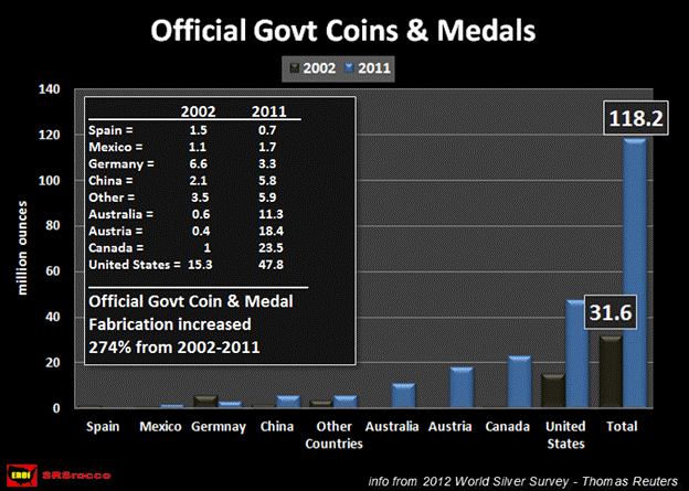
The four largest selling official government coins are the U.S. Silver Eagle, the Canadian Silver Maple, the Austrian Silver Philharmonic and Australian Silver Koala & Kookaburra. These four government mints produced 101 million silver ounces of coins & medals (majority were coins), 85% of the world's total in 2011.
Even though the sales of these official coins dropped off during the first part of year, strong demand has returned in the second half. For instance, there was a 32% decline in Silver Eagle sales in the first six months of 2012 when 17.4 million were sold compared to 22.3 million during the same period in 2011. However, if we look at the chart below we can see that 2012 Silver Eagle sales are now only down 18% compared to the same time last year.
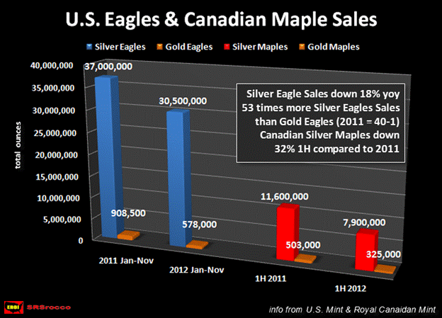
There was also a similar decline of Silver Maples in the first half of 2012. From January to June, sales of Silver Maples fell 32% compared to last year. Nevertheless, when the Royal Canadian Mint releases its third quarter report, we will more than likely see an increase of its Silver Maple sales in percentage terms compared the first half of 2012.
Another interesting trend taking place and shown in the chart above is the amount of Silver Eagles sold compared to Gold Eagles. Compared to last year, Gold Eagle sales (-36%) are down twice as much in percentage terms than sales of Silver Eagles (-18%). Furthermore, the U.S. Mint has sold 53 times more Silver Eagles than Gold Eagles in 2012 (the ratio in 2011 was 40-1). Thus, retail investors have been purchasing 33% more Silver Eagles than Gold Eagles compared to the same period last year.
Even though the four countries listed above produce the lion's share of official government coin sales, there is another country that has big plans to change their ranking in the future.
China: Big Plans For Future Silver Investment
China has been producing its one ounce Silver Pandas at a stable rate of 600,000 annually for nearly a decade. However, last year China decided to increase its mintage of its 2011 Silver Panda from 600,000 to 6 million... and in 2012, they plan on increasing it to 8 million. Why the sudden 10 fold increase of their Chinese Silver Panda sales in one year?
Well, according to Jim Orcholski who runs J & T Coins LLC Blog.com:
The main reason the mintage of these coins was increased so much starting last year is that it became legal in 2011 for Chinese citizens to own silver coins.
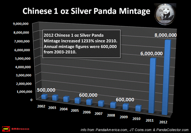
While this huge increase in silver Panda production figures seems impressive, it may only be a drop in the bucket for what is being planned by the Chinese government in the future. Again, according to Orcholski quoted in the article "China Strives to Make Silver Panda as Popular as American Silver Eagle":
The Chinese government is also eager to make Silver Pandas as popular as American Silver Eagles. Pandas are obviously very popular within China, and it's not known how many of the Silver Pandas are exported and how many are sold within the country.
For the Chinese government to make good on its promise to popularize its Silver Panda to equal that of the American Silver Eagle, they will have to increase their annual mintage substantially. In 2011, the U.S. mint sold nearly 40 million Silver Eagles. If the Chinese plan on surpassing this record, I would imagine they may set their goal at producing 50 million annually. This may not be that tough of a challenge due to the fact that the China has three times the population of the United States, and their citizens are becoming keen buyers of the precious metals.
It is plain to see, that the demand for official government silver coins has gone exponential over the past decade. However, this is only one part of the overall silver investment picture.
Silver Investment Demand vs. Industrial Applications
One of the more tiresome, boring and overused analysis in determining the future price of silver, is the forecasted consumption of silver in industrial applications. There is this notion that if the world's economies slide into a severe depression, then the demand for silver will fall as industrial activity declines. Thus, we would have much lower silver prices... that is, according to these analysts.
Hogwash. We now know from the data provided in both the surplus-deficit and official government coin charts above, it has been investment demand rather than industrial demand that has been the overriding force in determining the market price of silver. Again, if industrial demand didn't move the price when we had real annual silver deficits in the past, why on earth would we expect it to affect the price in the future.
To get a true picture of the massive increase of silver investment during the past decade, take a look at the chart below:
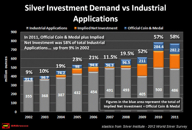
The grey bars in the chart above show how much silver was consumed on an annual basis by industrial applications while the blue represent coin & medal demand and the orange denotes implied net investment. These figures do not include silver consumption in either photography, jewelry or silverware. Below is the data for the following years (from the Silver Institute):
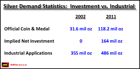
By adding the silver demand from official coin-medal and implied net investment together, we get the total amount for the year which was 31.6 million oz in 2002. Thus, total world silver investment in 2002 was just a mere 9% of the silver consumed by industrial applications. However, by 2011 global silver investment jumped to 282.2 million oz accounting for 58% of silver used by industrial applications.
The World Silver Survey calculates Implied Net Investment by subtracting total fabrication from the total global silver supply. In 2011, global silver supply (mine & scrap) was 1.04 billion oz and total fabrication (industrial applications, photograph, jewelry, silverware and coin & medal) consisted of 876 million oz leaving a difference of 164 million oz as implied net investment.
According to the 2012 World Silver Survey, physical bar investment accounted for 98 million oz of the 164 million oz implied net investment total in 2011. Here again, we can see from the two charts above, institutional and retail investors have been the predominant force in pushing silver from an average of $4.60 an ounce in 2002 to averaging over $35 an ounce last year.
Even though silver has risen nearly 75% per year for the past nine years... this is just the beginning of the price moves to come. Why? It looks like something quite fishy is taking place in the precious metal exchanges.
U.S. Silver Exports: Putting Out The LMBA Fire?
In the past, investors were happy to fork over hard earned money for paper promises of gold and silver. However, that trend seems to be reversing quite rapidly. After the collapse and bankruptcy of several large commodity brokerage houses along with the supposed ongoing threat that allocated and unallocated gold and silver accounts have been rehypothocated (stolen), investors are now demanding delivery of physical metal instead of paper I.O.U.'s.
Furthermore, a week doesn't go by without an article written about government gold repatriation or whether or not a central bank actually holds the very gold (or rights to the gold) that is shown on its balance sheet. When we add up all these factors, who can blame the investor for wanting to acquire the real physical asset?
One country that is scarfing up as much of the precious metals as it can, is China. According to the research done by Jim Willie, massive amounts of gold (official & unofficial) have been shipped from West to East (mainly China) in the past several years. One place for an investor or a sovereign country to take delivery of large quantities of gold and silver is from the LBMA located in London -- the largest metal exchange in the world.
Rumors are floating around the precious metal blogosphere that wholesale physical supplies of gold and silver are extremely tight, even though so-called "official statistics" may state otherwise. Nevertheless, there is one "official source" that may help confirm these rumors.
In 2011, the USGS published that the U.S. exported 19 metric tonnes of silver bullion to the United Kingdom during the entire year -- a very miniscule amount indeed. However, something very interesting occurred in May of this year. In May, the U.S. exported 19.4 metric tonnes of silver which was more silver than was exported during the twelve months in 2011... and this is just the tip of the iceberg.
If we look at the chart below, we can see just how much silver is leaving the shores of the U.S. and being shipped to the United Kingdom in 2012:
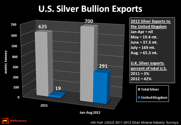
In the upper right hand portion of the chart you will see the quantity of silver exported each month to the United Kingdom. In addition to the figure stated above, the United States exported 37.3 metric tonnes of silver in June, 169 metric tonnes in July and 65.3 metric tonnes in August. In just four months, the U.S. has exported 291 metric tonnes of silver to London (LBMA).
There are two significant trends taking place that are represented in the chart above. First, the United States has exported more silver bullion in the first seven months of the year than it did in all of 2011. Secondly, silver bullion shipped to the United Kingdom rose from 3% of total U.S. silver exports in 2011, to a staggering 42% of the 700 million oz exported so far this year.
Why has there been such a large increase of silver bullion exports to the United Kingdom over the past few months? Could it be that the English have suddenly ramped up solar power manufacturing... or may it be due to an abrupt increase in foreign demand for their formal silverware? I highly doubt it.
More likely than not, the large silver bullion exports to the U.K. have been utilized to help meet the insatiable physical silver bullion demand taking place on the LBMA. As the old saying goes... where there is smoke, there's probably a great deal of silver paper on fire.
If we consider the strong investment demand forces described in the examples above (present & future), I hate to say, investors should probably brace themselves for much higher silver prices in the next several years. Yet, investment demand is only one part of the powerful forces that will push the price of silver over $100 an ounce.
Will Higher Silver Prices Bring On More Future Mine Supply?
There is this economic principle that states increased demand and higher prices of a commodity or product will eventually bring more supply to the market. While this has normally been the case during the history of mankind, the world will soon be hit by a rude awakening.
Gold and silver mining is extremely energy intensive. Back in the good 'ole days (late 1800's & early 1900's), the majority of energy used in mining was human and animal labor. This somewhat primitive method of extracting the precious metals from the ground worked fine as the ore grades were extremely rich and confined to narrow veins. But, as the best quality mines were played out and the average ore grades started to decline across the world, more energy was needed to mine and process the ore.
The mining industry solved this problem by building bigger machines that could move larger amounts of ore to compensate for the declining ore grades. Eventually, animal and human labor was replaced by earth moving machines. For a while, bigger accomplished the job until the mining industry demanded... GARGANTUAN.
Caterpillar met this challenge by designing and building the Model 797F Haul Truck -- one of the largest mining haul trucks on the planet
The 797F is the epitome of massive on all scales. It is nearly 50 feet long and can haul 400 tons of ore (800,000 lbs). The tires specifically designed for the 797F, are 13 feet tall and cost $42,500 a piece. The 797F is so large, it takes 12 semi tractor trailers to ship the truck to the mining site for final assembly. Included in the list of parts is its tiny 1,000 gallon fuel tank.
Here's the good part. The Caterpillar 797F is so large, it averages 0.3 mpg and consumes roughly 65 gallons of diesel per hour. Because of its huge cost, the 797F is normally run 24 hours a day, 365 days a year, stopping only for scheduled maintenance. If we calculate its annual fuel consumption based on conservative figures, the 797F can burn nearly a half a million gallons of diesel a year.
Again, the reason why the mining industry transitioned its machines from bigger to gargantuan was to offset the decline of ore grades that went from very rich to extremely poor. Before I tie together the future energy picture and its impact on silver mine supply, let's look at some actual data on declining ore grades in the top silver miners.
Putting Actual Data Behind The Decline Of Ore Grades At The Top Silver Miners
In all my research on the Internet, I have yet to come across an individual or publication that has provided the public with actual data on the overall decline of the average ore grade (and yields) in the silver industry... well that is, up until now.
When I gathered the data to produce the chart below, I had no idea of what the final outcome would be. However, as I tallied the final figures, I was completely surprised by the results:
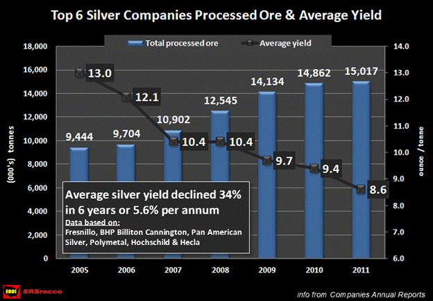
For the sake of clarity, an ore grade is the amount of silver contained in the ore before mining. The average yield is the actual amount of silver the company produces when it processes a tonne of ore.
Here we can see that in just six years, the top silver miners average yield has declined 34% or 5.6% per annum. In 2005, the top 6 silver miners produced on average 13 ounces of silver per tonne of processed ore, but by 2011 their average yield dropped to only 8.6 oz per tonne.
Moreover, in 2005, the top 6 silver miners produced 123 million oz of silver by processing 9.4 million tonnes of ore, but just six years later they had to process 15 million tonnes of ore to generate 129 million oz of silver. Subsequently, the net result was a mere 5% addition of silver production with a 60% increase of processed ore.
RULE OF THUMB: As ore grades or silver yields decline, it takes more energy to produce the same or less metal.
The mining companies included in the calculation above were Fresnillo, BHP Billiton's Cannington mine, Pan American Silver, Hochschild, Polymetal and Hecla. Some of these silver miners were chosen over other companies who had higher annual silver production due to the availability of data as well as consistency of its reported annual silver yields.
I omitted Coeur d'Alene because its annual silver yields were all over the place due to new mines be added and old mines dropping off throughout the years in which I collected the data stream. Truth be told, Couer's average silver yield in 2011 was only 4.2 oz per tonne. In that regard, the addition of Coeur's silver yield data into the mix would have made the overall yield even lower.
Furthermore, the companies and the one individual mine (Cannington) were chosen as they are primary silver mines. The authors of the annual World Silver Survey did not include Hochschild or Polymetal in their example of primary silver miners, although I included them due to several reasons.
According to the Silver Institute-2012 World Silver Survey, Fresnillo is listed as one of the largest primary silver miners in the world. However, in its first half 2012 report, Fresnillo received 51% of its revenue from gold and 45% from silver. Hence, Fresnillo is actually making more revenue from mining gold rather than silver.
On the other hand, in Hochschild's first half 2012 report, the company received 70% of its total revenue from silver and only 30% from gold. In my book, Hochschild is more a primary silver miner than is Fresnillo.
Polymetal was also selected due to the fact that its two primary silver mines, Dukat and Lunnoye produced 17 million oz of silver at an average yield of 9.8 oz per tonne in 2011. Furthermore, Polymetal's first half revenue were split equally at 48% each from gold and silver. So, in reality, Hochschild and Polymetal are just as much a primary silver producer as is Fresnillo.
I only included data from primary silver mines in the companies listed above. Even if a company received additional silver production from one of its primary gold mines, I elected not to include these figures as it would have skewed the results in determining the true decline rate of yields in the primary silver mining industry.
Lastly, there is this practice in the mining industry to process lower grade ores as the price of the metal increases. Some mines actually put a mark locating the lower grade ore within the project for the miners to remove during the year. Furthermore, mines will process lower grade ores and tailings that they neglected to do in the past when prices were lower. However, this does not really alter the overall average annual decline of yields in the silver mining industry shown in the chart above.
For example, both the Fresnillo and Cannington mines have seen substantial declines in their average silver yields in the past six years. This was not due to mining and processing lower grade ore to take advantage of higher metals prices, rather it was due to the mine being played out and finally reaching the reserve base ore grade stated in their production reports.
Silver = Stored Energy
One factor that most precious metal investors fail to comprehend is the energy nature of silver as a store of value. Of course they understand that silver and gold are real money, worth a certain amount of perceived or intrinsic value. Unfortunately, they fail to realize that the most important value attached to an ounce of silver, is the stored energy contained in each coin.
A monetary value was attributed to an ounce of silver or gold based upon the amount of energy and capital it took to mine the metals as well as its degree of rarity. During the Roman times when silver was mined by human and animal labor, the monetary value was given based upon the amount of labor (energy) it took to produce a one ounce coin. Basically, the free market determined the prices of goods and services in silver coin to their relative energy value.
For example, if it took on average four hours of labor to produce an ounce of silver during the Roman Empire, that coin was exchanged for a good or service of equal energy value. In this example, a city laborer working a twelve hour work day might receive 3 silver coins as pay. I realize I am making a basic assumption here, but this is how a monetary value was given to gold and silver. Of course, the free market would determine the value of an egg, chicken, horse or say a cow in gold or silver coin. But, in the end, the more energy that went into producing a good or service, the more silver or gold coins it took to equal the energy transaction.
Once an investor realizes this energy value as it pertains to silver (or gold), you will then understand how important energy plays as a role in the production of the metal as well as its role in the overall economy. Thus, as the energy supply of a society increases, so will its production of gold and silver as money (if the society uses precious metals as money). On the other hand, as the society experiences a decline in its energy supply, so will the mine supply of its gold and silver.
The mining industry has been banking on the continued growth of the global liquid energy supply to be able to increase the production of gold and silver. With the knowledge that the peak of conventional oil production is now upon us, new hope has been placed on the supposed SHALE ENERGY PARADIGM to be the U.S. and world energy savior.
How The Shale Energy Boom Will Turn Into A Huge Bust
As I mentioned before in my article WHY IS THE FUTURE SUPPLY OF SILVER MORE AT RISK THAN GOLD, the world has been watching closely the new shale energy boom taking place in the United States. Why? If the United States shale energy model proves successful, then the rest of the world believes they will be able to recreate the same results in their respective countries.
It is due to this very reason the Shale Oil & Gas Industry have spent a great deal of time and money pumping out a positive PR campaign to convince the U.S. public and the world that shale energy is indeed our next energy savior. They state that shale oil and gas can supply the United States (and the world) with cheap energy for the next several decades.
While it is true that production volumes in both shale gas & oil have risen quite substantially in the U.S. over the past few years, there seems to be a dark side of the equation that the industry would like to keep a secret.
In his article IS SHALE OIL PRODUCTION FROM THE BAKKEN HEADED FOR A RUN WITH THE RED QUEEN?, Rune Likvern presented this chart on the monthly net additions of producing oil wells in the Bakken:
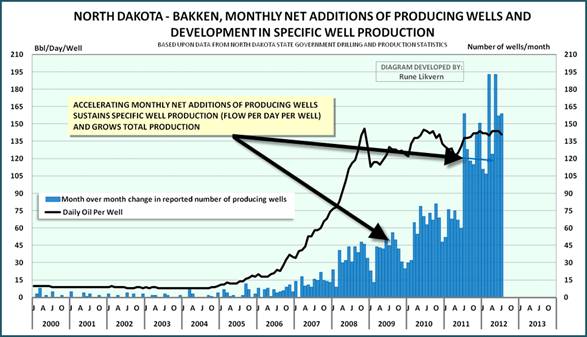
The month over month change of reported wells are shown by the blue bars. Here we can see that from early 2006 to the end of 2008, additions of a modest number of shale wells allowed the overall production per well to increase significantly (shown by the black line). Nevertheless, since 2008, the rapid increase of monthly net additions of new shale wells has masked the high depletion rates while allowing only a modest increase of overall production from the Bakken.
According to Rune Likvern:
The wells normally have a high production at start up that rapidly enters into steep declines.
To facilitate growth in total production an accelerating number of wells needs to be brought into production.
To sustain a plateau requires a continual addition of a high number of producing wells.
Basically, the shale oil players have to run faster and faster just to stay in the same place. This practice has allowed the increase of oil production from the Bakken Field in North Dakota, but it has done so at a huge cost.
In another chart developed by Likvern (including my annotations), we can see the estimated cumulative net cash flows for shale oil in the Bakken:
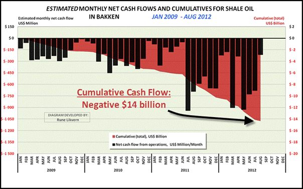
The chart reveals the ugly truth that the shale oil operations have accumulated an estimated $14 billion in negative cash flow since January of 2009. Here we can see that shale oil players in the Bakken have seen an accelerated need for additional sources of capital not provided by their operations alone. How long can they continue this losing battle?
The big energy companies such as Exxon-Mobil, Conoco-Phillips and Chevron-Texaco are cash cows. They are so cash rich, they have been taking a portion of their positive cash flow and buying back their stock. So, why are these shale energy companies either suffering from negative cash flows or are being loaded down with huge amounts of debt? Could it be that the shale oil is not really what it has been hyped up to be?
To offer a fair and balanced analysis of shale energy, I have to provide a few bullet points on wonders of shale gas. If you think the information coming from the North Dakota Bakken Field is disappointing, the data being released about the shale gas industry is even worse.
Some Pearls Coming From the Shale Gas Industry
1) The USGS recently announced massive downgrades of U.S. shale gas reserves
2) Break-even price for typical shale gas player (over the life of the well) is at least $6-7 mmbtu. With the current price of natural gas at $3.50 mmbtu... we can only imagine the hemorrhaging taking place on their balance sheets.
3) Geologists at Labyrinth Consulting have examined 9,100 of the 15,000 wells in the Barnett shale play using production data filed by the operators with the Texas Railroad Commission and found that less than 6% actually met minimum economic thresholds.
4) Forecasted revenues to land owners were a mere fraction of what was promised:
a) The wells at DFW airport have come in with dismal returns. (8) They never performed up to original projections. Chesapeake Energy needed 2.0/Bcf to break even. The wells have produced .9/Bcf .
b) The University of Texas at Arlington saw revenues peak at approximately $7M with a mere 6 wells on campus to plummet drastically in a matter of months. Revenues in 2010 were down to $800K even though there were now 22 wells on campus.
5) To acquire additional capital to continue the shale gas treadmill, companies drilled a few wells to prove up new large reserves. They took these supposed reserves and pawned them off on larger companies such as BHP Billiton, Encana and BG Group.
6) In 2012, the shale gas party ended when in the first half of the year, over $8 billion dollars of impairment charges of shale gas investments were written of the balance sheets of major oil and gas companies. BHP Billiton won the grand prize by suffering a $2.5 billion impairment write down from its initial $4.75 billion shale gas investment it purchased from Chesapeake the prior year.
7) Wall Street firms have made a killing putting together these sort of lousy energy deals. Without Wall Street, the Shale Gas Treadmill would not have the means to continue.
(information from [2] Art Berman, [3-4] Deborah Rogers at the EnergyPolicyFourm.com)
If we have an open mind and are able to process the basic information on shale oil & gas provided above, we should come to the conclusion that shale energy will not be the savior of our future energy needs. It may provide additional energy production for a brief period of time, but it is not a viable long term energy source
Quick Wrap Up & Connecting The Dots...
Investment demand has been and will continue to be the driving force behind the rising price of silver. Analysts who point to the growing so-called annual surplus of silver as a negative factor, have been brain-dead since 2004... the year both the surpluses began as well as the time when the price finally broke above its decade level in the $4-5 range.
One area that denotes increased investment demand is "official coins" produced by government mints. In just nine years, official coin demand has increased 274% from 31.6 million oz in 2002 to 118.2 million oz in 2011. Even though China is currently ranked as the fifth country in official coin production, they plan on making their Silver Panda as popular as the American Silver Eagle. To do so, they may set a goal to increase their mintage of their Silver Panda to over 50 million annually.
According to the data provided by the 2012 World Silver Survey, total global silver investment demand has risen from only 31.6 million oz in 2002 to a staggering 282.2 million oz in 2011. As world economic fiat based monetary system continues to deteriorate, investors are taking delivery of physical silver rather than holding on paper contracts that may not be backed by any metal whatsoever.
This has created a run on the LBMA bank... the largest metal exchange in the world. Evidence of this can be seen by the huge increase of U.S. silver bullion exports to the United Kingdom. In 2011, the U.S exported a mere 19 metric tonnes to London. However, in just four months (May-Aug), the U.S. has exported 291 metric tonnes to the LBMA vaults in the U.K..
The top 6 silver miners in the world have seen their average yield decline 34% in six years from 13 oz per tonne in 2005 to only 8.6 oz/t in 2011. As ore grades and yields decline, it takes more energy to produce the same or less silver. Metal analysts are forecasting continued growth of annual silver production for the next decade and beyond. To be able to grow silver metal production, the world will have to grow its liquid energy supply.
As the world is beginning to wake up to the fact that conventional oil production is peaking (or has already), shale gas & oil have been touted to be the new energy savior to keep business as usual going for several more decades.
Production statistics and financial data coming out of the Bakken oil field and the shale gas industry are quite depressing to say the least. While the big energy companies are cash cows, the shale energy players are experiencing large negative cash flows or are saddled with debt. The hyped Shale Energy Boom will more than likely turn out to be a Huge Bust.
Once the world 's liquid energy supply starts its inevitable decline from its current plateau, annual silver metal production will decline as well (or may follow soon thereafter). Metal analysts who are forecasting a glut of silver coming onto the market in the following years are also suffering from the ability to process information correctly. There will be no silver glut and there will be no silver available when the world's fiat monetary system finally dries up and blows away.
Get ready. As the forces for pushing silver over $100 have just begun.
Comments are always welcome and can be sent to SRSrocco@gmail.com
Steve St .Angelo Independent researcher residing in southwest Utah
Contact SRSrocco@gmail.com
© 2012 Copyright Steve St .Angelo - All Rights Reserved Disclaimer: The above is a matter of opinion provided for general information purposes only and is not intended as investment advice. Information and analysis above are derived from sources and utilising methods believed to be reliable, but we cannot accept responsibility for any losses you may incur as a result of this analysis. Individuals should consult with their personal financial advisors.
© 2005-2022 http://www.MarketOracle.co.uk - The Market Oracle is a FREE Daily Financial Markets Analysis & Forecasting online publication.


