


Using Gold to Forecast Silver’s Final Blow-Off Rally
Commodities / Gold and Silver 2013 Aug 23, 2013 - 06:58 PM GMTBy: Hubert_Moolman

 I have previously written about how gold can be used as a leading indicator for silver. Using this principle, there is an indication that we are at or close to the period for a 1979/1980 style rally in silver. The following is a simple concept but can make for some intense reading (a lot of concentration and possibly re-reading is required). Below is gold chart from 1968 to 1975:
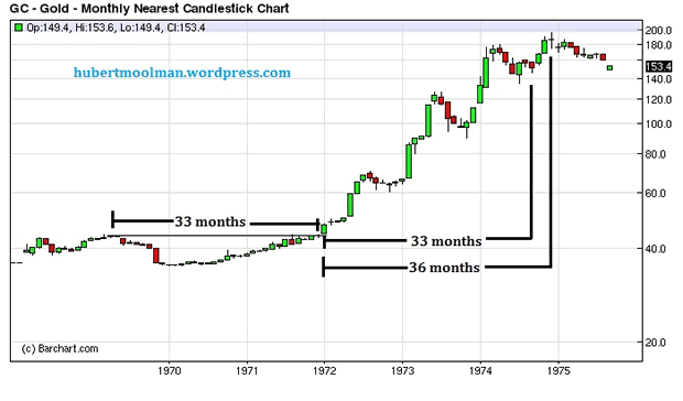
I have highlighted a cup formation that formed from 1969 to the end of 1971. It took about 33 months to form the cup. If one counts 33 months (the time the cup took to form) after price went higher than the peak of the cup, then one gets to the point where the final rally to the peak started.
Also, the peak came in 36 months after passing the peak of the cup.
The silver chart also formed a cup around the same time of the gold chart; however, silver's cup was bigger. Below, is a silver chart from 1968 to 1980:
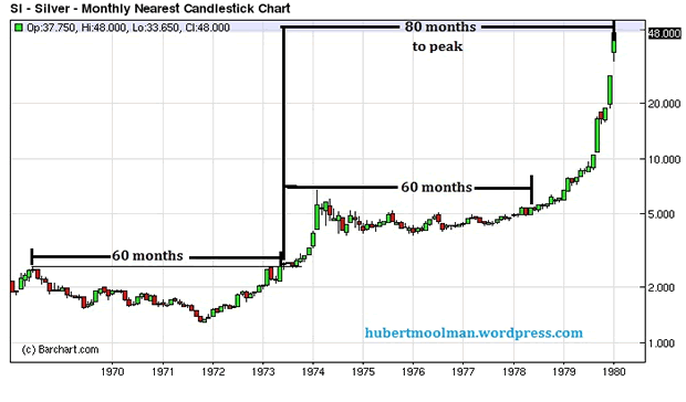
On the chart, I have highlighted the cup that formed during the same time as the gold cup. The cup formed from 1968 to the beginning of 1973 - about 60 months. Now, suppose that it was 1978 and more than 60 months have passed since the silver price went higher than the cup's high. If one was now (1978) to use the outcome of the gold price action after its cup formation to predict what silver could do after its cup formation, one would come to the following conclusion:
-
33 months (the time the cup took to form) after the gold price went higher than the peak of the cup, then one got to the point where the final rally to the peak started. Applied to silver, it means that its final rally to the peak could come soon (from that time in 1978) - and as we can see it did.
-
The final peak in gold came sometime after the 33 months after the price went higher than the cup's high. It came 36 months after the price went higher than the cup's high - that is 36/33 = 1.09 times the cup's width. Applied to silver, it means the silver peak can come sometime after the 60 months after the price went higher than the cup's high. It could come as early as 65.46 months after the price went higher than the cup's high. The peak did come sometime after the 60 months after the price went higher than the cup's high, however it was 80 months and not 65.46.
-
The peak for gold was 17.03 times the depth of the cup, higher than the peak of the cup. The calculation is as follows: depth of the cup = 43.9 (peak of the cup) less 35 (bottom of the cup) = 8.9. Price movement from peak of the cup to ultimate peak = 195.5 (ultimate peak) less 43.9 (peak of the cup) = 151.6. That gives us 17.03 (151.6/8.9).
The silver peak could be a minimum of 17.03 times that of the depth of the silver cup plus the high of the silver cup. That would be 1.277 (2.565 (high of silver cup) less 1.288 (bottom of the silver cup) times 17.03 plus 2.565 = 24.31. The peak was not at $24.31 but at $50 - 37.145 times the depth of the cup plus the peak of the cup.
Using this methodology and putting it all together, it would have been reasonable to expect:
-
The final rally to silver's peak to start after May 1978.
-
The final peak to come as early as 5.46 months after the end of May 1978 - therefore, November 1978. But this would be subject to price hitting a new all-time high or at least or close to the price predicted in point 3 above.
-
The peak to at least hit $24.31 - before or after November 1978.
The price did hit a peak in November 1978, but it was not an all-time high or anything close to the peak estimated in point 3 above. A strict application of this methodology would have meant one would have held on to December 1979 when the price went to the target of $24.31. That would have been a good return from the $5 to $5.5 price levels of 1978.
Now, that is easier done in hindsight, since the reality is a very different story. Despite missing out on silver doubling (at least) from $24, I would be happy with such an outcome. Roughly that would be like silver going to $400 from where it is now, but one only catching the move to $200. I would take that anytime it was offered, now.
From the above, you can see that it is possible to use gold's price action to predict what the silver price could do and when. Let us now apply the above methodology to the current silver and gold situation. Below is a monthly gold chart from 2008 to 2013:
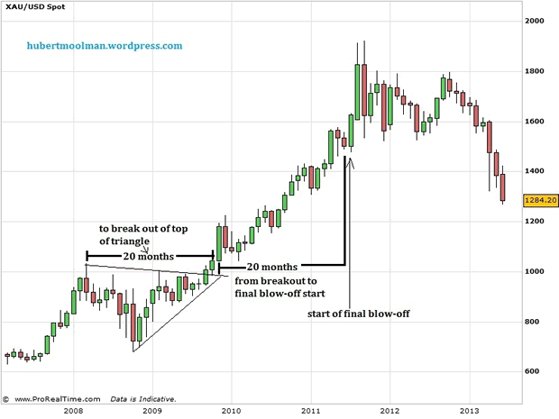
Just like for the 1970s, I have highlighted a formation (this time more of a triangle instead of a cup) that formed from the beginning of 2008 to the end of 2009. It took about 20 months to form the triangle. If one counts 20 months (the time the triangle took to form) after price went higher than the peak of the triangle, then one gets to the point where the final rally to the peak started (end of June/beginning of July 2011) - just like it was for the 70s chart.
Also, the peak came in around 22 months after price went higher than the triangle. That is relatively the same as the peak for the 70s chart. The peak for the 70s gold chart came in about 36 months after passing the peak of the cup; however, the formation is currently smaller than the 70s formation - a ratio of 20:33. So if applied to the 36 months of the 70s, we would get 21.82 (20/33 *36), which is rather close.
The silver chart also formed a triangle around the same time of the gold chart; however, silver's triangle was bigger. Below, is a silver chart from 2006 to 2013:
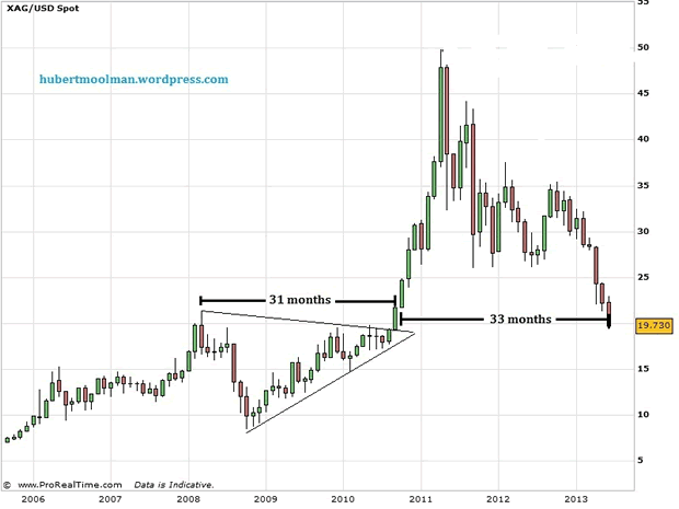
On the chart, I have highlighted the triangle that formed during the same time as the silver cup. The triangle formed from 2008 to before the end of 2010 - about 31 months. Using the same methodology as we did for the 70s situation we can try and predict what the silver price might do. Unfortunately, this methodology cannot help us to determine where the bottom for this silver decline might be (but more about that later).
-
For gold, as said above, If one counts 20 months (the time the triangle took to form) after price went higher than the peak of the triangle, then one gets to the point where the final rally to the peak started (end of June/beginning of July 2011) - just like it was for the 70s chart. So if applied to silver, it means that its final rally to the peak could come soon, since we have passed more than 31 months since the price first went higher than the top of the triangle.
-
The final peak in gold came sometime after the 20 months after the price went higher than the triangle's high. It came 22 months after the price went higher than the triangle's high - that is 22/20 = 1.1 times the triangle's width. Applied to silver, it means the silver peak can come sometime after the 31 months after the price went higher than the triangle's high. It could come as early as 34.1 (1.1*31) months after the price went higher than the triangle's high. Remember this month is 33 months after passing the triangle's peak. However, this time, based on the 70s experience, we expect the silver peak to come much later than the relative gold peak. If we apply the 70s ratio then the silver peak can come 41.33 (80/60*31) after passing the peak of the triangle.
-
The peak for gold was 2.52 times the depth of the cup, higher than the peak of the cup. That is 888 (1921 less 1033) divided by 353 (1033 less 680). The silver peak could, therefore, be a minimum 2.52 times that of the depth of the silver cup plus the high of the silver cup. That is $53.8578 (2.52*12.89+21.375). However, this time, based on the 70s experience we can expect the silver peak to be more, relative to the gold peak. If we apply the ratio of the 70s, then the silver peak can be 5.50 (37.145/17.03* 2.52) the depth of the silver cup plus the high of the silver cup. That would be $92.27 (5.5*12.89 + 21.375)
Using this methodology and putting it all together, it would be reasonable to expect:
-
The final rally to silver's peak to start any time now.
-
The final peak to come as early as 34.1 months after price passing the triangle's peak - therefore, August 2013. But this would be subject to price hitting a new all-time high or at least or close to the price predicted in point 3 above. However, the 70s experience tell us that the peak might only come in much later - 41.33 months after passing the peak of the triangle. That would be February 2014.
-
The peak is to at least hit $53.8578, but based on the 70s experience it could hit at least $92.27
The reason I am presenting the above is not for the purpose of calculating a target for silver, but to have an idea of where silver is going over the next months as well as have a feel for the timing involved. The price targets are just a guide to help navigate the timing calculations. I will go into more detail about price targets in another silver and gold update.
"And it shall come to pass, that whosoever shall call on the name of the Lord shall be saved"
For more silver and gold analysis and guidance, see my Long-term Silver Fractal Report or subscribe to my Premium Service.
Warm regards and God bless,
Hubert
http://hubertmoolman.wordpress.com/
You can email any comments to hubert@hgmandassociates.co.za
© 2013 Copyright Hubert Moolman - All Rights Reserved
Disclaimer: The above is a matter of opinion provided for general information purposes only and is not intended as investment advice. Information and analysis above are derived from sources and utilising methods believed to be reliable, but we cannot accept responsibility for any losses you may incur as a result of this analysis. Individuals should consult with their personal financial advisors.
© 2005-2022 http://www.MarketOracle.co.uk - The Market Oracle is a FREE Daily Financial Markets Analysis & Forecasting online publication.