


Stock Market Dow Theory Big Picture
Stock-Markets / Stock Markets 2013 Oct 26, 2013 - 10:19 AM GMTBy: Tim_Wood

 With the last all time closing high on the Dow Jones Industrial Average having occurred on September 18th, it is an indisputable fact that as of this writing, structurally, the advance out of the 2009 low remains intact. From a Dow theory perspective, the bullish primary trend change also remains intact. The money makers continue their infusion, the commentators in the mainstream news continue telling us why all is well and what to believe. All the while the public continues taking the bait and seemingly believing that the illusion is real.
But, I maintain that this is a financial house of cards, a bull trap, a bull market mirage, whatever you want to call it and that once again the public will be left holding the bag. In this article, I want to take a very simplistic look at the equity market, the advance out of the 2009 low and the very obvious, but also very simplistic warning signs that all is not so well.
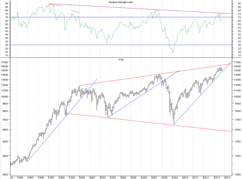
The first chart below is a monthly chart of the Dow Jones Industrials Average and in the upper window I have included a very basic technical indicator, the Relative Strength Index. This indicator does not measure the underlying market relative to another. Rather, this indicator is a momentum indicator that in effect measures the relative strength of the underlying market against its recent price action. The ongoing long-term divergence or non-confirmation, by definition, shows that we are seeing an increasingly weakening market. Folks, this is about as basic as technical analysis gets. Don't take my word for it. Please, just take the time to read about this indicator in any technical analysis book. You will see for yourself that this is not healthy behavior. Or, you can even go to www.bloomberg.com/video/56591362-relative-strength-index.html and there is a quick video explaining this very basic indicator. Their explanation of this indicator confirms what I've been saying about this rally all along. Further evidence of the continuing weakening of the market can be seen on this chart simply by the fact that not only does the very long-term bearish divergence continue, but note that each more minor divergence since the 2000 top, which is noted in red, has been followed by a decline below the previous longer-term cycle low, i.e. the 2002 low, which moved below the 1998 low, and the 2007 low, which moved below the 2002 low.
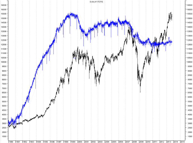
But wait, this is just one technical indicator and like Bloomberg said in the video, RSI should be used with other technical indicators. So, I want to show you another very very basic measure of the underlying technical health of this market. Below, is another long-term chart of the Industrials, plotted in black. I have plotted in blue the Total NYSE Issues Traded. Let me walk you through a very very elementary observation in which one does not have to know anything about technical analysis. Note that the 2007 high occurred with less total issues traded than was seen in conjunction with the 2000 top. In other words, total issues did not confirm the move to new highs in 2007. The outcome that followed that advance was labeled as the worst financial disaster since the great depression. Obviously a rising market with shrinking issues traded is not a good thing. Now, note the advance once again to new highs with what is this time an even greater contraction of total issues traded. So, as is the case with the Relative Strength Index, the number of issues traded is also not confirming the progressive price highs. Thus, I have to pose a few very very basic questions. First of all, why and how can we realistically expect a different outcome this time? How could this really be a secular bull market environment? Does it really look like the man behind the curtain has fixed the underlying issues with the market? Is it not logical that the man behind the curtain has actually made matters worse by driving price up in such a weak technical back drop?
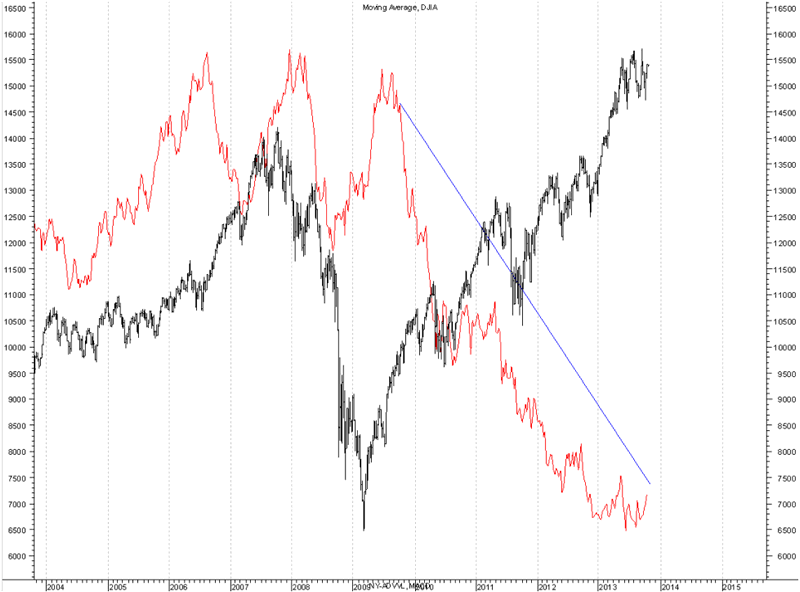
Let me show you another little piece of basic technical data. In the chart below we once again have the Dow Jones Industrial Average, which is plotted in black and in red is the NYSE Advancing Volume. This chart shows the advance into the 2007 top, the decline into the 2009 low and the rally to present. It is from the 2009 low to present that is most important. As price began to rally out of the March 2009 low, advancing volume increased with price, which is a positive development typically seen in normal healthy rising markets. But, in August 2009 advancing volume peaked. The advance out of the July 2010 low into the May 2011 high was not confirmed with higher advancing volume. Thus, this set a non-confirmation/divergence between price and advancing volume into play as well. Since then, this divergence has only intensified.
So, rather than confuse the issue with fancy talk about cycles, Dow theory, the alleged meaning of some fundamental report or whatever, I have shown you a few very very basic charts in which just a little common sense is needed. How can we realistically look at these charts and conclude that the market is healthy? If we compare just the divergences seen in the first two charts, how can we expect a different outcome this time? Compound this with the contracting volume and how is it remotely logical for rising price on the back of a weakening market, per the RSI, and contracting issues and volume to be a positive environment? How can this possibly end well? I don't care what the politicians, the economists or some Phd. type on TV says. They are wrong! They are wrong! They are wrong! This data is indisputable, Period. These same people did not warn the public of the top in 2000, in 2007, of the housing top, the banking crisis or any other market peak or downturn. Even if they wanted to, the mainstream media would not allow it or they would make them out to be some sort of extremist. I know this first hand. The media cannot and will not tell the truth. They can't. It would obviously cause a stampede. Their job is to keep the cattle calm and corralled.
Yes, I have been saying since the rally out of the 2009 low began that it was a rally within the context of a longer-term secular bear market. These basic charts present very elementary, but indisputable supporting evidence to this effect. We have yet to see the technical setup to cap this advance and I have consequently not once said that the top has been seen. All the while, my longer-term view about this advance, which is based on hard data, not emotion, has not changed.
These very basic charts should speak volumes to anyone that can think for themselves. I do not want to see the working person being suckered into the trap and decimated as he was with the housing collapse and the stock market collapse that followed the equity peak in 2007. I realize that when you see higher stock prices and hear the positive spin from the so-called "experts" on TV, that it is hard to believe anything any different. But, I'm telling you, in spite of their rhetoric the perfect financial storm quietly continues to brew.
I have begun doing free audio market commentary that is available at www.cyclesman.net so please begin joining me there. The October issue of Cycles News & Views has been released and in it I give detailed analysis of the current situation from a cyclical and a Dow theory perspective as well as a look at the currently applicable statistics and the DNA Markers. A subscription includes access to the monthly issues of Cycles News & Views, which included Dow theory, a very detailed statistical based analysis covering not only the stock market, but the dollar, bonds, gold, silver, oil and gasoline along with short-term updates 3 times a week.
By Tim Wood
Cyclesman.com
© 2011 Cycles News & Views; All Rights Reserved
Tim Wood specialises in Dow Theory and Cycles Analysis - Should you be interested in analysis that provides intermediate-term turn points utilizing the Cycle Turn Indicator as well as coverage on the Dow theory, other price quantification methods and all the statistical data surrounding the 4-year cycle, then please visit www.cyclesman.com for more details. A subscription includes access to the monthly issues of Cycles News & Views covering the stock market, the dollar, bonds and gold. I also cover other areas of interest at important turn points such as gasoline, oil, silver, the XAU and recently I have even covered corn. I also provide updates 3 times a week plus additional weekend updates on the Cycle Turn Indicator on most all areas of concern. I also give specific expectations for turn points of the short, intermediate and longer-term cycles based on historical quantification.
Tim Wood Archive |
© 2005-2022 http://www.MarketOracle.co.uk - The Market Oracle is a FREE Daily Financial Markets Analysis & Forecasting online publication.