Gold and Silver Precious Metals Complex Caught in a Trap, Bull or Bear?
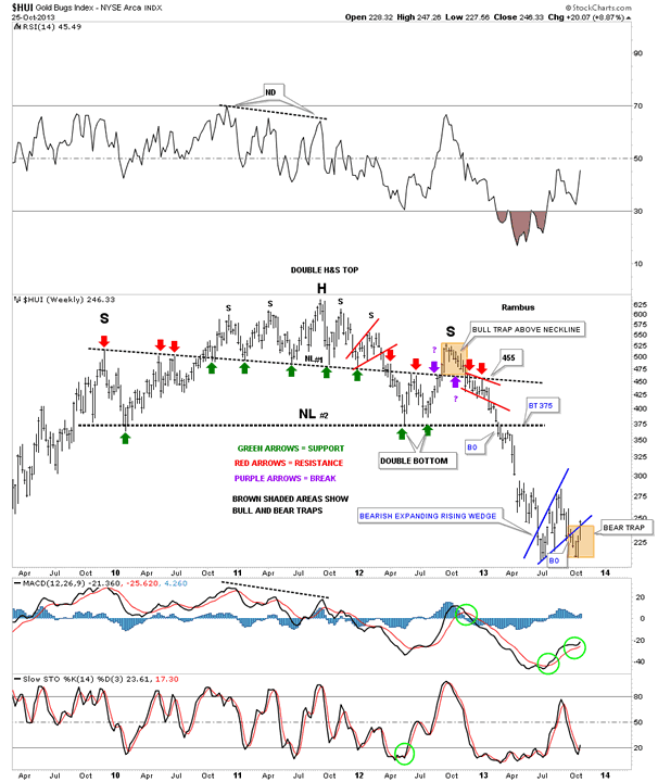
Commodities / Gold and Silver 2013 Oct 28, 2013 - 09:05 AM GMT Many times, just before a big move is to occur, you will get a false breakout that can whipsaw you before you know what hit you. It gets everyone moving one way and then out of know where the price reverses direction leaving everyone shaking their heads and afraid to make a move. As you were just whipsawed your thinking is, I'm going to wait until I see a better setup. Does this sound familiar to you. The problem is the real trend is just starting and you are sitting on the sidelines waiting for a new entry point that gets higher and higher. Whipsaws are just part of the game we play and can be painful if not understood. One year ago we got a good whipsaw on the HUI when it broke back above the smaller H&S top, neckline #1, that looked like a real move to the upside when it happened. I got sucked into that one just like everyone else at the time because there was a nice double bottom that had formed that created the right side of the much bigger H&S top, neckline #2.
The brown shaded area, just above the smaller neckline #1, turned out to be a bull trap just as the big downtrend was beginning. It trapped many bulls that held on far longer than they should have. You talk about a head fake. Luckily I was able to reverse our long position when the smaller neckline #1 was broken to the downside, breaking even for the trade. That's when we got short and rode the new downtrend all the way down into the August time frame when the HUI finally crossed above the 50 dma. You can see a couple of small backtests to neckline #1, last two red arrows on the right side of the chart, that gave us all the clues we needed to be short the precious metals stocks. Now look down to the bottom right hand side of the chart that shows the exact same brown shaded area that I'm calling a bear trap. Again, we were short when the blue bearish expanding rising wedge was broken to the downside. When the price action couldn't move lower than the June bottom a red flag came up for me. As you know I abruptly reversed course again on October 18th and went long. I know many of you were thinking what is he doing? How could he be a bear one day and a bull the next? After being whipped sawed as many times as I have been you begin to understand what is happening and you actually become more embolden once you figured it out. That is why I wasted little time going from being short to being long. If I'm correct on this one we'll have bought very close to the actual bottom which is looking more like a double bottom now. We still need to trade above 280 or so to confirm the new uptrend but we have excellent positioning right now with our NUGT 3 X long the precious metals stocks etf.
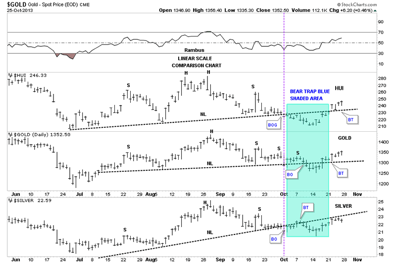
The next chart is a comparison chart that shows the HUI on top gold in the middle and silver on the bottom. If you recall I was looking at the many H&S consolidation patterns that were forming on the precious metals stocks and the PM stock indexes. As you will see the HUI and gold have now broken back above their respective necklines negating their H&S consolidation patterns. Silver is still trading below it's neckline but it's steeper than the HUI and golds. The blue shaded area shows the bear trap that many don't believe is happening. There is an important clue but a very subtle one on the HUI. Follow the price action when the neckline was broken to the downside, which is the bear trap. Notice how the HUI gapped above the neckline and then the very next day backtested it from above. As you can see gold had a similar breakout and backtest form the top side of it's neckline. This explains why I reversed course when I did. So far it has worked out beautifully.
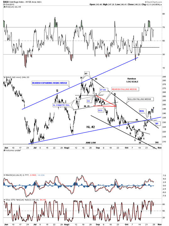
Next I would like to show you a 60 minute chart that shows more detail of the reversal, off our current low, that has taken place on the HUI. There is a really big clue that stands out like a sore thumb. Note the big breakout gap that occurred at the bottom rail of the blue expanding rising wedge - neckline and the top black rail of the bullish falling wedge, on the far right hand side of the chart. That big gap is one way to get over resistance. Also note the backtest to the blue rail that told me that rail was hot even though it had failed to hold resistance on our current rally. Whenever you see a gap that trades above an important support or resistance rail listen very carefully to what the market is telling you. Its talking to you but you have to understand the language and with enough time and experience you will be able to interpret what she is saying.
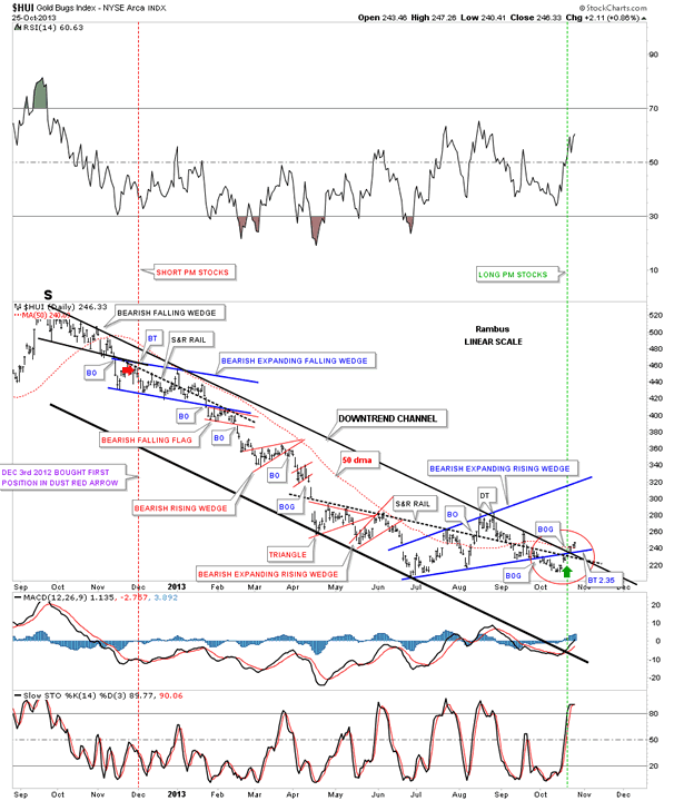
There was another very important clue that caught my attention this past week. The chart below shows the downtrend channel, that began with the bull trap I showed you on the first chart above, that is the top of the right shoulder of the big H&S top pattern. This chart shows you all the small consolidation patterns that we watched form in our long ride down from the red arrow, red vertical line, to where the HUI gapped above the 50 dma in August. That is where we exited our short positions on DUST, DGLD and DSLV. The green arrow, green vertical dashed line, shows where we have gone long starting on October 18th. I think this would qualify as selling or shorting the top and buying the bottom, at least up to this point in time. I would like to focus your attention on the red circle that shows how the HUI interacted with the confluences of resistance rails. You have to look real close, inside the red circle, that shows a big gap right where the green arrow is pointing up. That gap took out the big one plus year top rail of the downtrend channel, the bottom blue rail of the expanding rising wedge, the black dashed support and resistance rail and the 50 dma all at one time. That was a very important development IMHO.
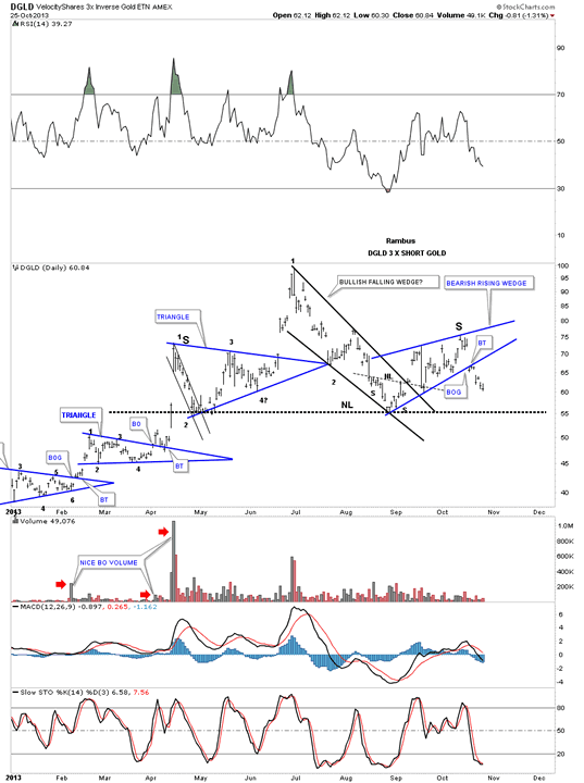
Next I would like to look at some inverse etf's for gold, precious metals stocks and silver. I'm actually getting a pretty clear reading on these short 3 X etf's that are painting a very positive picture for the precious metals complex. Remember they are inverse etf's that shows if DGLD is building a H&S top then gold is showing a H&S bottom. The first chart we'll look at is DGLD 3 X short gold that has a very nice looking H&S top in place. As you can see it's made up of three different chart patterns. The price action broke below the blue bearish rising wedge, about 8 days ago, with a quick backtest that told me to expect a move down to the neckline at the very least. This is good for our UGLD trade which is 3 X long gold.
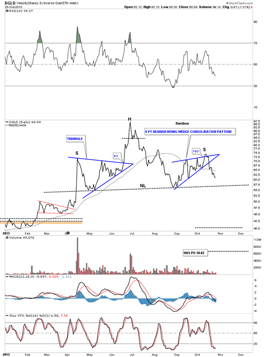
Below is a line chart for the DGLD short gold etf that shows a nice symmetrical H&S top that is trading below the 50 dma.
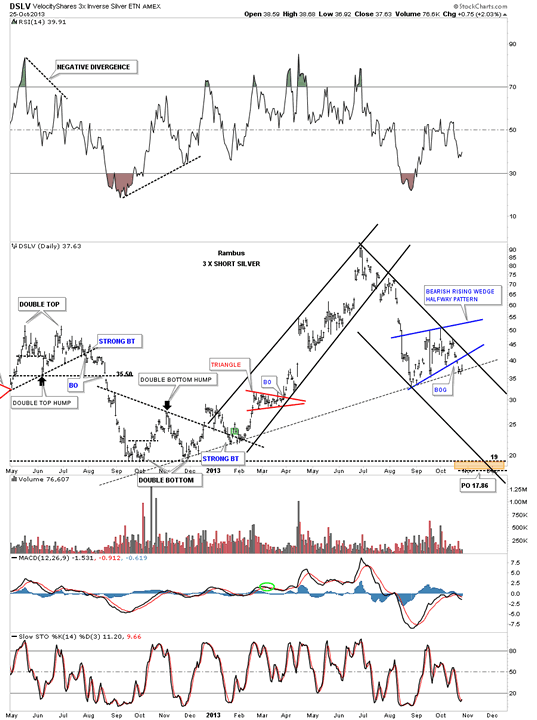
Next lets look at DSLV which is a 3 X short silver etf that is showing a very bearish picture for that etf but a very positive picture for your USLV 3 X long silver etf. DSLV is hanging on by a fingernail to the black dashed uptrend rail. Note it has already broken out from the blue bearish rising wedge halfway pattern. These types of patterns generally form about halfway through the impulse leg down. By the looks of this chart the next 4 to 6 weeks should be very bad if you are short silver but very good if you're long silver.
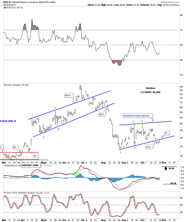
Below is a close up view of DSLV's bearish rising wedge complete with a breakout gap and backtest last Friday. This is the reason silver was weaker last Friday compared to gold and the HUI as it was in backtest mode, not quite ready to start its impulse leg.
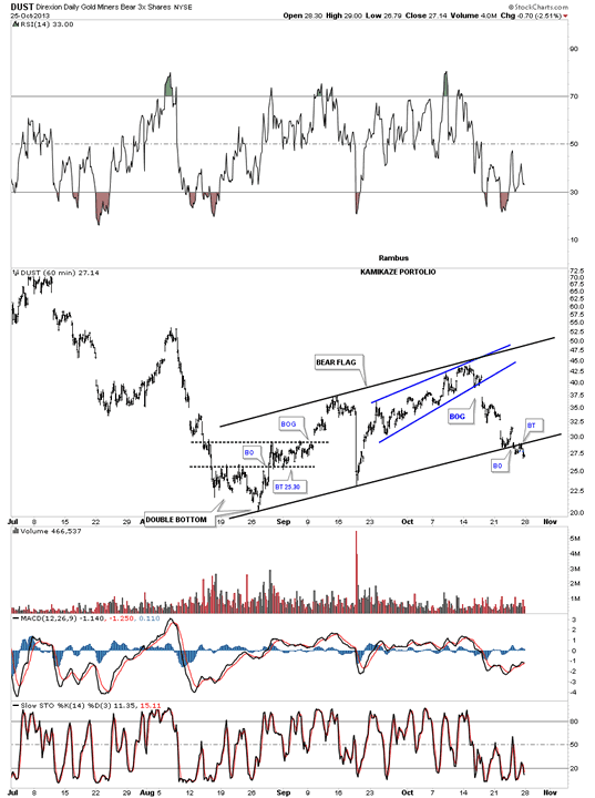
Now lets look at everybody's favorite 3 X short etf, DUST. The 60 minute chart shows the blue bearish rising wedge that we were watching very close that had a false breakout to the upside if you recall. It is now part of a much bigger chart pattern the bearish rising flag. Notice the big break away gap from the blue bearish rising wedge. If you recall that is where we exited our DUST position at the time. I said when you see a big gap like that, don't ask questions, just get out of your position as quickly as possible because there is a good possibility that a big move is about to begin. That is another clue as to why I made such an abrupt turn around from being short the PM complex to going long. Gotta listen to the clues. As you can see DUST has already broken out of the bear flag and did a backtest last Friday.
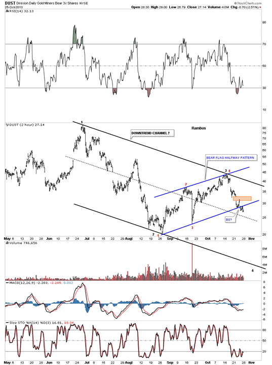
This next chart of DUST puts our bear flag into perspective as a halfway pattern within a bigger downtrend channel. The red numbers shows the nice clean reversal points in the blue bear flag.
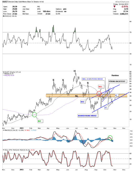
The daily chart for DUST shows a rather ugly H&S top formation with a strong backtest. As you can see the price action from the last two days has traded below the bottom blue rail of the blue bearish rising wedge so we are actually 2 days into the breakout.
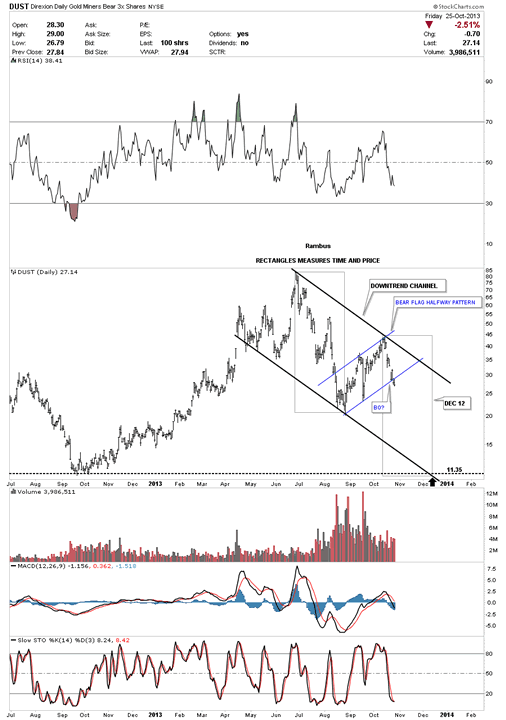
This last chart shows how I'm measuring the blue bear flag as a halfway pattern. Each rectangle measures time and price. Notice how the price objective is all the way down to the October low from last year that should come in around the 11.35 area around the 12th of December. This chart is a template for us to watch to see how things progress. As long as nothing gets broken and the price action continues to fall we'll just bid our time waiting for the price objective down to the 11.35 area to be hit. There are no guarantees that this will unfold exactly how I have it laid out but this is the best scenario I see from a Chartology perspective.
Keep in mind these three etf's are short the precious metals complex. The reason I'm showing you these short etf's is because they have a clearer picture and are easier to see their tops which would be bottoms on our long precious metals stocks, NUGT, UGLD and USLV. By the looks of these chart above we are on the cusp of something interesting that is about to happen in the precious metals sector. Stay tuned for further developments. All the best...Rambus
All the best
Gary (for Rambus Chartology)
FREE TRIAL - http://rambus1.com/?page_id=10
© 2013 Copyright Rambus- All Rights Reserved
Disclaimer: The above is a matter of opinion provided for general information purposes only and is not intended as investment advice. Information and analysis above are derived from sources and utilising methods believed to be reliable, but we cannot accept responsibility for any losses you may incur as a result of this analysis. Individuals should consult with their personal financial advisors.
© 2005-2022 http://www.MarketOracle.co.uk - The Market Oracle is a FREE Daily Financial Markets Analysis & Forecasting online publication.


