


Gold Big Picture - Old Necklines Never Die…
Commodities / Gold and Silver 2013 Nov 25, 2013 - 10:43 AM GMT

 In this Weekend Report I’m going to show you the Chartology of gold, from my perspective, for the last 17 years or so. As you know I don’t pay lip service to the cycle guys, Elliot Waver’s or the many different disciplines that folks use to analyze the markets. My goal is to give you an unbiased look at the markets strictly from a Chartology perspective that is unique for our site.
In this look at gold I’m going to use several different concepts that I’ve shown you in the past to try to give you a feel of where we maybe headed. We’re going to look at neckline symmetry rails, neckline extension rails, reverse symmetry and just your everyday support and resistance points on a chart. I hope to paint a fairly accurate picture of where the gold market may find an important low based on the charting concepts listed above.
1…NECKLINE EXTENTIONS
Before we look at gold I want to show you some of these charting concepts so you will have a better understanding of what I’m showing when we get to gold. The first thing I would like to show you is a neckline extension rail. Many times when a neckline is broken you will get an immediate backtest and then the move will take place. There is a saying I uses that goes like this, a neckline never dies it just slowly fades away. By that I mean you can extend the neckline way out in time and it can still be active even though the original move has completed and the price objective met.
AEM was one of the first big cap precious metals stocks to form its high and breakdown while the rest were still building out their topping patterns. There are three H&S tops on this weekly chart below but we’re just interested in the middle one that formed back in 2010 – 2011. After reaching its price objective down at 33 or so it then had a counter trend rally that took the price action all the way up to the old neckline that I’ve labeled, Neckline Extension Rail. As you can see AEM tried for several months to breakout above that neckline extension rail but failed. That failure created the head portion of another H&S top which reached its price objective down at the 25.62 area where its currently trying to form a blue falling wedge.
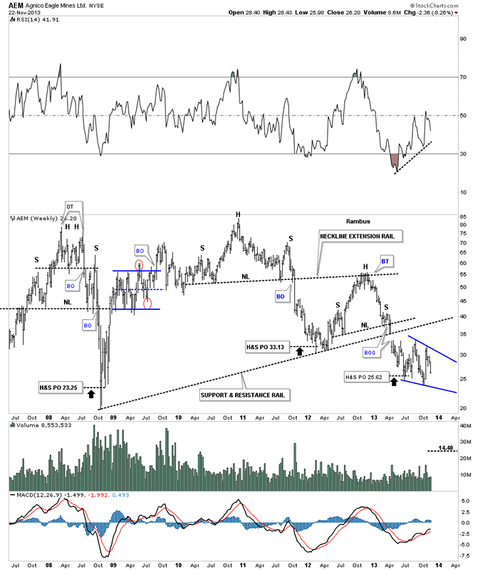
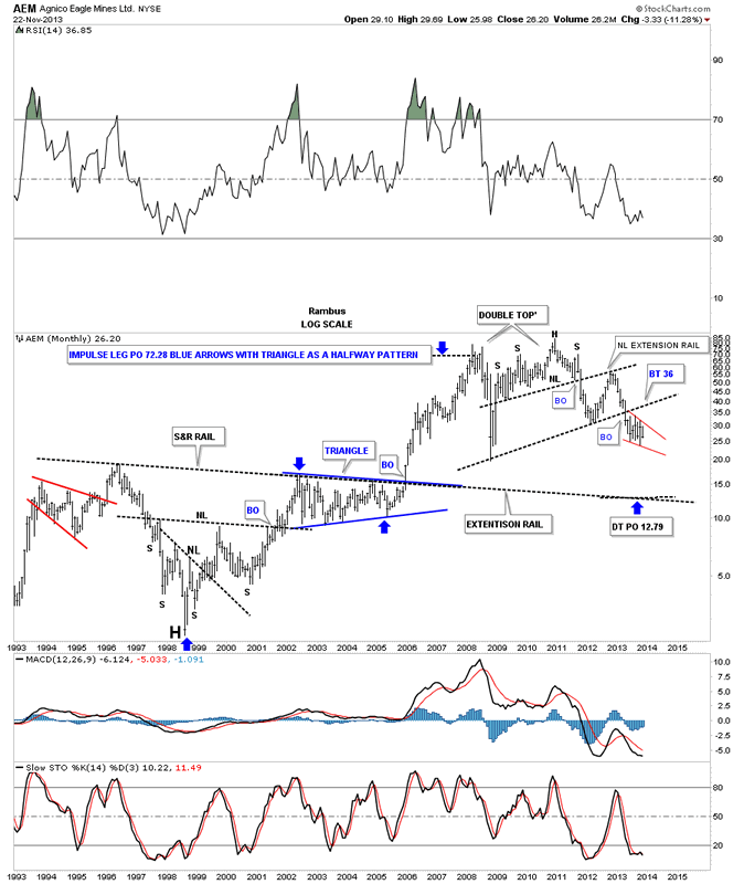
The very long term monthly chart for AEM shows our Neckline extension rail at the top of the chart with a much bigger one towards the bottom that could offer some support at the 12.79 area. Keep in mind this was roughly an $85 stock back in 2010. If one understood the Chartology of this stock he would have sold out at least when the H&S top broke down. I wonder how many PM investors are still holding on to this stock waiting for it to come back? I don’t want to say 1980 deja vu all over again but the point is one never knows when the long term move has been completed. Maybe AEM will end up going much higher than 85 in the very long run but if one has been holding this stock for the last several years its been a painful ride no matter how you want to spin it.
2…NECKLINE SYMMETRY SHOULDER LINES
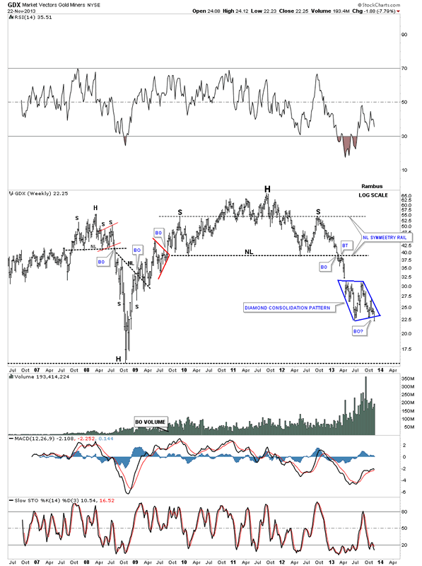
Lets look at some neckline symmetry rails that are just a parallel line taken off the neckline and moved to the left shoulder high or low when you think there is a possibility of a H&S forming. It’s not a perfect science but it does give you a place to look for a high or low for a right shoulder. It is amazing tho how many times this works out. The massive H&S top on GDX shows a beautiful neckline symmetry rail that nailed the top for the right shoulder. When I see something like that it increases my confidence level that I’m on the right track.
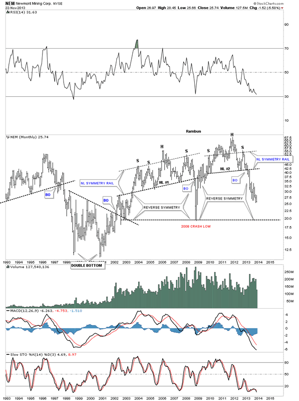
NEM formed two very nice neckline symmetry rails, one back in the 2008 H&S top and one in our current H&S top. You can also see the reverse symmetry coming back down.
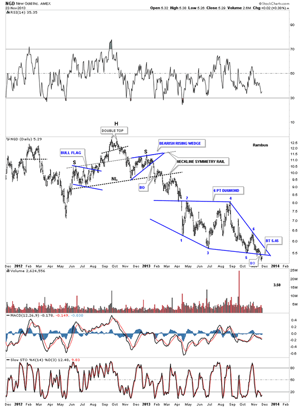
NGD had a nice neckline symmetry rail that showed the high on the right shoulder. As you can see each shoulder was made up of individual chart patterns which is common.
3…REVERSE SYMMETRY
Now lets look at probably the prettiest reverse symmetry chart I could find. Most of the precious metals stocks are reversing symmetry down vs how they went up during the rally off the 2008 low. If I had a hall of fame for some of these charts this chart for ANV would go in under the reverse symmetry category. Again like AEM this was a $47 dollar stock not that long ago. As fear is a more powerful emotion than greed you can see how this stock has come down a bit faster than it went up. What makes this chart so beautiful is the blue reverse symmetry triangles that are forming in the exact same location on each side of the rally and decline phases. As you can see the blue triangle broke out last week and now is headed down to the 2008 crash lows.

……………….
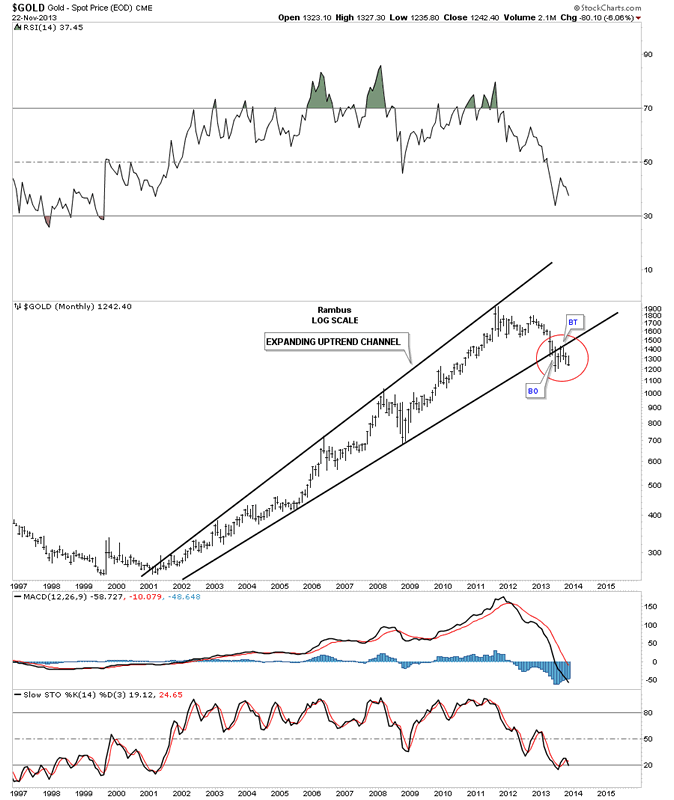
With these three basic concepts in Chartology lets now apply them to the long term look at gold and see what they show us. The first chart for gold is a 17 year log scale chart with no annotations on it. I just want to show you how we will make this chart come alive by adding a few trendlines, in the right spots, to show what may take place going forward. When looking at this blank chart just notice that during the bull market years how gold made higher highs and higher lows all the way up except for the 2008 crash low that just slowed down the bull market for a bit. Note the price action since the high was put in in 2011. There is a series of lower highs and lower lows which by definition is a downtrend.
![]()
With this next chart for gold we’ll add a top and bottom trendline that encompasses the bull market. These two trendlines form an expanding rising wedge. Note how many times the top rail has been touched. The red circle shows a very important aspect to this chart. What it shows is the break down form gold’s bull market expanding uptrend channel complete with the backtest. Remember we are constantly looking for clues. The backtest was a very important clue as it shows the bottom rail to be HOT.
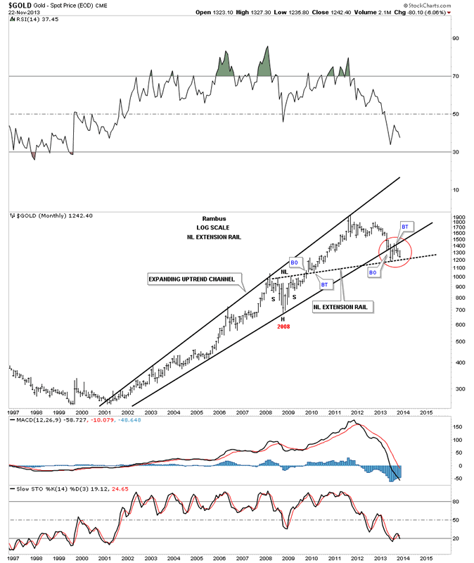
This next chart I will add a neckline extension rail made off the 2008 H&S consolidation pattern that now starts bringing this chart to life. On the chart above you can see how gold broke through the bottom rail of the expanding uptrend channel. The reason it bounced from that low for the backtest is because of the 2008 neckline extension rail.
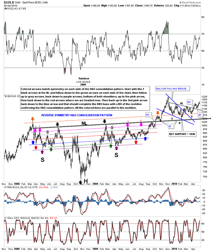
Before we move on I want to show you the 2008 H&S consolidation pattern in all its glory that I had a feeling would come back in play at some point in the future. When you look at the monthly chart above the 2008 H&S consolidation pattern doesn’t look like anything special but looking at it up close and personal it gives a whole new meaning to how beautiful Chartology can be sometimes. Of all the H&S patterns I’ve charted through the years this one on gold has to be one of the most symmetrical ones I’ve ever had the privilege to chart. They say beauty is in the eye of the beholder. Some of you will look at this next chart and say what is so special? We touched on neckline symmetry rails in the first part of the article on the GDX and NEM. If you can take just five minutes to study this chart below you will see the beautiful colored symmetry rails and how they played out on each side of the H&S. I wrote an explanation on how to read the H&S consolidation pattern on the chart. Just divide the H&S into, from the head straight up to the neckline where you will see two black arrows. The colored neckline symmetry rails are all the exact same angle. Follow the colored arrows down on the left side and then do the same thing on the right side chart. You will see each side of the H&S consolidation pattern, the lows and highs correspond to each other. Another very important feature on this chart is the big fat neckline. Note the first breakout and backtest that was spot on. Gold then had a good rally that stalled out and the reaction found support again on the big fat neckline at 1040. That is the point that led to gold’s final major rally phase up to 1920, its bull market high. One last point on this chart. Follow the top brown symmetry rail all the way from the left side of the chart to the right side of the chart. Note how the smaller H&S bottom that formed on the big fat neckline, as a big backtest. The left and right shoulders formed on the brown NL symmetry rail. Watching this unfold in real time was quite exciting as I always had a place to look for support which always showed up exactly when it needed to. Anyway, from my perspective I find the symmetry to be quite amazing which is why I’m so attracted to the Chartology of the markets.
This next chart for gold shows how I’ve extended the 2008 neckline to the present day. I will now show you how the neckline symmetry rails are working in regards to our current situation. I showed you earlier on the GDX and NEM how the neckline symmetry rails showed the top for the right shoulder. We are now reaching a most critical point in regards to where gold maybe heading over the intermediate term. If the neckline extension rail, made off the 2008 H&S consolidation pattern, extended out to our current time frame, maybe showing us a very large H&S top in play. What the neckline symmetry rail is showing us is a possible high for a right shoulder. What is interesting is that the neckline symmetry rail, that shows the bottom for the left and right shoulders on the 2008 H&S consolidation pattern, is also the same angle as our current H&S symmetry rail that is showing a high for our current and possible, much bigger H&S top left and right shoulders. All the neckline symmetry rails are the exact same angle as the 2008 big fat neckline.
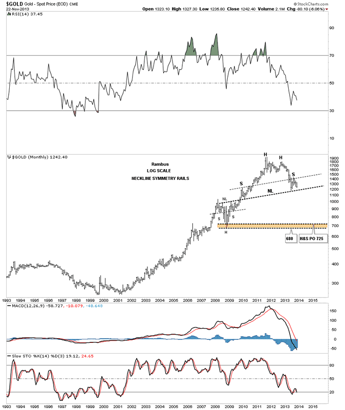
This last chart for gold puts all the pieces of the puzzle together using the Chartology concepts we discussed earlier in the article. The brown shaded area shows where we might see an important low for gold based on the price objective for the H&S top and the previous low at 680. Stocks usually come down faster than they go up so by looking at the reverse symmetry down it could take anywhere from 6 months to a year before we see the bottom but that is only a guess at this point. I also expect a small consolidation pattern to form about halfway down from the breakout of the neckline to the brown shaded area low.
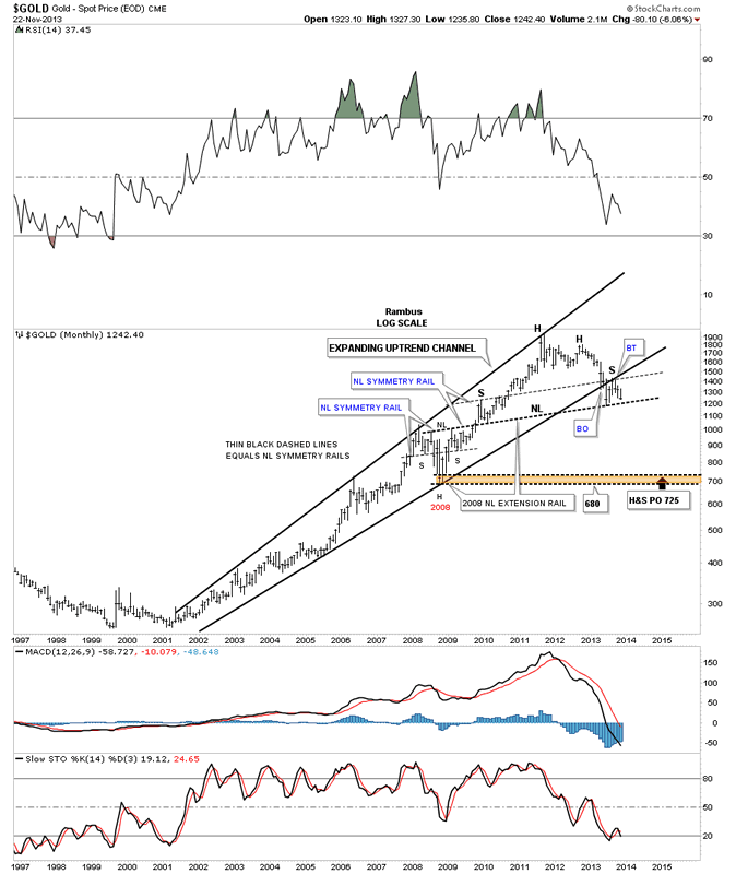
This is how I see things playing out over the intermediate term. Right now the most important area to focus on is the neckline extension rail made off the 2008 H&S consolidation pattern that comes in at 1200. I will be watching with great interest how we inter act with that 1200 neckline. That is the whole ball game right there. I would expect an initial hit at 1200 with a small rally followed by a break of the 1200 area followed by a brief backtest to the underside and then the fall away. That would be the perfect Chartology way to break 1200 and the possible big neckline that would complete a massive H&S top similar to the HUI and the rest of the Precious metals stock indexes. We now have something concrete to watch and pay close attention to. The market will tell us of her intentions, we just have to pay attention to what she is saying.
All the best
Gary (for Rambus Chartology)
FREE TRIAL - http://rambus1.com/?page_id=10
© 2013 Copyright Rambus- All Rights Reserved
Disclaimer: The above is a matter of opinion provided for general information purposes only and is not intended as investment advice. Information and analysis above are derived from sources and utilising methods believed to be reliable, but we cannot accept responsibility for any losses you may incur as a result of this analysis. Individuals should consult with their personal financial advisors.
© 2005-2022 http://www.MarketOracle.co.uk - The Market Oracle is a FREE Daily Financial Markets Analysis & Forecasting online publication.