Dow Countdown To Stock Market Meltdown
Stock-Markets / Stock Markets 2014 Jun 04, 2014 - 10:58 AM GMTBy: Austin_Galt
 “It’s not timing the market but time in the market”. Yep, we’ve all heard this refrain from market commentators on TV disguised as experts. Some go even further saying it’s impossible to time the market. Well, what a load of codswallop! Anyone that says this to you is a happily oblivious member of the Flat Earth Society (FES). Sure, FES members can still function well and be successful in their one dimensional world. Ignorant bliss can be extremely satisfying. However, in the analysis I’ve undertaken of the Dow, there is clear evidence presented that the market can, despite the naysayers, indeed be timed.
Let’s leave the timing aspect aside for the moment and using my top-down analysis approach begin with the yearly chart.
YEARLY CHART

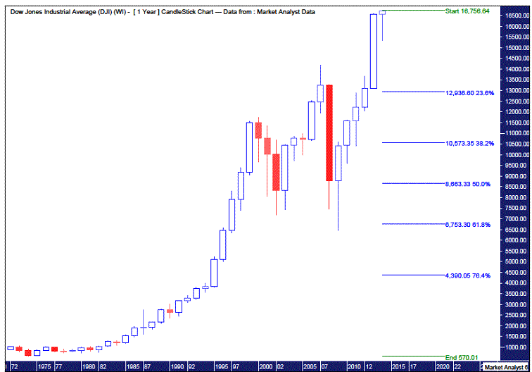
That massive upmove in 2013 absolutely slaughtered the bears, possibly close to the point of extinction. Claws holding white flags of surrender were raised. Just the sign required that a significant top is close at hand. A big, positive candle such as the 2013 candle should normally see a little follow through action which we are experiencing right now. The 2013 high was 16588 while currently the 2014 high is north of 16700. Years of looking at charts has shown me that big candles like that generally need to be consolidated which may involve just a simple correction, which we have already seen, but can often be a reversal of trend. In a moment we’ll move on in a bid to determine which scenario is more likely going forward.
Before that I wanted to do some more long term work. I have added Fibonacci retracement levels of the whole upleg from the 1974 low of 570 to the current top. Now I don’t think we’ve seen the final top but I expect it to be only marginally higher so using the current top won’t have any significant effect on this analysis.
Firstly, we can see the 2009 low is close to the 61.8% level bottoming just under that level. (Using Fibonacci in this forward looking manner is a way to predict future tops and lows). This adds significance to that low and is an argument against the megabears predictions that the 2009 low will be taken out. My personal opinion is to look for a low around the 50% retracement level which is currently just above 8650. The 50% level is also one of Gann’s key levels. Another of Gann’s discoveries was that lows are often 50% of the high price. Currently, 50% of the high price is a bit above 8350. Of course, as the Dow rises higher so too will these Fibonacci and Gann levels.
My personal opinion is that the coming plunge will see most, if not all, of 2013’s gains wiped out before a rally into the end of the year. Then an even more bearish 2015 before final low in 2016 close to the levels I just outlined. Now this, of course, is purely speculation on my own part.
But we’re getting ahead of ourselves here. Let’s slow it down and move onto the monthly chart and see what that tells us.
MONTHLY CHART

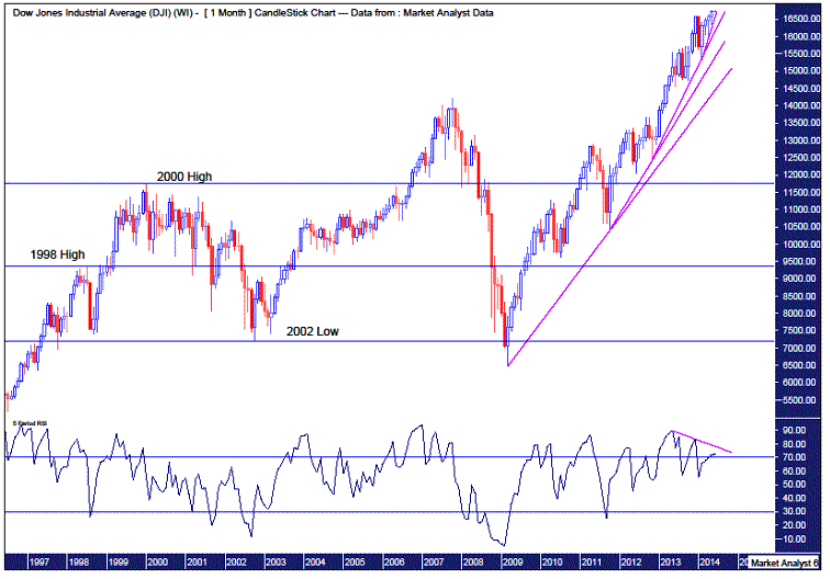
This chart is very revealing. Firstly, I have drawn trendlines from consecutive lows starting from the March 2009 low, then the October 2011 low, the November 2012 low and finally the February 2014 low. It can be seen that each new trendline is getting steeper and steeper. We are now onto the fourth consecutive steeper trendline. That folks, is undeniable evidence that the bull market is in its last throes.
Secondly, I have added a Relative Strength Indicator (RSI) whereby a downtrend line can be seen. This shows that the recent Dow tops are declining in strength. A bearish divergence. Generally after the third bearish divergence a significant down move can be expected. (There’s the magic number three again.) We are now just awaiting the next Dow high to coincide with a weaker RSI reading than its previous two tops. Now keep in mind we are dealing with the monthly chart and the longer the timeframe the stronger the indication.
You will also notice I have drawn horizontal lines on the chart which refers to the levels of the 1998 high, 2000 high and 2002 low. Assuming the bull market since 2009 is just about finished, I wanted to look at potential correction ending levels. As Gann noted, old tops often become support in the future. So that brings into the frame the 2000 high of 11750 and the 1998 high of 9367. Now going back to the yearly analysis, the 2000 high appears too high. Sure there may be a short term reaction off that level but I still favour a lower level for the final correctional low. That brings us to the 1998 level. Corrections generally push into the old high levels giving them a decent test so we could assume a little below this level. That would also conveniently be close to the Fibonacci/Gann 50% level and Gann’s 50% of high price level as mentioned in the yearly analysis. Now if the 2002 low were to be taken out then the probabilities of breaking the 2009 low would increase dramatically. While not out of the question, it is a scenario I just don’t favour at all to be quite frank.
Let’s move on and view the weekly chart.
WEEKLY CHART

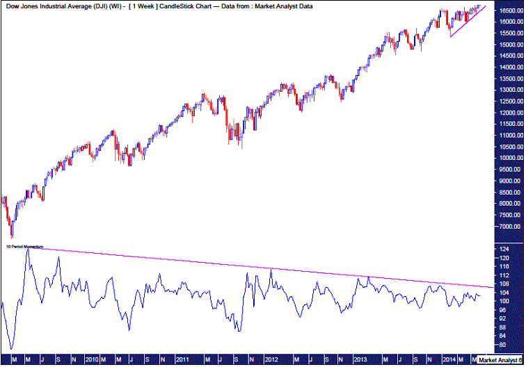
Not too much more to add here other than I have added a Momentum indicator. It can be seen that ever since the very first high after the 2009 low, momentum has been declining. Undeniably clear evidence that the bull market has just about run out of puff. It is absolutely exhausted.
I have also redrawn that last and steepest trendline from the monthly chart. I’d suggest that once that line is breached the bull market is done. Selling that break in itself would be a form of timing the market.
So let’s finish off the analysis by coming back to the timing aspect and we’ll look at the daily chart to do that.
DAILY CHART

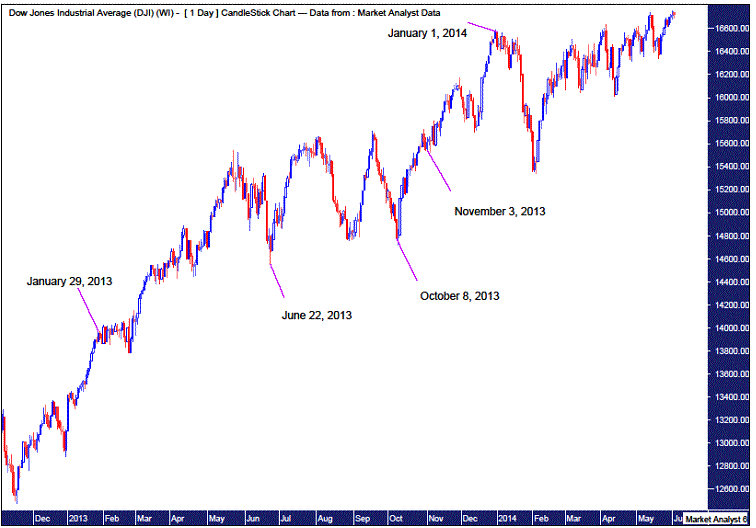
Now Gann was famous for his ability to time market highs and lows well in advance. He used various cycles to help him do this. But he wasn’t alone in using cycles. A Nebraskan astrologer, by the name of Donald A. Bradley, used his knowledge to develop a model in the 1940’s to forecast stock market cycles based on planetary constellations. Now I don’t want to get into spooky market revelations here. That is another discussion for another time. I look for hard evidence and hence I have added the Bradley Model major turn dates since the start of 2013 to make my point. It is clearly demonstrated that virtually every turn date coincided with a turn, most of these being significant turns. The last turn date was 1st January 2014. Now of course this date was a holiday. The market topped on the last trading day of 2013 before a significant correction took place. This chart is evidence that the Bradley Model is currently in synch with the Dow Jones Industrial Index and that timing the market is most definitely not impossible.
So what are the other Bradley Model turn dates in 2014? Interestingly, the next major turn date is 16th July 2014. Will this date be a significant turning point? Maybe. Maybe not. There are no foregone conclusions in the market. Now if the Dow keeps edging up into that date, we could very well have the major stock market high coincide with this timing period. It will certainly be a key time period to watch for a top. Every other piece of evidence gained from the analysis so far suggests we are near a major top. Now trying to pinpoint major tops and bottoms is fraught with danger but it is not impossible. Key cycle dates combined with various technical indicators can be a potent combination.
As for a potential price target for top, I really don’t expect much higher than current levels. I’ve noticed recently that quite a few market commentators on TV are now calling for the Dow to hit 17000. Uh oh! Popular consensus like that gives me the heebie jeebies so my personal preference is for price to fall just short of that level.
The last Bradley Model turn date in 2014 is 20th November so that could be a potential timing period to look for a low if price is heading down into that date. But that can be looked at more closely in the future.
The fact is everything in this world revolves around cycles. Night and day cycles. Hot and cold cycles. Wet and dry cycles. And the stock market is no different with bull and bear cycles or boom and bust cycles.
Now presenting this evidence to FES members would just make their heads explode. They can’t rationalise it. There are some things in this world that we just don’t have the knowledge to explain. But that doesn’t make them any less true.
So the next time you’re watching your local market expert or fund manager on TV saying it’s all about time in the market and not timing the market, keep in mind they often use time frames beginning just after major market lows in order to manipulate the results. Simply put, it really is just complete and utter rubbish.
To sum it all up, time is ticking on the boom cycle with a bust cycle nearly upon us.
Bio
I have studied charts for over 20 years and currently am a private trader. Several years ago I worked as a licensed advisor with a well known Australian stock broker. While there was an abundance of fundamental analysts there seemed to be a dearth of technical analysts, at least ones that had a reasonable idea of things. So my aim here is to provide my view of technical analysis that is both intriguing and misunderstood by many. I like to refer to it as the black magic of stock market analysis.
Please register your interest in my website coming soon. Any questions or suggestions, please contact austingalt@hotmail.com
© 2014 Copyright Austin Galt - All Rights Reserved
Disclaimer: The above is a matter of opinion provided for general information purposes only and is not intended as investment advice. Information and analysis above are derived from sources and utilising methods believed to be reliable, but we cannot accept responsibility for any losses you may incur as a result of this analysis. Individuals should consult with their personal financial advisors.
© 2005-2022 http://www.MarketOracle.co.uk - The Market Oracle is a FREE Daily Financial Markets Analysis & Forecasting online publication.


