How to Determine the Best Place to Invest Using Technical Analysis
InvestorEducation / Learning to Invest Feb 17, 2015 - 06:04 PM GMTBy: Investment_U
 Christopher Rowe writes: Over the next five minutes, I’ll teach you one of the most successful investment approaches in history... one that can tell you which part of the stock market you should be in right now.
Its success has been documented in more than 100 independent studies over the last few decades. And it’s been back-tested for over a century.
But before I show you how it works, let me show you where it’s pointing today.
Where to Invest Now
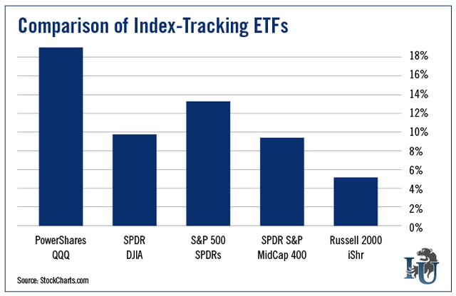
Right now, according to this investment approach, the strongest market index is the Nasdaq 100. You can invest in this index via the popular exchange-traded fund PowerShares QQQ Trust (Nasdaq: QQQ).
To show how it measures up against other indexes, I’ll compare the strength of QQQ to the following index-tracking ETFs:
- SPDR Dow Jones Industrial Average ETF (NYSE: DIA)
- SPDR S&P 500 ETF (NYSE: SPY)
- SPDR S&P MidCap 400 ETF (NYSE: MDY)
- iShares Russell 2000 (NYSE: IWM)
In 2014, QQQ was up 19.4% while the remaining four indexes gained only between 5.04% and 13.06%
It’s really no wonder the index performed so well. As you may have guessed, the Nasdaq 100 is loaded with tech stocks. They make up 58.18% of its holdings.
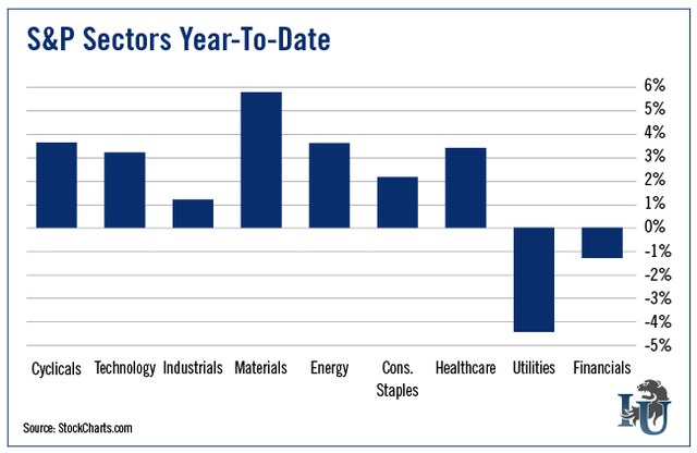
You may recall that last year was a pretty stellar year for this sector. The tech portion of the S&P rose 17.84%.
It also doesn’t hurt that the Nasdaq 100 holds a significant weighting in healthcare - 14.76% to be exact. This portion of the S&P shot up 25.13% last year.
So far this year, the Nasdaq 100 continues to outperform other popular stock market averages.
This is partially due to continued strength in the tech and healthcare sectors. But it’s also because of the newly revived strength in the consumer discretionary sector, which has the second-largest weighting in the index (18.95%).
The question is: How did my very old (but not very popular) investment approach determine I should look at the Nasdaq 100 in May of last year?
And, perhaps more importantly, how can regular investors use it?
How to Pinpoint the Strongest Security
This very simple approach is called relative strength investing. You’ve probably heard me mention it before. It’s a piece of every second or third article I publish.
You can implement it pretty easily on your own. Let me show you how it’s done...
Step 1: Go to a charting service that allows relative strength studies. (I use StockCharts.com in the example below.) This is NOT the RSI (relative strength index). Investors commonly get the two confused for obvious reasons.
Step 2: Compare the relative strength of one base security to a comparative security.
Don’t worry - you don’t have to do any math. You just have to know the symbols of the two securities you’re comparing.
Behind the scenes, the base security is the numerator and the comparative security is the denominator. Relative strength charts are created by dividing the value of the base security (in this case QQQ) by the comparative security and plotting the result on the chart.
It’s worth noting that some services multiply the result by a number. Don’t let this confuse you. The “value” on the relative strength chart doesn’t matter. It’s only there so the chart can be created.
The point is to watch for higher highs and lows, which means your base security is stronger than your comparative security.
Let’s first try comparing QQQ to SPY. Notice in the top left corner where the quote is posted. Every chart service is different but, in general, you should be able to create a relative strength chart by separating the base security and comparative security with a colon.
So the quote in this case is QQQ:SPY. If you do it backward then you’ll be looking at the exact opposite chart. The chart below advances when QQQ is either going up by more or down by less than SPY.
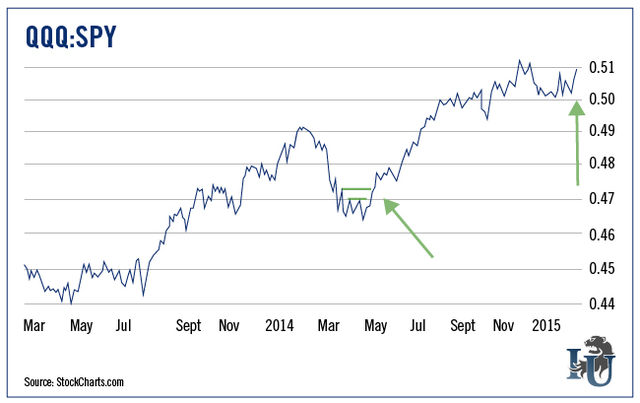
In the first part of 2014, you can see the line declined. That means the SPY was performing better than the QQQ. But in May, you can see the chart started making higher highs again (where the first arrow is pointing above) followed by higher lows.
After some sideways action since December 2014 (implying the two were performing about the same), we see what appears to be another breakout of the relative strength chart. (See my second arrow.)
Now let’s compare the QQQ to some other indexes...
The Nasdaq 100 vs. The Dow, Russell and S&P
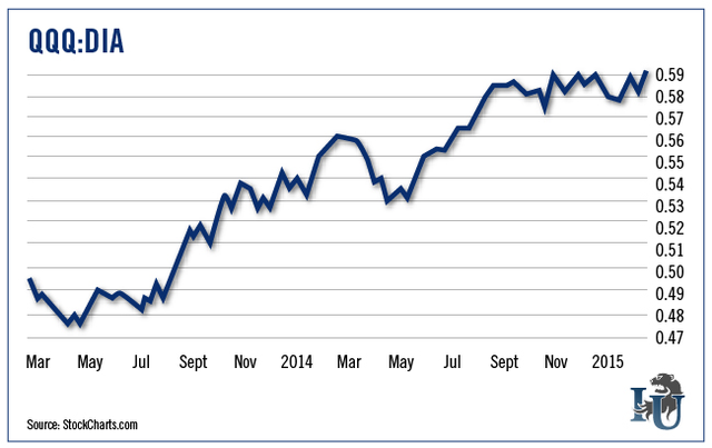
Below is a similar picture seen when comparing QQQ to DIA (again, this is an ETF tracking the Dow Jones Industrial Average).
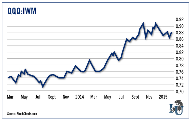
The next chart compares QQQ to IWM (an ETF that tracks the Russell 2000 small cap index). Notice on the far right that we are not seeing quite as much strength verses the small caps. It will be interesting to see how this pans out.
The next chart compares QQQ to MDY (which tracks the S&P 400 mid cap index). Notice on the far right that we have been seeing relative weakness on an intermediate-term basis. But the QQQ has been gaining strength over the past few weeks.
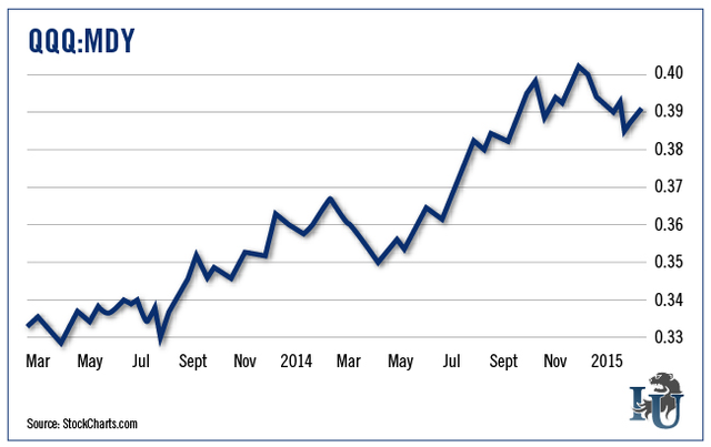
This is interesting and worth watching. We saw similar action in the first part of 2014 and the Nasdaq 100 prevailed as the strongest index of the year.
When I see these intermediate-term weak patches, I tend to view them within the context of a long-term picture. So for now, I’ll assume the Nasdaq 100 will continue to be among the strongest indexes.
It doesn’t take much to keep yourself invested in the strongest market index. If gauging the strength of five indexes every couple of months generates 44% more in profits (as the QQQ did verses the S&P 500 last year), isn’t it well worth your time?
Good investing,
Chris
Copyright © 1999 - 2015 by The Oxford Club, L.L.C All Rights Reserved. Protected by copyright laws of the United States and international treaties. Any reproduction, copying, or redistribution (electronic or otherwise, including on the world wide web), of content from this website, in whole or in part, is strictly prohibited without the express written permission of Investment U, Attn: Member Services , 105 West Monument Street, Baltimore, MD 21201 Email: CustomerService@InvestmentU.com
Disclaimer: Investment U Disclaimer: Nothing published by Investment U should be considered personalized investment advice. Although our employees may answer your general customer service questions, they are not licensed under securities laws to address your particular investment situation. No communication by our employees to you should be deemed as personalized investment advice. We expressly forbid our writers from having a financial interest in any security recommended to our readers. All of our employees and agents must wait 24 hours after on-line publication or 72 hours after the mailing of printed-only publication prior to following an initial recommendation. Any investments recommended by Investment U should be made only after consulting with your investment advisor and only after reviewing the prospectus or financial statements of the company.
Investment U Archive |
© 2005-2022 http://www.MarketOracle.co.uk - The Market Oracle is a FREE Daily Financial Markets Analysis & Forecasting online publication.


