U.S. Inflation Setup to Upset
Economics / Inflation Nov 18, 2015 - 03:56 PM GMTBy: Ned_W_Schmidt
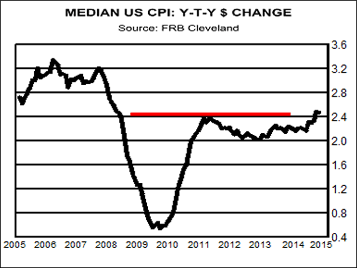
 Is U.S. inflation setup to upset the markets? Motivation for considering this question begins with graph to right. Plotted in that chart is the year-to-year percentage change for the median U.S. CPI. That measure is calculated monthly by the diligent elves at Federal Reserve Bank of Cleveland. Period of time for chart is past ten years.

Let us start with some casual observations. First, U.S. inflation as measured by year-to-year percentage change of the median CPI has not been negative anytime in the past decade. Second, only one major cycle of lower inflation occurred during this period. Third, and perhaps most important, the measure has now exceeded the last high which occurred at the end of 2011. As indicated by the red line, this measure of inflation is at the highest level since the beginning of 2009.
What is the median CPI? To calculate the headline CPI for any particular month the rate of change is calculated for each of the components of the CPI such as energy, food, and housing. The headline CPI is then calculated by weighting each of those component. It is what is called a weighted average. The median CPI is that rate of change for which half of the components had a higher rate of change and half had a lower rate of change. The median is less impacted by extreme changes in the prices for any component which can in someways distort the weighted average CPI.

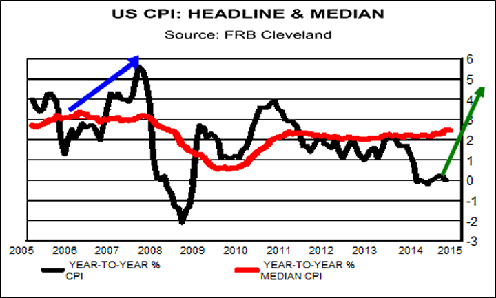
As shown in bottom chart, three times the year-to-year percentage change for the headline CPI, black line, has been below that for the median CPI, red line. In each of those cases it spiked lower. Both of the first two times the headline rate for the CPI then moved sharply higher, as highlighted by blue arrows. That divergence below the median CPI by the headline CPI suggests an unstable situation which is corrected by a rise in the headline CPI.
On the right side of the graph the headline CPI has been running below the median CPI for some time and has again spiked lower on the collapse of oil prices. Picture is much like that which occurred in the first two inflation events. This situation suggests that soon the headline CPI could begin rising at a much faster rate, just as it did twice before.
How high might the rate of U.S. inflation as measured by the headline CPI go? In the first inflation event in the graph inflation rose, using rough numbers, from 1.5% to 5.5%, or by 4 percentage points. In the second inflation event, again using rough numbers, the CPI rate of change initially rose from -2% to more that +2%, or again by about 4 percentage points.
Using those simplistic numbers suggests that U.S. inflation as measured by the CPI could rise to an annual rate of about 4% as indicated by the green arrow. Such a development is likely not part of the thinking of either financial market participants or the central bank. Despite the rough nature of this approximation, U.S. inflation also has the potential to move above the previous high which would portray a picture of a rising inflation trend. This situation seems to be a setup that could potentially upset financial markets.
By Ned W Schmidt CFA, CEBS
Ned W. Schmidt,CFA has had for decades a mission to save investors from the regular financial crises created by economists and politicians. He is publisher of The Value View Gold Report, monthly, with companion Trading Thoughts. To receive these reports, go to: www.valueviewgoldreport.com Follow us @vvgoldreport
Copyright © 2015 Ned W. Schmidt - All Rights Reserved
Ned W Schmidt Archive |
© 2005-2022 http://www.MarketOracle.co.uk - The Market Oracle is a FREE Daily Financial Markets Analysis & Forecasting online publication.


