


The Scariest Commodity Market Chart on the Planet
Commodities / CRB Index Jan 14, 2016 - 12:30 PM GMT

Excerpt from Tonight's Wednesday Report
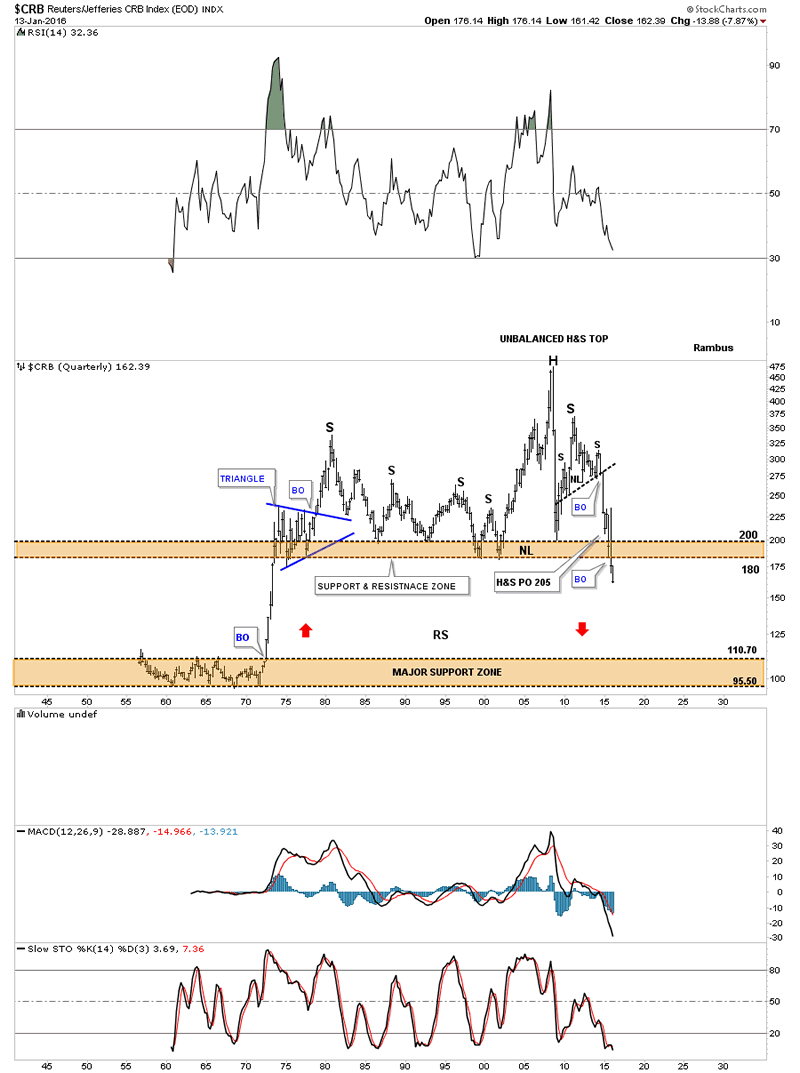
The implications of this 60 year quarterly chart for the CRB index is staggering if it completes this impulse move down which so far has been working out beautifully. Again on this massive time scale you can see an unbalanced H&S top that measures out to just below the major support zone at the bottom of the chart.
Back to the Future Indeed.
CRB Index Quarterly Chart
All the best
Gary (for Rambus Chartology)
FREE TRIAL - http://rambus1.com/?page_id=10
© 2016 Copyright Rambus- All Rights Reserved
Disclaimer: The above is a matter of opinion provided for general information purposes only and is not intended as investment advice. Information and analysis above are derived from sources and utilising methods believed to be reliable, but we cannot accept responsibility for any losses you may incur as a result of this analysis. Individuals should consult with their personal financial advisors.
© 2005-2022 http://www.MarketOracle.co.uk - The Market Oracle is a FREE Daily Financial Markets Analysis & Forecasting online publication.