This Chart Shows an Economic Anomaly That Investors Can’t Explain
Interest-Rates / US Interest Rates Feb 15, 2017 - 11:38 AM GMTBy: John_Mauldin
BY PATRICK WATSON : Nineteenth-century writer Frédéric Bastiat, in his classic “Broken Window” parable, warned that economic thinking requires us to see what isn’t happening as well as what is.
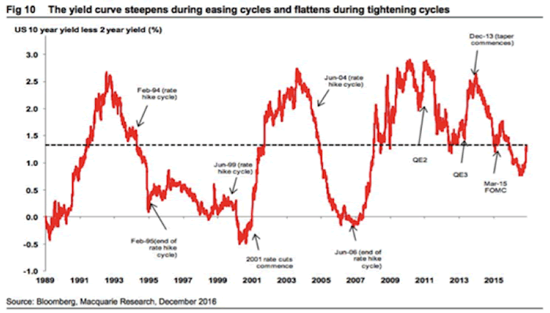
This yield curve chart from Macquarie Research provides a good example.

Source: Macquarie Research
The chart shows the difference between 2-year and 10-year US Treasury bond yields. Traders follow this because a “steep” yield curve is what gives banks their greatest profit opportunity.
Normally, the curve gets steeper (higher) in recessions when the Federal Reserve is cutting interest rates, and lower/flatter when the Fed is tightening during growth phases.
Why is the curve steepening now?
That’s under normal conditions, which we apparently don’t have right now. The yield curve has been steepening since the US election despite the Fed’s hiking rates in December and forecasting more of the same in 2017.
Why is this? For now, we can only speculate. But this is the kind of anomaly that Bastiat said we should notice. It is likely important for a reason that will be obvious only in hindsight.
Subscribe to Connecting the Dots—and Get a Glimpse of the Future
We live in an era of rapid change… and only those who see and understand the shifting market, economic, and political trends can make wise investment decisions. Macroeconomic forecaster Patrick Watson spots the trends and spells what they mean every week in the free e-letter, Connecting the Dots. Subscribe now for his seasoned insight into the surprising forces driving global markets.
John Mauldin Archive |
© 2005-2022 http://www.MarketOracle.co.uk - The Market Oracle is a FREE Daily Financial Markets Analysis & Forecasting online publication.


