Create a Compelling Landing Page in Less than 30 Minutes
Companies / SME Jun 09, 2017 - 12:49 PM GMTBy: Boris_Dzhingarov
 In case you’re not familiar with the term, a landing page is a page that a visitor arrives at by clicking on a link or an ad. In the context of digital marketing, a landing page is a web page completely detached from your main website. It’s a single-page site created solely to serve one purpose – conversion.
Creating a compelling landing page is a quick and easy process, especially if you’ve got a few inside tips and tricks. No designing or coding skills necessary. And did we mention you can do it in under 30 minutes as well?
Set your timer and let’s get started.
1.Choose a great website builder

Time is of the essence here, so building a landing page from scratch is out of the question. To make the entire process run faster and smoother, choose a website builder that’s intuitive and easy to use.
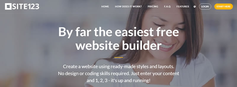
There’s a myriad of different platforms available, but SITE123 is a one that stands out from the crowd. It’s by far the simplest and fastest way to get a website up and running, and the same can be said about landing pages.
Choose a free template you think would go best with the image you’re trying to project with your landing page, and you’ve already got all the heavy lifting done.
2.Design with visual hierarchy in mind
Remember that you’re creating a landing page with a single objective in mind – to promote an action. Whether it’s clicking, buying or subscribing - your design needs to be focused on fulfilling that objective. An excellent way to do that without using words is to apply the rules of visual hierarchy.
Use contrasting colors to accentuate a particular image. Draw your customer’s attention to a “subscribe” or a “buy” button by placing it in the middle of the page.

You can take advantage of the single-page layout and separate the landing page into sections. Use these sections, or modules, to highlight testimonials, promo content or a list of brands and companies you’ve worked with. People are visual creatures, and having a visually compelling landing page should be your priority.
3.Choose a message you want to convey

Are you looking to project a well-polished, professional image and create a formal atmosphere around your business? Or do you want to create a more casual, friendly image and appeal to a younger audience?
A formal image requires classic, clean fonts, and straightforward, concise sentences.
A more casual setting, on the other hand, gives you more freedom when it comes to the design and language you use. You can experiment with different fonts and colorful images, and write fun, witty descriptions in a casual tone.
By deciding on what kind of message you want to communicate, you’ll create a foundation from which you’ll be able to build your content.
4.Write killer content
Having a visually compelling design will attract visitors. Having amazing content, on the other hand, is what will turn them into customers.
To get your customers hooked, your content needs to be straightforward and clear. Stay away from unnecessary filler words and long, boring explanations. Keep it short and sweet – your customers will appreciate you getting right to the point.
Tell it as it is, don’t talk down to your readers, add clever wordplay into the mix, and – voila! You’ve successfully created amazing, five-star content in just a couple of minutes.
5.Include CTA
CTA, or call-to-action, is a marketing tactic of using words or phrases that prompt customers to take a certain action.
If done right, CTA phrases such as “buy it here” or “call us now” can do wonders for your conversion rate.
If your content is brief, follow it with a “find out more” button that links to your main website where the topic is covered in more detail. This classic call-to-action is bound to generate clicks, so don’t be afraid to use it to your advantage.
Want to grow your client base? Put a big “subscribe now” button in the middle of your landing page, and offer perks or discounts for people who join your newsletter through that specific link.
6.Finish it off with the technicalities
Once you add all the links and CTAs, you’re just minutes away from your landing page being finished. There are just a few technical details you need to take care off before your page goes live, the first one being choosing a relevant URL.
A good URL can do wonders for your landing page and should be complemented with an equally-good SEO title and meta description.
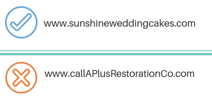
A few things to keep in mind when creating a URL:
· Make sure it contains the name of your business, product or service
· Keep it as short as possible and easy to remember
· Don’t use stop words (a, an, the, etc.) or unnecessary adjectives (amazing, fantastic, beautiful)

The SEO title should match the original title of your landing page, but you can always add a few words to make it a bit more catchy and search-engine friendly.
A meta description is a summary of what’s on your landing page or any other page for that matter.
While it won’t help you rank better, a meta description will entice people to click and open your page, attracting potential customers. So, make sure your meta description is short and clear, and don’t be afraid to add a few keywords to make it more appealing.
Ready to create a landing page for your business? Start with my recommendation SITE123 and in less than 30 minutes, you’ll have a powerful conversion tool right at your fingertips.
By Boris Dzhingarov
© 2017 Copyright Boris Dzhingarov - All Rights Reserved
This is an paid advertorial. Disclaimer: The above is a matter of opinion provided for general information purposes only and is not intended as investment advice. Information and analysis above are derived from sources and utilising methods believed to be reliable, but we cannot accept responsibility for any losses you may incur as a result of this analysis. Individuals should consult with their personal financial advisors.
© 2005-2022 http://www.MarketOracle.co.uk - The Market Oracle is a FREE Daily Financial Markets Analysis & Forecasting online publication.


