Revisiting US Money Supply M3 Contraction
Economics / Money Supply Aug 21, 2008 - 12:04 PM GMTBy: Mike_Shedlock

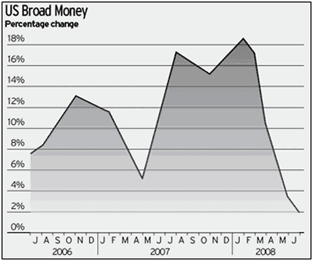
 Many have been writing asking how the chart and commentary in M3 Contraction - The Future Is Now can possibly be correct. Here is the chart and a snip of text once again for convenience. The key sentence below is in RED.
The Telegraph is reporting Sharp US money supply contraction points to Wall Street crunch ahead .
The US money supply has experienced the sharpest contraction in modern history, heightening the risk of a Wall Street crunch and a severe economic slowdown in coming months.

Data compiled by Lombard Street Research shows that the M3 ''broad money" aggregates fell by almost $50bn (£26.8bn) in July, the biggest one-month fall since modern records began in 1959. "Monthly data for July show that the broad money growth has almost collapsed," said Gabriel Stein, the group's leading monetary economist.
On a three-month basis, the M3 growth rate has fallen from almost 19pc earlier this year to just 2.1pc (annualised) for the period from May to July.
This is below the rate of inflation, implying a shrinkage in real terms. .....
Questions about that chart have been in comparison to charts of M3 on Now and Futures and ShadowStats.
Before we look at some charts, let's address the alleged " contraction ". I would not have used the word on my own accord but I can explain where it comes from. Read the last sentence in the excerpt above for an explanation. The contraction is in " real terms ". " Real" means inflation adjusted, and " inflation adjusted " means via the CPI or PCE deflator.
Sheeesh. Had enough? I hope so. So let's look at some charts.
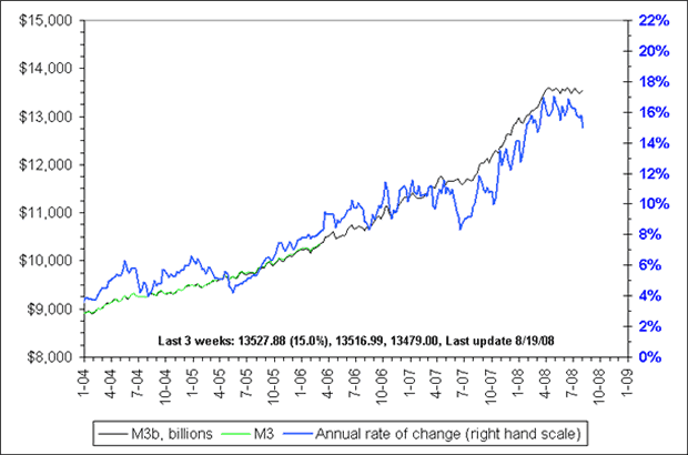
M3 - Now And Futures

The above chart courtesy of Now And Futures .
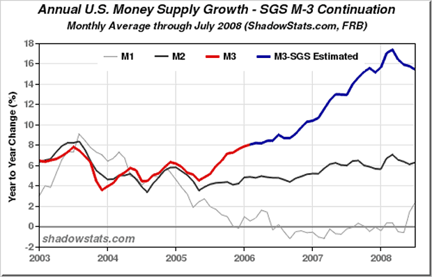
M3 - Shadowstats

The above chart courtesy of ShadowStats .
So which chart is correct?
The correct answer, most likely, is all three. Now and Futures and ShadowStats are looking at year over year comparisons, while the first chart is presumably a comparison of three month annualized vs. the prior three months annualized. There is merit to both methods.
As for the difference between the second and third charts, Now and Futures offers this explanation:
John Williams monthly reconstruction of M3 is here. Ours tends to be more volatile and averages slightly higher than his, partly because it's weekly and partly because of our minor differences in calculating the Eurodollar component of M3 and repos.
What's Going On With M1?
As long as we are discussing charts, inquiring minds may notice that M1 is rising in the ShadowStats chart. M Prime (M') and TMS are doing the same. (See TMS: A Truer Money Supply? for a discussion of the superiority of M' and TMS vs. M3 for economic purposes)
With M1 as with M3 it is important to understand why something is happening or very wrong conclusions will be drawn. One explanation is that consumers are moving money from savings accounts, T-Bills, CDs, and even brokerage accounts to checking accounts. A second explanation is consumers are saving, rather than spending their stimulus checks. A third explanation is that base money supply is rising. Why M1 is rising is likely a combination of all of those. If so, at least a part of M1's rise is a last ditch effort by consumers to maintain liquidity by draining other accounts and saving the stimulus.
The biggest reason M3 was soaring is corporations were tapping credit lines at a rapid pace and parking the money in institutional money market accounts before those lines of credit were shut down. Now and Futures explained this way back on 11/30/2007 as follows. " Much of the large growth in M3 lately has been in flows into CDs and Money Market Funds, a normal occurrence during financial turmoil. "
Ironically, what was described by many as evidence of hyperinflation was actually a flight to cash while cash was still available!
The recent plunge in M3 makes it likely that credit lines have been fully tapped and/or banks have simply turned off the spigot. Liquidity shrinks by the day. Banks Scrambling To Refinance Long-Term Debt are going to have a very tough go of it. Weekly unemployment claims are soaring. Consumers out of a job are going to have a tough time paying bills. Those looking for a bottom in these conditions are simply barking up the wrong tree.
By Mike "Mish" Shedlock
http://globaleconomicanalysis.blogspot.com
Click Here To Scroll Thru My Recent Post List
Mike Shedlock / Mish is a registered investment advisor representative for SitkaPacific Capital Management . Sitka Pacific is an asset management firm whose goal is strong performance and low volatility, regardless of market direction.
Visit Sitka Pacific's Account Management Page to learn more about wealth management and capital preservation strategies of Sitka Pacific.
I do weekly podcasts every Thursday on HoweStreet and a brief 7 minute segment on Saturday on CKNW AM 980 in Vancouver.
When not writing about stocks or the economy I spends a great deal of time on photography and in the garden. I have over 80 magazine and book cover credits. Some of my Wisconsin and gardening images can be seen at MichaelShedlock.com .
© 2008 Mike Shedlock, All Rights Reserved
Mike Shedlock Archive |
© 2005-2022 http://www.MarketOracle.co.uk - The Market Oracle is a FREE Daily Financial Markets Analysis & Forecasting online publication.


