


Financial Markets Heading for Trading Ranges
Stock-Markets / Financial Markets Aug 28, 2008 - 11:15 PM GMTBy: Brian_Bloom

 Arguably, gold shares are leveraged to the gold price.
Arguably, the markets look ahead. If these two propositions are true, then the direction of movement of gold share prices should be pointing the way to the future direction of gold price movements.
The chart below (courtesy stockcharts.com) reflects a fairly serious breakdown of the relative strength chart of gold shares vs the gold price
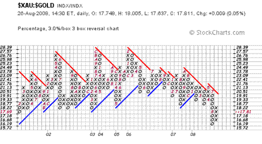
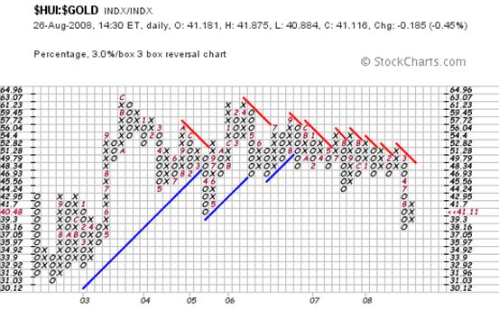
If this breakdown flows from “capitalisation” issues then the $HUI (which contains more speculative equity counters in the gold universe than the $XAU) should be reflecting a greater level of fear about the coming scarcity of capital.
At face value, the chart below shows this to be a possibility
The chart below shows the ratio of the $HUI:$XAU
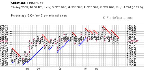
Objectively, there has been no breakdown (yet) but the market does seem to be worried about this issue of capitalisation.
Alterntively, is the market worrying more about deflation?
Frankly, there has been a recent development which has gotten this analyst thinking about that possibility. It is the fact that the monthly chart of the 30 year yield (courtesy decisionpoint.com) seems to be wanting to weaken.
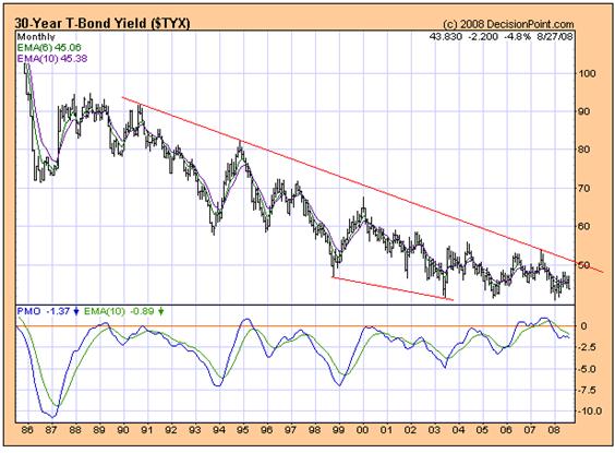
The PMO has been showing a series of rising bottoms since 1999. But, looking at the most recent data, there is the hint of a possibility that the rising trendline which joins these bottoms may be in danger of downside penetration.
When we ratchet the microscope up a notch to look at the weekly chart, we see what might even be a sell signal on the PMO.
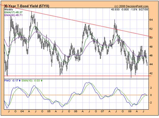
Note how the blue line of the PMO has recently crossed over and down through the green Moving Average line. When this happens at the zero line it tends to be significant.
What might this mean?
What it “might” mean is that the velocity of money might be slowing. Yes, in an environment of deflation, cash is king, but if the velocity of money slows then the demand for money for commercial transactions will also slow.
But, if the demand for money for commercial transactions slows, why is the US dollar so strong? The Dollar Index has risen from 71 to 77 in the past few weeks.
Well, is it all that strong? The Point and Figure Chart below is showing that the rise may have been nothing more than a technical bounce.
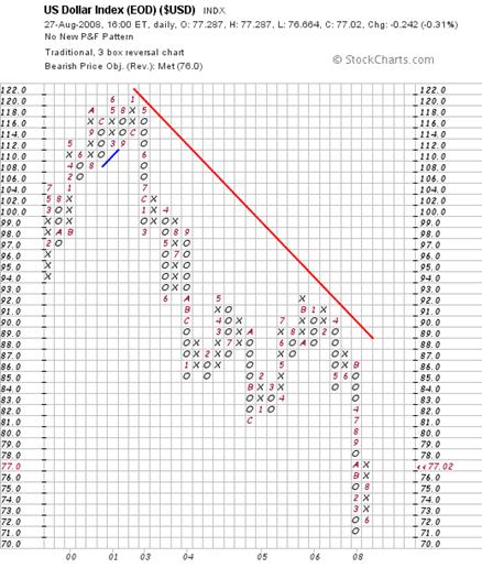
Conceivably, it might rise all the way to 86 and still be in a bear trend.
So what the hell is going on?
The 3% X 3 box reversal P&F chart of commodities seems to me to be offering a clue
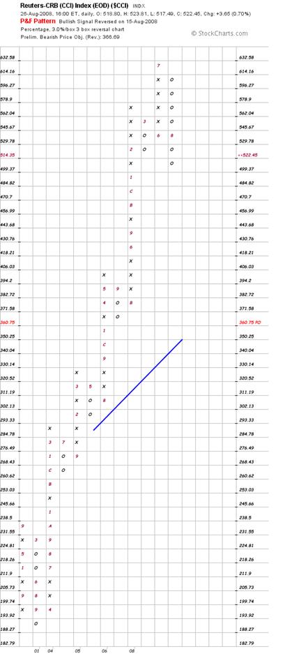
It has risen too far from its rising trendline for “normal” comfort. The vertical destination count of 360 would still cause the Commodities Index to be trading above its rising trend line, but I am suspicious of vertical counts that target moves against the Primary Trend. If the Primary Trend is “up” then I would prefer to trust the horizontal downside count target – which is around 470.
Having said this, my assessment assumes that the Primary Trend will remain pointing up.
Interim Conclusion
The markets seem to be pausing for what may be described as a “reality check”. Some steam is escaping from the pressure cooker, and the heat of the stove has been turned down to “low”, but not “off”.
If this interim conclusion is true, then this begs the question as to whether the markets will continue to simmer.
The chart below is absolutely fascinating to this analyst. (Go figure. Isn't it amazing what turns some people on J )
Well, hear me out on this one. Maybe you'll agree.
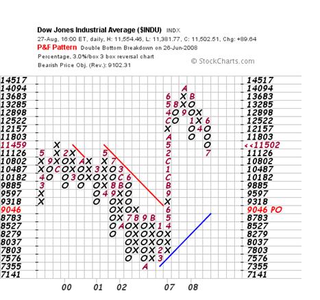
The downside count of this chart is showing precisely the same picture. Even if the vertical count target level of 9046 is reached, it will still not have penetrated the rising trendline on the downside.
What does this mean?
Well, to me it means that the markets are not positioning to panic. They – ALL of the equity, commodity and bond markets - are pausing to catch their breath.
Will the old heady days return? Probably not for a long time.
The chart below of the Standard and Poor is (yet again) showing precisely the same pattern – a forecast significant pullback within the context of a rising trendline.
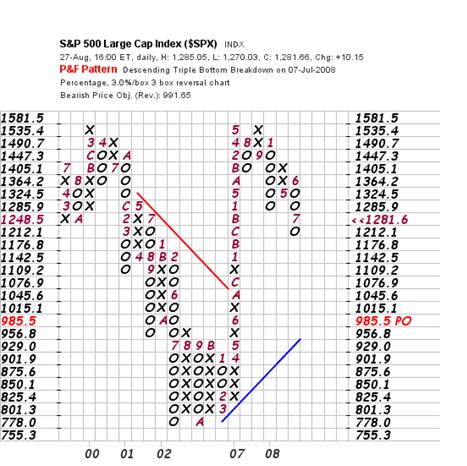
The implications of a pullback of the S&P – as far as 985 – can be better seen from the monthly chart below.
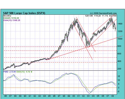
According to this chart, “sanity” will likely return in that my colleague Daan Joubert's “Preferred Gradient” concept is clearly visible. There are two angles of incline or “Preferred Gradient's” in the chart above. The steep angle of incline (penetrated on the downside 8 months ago) has been in place since 2003, and the shallow angle of incline has been in place since 1986 (on this chart. It may go back further). There was a period between 1995 and 2000 when the steeper angle prevailed – and then the market pulled back to the shallower angle. Then the steep angle manifested again. Now the shallower angle looks like it may be the prevailing Preferred Gradient.
Daan has been in correspondence with me recently about this concept and I think this man may go down in history as a technical genius who discovered an entirely new concept in investment analysis. I had the privilege of using his system 25 years ago when it was being developed and I just took it for granted at that time. He is now formalising the theories which underlie the concept and I would recommend investors take them very seriously. He is about to begin publishing the underlying theories. In my mind, they have the potential to change the way we look at investment and, therefore, they are extremely valuable.
Conclusion
Taking into account Daan Joubert's concept of Preferred Gradients – very loosely applied here because they are far more complex than I have alluded to above - the markets appear to be pausing for breath allowing sanity to return. Whilst we might well be facing some years of a trading range, the concept of a market crash does not seem to be raising its head in the investment world at this point in time. Of course, this is not to say that the position won't change but, right now, this conclusion is the most reasonable. Of course, within every trading range there are trading opportunities. However, if you are not a trader, then it might be well to focus more intently on underlying fundamentals – because it seems that this is more likely to be the driver of price movements going forward.
Copyright © 2008 Brian Bloom - All Rights Reserved
Disclaimer: The above is a matter of opinion provided for general information purposes only and is not intended as investment advice. Information and analysis above are derived from sources and utilising methods believed to be reliable, but we cannot accept responsibility for any losses you may incur as a result of this analysis. Individuals should consult with their personal financial advisors.
Brian Bloom Archive |
© 2005-2022 http://www.MarketOracle.co.uk - The Market Oracle is a FREE Daily Financial Markets Analysis & Forecasting online publication.