


Critical Impact Of US Medicare Premiums On Social Security Inflation Indexing
Politics / Inflation Dec 30, 2017 - 02:22 PM GMTBy: Dan_Amerman

 Medicare premiums are already eating Social Security inflation indexing from the inside, there have been effectively no real increases in net Social Security benefits for those 65 and over in recent years. And we are just getting started.
Experts agree that the Medicare program has far worse expected financial problems than Social Security over the long term. What is little understood, however, is that Medicare premiums are the back door whereby the health care expenses of an aging nation consume the individual standards of living that can be provided by Social Security. This process can entirely change our personal standards of living in retirement and needs to be fully taken into account when making financial planning decisions.
In this fourth analysis in a series, we are going to for the first time combine three levels of obscure technicalities to calculate the precise numbers for something that is not being reported upon enough - but that many millions of people are actually experiencing in their lives right now. When we combine all three factors of inflation lags, index mismatches, and rising Medicare premiums, the average retiree has already lost almost two weeks of the annual purchasing power of their Social Security benefits net of Medicare Part B premiums, just between 2015 and 2017.
If recent trend lines continue, the average retiree in the United States will lose a total of 3 weeks of the purchasing power of their net Social Security benefits by 2019, and more than a month of purchasing power by 2022 (relative to the purchasing power of net benefits in 2015 with no inflation lags).
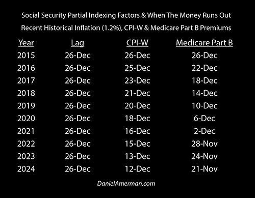
By 2024 if a retiree on a tight budget needed 12 full months of income to pay 12 full months of expenses - they will instead be running out of money by November 21st of that year.
What is explored in this Part 4 analysis could be called a somewhat ironic generational knowledge mismatch when it comes to how Social Security actually works. On the one hand we have tens of millions of people in their 40s, 50s and early 60s who are earnestly making retirement plans based on the conventional assumption of the full inflation indexing of Social Security benefits.
On the other hand we have many millions of people in their late 60s and older who have been actually collecting Social Security benefits while paying Medicare premiums in practice - and they understand full well how broken the inflation indexing of Social Security has been in recent years.
As will be demonstrated in this analysis - which is based entirely on official government statistics and their extrapolation into the near future - a generation of retirees is currently being slowly impoverished in plain sight. What is happening in real time with actual retirees has not however yet been generally incorporated into conventional financial planning for retirement for future retirees - and it badly needs to be, if genuine financial security is to be achieved.
Highlights Of Previous Three Analyses
As established in the first three analyses of this series, a more complete overview of which is linked here, Social Security is not fully inflation indexed as a matter of design
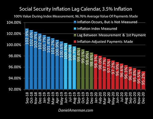
There are instead two distinct forms of inflation lags as explored in the Part 1 analysis which is individually linked here. We have the lag between when inflation is measured (the light blue bars) and when the first payment based upon that measurement is actually made (the red bars).
And then on top of that we have a steadily decreasing purchasing power for each benefit over the course of the year, which with historically average inflation means that the December benefits are likely to have a purchasing power of only 95 cents on the dollar.
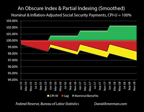
In the Part 2 analysis which is linked here, we examined the mismatch between the widely reported CPI-U inflation index and actual gross Social Security increases in practice, which are based on the much less reported CPI-W index and the particular methodology used by the Social Security Administration. We found there was a slight mismatch between 2015 and 2018, with gross Social Security Benefits increasing at an average of 0.75% per year, and lagging the CPI-U for those measurement dates by 0.47% per year.
If recent history were to repeat itself with very low rates of inflation, this index mismatch in combination with inflation lags would still be sufficient to cost the average retiree almost 3 weeks of purchasing power by the year 2024, relative to the inflation-adjusted value of benefits in 2015
In the Part 3 analysis which is linked here, we moved to a historically average rate of inflation of 3.5%, allowed for still mild 0.60% mismatch between the growth rate in retiree expenses and the benefit increase methodology used by the Social Security Administration, and looked a full 10 years and 20 years into the future.
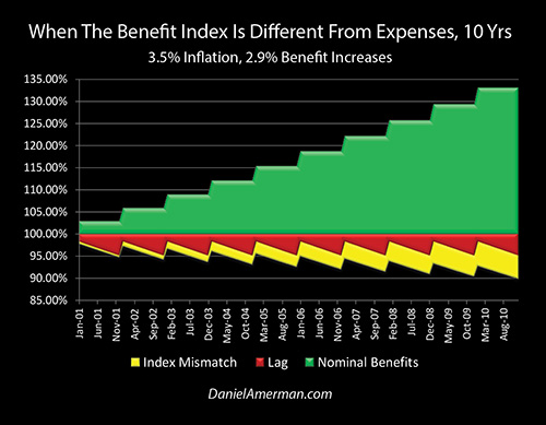
We also further developed the base Social Security purchasing power pattern shown above, with (1) the green stair step pattern of annually increasing benefits on a nominal basis (not adjusted for inflation); (2) the red saw-tooth pattern of real purchasing power when inflation lag losses are taken into account; and (3) the growing yellow area of cumulative purchasing power losses from the mismatch between the growth rate of retirement expenses and Social Security indexing. Because purchasing power losses are the sum of inflation lag losses and index mismatch losses, (4) a downwards zigzag pattern is created, with the bottom edge showing the monthly purchasing power of Social Security benefits over ten years.
As determined in that analysis, even these quite technical adjustments are sufficient to reduce the purchasing power of gross Social Security benefits by more than a month within 10 years, meaning that those on a tight budget for whom Social Security is most or all of their income, would have to find ways of covering 12 months of expenses with effectively only 11 months of income to work with.
Recent Benefit Increases & Medicare Part B
There is however a basic current issue, as most current Social Security recipients who are over the age of 65 are well aware of, but which those who are younger may not have spent much time thinking about.
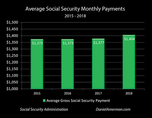
The above graphic shows actual average gross Social Security monthly benefits from 2015 to 2018 (for an average 2017 recipient). Benefits started at $1,373 in 2015, there was no increase in 2016, there was a 0.3% increase in 2017, and then a 2.0% increase for 2017 brings the average monthly benefit up to $1,404.
This $31 increase in monthly benefits has been slow to arrive, but it is positive, and on average there have been 0.75% annual increases for the years 2016, 2017 and 2018. It was this 0.75% number that produced the 0.47% annual mismatch when compared to the CPI-U inflation index, that was examined on a smoothed basis in the Part 2 analysis.
There is a problem, however, as most current Social Security recipients are well aware. More than 70% of total Medicare recipients have their Medicare Part B premium deducted from their monthly benefits. There are some advantages to doing so having to do with both convenience and the "hold harmless" provisions.
The regulations covering the relationship between income, Medicare Part B, "hold harmless" and Social Security claiming decisions are of critical importance to retirement planning, but we will set those aside for now and just focus on what has been happening in practice with the average retiree.
According to the Centers for Medicare & Medicaid Services governmental agency, the base Medicare Part B monthly premiums were $105 in 2015, the same in 2016, they rose to $109 in 2017, and rose again to $134 in 2018.
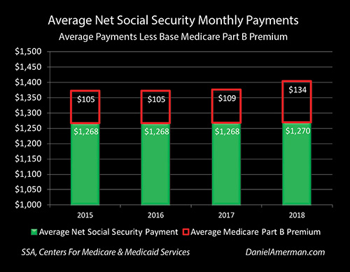
The effect of deducting the Medicare Part B premiums is shown in the hollow red boxes above, with the green bars now being the net monthly payments, the money that can actually be spent. When we look at net payments, there was no increase in 2016, the Medicare premium increase entirely consumed the 2017 Social Security benefit increase, and $25 of the $27 benefit increase for 2018 was also taken. This left the average Social Security recipient with only $2 in increased net monthly payments over the 2015 to 2018 period, which is an annual growth rate of only 0.053% or just over five hundredths of one percent per year.
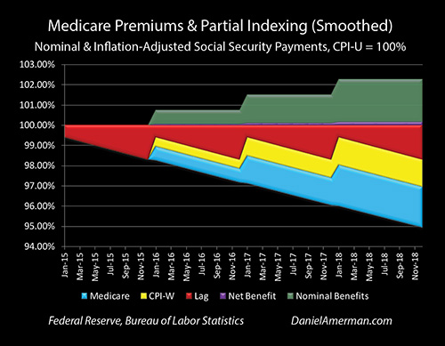
Combining The Three Purchasing Power Losses, 2015 To 2018
To examine the full impact of Medicare premiums effectively consuming Social Security inflation indexing - we need to include all three sources of purchasing power losses. For this examination, we will return to our Part 2 analysis where we on a smoothed basis combined the very low government reported CPI-U rate of inflation and accept it as accurate (for now), used the actual Social Security benefit increases, and we now also take into account the actual base Medicare Part B premium increases.
Everything is as reported by the government, and it is a bit of a blend of past and future. Most of the information is known for sure as it has already occurred, we also know now what average Social Security benefits and base Medicare premiums will be until the end of 2018, all that we don't know is inflation between now and then. So the 1.216% inflation rate seen through September of 2017 is extrapolated forward to the end of 2018.
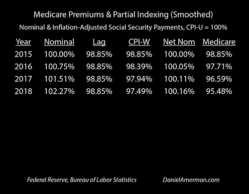
On a smoothed basis, gross benefits are up by the annual average of 0.75% for 2016, so the total nominal benefit is up to 100.75%. As seen in the "Lag" column, if that benefit increase were properly indexed, even with a very low 1.216% rate of inflation it would still only have an average purchasing power of 98.85% because of the twin inflation lag losses (the Part 1 analysis).
But the benefit increase on a smoothed basis comes up 0.47% short of the CPI-U general rate of inflation. So for 2016, the "Mismatch" column show that purchasing power is down to 98.39%, when our index mismatch is taken into account (the Part 2 analysis).
The next level of reality as seen in the "Net Nom" column is that net nominal Social Security benefits on a smoothed basis only rose by an average of 0.05% - not 0.75%. When we take that into account then the average purchasing power of net Social Security benefits in 2016 as shown in the "Medicare" column is only 97.71% (this Part 4 analysis).
So on a smoothed basis and based entirely on accepting government statistics at face value (for now), the retirees of the entire nation lost about 2.3% of their purchasing power in a single year, relative to the value of the 2015 payments with no inflation lags. Looking at this on a 365 day year basis, that is a loss of about 8 days of income, or just over a week of their 52 weeks of annual purchasing power.
By 2017, the smoothed purchasing power in the last column is down to 96.59%. On a 365 day year basis, that is a shortfall of 12.4 days, or almost two weeks of net Social Security purchasing power. If may not have been reported upon - but this has already happened on average for the retirees of the nation.
The purchasing power of net Social Security benefits falls further to 95.48% in 2018, assuming that there is very low inflation. That is a shortfall of about 16.5 days, or almost two and a half weeks of lost annual purchasing power.
Now, some people who are currently retired may believe that it is only Medicare premium increases that are consuming the value of their Social Security benefits. But as is clearly shown above - that isn't the case.
Rising Medicare premiums are responsible for less than half the damage by 2018, it is the inflation lag losses and index mismatch losses that account for the slight majority of lost purchasing power. As is being developed in this series of analyses, it is only when we explicitly combine all three sources of purchasing power losses that we can then see the real bottom line of net Social Security benefit purchasing power.
Wiping Out Inflation Indexing In Practice
When we visually look at the smoothed patterns from 2015 to 2018, there are three major changes from the Part 2 analysis.
The bold and prominent green stair step pattern of nominal gross benefit increases has become semi-transparent - because the supposed benefit increases are illusory for most, they are being almost entirely eaten up by Medicare premium increases for those 65 and older (and by the potentially larger private health care insurance cost increases for those 64 and younger).
When we look at average Social Security benefits net of base Medicare premiums we get reality - which is the new purple line. You might have to lean in and look very closely to make out the rising purple line - and this is accurate, because it is very hard to see the reality of 0.05% average annual net benefit increases, or to see a nation getting a $2 monthly raise over a period of three years.
Traveling down, we next see the familiar red "saw-tooth" pattern of purchasing power losses from Part 1, where our January payment is worth less than it was at the time inflation was measured by the Social Security Administration the previous summer, and it steadily declines in value over the course of the year
When we take into account the index mismatch from Part 2, we get the pattern of the widening yellow zigzag area, where the combination of inflation lag losses and cumulative index losses creates a January purchasing power that is little less each year than the year before, with a new low being set (on average) by December of each year.
What creates that downwards yellow zigzag pattern is the reset of the benefits every year, which is the result in the green stair step pattern of inflation indexing. But when the stair step of benefit increases are almost entirely consumed by Medicare premiums, the zigzag is also almost entirely knocked out. And what we are left with is not a zigzag - but an almost straight line moving downwards.
The blue pattern above is our purchasing power losses which are the result solely of the increases in Medicare Part B premiums. Every January that benefits would have gone up - but they didn't on a net basis because of Medicare - we get a big expansion of the blue area. We now have an almost straight line going down, where our net benefits every month of every year are worth a little bit less (on average) than they were the previous month.
Now again, there is the tempting simplification to say that Social Security indexing is getting knocked out solely as the result of Medicare premium increases. If you read some of the newspaper articles at the time that the 2017 and 2018 Social Security and Medicare changes were announced, that might be exactly what you think.
However, as can be plainly seen visually - that simplification is not true, and is indeed quite misleading. Medicare Part B premiums are very important - but they are less than half the problem in the early years.
It is only when we look at all three factors in combination that the full purchasing power cost can be seen, and the true nature of the challenge becomes clear.
What If The Recent Past Repeats Itself?
The problem with individually very small and obscure annual changes in multiple exponential series, is that it is difficult for most people to intuitively grasp just how powerful they can cumulatively become in combination over time.
The premise of the table below is to say "what if" the recent past as reported by the government were to simply repeat itself. What if we extrapolate the recent past into the future and say that Social Security benefits were to continue to increase at a smoothed annual rate of 0.75%, but rising Medicare Part B premiums were to consume all but 0.05% of those benefit increases, and inflation were to persist at a very low rate of just over 1.2%?
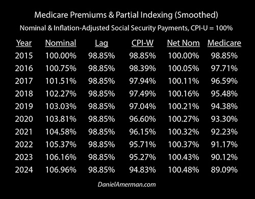
The first three columns of "Nominal", "Lag" and "CPI-W" are identical to what was calculated in the Part 2 analysis, and are explored in greater detail in that analysis.
If the recent past were to repeat itself, then as shown in the "Nominal" column, by 2024 gross monthly Social Security benefits would be almost 7% greater than they were in 2015. For an average recipient, this means that benefits would grow an additional $65 above their 2018 level, for a total of $1,469 per month.
On a reality basis if what the government says is a 1.216% inflation rate persists - after inflation lags, the purchasing power never rises above 98.85%.
If the 0.47% mismatch between CPI-U inflation and benefit increases persists, then as shown in the CPI-W column, the purchasing power of gross benefits will be down to 94.83% by 2024. meaning the average recipient has lost about five cents on the dollar in purchasing power, compared to 2015.
However, if we extrapolate our recent history with Medicare Part B premiums into the future - net benefits are not up almost 7%, but increase by just under one half of one percent, to a total of 100.48% as shown in the "Net Nom" column.
This crippling of inflation indexing brings the purchasing power of net Social Security benefits down to 89.09% when compared to 2015 - even with a very low inflation rate of just over 1.2%.
The combined and cumulative power of the small annual changes in these technicalities can be seen graphically above. If what we have seen in recent years continues to repeat itself, by 2024 we have a rapid widening that is going on with both the yellow area of index mismatches and the blue area of cash flow lost to Medicare premium increases.
Each factor has a surprising power over time - either one is individually capable of fundamentally changing standard of living in retirement, given enough time. When they are combined, however, what happens is that the damage is rapidly pulled forward in time. So what would have been waiting for us in the late 2020s to 2030s anyway, is pulled forward into the early to mid 2020s instead.
Because the extrapolated damage from rising Medicare premiums is occurring at a faster rate than the damage from gross Social Security benefit increases not quite keeping up with the growth in retiree expenses (0.70% vs 0.47%), the pattern of the blue area does widen at a faster rate than the yellow pattern.
Relative to the beginning of 2015, a full three weeks of purchasing power have been lost by the end of 2019. So as developed in Part 1, if we assume a retiree on a very tight fixed budget, who needs 12 months of income in full to meet 12 months of expenses, then they would effectively be running out of money by December 10th of 2019.
More than four weeks of purchasing power are gone by the end of 2021.
The money is running out in November by the year 2022.
By 2024 every Social Security recipient, in all their millions, would have lost the equivalent of six weeks of purchasing power to the cumulative impact of the three obscurities. Meaning if 12 months of income are needed in full to make 12 months of expenses, the money would run out by November 21st - even before Thanksgiving.
A Sense Of Déjà Vu
For those who have read the Part 3 analysis, they may be feeling a sense of Déjà Vu. Didn't we just do this?
Didn't we just change a few assumptions in a very mild and even conservative fashion, and all of sudden the money for the retirees of an entire nation was running out by November 29th?
That was a shocking conclusion. And now we have another shocking conclusion that is a little worse, but looks very similar - even using conservative assumptions, in the relatively near future retirees have 12 months of expenses but only 11 months of Social Security purchasing power.
Are they the same?
The fundamental issue for our nation, and the reason for what is being assembled step-by-step in this series - is that they are not the same thing.
Both Part 3 & Part 4 are based upon the Part 2 analysis, where using recent historical data we combined the inflation lag and minor index mismatch technicalities for the first time, and determined that if recent history were to repeat itself then the money would run out by December 12th in 2024.
In Part 3, we did three tweaks: 1) raising the very low 1.216% recent CPI-U inflation rate to the long-term (1933 - 2017) historical average of about 3.50%; 2) slightly raising the mismatch between Social Security benefit increases and the rate of growth in retiree expenses from 0.47% to 0.60%; and 3) looking a full ten years out, instead of just to 2024. Those seeming subtleties were enough to make the money run out by November 29th.
In this Part 4, we just made one entirely different change - we included what has been happening in the real world in recent years with base Medicare Part B premiums. When combined with our two technicalities from Part 2, if we extrapolate the recent past into the near future, then the money runs out by November 21st in 2024. So we got to a similar place, but by an entirely different path.
Each time we merge trivial obscurities - there is a surprising power to the results. We have not yet merged all the technicalities together, that will be the focus of the Part 5 analysis.
Slow Impoverishment Happening In Plain Sight
What makes this all the more remarkable - is that this is all based on official government statistics and is happening in plain sight.
This assumes (for now) that every government statistic used is completely accurate. That there are no changes in the law. That inflation is extremely low for the entire ten years. That Social Security is untouched, with payments being made in full and every dime of benefit increases occurring as required by law.
But yet - the potential destination is extraordinary.
Few may pay attention or understand the details as they have been slowly occurring in real time - and this may continue to be the case for those who are not yet retired.
Many people would probably prefer to watch paint dry rather than understand the twin mathematical obscurities that determine the real costs of inflation lags
And let's face it, watching the grass grow has some real appeal as an alternative to working out the relationships between the CPI-U, the CPI-W, and Medicare Part B premiums.
But participation is nonetheless mandatory for everyone who is depending on Social Security for a significant portion of their income in retirement.
The loss of purchasing power that has already occurred is very real. If recent history repeats itself the losses will become much more significant over the next several years.
And if we say no gloom and doom, no disasters, no big government conspiracy, and Social Security works exactly as promised, but the little obscurities continue to follow their recent trend lines - then by sometime in the early 2020s the average retiree may be coming up a full month short when it comes to the purchasing power of their net Social Security benefits, relative to what they were in 2015.
Someone who was retired in 2015 may have a full month less of purchasing power on an annual basis by 2022. Someone who is not currently retired but does retire in 2022 may start a potential multi-decade retirement with a full month less of purchasing power - and that could be the best financial year of their retirement, with the slow reduction of real income continuing from there forward.
Millions of lives will be changing in a major way - and there will be no missing that, even if the reasons why are never fully understood.
Now, that is not to say that this is some sort of firm forecast that there will be a decline in purchasing power to precisely 89.09% by exactly the year 2024. Rather, it is an educational and illustrative examination of what happens if the current trend lines continue, and we extrapolate those precise numbers into the near future.
Where we actually are in 2024 is likely to be different. It could be better. It could be worse.
Social Security Decisions
There are a number of sophisticated Social Security and retirement planning aids out there which produce what appear to be authoritative results, based upon the full inflation indexing of Social Security benefits. These models often show a major advantage to deferring claiming Social Security benefits until age 70 if possible.
The price is that for high earning individuals who have paid large payroll taxes over the years, they may be giving up close to a quarter million dollars in Social Security benefits before age 70. So the question becomes how long does someone have to live before deferring benefits becomes a good decision?
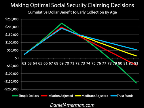
The analysis shown above and linked here does show the big hump of initial benefits foregone, and then it shows the crossover ages where deferring collection until age 70 becomes financially worthwhile. The green line does not take inflation into account, and is the basis of many naive decision models that are nonetheless in wide circulation. The red line takes inflation into account - assuming full inflation indexing and one of the inflation lags (so it is just a little more financially sophisticated than the norm). It shows that for someone who lives an average life span - there is indeed a significant advantage to deferring the claiming of Social Security benefits.
The yellow line does not include index mismatches, but it does include a mild version of the subject of this analysis, which is the impact of Medicare premiums. When premiums and "hold harmless" protections are taken into account - just that by itself can be enough to move the crossover date to beyond the average life span, and to shift the advantage to early collection.
The Broader Picture
What also needs to be understood is that this slow but powerful process is not negative for all, and there is a financial beneficiary. If an average retiree is losing 11% of the purchasing power of their net Social Security benefits by 2024 - then the heavily indebted and financially stressed United States government is saving 11% compared to what the cost would be if Social Security really worked the way that most people think it does.
This would be a nominal savings of over $150 billion a year for the government, based on current projections.
If the federal government were to openly announce it was reducing retiree standards of living by over 10% there would likely be a political revolution. But by slowly accomplishing the exact same thing through the mathematically complex combination of the individually obscure factors - nobody fully gets it, and there is little effective political cost.
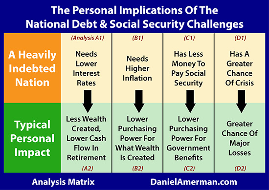
The analysis herein falls into the C2 family of analyses that can be found in the analysis matrix shown above and which is linked here. Because a heavily indebted nation has less money to pay Social Security (the C1 analyses), there is an enormous incentive for it to lower the purchasing power of Social Security payments.
What anyone who is investing to overcome a declining purchasing power for net Social Security payments needs to keep in mind, however, is that with the United States government currently being over $20 trillion in debt - it isn't just the "C" column. The government also has big problems with higher interest rates, as covered with the A1 analyses.
And as it turns out - there are a related but quite different set of trivial (but exponential) obscurities acting in mathematical combination when it comes to the relationship between interest rates, inflation and saver purchasing power over time. Indeed, over time trillions of dollars in real wealth can be effectively redistributed from individual retirement savers to the federal government in a manner which very few individuals fully understand or are taking into account with their financial plans. Those crucially important investment "technicalities" for individuals are examined in the A2 & B2 families of analyses.
Conclusion - The Biggest Obscure Technicality Of All
Some people have been saying that the last few years are just an anomaly. The idea is that we have just happened to hit a somewhat unusual combination of very low general inflation producing very low benefit increases, while we had particularly high inflation with the medical expenses that drive Medicare Part B premiums. It is that unusual low/high general and medical inflation mismatch which produces what is purported to be the bizarre and temporary situation of Medicare almost entirely destroying Social Security inflation indexing.
So the argument is that if the future holds the opposite combination of higher rates of general inflation producing larger Social Security benefit increases, while the growth in Medicare premiums slows down materially, then we return to the "normality" of having net benefits grow on a much more significant basis each year.
That could certainly happen.
Indeed, in the next analysis in this series that is exactly what we will assume - a historically average rate of inflation producing much larger annual benefit increases which substantially exceed what are on average much smaller annual increases in Medicare Part B premiums.
From a long-term perspective, what has been seen in recent years is an unusually prominent but still early stage and weak manifestation of the financial intersection between Social Security and Medicare for individual retirees. As we will see, there is a strong case to be made that the "obscure technicality" of Medicare premiums effectively crippling the inflation indexing of Social Security - and the standard of living for millions of retirees along with it - is a process that is just getting started, and it will necessarily grow far more powerful in the coming years and decades.
Daniel R. Amerman, CFA
Website: http://danielamerman.com/
E-mail: mail@the-great-retirement-experiment.com
Daniel R. Amerman, Chartered Financial Analyst with MBA and BSBA degrees in finance, is a former investment banker who developed sophisticated new financial products for institutional investors (in the 1980s), and was the author of McGraw-Hill's lead reference book on mortgage derivatives in the mid-1990s. An outspoken critic of the conventional wisdom about long-term investing and retirement planning, Mr. Amerman has spent more than a decade creating a radically different set of individual investor solutions designed to prosper in an environment of economic turmoil, broken government promises, repressive government taxation and collapsing conventional retirement portfolios
© 2017 Copyright Dan Amerman - All Rights Reserved
Disclaimer: This article contains the ideas and opinions of the author. It is a conceptual exploration of financial and general economic principles. As with any financial discussion of the future, there cannot be any absolute certainty. What this article does not contain is specific investment, legal, tax or any other form of professional advice. If specific advice is needed, it should be sought from an appropriate professional. Any liability, responsibility or warranty for the results of the application of principles contained in the article, website, readings, videos, DVDs, books and related materials, either directly or indirectly, are expressly disclaimed by the author.
© 2005-2022 http://www.MarketOracle.co.uk - The Market Oracle is a FREE Daily Financial Markets Analysis & Forecasting online publication.