


Stock Market Q1 2018 Outlook: We’re Gonna Need a Bigger Slide
Stock-Markets / Stock Market 2017 Dec 31, 2017 - 04:25 PM GMTBy: F_F_Wiley

 If 2018 rings in a bear market, it could look something like the Kennedy Slide of 1962.
That was my conclusion in “Riding the Slide,” published in early September, where I showed that the Kennedy Slide was unique among bear markets of the last eighty years. It was the only bear that wasn’t obviously provoked by rising inflation, tightening monetary policy, deteriorating credit markets or, less commonly, world war or depression.
Moreover, market conditions leading up to the Slide should be familiar—they’re not too far from market conditions since Donald Trump won the 2016 presidential election. In the first year after Kennedy’s election, as in the first year after Trump’s election, inflation seemed under control, interest rates were low, credit spreads were tight, and the economy was growing. And, in both cases, the stock market was booming.
Here’s an updated look at Trump’s stock rally versus the Kennedy rally and subsequent Slide:
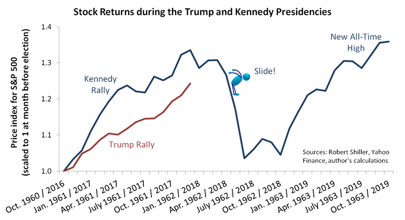
As you can see, we’ve now reached the chart’s critical juncture—at this time of the calendar in 1962, the post-election rally was ending, and the Slide was about to begin. Our chart begs the question: Will the similarities continue and lead us into a Trump Slide in early 2018?
Or, with less drama, you might like to hear my Q1 stock market outlook.
While it’s certainly possible Trump’s rally has run its course, I’ll argue that it’s unlikely. And to make my case, I’ll rely largely on a single indicator, one that measures monetary policy. I use the indicator to help determine whether policy is behind the curve, ahead of the curve, or somewhere in between. In this article, I’ll call it VCURVE, for “versus the curve.”
Tracking VCURVE through 16 Market Corrections
Before I explain how VCURVE is calculated, let’s look at the history. The following chart compares VCURVE to every instance since 1954 when the stock market corrected by more than 10% and for at least two months:
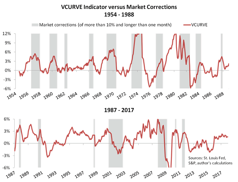
The upper panel shows an especially strong correlation with stock price cycles between 1954 and 1988. All ten of that period’s market corrections coincided with an upward spike in VCURVE. Despite a few instances of delay between the change in VCURVE and the market’s reaction, the indicator’s early track record was stellar—it predicted every correction with almost no head fakes. (I say “early track record” because fed funds data is only available from 1954. I’ll modify the indicator to gain a longer history at another time.)
But the historical performance didn’t persist after the 1980s at the same exceptional standard. The lower panel shows the correlation weakening, with jumps in VCURVE becoming a fifty–fifty proposition as to whether they signal a market correction.
The reason for the weaker correlation is open to debate, but I would say it’s explained mostly by the Fed’s practice of jumping to action at any hint of market turmoil. VCURVE probably hasn’t shown the same predictive power under the FOMCs chaired by Alan Greenspan, Ben Bernanke and Janet Yellen because of the respective Greenspan, Bernanke and Yellen “puts.” Whereas VCURVE before Greenspan was as reliable an indicator as you’ll find, more recently the Fed’s plunge-protection game often wins the day.
Calculating VCURVE
All that said, even the chart’s lower panel shows an excellent market indicator. The head fakes may be more frequent, but every correction still lines up with a degree of VCURVE turbulence. And just as importantly, it’s an easy indicator to calculate. Here are the two steps:
- From the current fed funds rate, subtract the lowest rate since the last market correction.
- Add the change in inflation over the past twelve months.
The first step tells us how far along the Fed is in a tightening cycle, and the second converts that figure to a measure of where the Fed stands versus “the curve.” Consider a few possible combinations:
- If the current tightening cycle is far along but inflation is falling, VCURVE won’t be as high as it otherwise would be, because the Fed has taken enough action to dampen inflation risks. (Policy is ahead of the curve.)
- If the current tightening cycle is young but inflation is rising, VCURVE will be higher than it otherwise would be, because the Fed may be forced to tighten more aggressively to contain inflation risks. (Policy is behind the curve.)
So VCURVE has three qualities that make it an effective indicator. It’s conceptually relevant, easy to calculate and historically proven.
And what does it tell us today?
At first glance, the latest reading is ambiguous. It’s higher than it was between 2012 and 2015, but only modestly so at 1.6%. To glean more information, we’ll take a closer look at the indicator’s history.
Testing VCURVE against Subsequent Real Stock Returns
The next chart shows average inflation-adjusted stock returns over three-month periods following VCURVE readings in each of seven buckets:
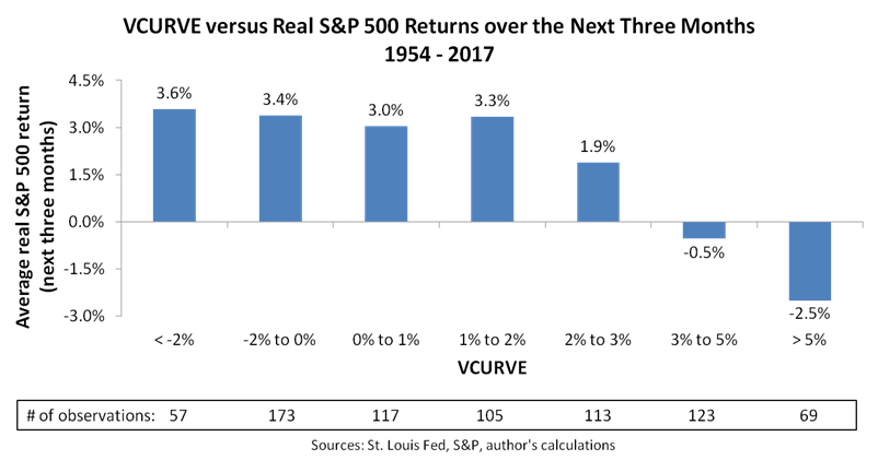
From the pattern shown on the chart, we can make two observations:
- The strongest real returns tend to follow VCURVE readings of less than 2%.
- Real returns don’t normally fall below zero until VCURVE jumps above 3%.
We shouldn’t bet all our chips on the exact thresholds of 2% and 3%, history not always repeating and all that, but the pattern gives us a reasonable guide to early 2018. The latest reading of 1.6% falls within a range that’s followed by real quarterly stock returns averaging over 3%—hardly a bearish signal.
Conclusions
More broadly, two particular risks pose the greatest threats in early 2018. First, the market may have run too hot since Trump’s election, leaving investors overextended and unable to push prices higher. An overbought market appears to partially explain the Kennedy Slide of 1962, and a similarly overbought market today could spark a profit-taking correction.
Second, the Fed’s determination to tighten policy should continue to push VCURVE higher, even as it’s not especially high today. To be sure, rate hikes alone are unlikely to make a difference until later in 2018 at the FOMC’s projected pace of twenty-five basis points every four months, but further hikes coupled with an unexpectedly large jump in inflation would be a different story. In a rising inflation scenario that shows the Fed falling behind the curve, a correction of at least 10% would be likely and we’d probably see a full bear.
Of course, plenty of other risks could gain traction as the year gets underway. See, for example, these thirty risks discussed by Deutsche Bank and ZeroHedge or these fifteen from Doug Kass and Real Investment Advice. Also, market valuation points to meager long-term returns, as I discussed in “2 Key Indicators” and then showed somewhat differently in “Charts that Might Define the Jerome Powell Era.”
On a three-month horizon, though, most of the best indicators favor continued strength. Credit markets aren’t nearly as threatening as they were before recent bears—delinquencies, credit spreads and bank lending standards are all either neutral or just mildly bearish at worst. Moreover, the real and financial economies appear settled into a “virtuous” loop of mutually reinforcing strength, as I discussed here, while the GOP’s tax cuts should help sustain that loop for awhile longer.
And lastly, the Fed’s inch-worming monetary tightening pace hasn’t accumulated enough force as of yet to push VCURVE into a danger zone. As possibly the most effective of all fundamental indicators, I don’t recommend betting against VCURVE.
All things considered, I expect market valuation to become even more expensive before the next correction takes hold. Comparing the Trump and Kennedy rallies—as in the first chart above—I expect Trump’s market to build an even bigger slide.
Author’s note: For more background on the economic thinking behind our research, see my book Economic for Independent Thinkers.
F.F. Wiley
F.F. Wiley is a professional name for an experienced asset manager whose work has been included in the CFA program and featured in academic journals and other industry publications. He has advised and managed money for large institutions, sovereigns, wealthy individuals and financial advisors.
© 2017 Copyright F.F. Wiley - All Rights Reserved
Disclaimer: The above is a matter of opinion provided for general information purposes only and is not intended as investment advice. Information and analysis above are derived from sources and utilising methods believed to be reliable, but we cannot accept responsibility for any losses you may incur as a result of this analysis. Individuals should consult with their personal financial advisors.
© 2005-2022 http://www.MarketOracle.co.uk - The Market Oracle is a FREE Daily Financial Markets Analysis & Forecasting online publication.