


This Isn’t Your Grandfather’s (1960s) Inflation Scare
Economics / Inflation Mar 15, 2018 - 10:31 AM GMTBy: F_F_Wiley

“This reminds me of the late 1960s when we experimented with low rates and fiscal stimulus to keep the economy at full employment and fund the Vietnam War. Today we don’t have a recession, let alone a war. We are setting the stage for accelerating inflation, just as we did in the late ‘60s.”—Paul Tudor Jones
As soon as the GOP followed its long-promised tax cuts with damn-the-deficit spending increases (who cares about the kids, right?), you knew to be ready for the Lyndon B. Johnson reminders.
And it’s worth remembering that LBJ pushed federal spending higher, pushed his central bank chairman against the wall (figuratively and, by several accounts, also literally) and eventually pushed inflation to post–Korean War highs.
Inflation kept climbing into Richard Nixon’s presidency, pausing for breath only during a brief 1970 recession (although without falling as Keynesian economists predicted) and then again during an attempt at wage and price controls that ended badly. Nixon’s controls disrupted commerce, angered businesses and consumers, and helped clear a path for the spiraling inflation of the mid- and late-1970s.
So naturally, when Donald Trump and the Republicans pulled off the biggest stimulus years into an expansion since LBJ’s guns, butter and batter the Fed chief, it should make us think twice about inflation risks—I’m not saying we shouldn’t do that.
But do the 1960s really tell us much about the inflation outlook today, or should that outlook reflect a different world, different economy and different conclusions?
I would say it’s more the latter, and I’ll give five reasons why.
1—Technology
I’ll make my first reason brief, because the deflationary effects of technology are both transparent and widely discussed, even if model-wielding economists often ignore them. When some of your country’s largest and most impactful companies are set up to help consumers pay lower prices, that should help to, well, contain prices.
2—Globalization
Globalization is another well-worn theme (I can hear the yawns), but it still gets overlooked. In the 1960s, developing countries hadn’t yet found much of a path to US consumers and businesses, such that America’s economy was protected from hundreds of millions of potential dollar-a-day workers. That’s no longer the case, and inflation fundamentals are no longer the same. As long as trade pathways remain open (watch the tariff war), policy makers should find it much harder to cook up inflation than they did fifty years ago.
As a measure of globalization, the chart below shows imports of goods separated by whether they come from developed or emerging markets (imports from emerging markets being more likely to dampen inflation) and comparing 1965 to 2017:
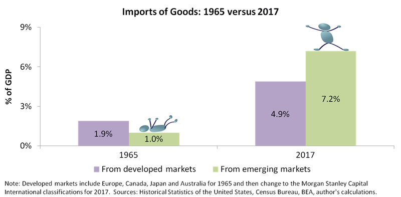
Of course, inflation responds not only to specific imports but also to the general threat posed by foreign competition. Nonetheless, the chart confirms the obvious—2018’s economy is less prone to inflation than the insular 1965 economy.
3—Private Debt
Just as increasing debt brings spending forward (more today, less tomorrow), it also brings inflation risks forward (again, more today, less tomorrow). If you borrow enough to drive private debt-to-GDP ratios well above 100%—as modern, developed nations tend to do—that can set up a disinflationary counterweight to crush any rise in inflation. The mechanism works like this:
- Inflation rises
- The inflation increase spooks bond investors and the central bank, lifting interest rates higher.
- In an economy that’s heavy with private debt, the increase in rates puts a dent in spending while stifling further credit creation.
- As credit dries up, pricing power disappears and disinflationary forces overwhelm the initial impetus to inflation.
In other words, in a debt-dependent economy, inflation breeds deflation.
Where does that leave us in our discussion of whether the 1960s should influence the inflation outlook today?
At a current reading of 150% of GDP, private nonfinancial debt is about two-thirds of GDP higher than it was in 1965, when it was only 84% of GDP. That’s relevant because 1965 was just before inflation began its ascent—core inflation climbed from 1.5% in 1965 to 3.1% in 1966 and 1967 and 4.7% in 1968. Private nonfinancial debt is also only 15% of GDP lower than it was in 2007, when it reached 165% of GDP, just before the global financial crisis seized up credit markets.
You’ll surely interpret those figures in your own special way, but to me they make the 1960s–70s experience a reach for today’s economy. That’s not to say we won’t see another severe inflation–interest rate spiral at some time in the future—we could see exactly that when investors give up on America’s public finances and force a debt restructuring. But that’s unlikely to happen anytime soon. In my opinion, America won’t restructure her federal debt until the 2040s at the earliest, because the Treasury market has enough history, inertia and central bank sponsorship to overcome junk-bond fundamentals. I expect a few more contractions in private credit markets—either with or without the inflation increase included in the steps above—before bond traders start treating Treasuries like they treated subprime adjustable-rate mortgages ten years ago.
4—Wage Growth
But how about a wage–price spiral—that’s how tax cuts and government spending increases should spark inflation, right?
Maybe so, but once again the 1960s don’t travel well to the third millenium. In the 1960s, both sides of the wage-negotiation table operated differently than they do today.
Wage earners bargained extra aggressively in the decades immediately after World War 2, thanks to union-friendly legislation in the 1930s and 1940s. In addition to annual pay gains of as much as 5% or more, they demanded substantial increases in pension and health benefits. And to make sure inflation volatility wouldn’t dilute their negotiating wins, they insisted on indexation—pay that automatically ratchets higher with each year’s inflation outcome.
Wage payers, meanwhile, were confident they could both inflate and grow their way into higher wages. They drew that confidence from a dearth of foreign competition, a belief the economy was more resilient than ever before (some thought the “New Economics” embraced by John F. Kennedy and then LBJ would abolish the business cycle), and in some industries, protective regulations that have long since been dismantled.
Even more importantly, wage payers were less profit-centric and more likely to apply a “stakeholder” approach to corporate governance. They protected the interests of each of their stakeholders, and wage earners were near the top of that list. In other words, higher wages didn’t send executives to the window ledge—companies just resolved to cover growing wage bills by selling more widgets while charging a higher price for each one.
So in hindsight the 1960s practically ordered up a wage–price spiral, as if selecting a flavor from Howard Johnson’s 28 choices. Needless to say, conditions in 2018 aren’t quite the same. Compared to the 1960s, businesses are more likely to fight wage increases and less able to raise prices.
And that’s not all, because the comparison should also consider how long it takes for a spiral to become established. I would say it takes quite a while, and here’s a chart that supports my position:
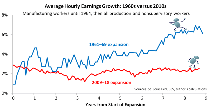
The chart’s blue line shows wage growth increasing from close to 3% to about 4% during 1965, just ahead of the beginning of the rise in core inflation. By comparison, the red line shows wage growth stuck at 2.5% as of the last data release. In other words, inflation didn’t begin its 1960s climb until wage growth was about two-thirds higher than the current rate. Of course, productivity growth was also higher in the 1960s, but that doesn’t explain away the stability of wage inflation as of this writing.
So what’s the bottom line when it comes to wage–price spirals?
Well, the cool kids will continue to call for rising wages, as they’ve been doing for several years now. This may be the year they get it right, but I wouldn’t put too much of your own pay package behind that bet. In fact, I recommend waiting it out. Considering “spiral” is something of a misnomer (unless it comes from a commodity shock, cost-push inflation is more like a slow stroll), let’s wait for real evidence of rising wages before sounding any alarms. With the current expansion soon to be nine years old, there’s an excellent chance of the business cycle ending after only a mini-spiral—one similar to the last three expansions—or even no spiral at all.
5—The Circular Flow
My final reason for discounting the 1960s might be the most important, because it gets at the types of imbalances that have triggered many high inflation episodes in world history. It relies on a variation on Monetarism that corrects for the Monetarists’ flawed treatment of money and banks.
In particular, leading Monetarists based their theories on research connecting money supply growth to GDP growth (both real growth and inflation), but without realizing their data was mostly showing a connection between bank lending and GDP growth. Instead of allowing that bank loans bring money into existence, they modeled banks as conduits, not creators, of the “initial monetary impulse.”
The Monetarists’ mistake wasn’t fatal, at first, because the monetary aggregates they followed, such as M2, correlated strongly with bank lending. But after the aggregates helped them predict inflation successfully in the late 1960s and 1970s, correlations weakened and the Monetarists’ forecasts became unreliable.
Confusing?
I recently covered this topic in detail, such as in last month’s “An Inflation Indicator to Watch.” In that 3-part article, I explained how we can spot both inflationary and disinflationary imbalances in the “circular flow,” referring to the circular relationship between spending and income. Here are the most important examples:
- Inflationary imbalances can arise when bank lending injects purchasing power into the circular flow, boosting spending above the prior period’s income. This is the piece that modifies Monetarism, by replacing the money measures Monetarists favor, such as M2, with measures that correlate more strongly with purchasing power and GDP, such as bank-created money.
- Disinflationary imbalances can arise when spending doesn’t adequately recycle back to income, opening a leak in the circular flow, which can happen, for example, when a country runs a substantial trade deficit.
Putting the types of imbalances together, we can construct an indicator that gives us a birds-eye view of inflation risks. When the indicator rises, inflation risks are high, and when it falls, inflation is likely to be contained apart from cyclical volatility. Here are the indicator’s readings for the current expansion versus the 1960s expansion:
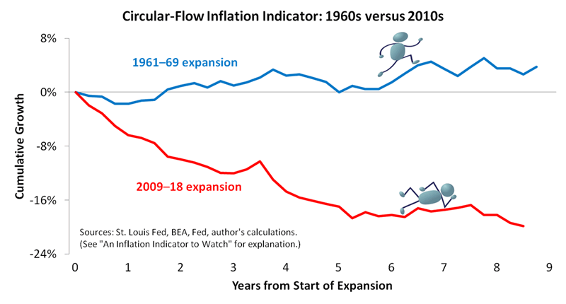
The chart provides yet another perspective on differences between the 1960s and today. It shows that inflationary circular-flow patterns were prevalent in the 1960s, whereas patterns of recent years have been benign. (For diagrams that depict the patterns I’m describing, see “An Inflation Indicator to Watch,” or for even more background, see my recently published book, Economics for Independent Thinkers.)
Conclusions
For a variety of reasons, I don’t buy the argument that we’re about to take a 1960s–70s-style inflation ride. I get the LBJ comparisons, and I can appreciate them, but current policy makers should find it harder to lift inflation than at the post–WW2 high water mark for insularity, labor strength and stakeholder-friendly corporatism. Moreover, private debt levels and circular flow analysis both suggest any inflation increase would be short-lived. In other words, LBJ never faced America’s current mix of disinflationary forces, and those forces are no pushovers.
Author’s note: As far as I can tell, only two authors have written trade books that focus mostly on America’s 1960s, 1970s and early 1980s battle with high inflation: William Greider (Secrets of the Temple) and Robert Samuelson (The Great Inflation and Its Aftermath). Greider’s book was widely read and praised (I’ve cited it in past articles), whereas Samuelson’s didn’t receive the attention it deserved. Samuelson not only blamed inflation on the macroeconomics profession’s arrogance and ineptitude (not a good strategy for winning mainstream acceptance) but had the misfortune of releasing the hardcover just as the financial sector imploded in autumn 2008. In any case, both books helped inform my article above.
F.F. Wiley
F.F. Wiley is a professional name for an experienced asset manager whose work has been included in the CFA program and featured in academic journals and other industry publications. He has advised and managed money for large institutions, sovereigns, wealthy individuals and financial advisors.
© 2018 Copyright F.F. Wiley - All Rights Reserved
Disclaimer: The above is a matter of opinion provided for general information purposes only and is not intended as investment advice. Information and analysis above are derived from sources and utilising methods believed to be reliable, but we cannot accept responsibility for any losses you may incur as a result of this analysis. Individuals should consult with their personal financial advisors.
© 2005-2022 http://www.MarketOracle.co.uk - The Market Oracle is a FREE Daily Financial Markets Analysis & Forecasting online publication.