Who Finances America's Borrowing? Recession Indicator for Independent Thinkers Part 2
Economics / Economic Theory Jun 06, 2018 - 03:00 PM GMTBy: F_F_Wiley
 Have you ever lacked for information about America’s various debt burdens? Twenty-odd years ago, if you paid any attention to debt, you might have relied on original source data to stay current. But the times they are-a-changing, aren’t they? In today’s high-tech, data-rich world, anyone who follows financial news should know roughly where we stand with our borrowings. Whether you’re a mainstream media addict or a blog junkie, your daily dose includes more commentary than ever before on which types of borrowers are increasing their leverage and by how much.
For example, don’t bother to sit down and ready yourself before reading the following observations about debt ratios, they should come as no big surprise (but note that we’re comparing debt to the highest prior GDP reading, or peak GDP):
- At 51% of peak GDP at the end of 2017, home mortgage debt has fallen to levels last seen in 2002, just before five years of manic home buying pushed it to a short-lived high of 73%.
- By comparison, nonfinancial business debt (72% of peak GDP) and consumer debt (19% of peak GDP) have edged above their prior highs, setting new records in 2017 and raising concerns about a possible credit bust.
- But the private debt trajectory appears relatively flat compared to general government debt (99% of peak GDP), which despite recent stability is all but certain to climb steadily higher. (See here for projections.)
Of course, we can also add it up and report that the major nonfinancial debt categories now total 249% of peak GDP, well above the pre–Global Financial Crisis high of 227%. But that, too, is probably unsurprising, so let’s move on. Let’s discuss a caveat that you might not have considered, which is this—most reported debt figures, including those noted above, play only one side of a two-sided record. As the B-side gets relatively little airtime, today we’ll narrow the deficit. We’ll flip the record over and see how the music changes, which means leaving the borrowers alone for a change and sizing up the lenders.
In other words, we’ll ask: Who exactly finances America’s debt? Using data from the Federal Reserve, we can divide total debt (public and private but excluding financial companies) among four financing sources with only a small residual. Here’s a picture showing the breakdown for the last 69 years, omitting the residual to keep it simple:
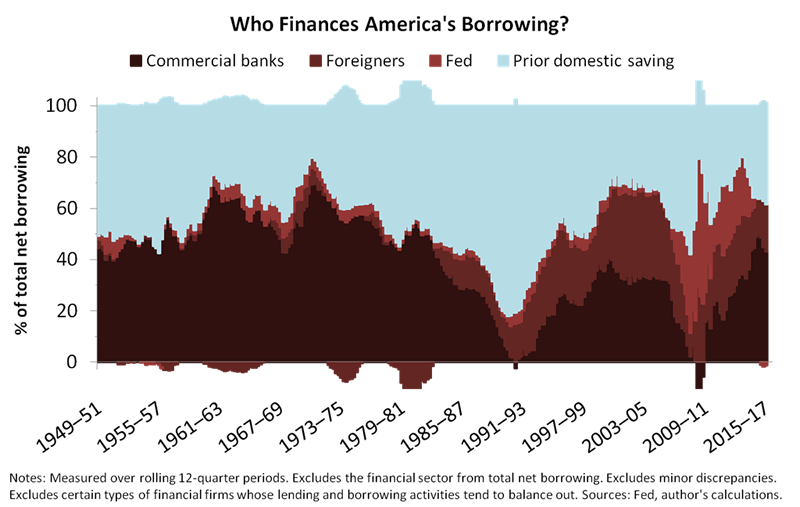
As you can see, the financing sources we’ve included are banks, the Fed, foreigners and prior domestic saving. The first three are self-explanatory, while the fourth refers mostly to U.S. households, pension funds and insurance companies, none of which can make investments without first accumulating wealth. The amount of wealth that these domestic, nonbank investors place in bonds, loans and bond funds composes most of our prior domestic saving category.
What Exactly Does the Financing Breakdown Reveal? A: Support for Our Nonmainstream Views or B: The Secrets of the Shugborough Inscription?
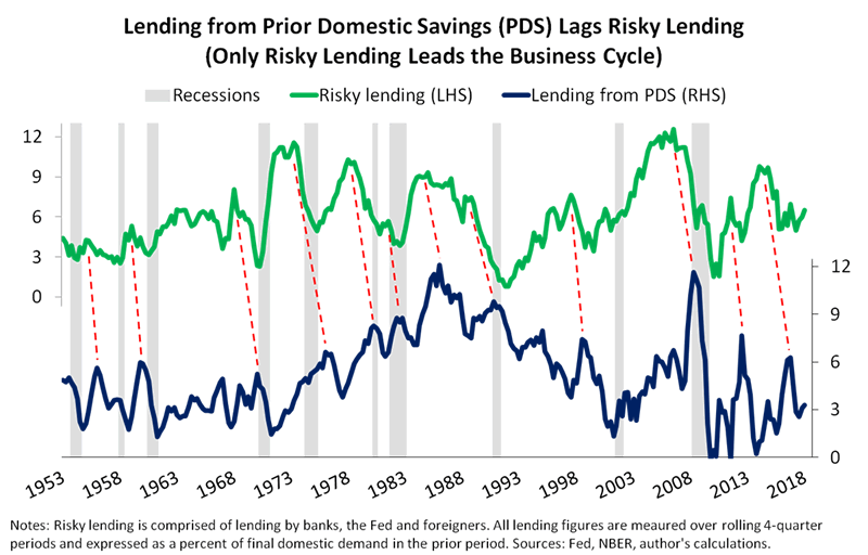
Okay, we’ll admit that the financing breakdown doesn’t knock you over with wisdom at first, but the closer you look, the more meaningful it becomes. For example, total lending by banks, the Fed and foreigners—which I’ll call risky lending because those financing sources are most prone to volatility—tends to lead the fourth source, prior domestic saving, through the business cycle. Also, risky lending always reaches its peak during an expansion, not a recession, whereas the peak in lending from prior domestic saving occurs either later in the same expansion, in the next recession or even further out.
Here’s a chart showing how lending from prior domestic saving continues higher after risky lending begins its descent into recession (the chart comes from our book Economics for Independent Thinkers, which discusses this topic in greater detail):
So the three riskier financing sources help us track the business cycle, but each operates differently and carries different risks. For a goal of building timely indicators (we’ll get to our recession indicator in just a moment), lending by banks is usually the most instructive of the three, being most closely related to spending by households and businesses. Lending by the Fed is of course also related to spending, but more reactively—see this article for discussion of the efficacy of the Fed’s lending activities. In any case, here are the correlations with total spending (also known as final domestic demand) for each financing source:
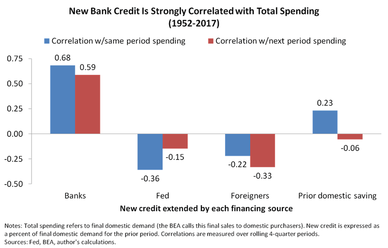
As shown in the chart, new bank credit correlates strongly with total spending in both the same period and the next period. You might choose from a few different explanations for the correlations, but we would say they’re explained mostly by the real-world relations discussed in Part 1 of this article, which we’ll summarize in two points:
- Bank loans create money from virtually nothing, and that new money flows directly into nominal GDP as borrowers spend it.
- Regardless of which GDP component is most affected (real growth or inflation), bank lending is fundamentally different to the lending that takes place outside the banking system.
Also, the economic effects of bank loans aren’t always immediate. Spending might respond to lending only gradually, explaining the correlation between new bank credit and the next period’s spending.
We conclude that America’s financing breakdown supports our nonmainstream views, answer A from the question in our first subheader. We can’t say whether it also unlocks the Shugborough Inscription (answer B), because we haven’t yet cracked the code. But you, loyal reader of our research, will be one of the first to know if we do (so check back often).
When We Play Our Inflation Indicator in Reverse, What Do We Hear? A: Angelic Melodies or B: Satanic Messages?
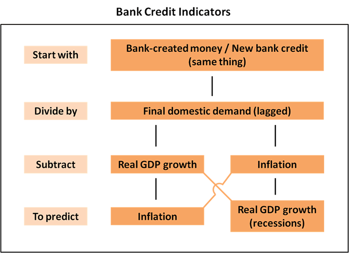
From the observations above, we can build a recession indicator with only one more step. If you don’t already know that step, you might guess it if you remember our article, “An Inflation Indicator to Watch.” We built our inflation indicator by first deducting real GDP growth from new bank credit (expressed as a percent of GDP), which gave us an estimate for the amount of bank credit that might prove inflationary. (We actually used bank-created money in place of new bank credit, because we wanted to show a progression from other money measures, but that’s like substituting polenta for grits—they’re just about the same thing.)
In other words, to develop our inflation indicator, we subtracted real GDP growth from new bank credit to isolate the amount that might flow into inflation. But this time we’re building a recession indicator, which means we do the same thing in reverse—we subtract inflation from new bank credit to isolate the amount that might flow into real GDP growth. Here’s a picture summarizing the inflation and recession indicators and how they relate:
The recession indicator, which we call real new bank credit, warns of recession risks when it falls below 1% of GDP, as shown in the next chart:
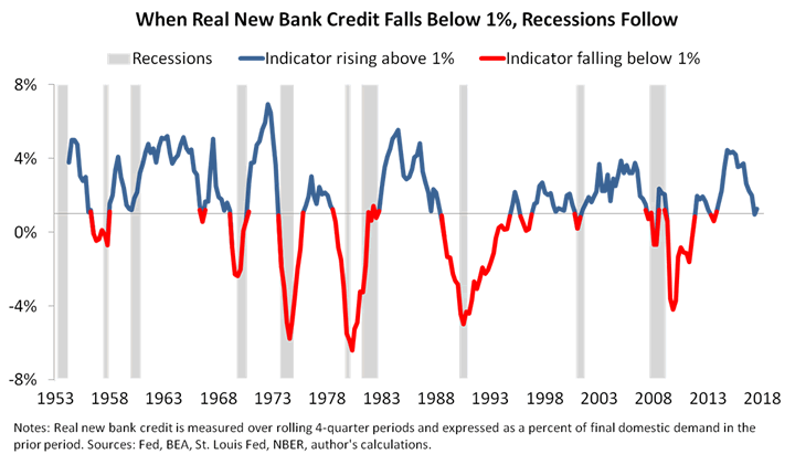
The chart shows the indicator dipping below 1% before all but one of the last nine recessions. The mild recession of 1960–61 was the lone exception, which isn’t surprising considering that was primarily an inventory recession, not a deleveraging. But even in 1960–61, real new bank credit slowed sharply before the business cycle peak, missing the 1% threshold by only 0.1%.
So answering the question in our second subheader, we hear neither angelic melodies nor satanic messages when we play our inflation indicator in reverse, but we do find a pretty good recession indicator. To be sure, it’s not perfect. (We’d be concerned if it was.) But the indicator’s anomalies and false warnings have reasonable explanations:
- The false recession warning in 1966 followed a policy-induced credit crunch that was quickly resolved when the Fed recognized the problem and altered its policies. The economy slowed but continued to expand during and after the credit crunch, thanks to the quick resolution as well as a healthy dose of fiscal stimulus as Lyndon Johnson boosted federal spending.
- The false recession warning in 1996 followed rising delinquencies and tightening lending standards in consumer loan markets, especially credit card loans. But other loan markets with stronger links to the business cycle—home loans, C&I loans and CRE loans—remained healthy.
- The indicator’s volatility from 2008 to 2014 followed emergency measures enacted during and after the Global Financial Crisis, including the Fed’s quantitative easing programs. Without those measures distorting bank balance sheets, the indicator would have likely mapped out a V-shape similar to that of the credit crunch that followed the two 1980s banking crises (S&Ls and Latin American debt). In other words, the 2008–9 spike and 2013 dip wouldn’t have occurred.
And that’s the history, but what about the present? You surely noticed that the chart shows real new bank credit dipping to 1% in late 2017. We await the Fed’s next Z.1 report for 2018 data (and any 2017 revisions), but higher frequency data from the H.8 suggest the indicator has remained near or below the 1% threshold. Does that spell an imminent recession?
To answer that final question, we should first consider a variety of other indicators, and we’ll share that analysis, dashboard-style, in a future article. In the meantime, here’s the spoiler.
Our Business Cycle Outlook
Nearly ten years after U.S. credit markets hit rock bottom, the contours of the next downturn appear to be taking shape. Alongside the slowdown in real new bank credit, we can see that consumer loan delinquencies are creeping higher while corporate debt has never been tilted more heavily toward junk (as discussed in this uncharacteristically bearish Moody’s report and combined with other relevant data in this ZeroHedge article). Also, neither consumer nor business borrowing has ever been higher as a percent of the economy, as noted in the first set of bullets above.
But the risks of overborrowing aren’t spilling into the real economy in the way they did in, say, 2008, and as Loris Karius would surely agree, timing is everything. (If you felt bad for Karius last month, as we did, don’t miss yesterday’s news that apparently he, too, was Ramosed.) Three indicators, in particular, tell us the credit cycle hasn’t peaked:
- Banks appear to be loosening business lending standards as readily as they were at any time during the past two years, and they continue to loosen residential mortgage lending standards. (See this Fed report and this Wall Street Journal article for data and further discussion.)
- The overall loan delinquency rate at commercial banks fell to a 10-year low in the first quarter, despite increasing consumer loan delinquencies. Moreover, those consumer loan delinquencies remind us of 1996, when other types of lending remained healthy even as consumer loans soured—in that instance, the business cycle expansion still had four years left in the tank.
- The U.S. high yield bond default rate is down from 5.9% in January 2017 to 3.7% as of April 2018, thanks to a sharp drop in energy sector defaults. To be sure, the April reading isn’t especially bullish—for one thing, bond defaults could worsen rapidly as interest rates rise—but it’s not yet signaling a turn in the credit cycle.
With those points in mind, we don’t expect an imminent, bank-led recession. And no, the flattening yield curve doesn’t change our outlook—the curve isn’t yet recessionary according to our research, although it bears watching.
Venturing outside credit markets, corporate earnings are rising strongly, house prices are also rising and fiscal policy is expansionary. Each of those fundamentals should support further economic growth over a period of, say, two or three more quarters.
All things considered, we expect more of the same slow growth that the current expansion has become known for. Real new bank credit, as long as it remains weak, tells us to question whether growth can accelerate above the current decade’s normal pace for longer than the odd quarter or two, especially as the spare supply of skilled workers dwindles. But a significant deceleration seems equally unlikely, for all the reasons noted above.
Finally, our conclusions are contingent on real new bank credit remaining above water, so to speak. If it takes a plunge comparable to the cliff dives that came before the 1970s and early 1980s credit busts or the early 1990s and 2008-9 crunches, that would suggest a recessionary process is underway. So we suggest listening regularly to both sides of the economy’s debt LP. (Can we still use that term?) Media commentators, bloggers and everyone else on the grid might dance mostly to the tunes played by America’s borrowers, but rocking out to the lenders can be just as revealing.
F.F. Wiley
F.F. Wiley is a professional name for an experienced asset manager whose work has been included in the CFA program and featured in academic journals and other industry publications. He has advised and managed money for large institutions, sovereigns, wealthy individuals and financial advisors.
© 2018 Copyright F.F. Wiley - All Rights Reserved
Disclaimer: The above is a matter of opinion provided for general information purposes only and is not intended as investment advice. Information and analysis above are derived from sources and utilising methods believed to be reliable, but we cannot accept responsibility for any losses you may incur as a result of this analysis. Individuals should consult with their personal financial advisors.
© 2005-2022 http://www.MarketOracle.co.uk - The Market Oracle is a FREE Daily Financial Markets Analysis & Forecasting online publication.


