How "Free Money" Helped Create Sizzling Housing Market & REIT Gains
Housing-Market / US Housing Nov 12, 2018 - 06:49 AM GMTBy: Dan_Amerman
 Housing prices and the associated REIT returns have worked very differently in the United States since the recession of 2001. The increasing financialization of the real estate markets by Wall Street, and the aggressive and unconventional interventions by the Federal Reserve over that time, have combined in multiplicative fashion to produce new and volatile sources of housing profits and losses.
One such change has been the creation of an extremely powerful profit engine for housing, that most real estate investors have not been taking into account. Indeed, there is a strong mathematical case to be made that "yield curve spread compression" has supported and enabled the substantial majority of housing price gains for homeowners and investors on a national average basis since the beginning of 2014.
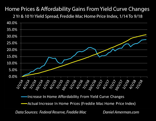
Actual monthly gains in single family home prices are shown in the yellow line above, and they climb from a starting point in January of 2014, to a national average gain of 31.3% by September of 2018 (based upon the Freddie Mac Home Price Index). This has been one of the most powerful real estate bull markets in history, and has literally created many trillions of dollars of new wealth for investors and homeowners.
The blue line shows the percentage increases in housing prices that have been effectively enabled by yield curve spread compression. This created what could be called a form of "free money" that supported housing price gains during the time period examined, as home buyers could pay up to a 27.6% higher price to buy a house than they would otherwise have been able to - while not having to pay a correspondingly higher monthly mortgage payment (principal and interest only, and all else being equal).
Obviously yield curve spread compression has not been the sole driver of housing price gains. There are myriad other factors including the underlying movement of short term rates, market and buyer psychology factors, and supply and demand factors in the numerous local markets that make up the national market.
The role of yield curve spread compression is that it has enabled the rapid growth of much higher housing prices than would have been the case without the compression. And as can be easily seen, the two lines have been tracking together with very similar slopes.
Through September of 2018, the 27.6% increase in home prices that is mathematically enabled by yield curve spread compression equals about 88% of the 31.3% in actual housing price gains. Comparing the two data series on a monthly basis, there is a 91% correlation between the theoretical gains in housing prices enabled by yield curve spread compression, and actual national average housing price gains during that time - which is a remarkably close relationship.
Many people believe that the Federal Reserve creating a cycle of record low interest rates is what has created a cycle of record high real estate prices, and there is a great deal of truth to that - but it isn't the entire truth. The Federal Reserve changed the cycle to one of increasing interest rates in late 2015, and has been raising rates on a reasonably consistent basis since late 2016. Yet, real estate prices have continued their rapid climb, with almost 2/3 of the housing price gains since early 2014 occurring after the Fed began raising rates.
When we raise our sophistication level a notch and look not just at interest rates but at cyclical changes in the relationship between short and long term interest rates (i.e. the "yield curve"), then we get a rich reward for our effort - a far better understanding of what actually changes mortgage rates, mortgage payments and housing prices in this financialized world that is often dominated by Federal Reserve actions. More specifically, we can understand what has freed up the cash to support one of the most profitable housing and REIT markets in history, along with the extraordinary rewards for homeowners, direct housing investors and REIT investors.
That understanding is of particular importance at this time, because the current yield curve spread compression cycle is coming to an end, which has the potential to materially change - and possibly reverse - the recent cycle of rapidly rising home prices.
This analysis is part of a series of related analyses, an overview of the rest of the series is linked here.
Recap Of The Previous Analysis
The immediately preceding analysis in this series is linked here. It contains a detailed, step by step, exploration of what yield curves are, and the cyclical changes that have produced an average savings for home buyers in 2018 of about $3,000 per year. A graphically oriented recap of that analysis is below.
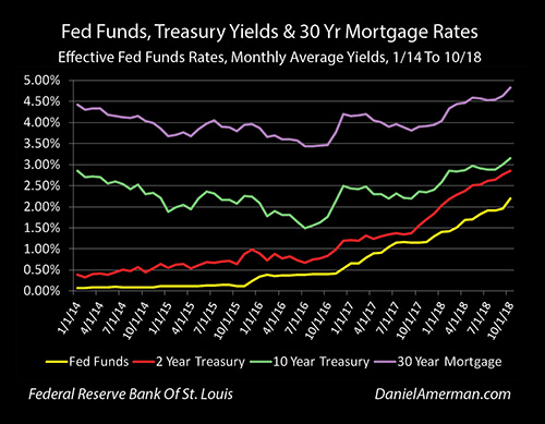
The graph above shows Fed Funds rates, Treasury yields and 30 year fixed mortgage rates over the period from January of 2014 through October of 2018. As can be seen, 30 year mortgage rates are generally priced at a spread above the 10 year Treasury rate.
The difference between interest rates of various maturities is known as the "yield curve", and the most common market measure of yield curve changes is the difference between 2 year and 10 year Treasury yields, which is the spread between the green and red lines in the graph above.
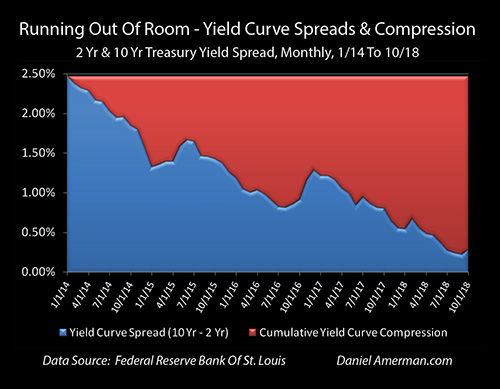
The top of the blue area in the next graph shows the yield curve spread over time. This difference between the 2 and 10 year Treasury yields starts at a quite wide 2.47% in January of 2014. The difference between short and long term interest rates narrows to a mere 0.29% by October of 2018.
The red area is the inverse of the blue area, and it shows the cumulative compression of the yield curve over time. As can be seen, almost the entire available yield curve had been "compressed" and used up by October of 2018, meaning it was no longer available to further lower long term rates (and mortgage rates), relative to short term interest rates.
(The previous analysis was based on weekly yields and showed a maximum 2.62% yield curve spread. In order to correspond to the monthly reporting of home price levels, this analysis looks at yields on a monthly basis, with a maximum recent yield curve spread of 2.47% in January of 2014.)
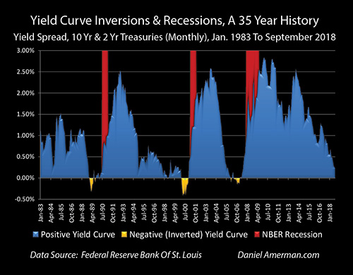
The graph above shows that the shrinkage of the blue area of yield curve spreads is part of a regular cycle, with similar cyclical compressions in the years 1992 to 2000, and in 2003 to 2006 . These ongoing cyclical compressions in the spreads between short term and long term yields are associated with the overall business cycle of expansions and recessions, as well as the corresponding Federal Reserve cycles of raising and lowering interest rates.
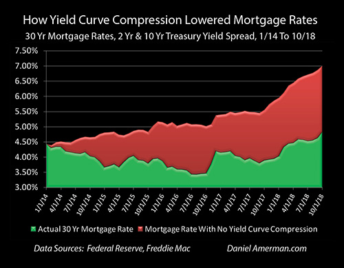
The top of the green area in the graph above shows actual historical 30 year mortgage rates. Because those mortgage rates are based upon 10 year Treasury yields - they are also necessarily the result of yield curve spread compression (all else being equal). This raises the question - what would mortgage rates have been without that compression?
To find the mathematical answer, the "yield curve compression" red area from the "Running Out Of Room" graph is added to actual mortgage rates. As conceptually explored in the previous analysis, mortgage rates would have 4.81% in January of 2015 instead of 3.67%, and 7.01% in October of 2018 instead of 4.83%. (Again, these are now monthly averages, instead of weekly.)
Obviously, if current home buyers were needing to pay 7% mortgage rates instead of under 5% mortgage rates - they would be needing to come up with a lot more cash every month.
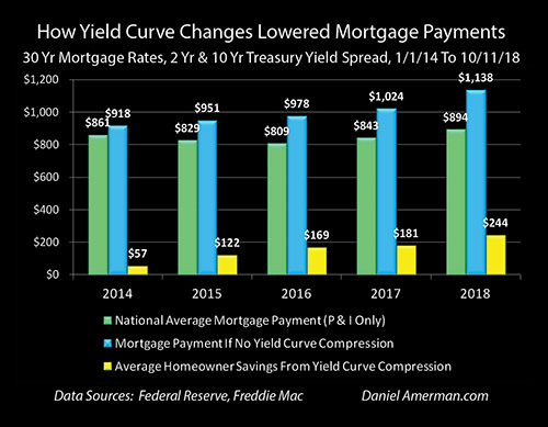
The graph above show the impact on monthly mortgage payments for a nationally average home buyer. Mortgage payments would have been $57 a month greater in 2014, $169 a month greater in 2016, and $244 a month greater in 2018 (through October). For the average U.S. home buyer in 2018, they are indeed saving about $3,000 a year in mortgage payments as the direct result of yield curve spread compression - even if they have never heard of the term "yield curve".
How Yield Curve Changes Created A Lucrative Profit Engine For Housing Investors
Mortgage rates play a critical role in determining not only home affordability - but also home prices. With an increase in mortgage rates (all else being equal), it costs more money per month to buy a home at any given price, which means fewer people are likely to pay that price - particularly if the higher mortgage payment means that they no longer qualify under loan underwriting standards.
Conversely, a decrease in mortgage rates allows ever more people to qualify for loans to purchase a home at a given price level. Indeed, a decrease in mortgage rates allows buyers to purchase a home at a higher price with potentially no increase in their monthly mortgage payments (principal and interest only, and not including changes in down payment requirements).
This ability to buy homes at ever higher prices - without any increase in monthly mortgage payments - can create a very powerful "free money" situation for housing purchasers (whether homeowners or investors), where they can pay steadily higher prices, without increasing their monthly (P&I) payments. Paying higher prices does not cost them more money, and in some cases, substantially higher prices can be paid AND the monthly mortgage payment can go down at the same time.
For homeowners as well as housing and REIT investors - this "free money" situation over time where buyers can pay substantially higher prices for homes without increasing their mortgage payments (relative to what they would have been without yield curve spread compression) can be an extraordinary source of ongoing price gains.
The degree to which housing price gains are supported by yield curve spread changes is also something that can be mathematically determined for any point in time.
The Math Of "Free Money" & Housing Price Gains
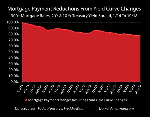
Our first step in this phase of the analysis is to determine how yield curve changes can reduce mortgage payments in percentage terms relative to what they otherwise would have been, as seen in the graph above.
As an example, our starting point is January of 2014, and if we go to January of 2015, then actual national average rates mortgage rates were 3.67%. Yield curve spread compression (the difference between the 2 year and 10 year Treasuries) was 1.14% over that period, meaning that mortgage rates would have been 4.81% if it were not for yield curve compression, all else being equal.
For an example $200,000 mortgage, the monthly payment is $917 with the actual 3.67% mortgage rates. That payment would have been $1,051 if there had not been yield curve spread compression, and average mortgage rates had been 4.81%
Because $917 is 87.3% of $1,051, that means that yield curve compression reduced mortgage payments to only 87.3% of what they otherwise would have been, and that 87.3% is shown in the reduction of the red area in the graph above.
Moving to the right side of the graph, 30 year mortgage rates averaged 4.83% in October of 2018, which meant that the monthly payment for a $200,000 mortgage would be $1,053. Cumulative yield curve spread compression was 2.18%, which means that mortgage rates would have been 7.01% without the compression, and the monthly mortgage payment would have been $1,332.
Because $1,053 is 79% of $1,332, this means that as shown on the graph, the cumulative impact of yield curve spread changes between January of 2014 and October of 2018 was to reduce mortgage payments to a level that was only 79% of what they would otherwise would have been.
Another way of phrasing this is that yield curve spread compression freed up 21% of the money that would have otherwise been needed to make a mortgage payment at any given home price - and this "free money" then became available to pay higher prices for housing for the nation as a whole.
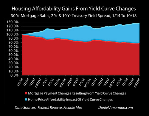
Just how much housing prices could go up with the freed up purchasing power is shown in the graph above. As can be seen visually, there is an inverse relationship between the reductions in mortgage payments, and the increases in housing affordability. Whenever the red area of percentage reductions in mortgage payments goes down, then the blue area of percentage increases in housing affordability goes up.
When changes in the yield curve freed up 12.7% of purchasing power by January of 2015 - it allowed home prices to climb by up to 14.5%, without increasing monthly principal and interest payments.
The math behind the 14.5% gain is fairly simple - once we have calculated the data used for the all red graph above, which is the result of all the steps in the previous analysis. The housing price that can be supported is the inverse of the percentage amount of the mortgage payment that has been reduced as the result of cumulative yield curve spread compression. So, 1/.873 = 114.5%, which is a housing price increase of 14.5%.
An alternative financial methodology is to take an equal size payment and find the mortgage amounts that can be supported, with and without yield curve compression. A $1,000 P&I payment at a 3.67% rate will support a mortgage of $218,061, a $1,000 monthly payment with no yield curve spread compression and a 4.81% mortgage rate will support a $190,378 mortgage, and since $218,061/$190,378 does indeed equal 114.5%, that does provide financial verification of the simpler mathematical shortcut.
With either approach, when cumulative yield curve compression created 17.8% of monthly "free money" by August of 2016, it allowed housing prices to climb by up to 21.7% without increasing mortgage payments.
And with cumulative yield curve spread compression close to maxing out in September of 2018, with 21.7% of monthly "free money" available, it could support housing prices that were a full 27.6% above where they were at the beginning of 2014.
(For financial verification, a $1,000 monthly payment at 4.63% will support a $189,941 mortgage. A $1,000 monthly payment at 6.87% will support a $152,301 mortgage. The percentage price difference is $189,941/$152,301 = 127.6%, which is an increase of 27.6%.)
An almost 30% supportable gain in housing and associated REIT prices in a little less than 5 years is an extraordinary outcome - that is entirely justifiable, when we follow the step-by-step financial mathematics of this and the previous analysis.
So, if a near 30% gain is the theoretical result - how does this compare to actual housing price gains in the 2014 to 2018 period?
A Remarkable Correlation
The shape of the blue line in the graph below is identical to the top of the blue area generated in the previous section. However, the scale has changed because it is now being presented in terms of mathematically supportable gains (i.e. 14.5% by January of 2015), instead of a total housing price of 114.5%.
The yellow line is the cumulative percentage changes in the national Freddie Mac Home Price Index over the same period. (The time period for this graph and the ending calculations above ends in September instead of October, because of lags in the reporting of real estate price changes.)
As is visually obvious, there is a great deal of similarity between the two lines of the potential increases in home prices that are the mathematical result of the compression of yield curve spreads (i.e., the "free money"), and what national average housing price changes have been in practice over that same time period.
When the two data series are compared statistically, there is a 91% correlation between theoretical price changes and actual price changes. This is a remarkable result.
In total, national average housing prices climbed by 31.3% through September of 2018. Theoretical potential price gains were 27.6%, which means they equaled 88% of actual housing price gains.
For the nation as a whole then, the results of yield curve spread compression was to enable and support one of the strongest real estate markets in history, with price gains in excess of 30% in less than five years in a relatively low inflation environment. The compression was not the sole reason for the price gains - far from it - but it did effectively pay for 88% of those price gains (all else being equal), and the remarkably close relationship between the theoretically supported price gains and the actual national average home price gains is compelling.
Arbitraging Federal Reserve Cycles
The underlying premise of this analytical series is that the financial world does not work the way that it used to - and while that creates a number of dangers and problems, it also necessarily creates an ongoing series of new opportunities as a financial and mathematical necessity.
The graph below is from the Five Graphs series (link here), and what it shows is national average housing prices for the United States in inflation-adjusted terms.
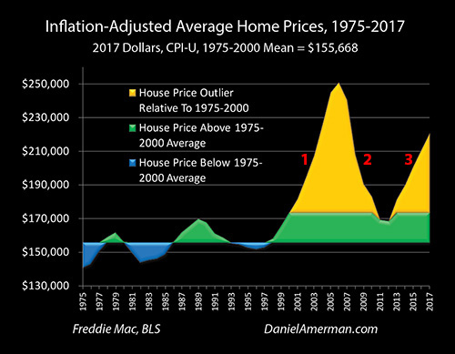
As is visually obvious, the patterns of housing price changes have radically changed since about the year 2000. Single family home prices used to be remarkably stable in inflation-adjusted terms. Since 2000, this stability has been replaced with a far more volatile housing market, that nonetheless seems to show a strong cyclical pattern when viewed in inflation-adjusted terms.
Examining the graph raises a number of questions.
Why have the patterns changed so dramatically?
Why has a second "golden spike" emerged, and why does it bear such an uncanny resemblance to the first spike?
What are the new investment opportunities and dangers?
As explored in the series through the mechanism of the Five Graphs, there is a logical and compelling explanation. Since 2000, the Federal Reserve has engaged in two of the most powerful monetary interventions in history. The first was to smash interest rates down to near 50 year lows in order to contain the damage from the collapse of the tech stock bubble and the resulting recession. The second was to smash interest rates down to the lowest in history, in order to contain the damage from the Financial Crisis of 2008 and the resulting Great Recession.
By doing so, the Fed has created cycles of crisis, the containment of crisis, and exiting the containment of crisis - to a degree that did not used to exist, and which continue to this day.
The particular cycle examined herein, that of yield curve spread compression, is one component of the current broader cycle of exiting the containment of crisis. Yield curve spread compression is a regular cycle that has existed for many years, and is a traditional result of the Federal Reserve going through cycles of increasing interest rates.
What is quite different, however, is the impact on housing and other investment prices. In the previous century, there was very little correlation between cycles of yield curve spread compression and housing prices.
In this much more financialized world, where Wall Street, REITs and other institutional investors seeking yields are major participants in the real estate markets, we are seeing a much tighter correlation between capital markets, interest rate changes, mortgage rates and changes in home prices. This financialization then acts as a multiplier when it comes to the new cycles of crisis, the containment of crisis and exiting the containment of crisis.
When people talk about differences between now and the "old days" there is often a focus on the negatives - and there have indeed been many negatives, as well as many new dangers. But we have also seen record prices for stocks, bonds, precious metals and real estate - and these have all arguably occurred as a direct result of the new cycles.
What we have explored in this analysis is something extraordinary - a cyclical change in the term structure of interest rates that has enabled an almost 30% increase in housing prices with no increase in monthly principal and interest payments - compared to what they otherwise would have been. On a national basis, we have seen practice tracking right behind theory, and an over 30% increase in actual housing prices, even when going right into the teeth of a cycle of rising interest rates.
Many trillions of dollars in wealth have been created across the nation over the last few years - and hopefully this analysis has given you a new understanding of one of the factors that enabled this extraordinary increase in real estate prices.
Daniel R. Amerman, CFA
Website: http://danielamerman.com/
E-mail: mail@the-great-retirement-experiment.com
Daniel R. Amerman, Chartered Financial Analyst with MBA and BSBA degrees in finance, is a former investment banker who developed sophisticated new financial products for institutional investors (in the 1980s), and was the author of McGraw-Hill's lead reference book on mortgage derivatives in the mid-1990s. An outspoken critic of the conventional wisdom about long-term investing and retirement planning, Mr. Amerman has spent more than a decade creating a radically different set of individual investor solutions designed to prosper in an environment of economic turmoil, broken government promises, repressive government taxation and collapsing conventional retirement portfolios
© 2018 Copyright Dan Amerman - All Rights Reserved
Disclaimer: This article contains the ideas and opinions of the author. It is a conceptual exploration of financial and general economic principles. As with any financial discussion of the future, there cannot be any absolute certainty. What this article does not contain is specific investment, legal, tax or any other form of professional advice. If specific advice is needed, it should be sought from an appropriate professional. Any liability, responsibility or warranty for the results of the application of principles contained in the article, website, readings, videos, DVDs, books and related materials, either directly or indirectly, are expressly disclaimed by the author.
© 2005-2022 http://www.MarketOracle.co.uk - The Market Oracle is a FREE Daily Financial Markets Analysis & Forecasting online publication.


