Is the Stock Market Rally Floating on Thin Air?
Stock-Markets / Stock Markets 2019 Jul 18, 2019 - 01:33 AM GMTBy: Troy_Bombardia
 The stock market went nowhere today. Today’s headlines:
- S&P internal weakness
- Low volume vs. high volume rallies
- Short term, medium term, and long term trend
- Mean reversion
- Consumer discretionary on fire
Go here to understand our fundamentals-driven long term outlook. For reference, here’s the random probability of the U.S. stock market going up on any given day.

S&P internal weakness?
I saw a popular tweet on Twitter that looks at the S&P’s internal sectors. According to this tweet, fewer and fewer sectors are making all-time highs as the stock market makes new highs. This is supposed to indicate “internal weakness”.
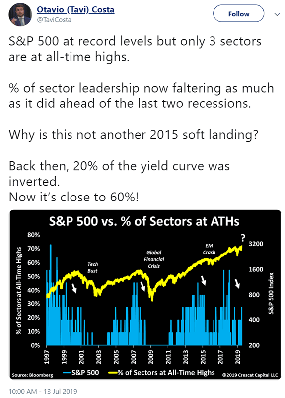
This chart is limited from 1997 – present, but sector data from Bloomberg is available from 1989 – present.
I’m usually skeptical of charts that are limited, because people usually limit charts in order to effectively sell a message (focus on the history that supports their bias, hide the history that goes against their bias). Financial marketing 101.
So I took the data and recreated a similar chart from 1989 – present using the S&P 500’s 10 sectors (all sectors excluding real estate, whose data is more limited).
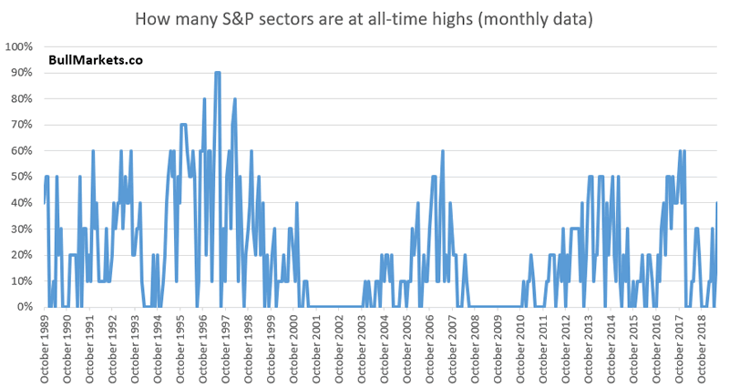
Is this sector divergence bearish?
Here’s every case in which the S&P rallied over the past 1.5 years to a new all-time high, while the % of sectors making new all-time highs fell.
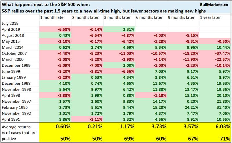
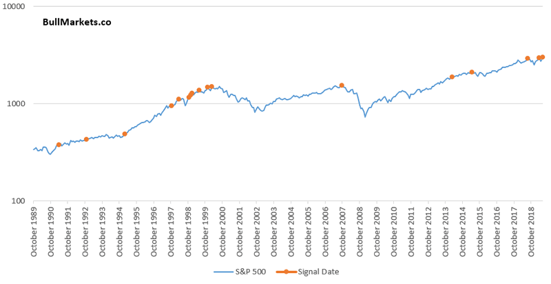
If you only look at the data from 1997 – present, then yes, this is very bearish. But if you include the pre-1997 data, this “breadth divergence” is less ominous.
The problem with these simplistic breadth studies is that they don’t look at the weights of each specific sector. The S&P 500 has 11 sectors (used to be categorized as 10 sectors), but not all of these sectors are of equal importance. Some sectors are huge, whereas other sectors are small. Taking a simplistic look at “the % of sectors making new highs” completely ignores these different weightings.
Volume
The stock market went nowhere today. As a result, volume was low.
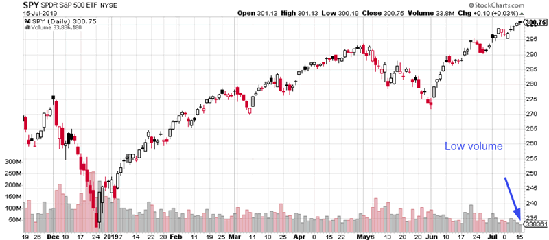
Standard technical analysis teaches us that “low volume rallies are bearish, because volume should ‘confirm’ price. Healthy rallies see expanding volume”.
The following chart illustrates:
- Buy SPY when its volume is below its 52 week average (low volume), in orange.
- Buy SPY when its volume is above its 52 week average (high volume), in grey.
*These charts simulate real-time trading. To decide if you buy/sell this week, use the PREVIOUS 52 weeks’ data (excluding this week’s).
*SPY = S&P 500 ETF
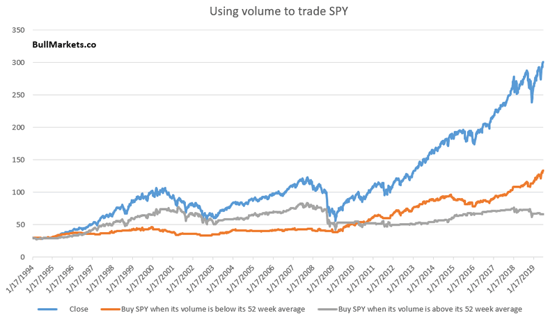
Here we can notice a few interesting things:
- From 1994 – 2007, it was better to buy stocks on high volume than to buy stocks on low volume
- But since this bull market began 10 years ago, it’s been better to buy stocks on low volume than to buy stocks on high volume.

Generally, price-based indicators are more useful than volume-based indicators. Moreover, you can see a key problem with many technical indicators: their usefulness changes over time. What worked in the past for technical analysis may not work in the future. This is why I prefer to combine fundamentals with technicals.
Trend
Speaking about price-based indicators, the S&P is trending upwards on a short term, medium term, and long term time frame. These 3 “trends” are often defined as:
- Is the S&P above its 20 dma?
- Is the S&P above its 50 dma?
- Is the S&P above its 200 dma?
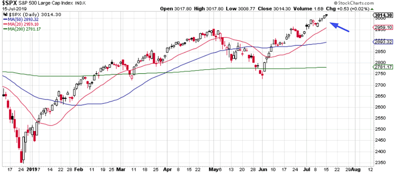
From a trend following perspective, it’s better to buy the S&P when it is above these 3 popular moving averages than to buy the S&P when it is below these 3 moving averages. This is particularly true from 1950 – 2000.
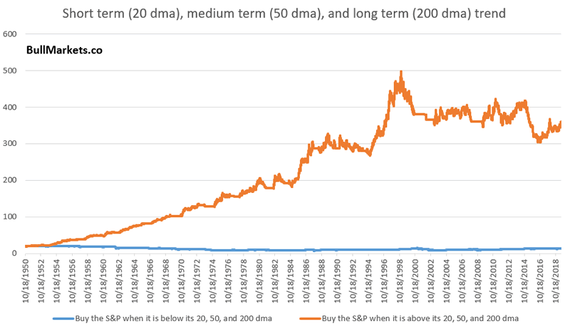
Here’s what happens when you:
- Buy the S&P if it is above its 20, 50, OR 200 dma (orange)
- Buy and hold (blue)
- Buy the S&P if it is below its 20, 50, AND 200 dma (grey)
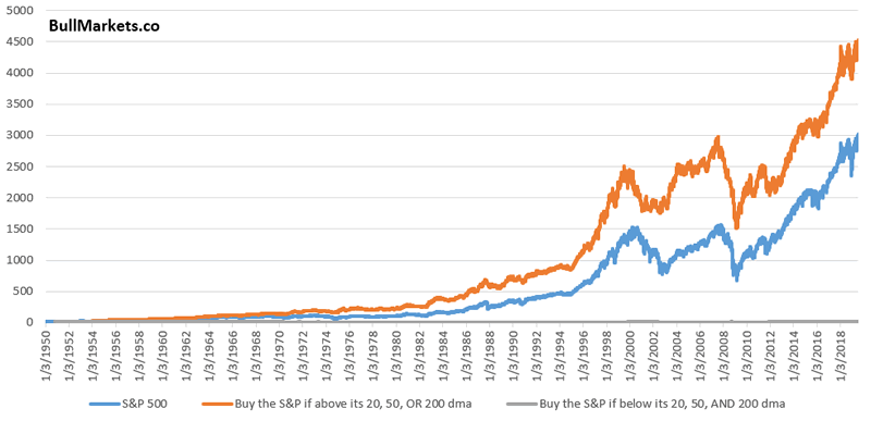
Here’s the same chart on a log scale
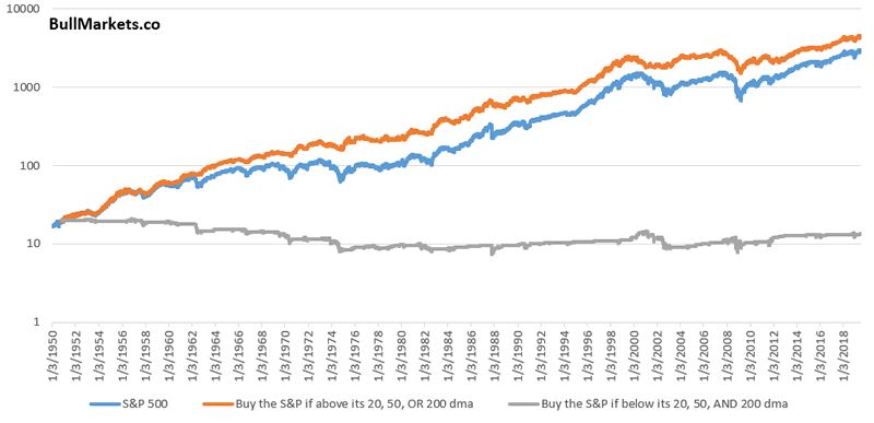
Slight outperformance against buy and hold.
Mean reversion
Sentiment indicators are popular, because they allow you to feel like you’re the “smart money” when you see what everyone else is doing. Sentiment tends to move inline with price.
- Prices soars, sentiment goes up
- Price crashes, sentiment goes down
So instead of looking at a dizzying array of sentiment indicators (CNN fear/greed, AAII, NAAIM, COT positioning, Daily Sentiment Index…..), we can look at a simple price-only mean reversion indicator.
The following chart plots the S&P’s distance from its 50 day moving average, which is quite high right now.
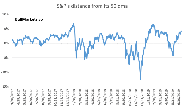
*”Distance from moving average” is one of the components in CNN’s popular Fear & Greed Index.
So how bearish is this? Here’s what happens next to the S&P when it is at a 1 year high, while more than 4% above its 50 dma.
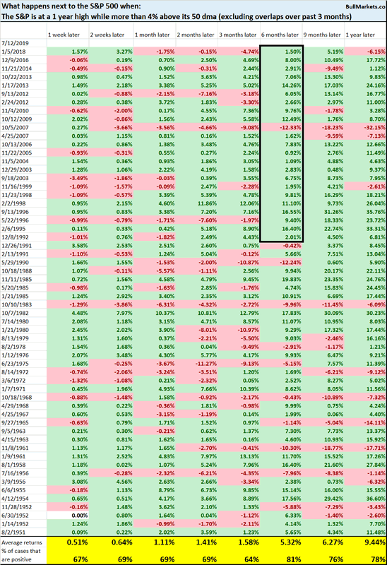
Short term forward returns are mixed. “Eventually” there is a pullback/correction, but no one can consistently and accurately tell you if that pullback/correction will occur tomorrow, next week, next month, or 3 months later.
But 6 month forward returns are slightly more bullish than random, particularly from 1991-present.
XLY streak
And lastly, XLY (consumer discretionary ETF) has gone up 13 days in a row. This is one of the longest streaks.
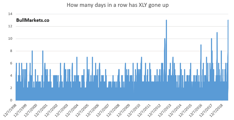
The only other streak that lasted this long was July 12, 2013
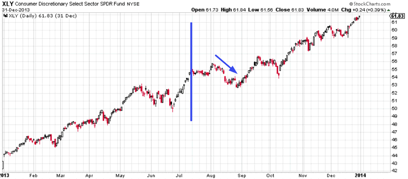
But n=1 isn’t very useful, unless you’re posting an n=1 chart on Twitter that tells everyone why today is just like 2008 (in which case you will get a lot of attention, retweets, and popularity).
So let’s try to increase the sample size. Here’s what happens next to XLY when XLY falls for the first time in at least 8 days.
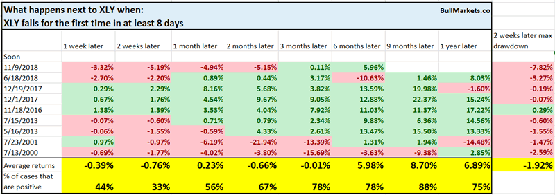
1-2 week forward returns are more bearish than random.
We don’t use our discretionary outlook for trading. We use our quantitative trading models because they are end-to-end systems that tell you how to trade ALL THE TIME, even when our discretionary outlook is mixed. Members can see our model’s latest trades here updated in real-time.
Conclusion
Here is our discretionary market outlook:
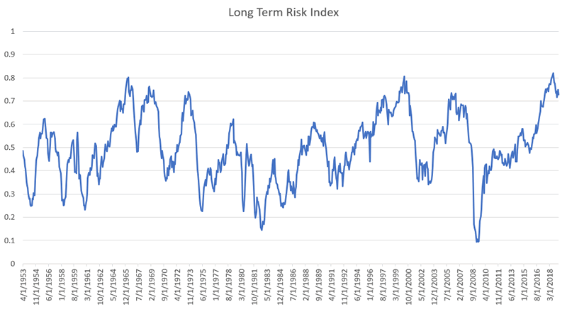
- Long term: risk:reward is not bullish. In a most optimistic scenario, the bull market probably has 1 year left.
- Medium term (next 6-9 months): most market studies are bullish.
- Short term (next 1-3 months) market studies are mixed.
- We focus on the medium-long term.
Goldman Sachs’ Bull/Bear Indicator demonstrates that risk:reward favors long term bears.
Click here for more market analysis
Here’s what happens next to the S&P when lumber rallies above its 50 week moving
By Troy Bombardia
I’m Troy Bombardia, the author behind BullMarkets.co. I used to run a hedge fund, but closed it due to a major health scare. I am now enjoying life and simply investing/trading my own account. I focus on long term performance and ignore short term performance.
Copyright 2019 © Troy Bombardia - All Rights Reserved
Disclaimer: The above is a matter of opinion provided for general information purposes only and is not intended as investment advice. Information and analysis above are derived from sources and utilising methods believed to be reliable, but we cannot accept responsibility for any losses you may incur as a result of this analysis. Individuals should consult with their personal financial advisors.
Troy Bombardia Archive |
© 2005-2022 http://www.MarketOracle.co.uk - The Market Oracle is a FREE Daily Financial Markets Analysis & Forecasting online publication.


