


U.S. Recession Watch: The Six-Cycle Forecast
Economics / Economic Theory Jul 23, 2019 - 02:18 PM GMTBy: F_F_Wiley

 It’s usually a bad idea to stand too close to something—whether an object, a problem you’d like to solve or any number of other things—which could mean seeing all of the pixels but none of the patterns. That’s why we populate albums, frames and holiday cards with bird’s eye views and sweeping vistas. It’s why every city that aspires to “destination” status advertises this or that Tower, Arch, Needle or Eye.
But if we look from too far away, we run a different risk of missing important information. That’s why we send probes, ships and occasionally scientists into outer space. It’s why we don’t Facetime our doctors, we hop on the examination table and show them exactly what’s bothering us.
Now hold those thoughts for a second except the last one—when I segue to economics momentarily, it’ll be from the medical field. But instead of being the patient lying on the examination table, imagine you’re the physician standing alongside it. That means you’re an expert on bodily systems—respiratory, circulatory, nervous, digestive, immune and so on—and you use that knowledge to diagnose the symptoms your patient describes. In other words, the key to your diagnosis is your understanding of the systems and how they interact.
So the connection to economics is this: the economy, too, consists of a mish-mash of interacting systems, or if we’re interested in forecasting, we should think of cycles. But I’m not referring to the capital-B, capital-C Business Cycle as a uniform force—that would be the too-far-away view. I mean the component cycles that are easier to monitor and conceptualize. Component cycles relate to the overall economy in the same way that bodily systems relate to overall health. And like bodily systems, component cycles interconnect while also operating with a degree of autonomy. Therefore, we should choose vantage points that allow us to see the patterns mapped by each one. Our ideal positioning isn’t too close (all anecdotes, no distinguishable patterns), but it isn’t too far away, either.
The Map
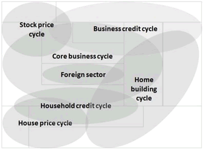
I’ve argued that six component cycles demand our attention and should be in clear sight both individually and collectively. Here are my big six:
- Core business cycle
- Business credit cycle
- Stock price cycle
- Household credit cycle
- Home building cycle
- House price cycle
When two or more of these cycles push in the same direction, they reinforce each other and strengthen the economy’s momentum. When they pull in different directions, their relative strength determines the economy’s eventual path. And the potential push–pull combinations are numerous, meaning that patterns change over time. In the 2008–9 recession, for example, the home building and house price cycles began to deteriorate well before the core business cycle. By comparison, the 2001 recession began in the business credit and stock price cycles.
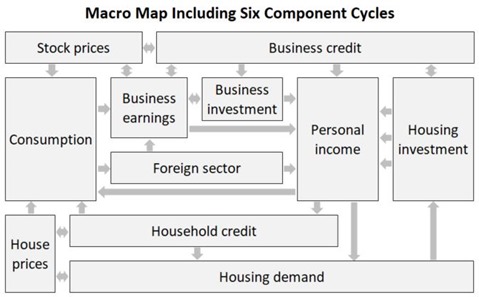
But let’s narrow it down—let’s pick one recession and paint the broadest view, which should help demonstrate how the approach works. Glossing over interactions within each component cycle (not because they’re unimportant, but to keep it at a high level), we can show how the pieces fit together using the map below:
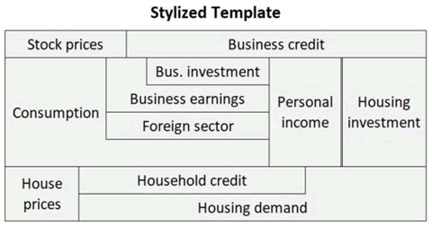
We can then collapse the map into a stylized template for tracking the economy, as follows:
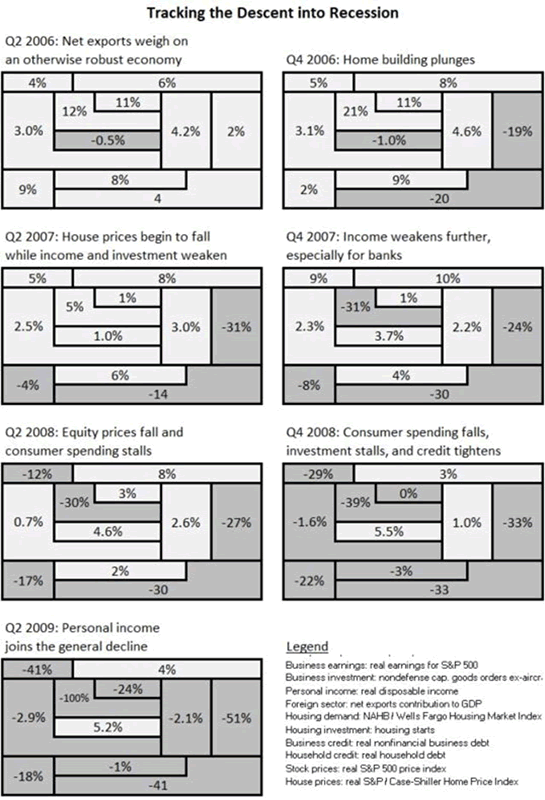
Then the next figure uses the template to show the economy’s descent into recession from 2006 to 2009:
The Threshold
Scanning through the economy’s descent—as above for 2006–9 although we could do the same for any recession—you might believe as I do that there’s a threshold beyond which a recession becomes unavoidable. Needless to say, that threshold is a critical juncture in the Business Cycle, maybe the most important of all junctures. The better we understand it, the better prepared we’ll be for the next recession, and here’s my nickel’s worth of advice. (Note that I’ll continue to capitalize the overall Business Cycle to distinguish it from the component cycles.)
First, imagine a world of virtuous and vicious loops that continually battle for supremacy. You might be more accustomed to the term circles than loops, but the idea is surely familiar. In a virtuous loop, growth in one part of the economy spills into other parts, and these growth forces then continue to strengthen in a mutually reinforcing way. Vicious loops describe the same process in reverse. Although both types of loops can encompass any of the component cycles listed above, they usually connect the real economy (the core business and home building cycles) to the financial economy (the credit and asset price cycles). Typically, the financial economy supplies the accelerant.
So the recession threshold, then, is a tipping point in the perpetual tug-of-war between virtuous and vicious loops—probabilities tip toward recession when vicious loops gain more momentum than that of the remaining virtuous loops. And then at that point, the Business Cycle is likely to peak within six to nine months. In a nutshell, that’s the context for economic forecasting using the six-cycle approach. It’s about having the discipline to carefully weigh the forces acting within and between component cycles.
Easier said than done?
Maybe so, but as part of that nickel’s worth of advice I’ll tell you it’s achievable—the approach has a solid record in real life and backtests.
Sensible enough but vague?
Again, maybe so, so let’s expand. I think it’s important to start with the philosophy, but I can be as specific as you’d like.
The Checklist
Readers familiar with my book know that I’ve augmented the six-cycle map with a variety of rules to make my approach as predictive as possible. Let’s skip over those rules, for now. You’ll be left without the arguments I use to justify each piece of the analysis—and the absence of the pieces I leave out—but the end result should be easy enough to follow. After all, it’s just a checklist. If you don’t mind pretending to be a doctor again, it’s no different to the list of questions and diagnostics you might use when your patient comes in for a check-up. In other words, whether we’re talking about the economy, the human body or any other complex system, constructing a checklist is an obvious way to screen for problems. In an economic context, a simple checklist can provide the necessary discipline discussed above—it enforces a broad view even as public attention swings from one topic-of-the-day to the next.
So add the checklist to the map and the threshold, and we have the makings of a disciplined approach to evaluating economic risks. The checklist needs to be well-constructed, but again, I’m skipping over the research and reasoning behind the construction, for now. I’ll share one of the end results—my primary checklist, which consists of ten assessments. I make two assessments for the core business cycle (one each for households and businesses), one for every other component cycle and the following three extras:
- The foreign sector
- Fiscal policy
- Monetary policy
These last three items are mostly external to the six component cycles but no less important to the economy’s path.
Before I go further, notice that I’m not using the most common economic forecasting tool: econometrics. I don’t statistically or numerically optimize anything. I don’t regress anything on anything else. I don’t vector autoregress or stepwise regress or cointegrate. There are no principal component derivations, Markov switching models, Kalman filters or Grozerian cross-dimensional reversals.
Okay, the last one isn’t real, I took it from Ghostbusters. But when it comes to everyday volatility, the others are fictional, too, because they presume the economy sits atop a stable mathematical structure, typically a linear structure with Gaussian distributions. That makes them fundamentally unrealistic before you’ve even booted up your stat software. Real-world economic volatility isn’t stable, linear or Gaussian, to name just three conditions it fails to satisfy from a list that’s longer than a Grozerian mile.
To be sure, I test my methods against history, I’m just unimpressed by stacks of econometrically derived coefficients—they give me the same sense of futility that I get from certain political ideologies. So like everyone else, I stick to what makes sense to me. You might call my approach back-to-basics. The things I try to do well include choosing the best vantage points, separating leading from lagging or coincident indicators, uncovering stellar indicators that aren’t readily available because of substantial flaws in economic theory, and borrowing pragmatic methods that are as old as dirt, such as checklists, which the pretentious regard as overly simplistic even though we all know they’re indispensable.
(As a final clarification, none of the above is meant to suggest that basic econometrics can’t yield some insights if limited to appropriate questions—think micro, not macro—but the unmistakable if rarely spoken truth is that the world abounds with madcap econometric models that overreach and underdeliver.)
Conclusion
So now that you know me better, I’ll summarize and then preview the next article in this series.
To recap, I’m suggesting that the best recession screen begins with a conceptual view of how the component cycles and other economic forces fit together. That might seem an innocuous thing to say—who would put their hand up and insist the conceptual view doesn’t matter?—but it’s different to the typical leading economic index. In the typical approach, forecasters pour a giant bag of indicators into a giant pot and then econometrically blend them, which means letting their chosen statistical methods do the cooking. My rebellion, in comparison, holds that it’s better to do our own cooking, by using the six-cycle map and a checklist to assign predetermined roles to predetermined indicators, such that each has a specific job to do. We can then assess those indicators with a goal of weighing positive versus negative forces, once again informed by the map.
That’s the basic idea, and I’ll put it to use in my next “recession watch” article, which I’ll publish later this week. I’ll share my checklist assessments for the U.S. economy, and then I’ll shape those assessments into an outlook. If you’re willing to accept that I might be onto something, check back for a practical application of the six-cycle approach.
F.F. Wiley
F.F. Wiley is a professional name for an experienced asset manager whose work has been included in the CFA program and featured in academic journals and other industry publications. He has advised and managed money for large institutions, sovereigns, wealthy individuals and financial advisors.
© 2019 Copyright F.F. Wiley - All Rights Reserved
Disclaimer: The above is a matter of opinion provided for general information purposes only and is not intended as investment advice. Information and analysis above are derived from sources and utilising methods believed to be reliable, but we cannot accept responsibility for any losses you may incur as a result of this analysis. Individuals should consult with their personal financial advisors.
© 2005-2022 http://www.MarketOracle.co.uk - The Market Oracle is a FREE Daily Financial Markets Analysis & Forecasting online publication.