Precious Metals Complex Super Bases
Commodities / Gold & Silver 2019 Aug 29, 2019 - 08:22 PM GMT The most important part of investing is knowing if you are in a bull or bear market. It’s always much easier to trade in the direction of the main trend. There are times when a market is reversing from bull to bear or vise versa that there is not a lot of confirmation the turn has completed which leaves one apprehensive about getting fully invested. The more clues you can get that the major trend has reversed the more confident you can become to put your hard earned capital to work.
Over the last year or two we have been slowly gathering clues on the PM complex that is reversing from the 2011 bear market to the new bull market which has just started to takeoff. There are still many investors that can’t believe the 2011 bear market is over and are gun shy to put capital to work in the PM complex. This is perfectly understandable because the job of a bear market is to crush any optimism one may have had with the PM complex.
Tonight I would like to show you some super bases that will leave no question in your mind that the PM complex has indeed reversed course from the 2011 bear market to a new and long term bull market that will have many years to run. I know you are tired of me saying, “big patterns lead to big moves.” but the charts to follow will show you exactly what I mean by that statement.
When looking for big bases or reversal patterns in the PM complex I like to use a quarterly line chart. Keep in mind we are looking for big patterns that are well over 5 years in the making that show up at major reversal points from bull to bear or bear to bull markets. When you find a big pattern like I’m going to show you then you can be pretty confident of what the major trend is and invest accordingly.
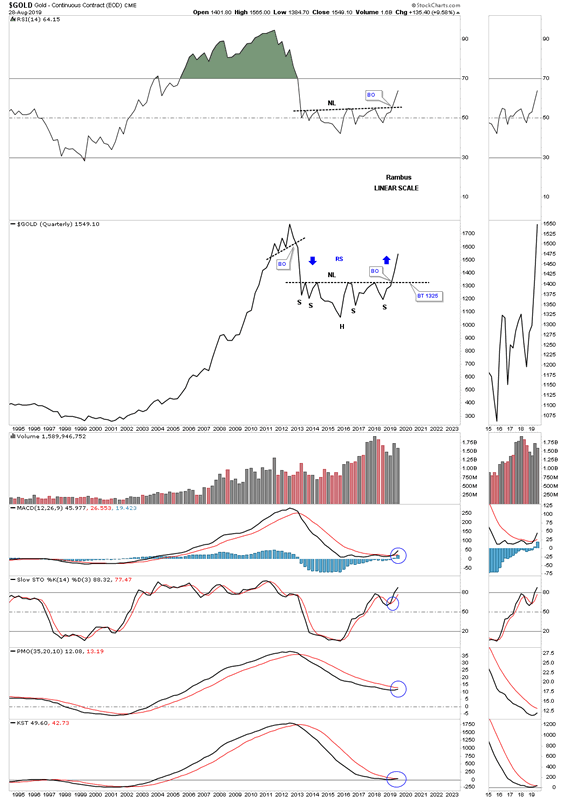
Lets start with the quarterly line chart for gold I first showed you back in 2017 when the price action bounced off the 2013 neckline failing to breakout. At the time we did have the possible H&S neckline building out but no confirmation the H&S bottom would eventually play out. What we did have in place were 2 left shoulders and a possible head with one right shoulder. Symmetry suggested before the H&S bottom would be completed that we would most likely see 2 right shoulders form. As you can see that was the case.
Also what a quarterly line chart can show us is reverse symmetry, how a stock goes up is often how it comes back down over the same area and visa versa. You can see this very clearly on this quarter line chart for gold. Also when looking at the quarterly line charts to follow take a quick look at the indicators for confirmation the major trend has reversed from down to up. I’m starting with the gold chart because it has been leading the rest of the PM complex higher and shows you what to expect with the rest of the PM complex when it becomes their turn to run higher.
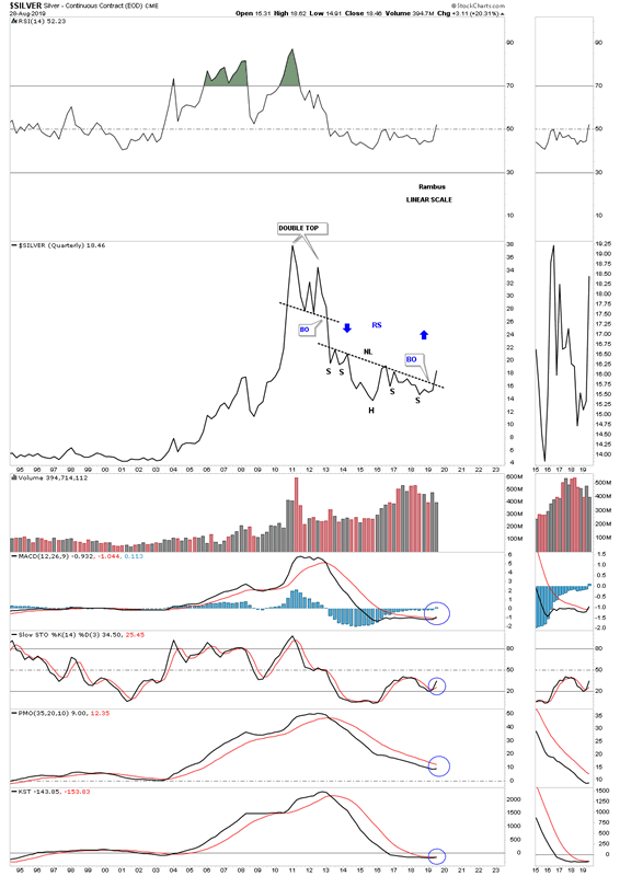
Many PM investors are in awe of the run silver is having right now not knowing why. The reason silver is rallying so strongly right now is because it has just broken out of its massive H&S base that had 2 left shoulders and 2 right shoulders. There is no question that silver has been one of the laggards when it comes to the PM complex as shown by the downscoping neckline. Nevertheless its 2013 neckline has given way completing its massive H&S bottom. Again, look at how gold reversed symmetry up after breaking out from its H&S bottom. Silver is going to do the same thing and has already started.
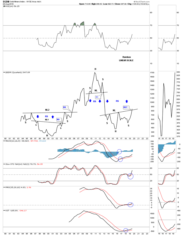
Next is the quarterly line chart for the GDM, gold miners index, which has been around the second longest of all the PM stock indexes except for the XAU. Note the massive base which formed from the mid 1990’s to the early 2000’s which launched this PM stock index on its bull market run. As you can see it is now in the process of breaking out above its 2013 neckline. There appears to be some possible serious reverse symmetry just above the neckline.
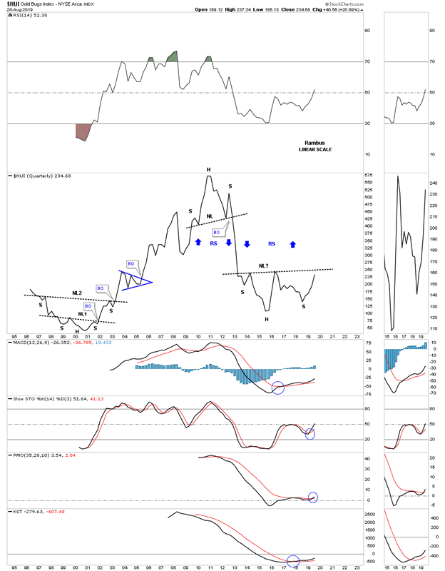
Below is the quarterly line chart for the HUI which is still trading below its 2013 H&S neckline. There is no doubt that the HUI will follow suit and breakout from is super base. Again, note how the price action could very well reverse symmetry back up over the same area on the way down as shown by the blue arrows.
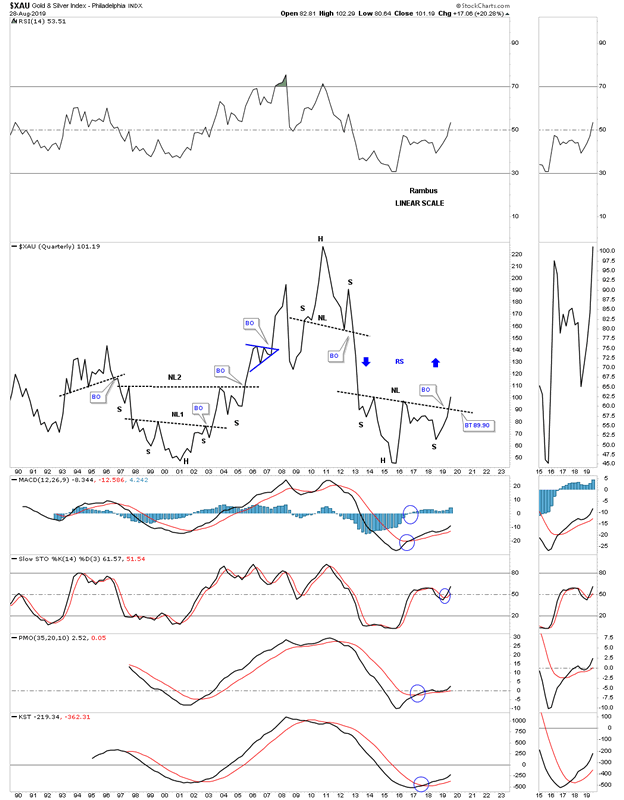
Next up is the XAU, gold and silver index, which is breaking out from its 2013 H&S neckline. Again, note the super base on the left hand side of the chart which launched this PM stock index on its bull market that ended in 2011. What’s interesting is that the XAU actually retraced 100% of its 2000 to 2011 bull market because this index is made up of some silver stocks which were very weak during the bear market years.
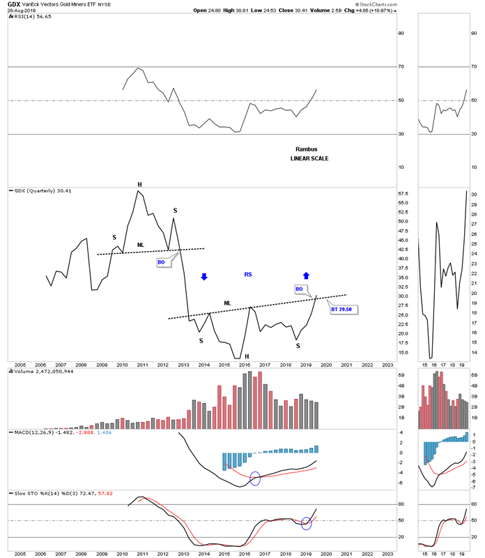
The GDX has only been around since 2006 but has still produced 2 super pattens, the 2011 H&S top and the current 2013 H&S bottom. The price action is currently trying to breakout from the 2013 H&S neckline.
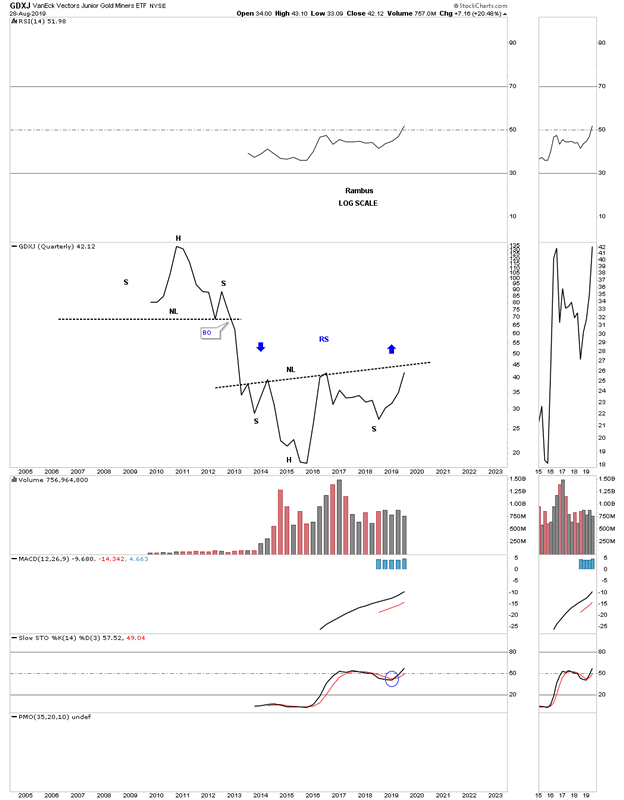
The GDXJ, junior gold miners etf, has only been around for 10 years. When you compare this 2013 base to the GDX 2013 base you can see the juniors have been slightly underperforming the big cap PM stocks up to this point. At some point in the future we will see the juniors outperform the big caps in a big way once the speculative fever hits the PM complex.
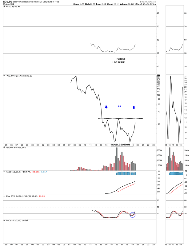
This next stock, HGU.TO, Canadian gold miners etf, is setup a bit differently than the rest of the PM stock indexes we’ve looked at so far. It doesn’t have a lot of history but it does have enough to show a 3 year double bottom building out. A breakout above the double bottom trend line will complete the reversal pattern. To measure for a price objective just measure the distance of the double bottom and add it to the breakout of the double bottom trendline. Again, there could be some very nice reverse symmetry to the upside.
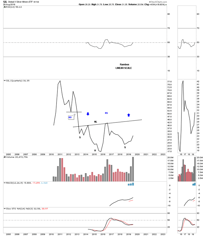
Yesterday we looked at a short term daily chart for the SIL, silver miners etf, which was breaking out from a bullish rising flag. I mentioned that SIL was probably the weakest sector within the PM complex but it could be getting ready to play some catch up. This quarterly line chart really drives home just how weak this index is vs the rest of the PM stock indexes.
What all these charts above are strongly suggesting is that the corner has been turned from bear market to bull market in regards to the PM complex. The indexes where the necklines are sloping up are showing more strength than the ones that are sloping down. Either way though a breakout above any of the necklines is a very bullish setup and lays the groundwork for many more years of bull market price action. Big patterns lead to big moves. All the best…Rambus
All the best
By Rambus Chartology
FREE TRIAL - http://rambus1.com/?page_id=10
© 2019 Copyright Rambus- All Rights Reserved
Disclaimer: The above is a matter of opinion provided for general information purposes only and is not intended as investment advice. Information and analysis above are derived from sources and utilising methods believed to be reliable, but we cannot accept responsibility for any losses you may incur as a result of this analysis. Individuals should consult with their personal financial advisors.
© 2005-2022 http://www.MarketOracle.co.uk - The Market Oracle is a FREE Daily Financial Markets Analysis & Forecasting online publication.


