US Housing Market 2018-2019 and 2006-2007: Similarities & Differences
Housing-Market / US Housing Oct 11, 2019 - 08:32 AM GMTBy: Dan_Amerman
 As can be seen in the graph below, there is an almost uncanny similarity between housing prices at the 2006-2007 peak, and current home prices.
The biggest difference is that current home prices are substantially higher. Should we be worried about a repeat scenario - and another six year decline in home values?
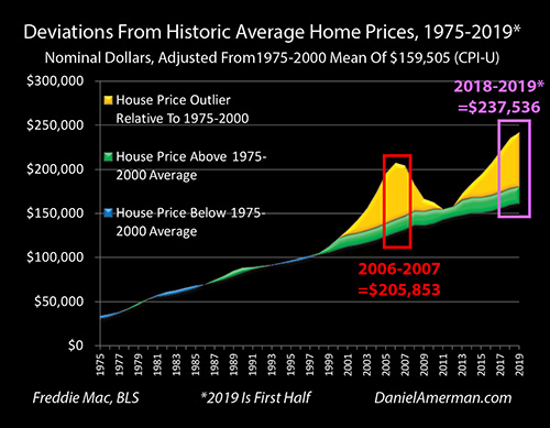
This analysis explores in detail the similarities between 2006-2007 and current home prices, on a national average basis. When we dig beneath the surface, we also find some major differences as well, which means that the next round could be quite different than the last round.
This analysis is part of a series of related analyses, which support a book that is in the process of being written. Some key chapters from the book and an overview of the series are linked here.
Very Low Interest Rates - Similar But Different
All else being equal, the lower that mortgage rates go - the higher the price that can paid for a house, without increasing the mortgage payment.
The monthly payment on a $200,000 thirty year mortgage loan at an 8% rate is $1,468. That same payment at a 4% rate will support a $307,391 mortgage. So, if interest rates drop from 8% to 4%, and the homeowner is borrowing the money to buy the home, that means they can afford to pay a 54% higher price for their home, without increasing their monthly payments (leaving aside down payments, taxes and insurance, this is just principal and interest payments).
As previously developed in much more detail in Chapters 3 & 7, the Fed slammed interest rates down to fifty year lows in the attempt to contain the damage from the popping of the tech stock bubble and resulting recession in 2001 and the years thereafter - and by doing so, laid the foundation for the real estate stock bubble of the early 2000s. It became easily affordable to pay record high prices for homes, thanks to those very low rates.
The collapse of that bubble was one of the leading causes of the Financial Crisis of 2008, and the resulting Great Recession. The Fed then responded with zero percent interest rates and massive monetary creation - and the end results were a second round of the highest real estate prices in history, even higher than the first round (in simple dollar terms).
As a potential recession looms - are we likely to see a second round of major and sustained decreases in home prices? There are many factors involved, but because interest rates and affordability have been so important in the past, let's look for some answers by closely comparing what was happening in 2006-2007, with what we have seen in 2018 and the first six months of 2019 (real estate price statistics lag a bit, they are not available in real time like stock prices or bond prices).
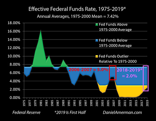
The graph above is one of the Five Graphs series developed in Chapter 3, and it shows Federal Funds rates on an annual average basis. The green and blue areas look at what was normal before the first containment of crisis in 2001, with the green being above average Fed Funds rates, and the blue being below average rates. The gold is the outliers - rates we had not seen until the post 2000 cycles began (or at least not since the 1950s).
As can be seen, Fed Funds rates bottomed out at the outlier of 1.13% (annual average) in 2003. They rose a bit to 1.35% by 2004, and then jumped out of the outlier range and back into the blue area of modern norms with a rate of 3.21% in 2005. In other words, record low rates helped create record high prices, then rates were no longer at record lows - and that created problems for the affordability of those record high prices.
Home prices peaked in 2006, and mildly declined in 2007. When we isolate those two years above, the average Fed Funds rate had jumped all the way up to 5.0%. This was on the low side for longer term averages, but was back to being in the historical range, and 3.9% above the outlier of a few years before.
When we look at the 2018 to first half of 2019 period - we see a very different picture. Fed Funds were much lower, and for a much longer period of time. Based on annual averages - Fed Fund rates have continuously been in the outlier range since 2008. And the Fed's 2019 interest rate pivot to forcing rates down in the attempt to prevent recession and crisis (and plunging home prices) is occurring at a place that is a full 3% lower than what we saw in 2006-2007.
The Fed Funds rate average for 2018 and 2019 was only 2%, as compared to a previous 5%. With many considering another decrease likely for the end of October, this is likely to come down even more when we have the full numbers for 2019.
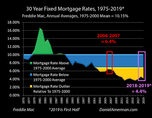
Now, Fed Funds are an important influence on thirty year mortgage rates, but to get to the exact impact on home affordability, we need to add in some other factors, with the most important being changes in the yield curve (as covered in previous chapters). When we do that, we get the 30 year mortgage rate graph shown above.
The previous turn in the real estate market occurred with average mortgage rates that were 6.4% for 2006 to 2007. These were very low levels on a historical basis, and in the golden outlier range. Yet, from the perspective of the 2010s - those were extraordinarily high rates.
The 2018 and the first half of 2019 mortgage rates are a full 2% lower than they were in the 2006-2007 period. It is also important to note just how much quicker the pivot in declining mortgage rates is happening this time around (this feeds back to and interrelates with prior chapters and analyses on long bond prices, yield curve arbitrage, and the Fed's plan to use quantitative easing to fund maturity extension programs in the event of a recession).
So from a much lower starting place, mortgage rates are going down much faster, and the difference between 2006-2007 and 2018-2019 will likely be much greater when we have the full year data for 2019, including average mortgage rates getting down to 3.62% for the month of August of 2019.
While there are multiple sources, the combined effect is that the housing market is being preemptively juiced up in 2019, with a far faster and larger reduction in what were already much lower mortgage rates than what we saw in 2006-2007.
Very High Housing Prices - Similar But Different
As shown in the introduction, we currently have average housing prices that are by far the highest that we have seen. At an average price of $238,000 on a national basis, these prices are far higher than the $206,000 experienced in the previous peak real estate bubble years of 2006-2007.
There is a remarkable similarity in the increase in housing prices each time - will there also be a remarkable similarity in the fall in home prices?
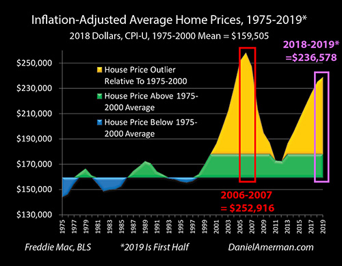
To find a better answer, we need to look at home prices in inflation-adjusted terms. As can be easily seen above, when we do so, then the extraordinary change in housing prices resulting from the Fed's heavy-handed interventions becomes even more obvious. We have two towering golden spikes now for home prices that are far in excess of historic norms (even after accounting for changes in home sizes and amenities).
But yet, while the uncanny resemblance between the two golden spikes remains, the relationship between them changes when we account for inflation. In 2018 dollars, the average price for a home in 2006-2007 was $253,000. So the 2018 to 2019 spike is now 6% below the 2006-2007 peak, instead of being the 15% higher that it is when we simply compared prices without adjusting for inflation.
Radically Different Housing Affordability For Homeowners & Investors
When we adjust for inflation, we have lower real home prices in 2018-2019, and we also have much lower mortgage rates than what the nation had in 2006-2007. When we combine price and rates - then we get real affordability.
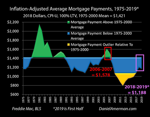
When we look at inflation-adjusted mortgage payments - what homeowners or investors have to pay in real terms - then we see by far the most dramatic difference between the 2006-2007 peak, and the current housing market.
As developed in detail in previous chapters (and as can be seen in the preceding graphs), most of the initial inflation of the housing bubble of the early 2000s was a "free ride" for homeowners and investors. Yes, housing prices were spiking far above historic norms - but Federal Reserve policies were pushing mortgage rates far below historic norms.
Combining those two forces, housing prices were able to surge to about 30% above long-term averages by 2004, going far into the outlier range - but mortgage rates that were well below historic averages kept real (inflation-adjusted) mortgage payments below average the whole time. Unusually high housing prices - were unusually affordable for the average home buyer.
However, the Fed cycle of increasing interest rates hit the still higher housing prices of 2005 - and inflation-adjusted mortgage payments started to move into the green area in the graph, slightly above historic averages. For 2006 and 2007, the free ride ended, home purchasers were finally really having to come up with the actual cash every month to pay for their higher home prices - and inflation-adjusted mortgage payments hit $1,578 per month, as can be seen with the green triangle.
With the end of the free ride - the return to home prices that were more in line with historic norms was quick to follow.
For 2018 through the first half of 2019, when we combine inflation-adjusted home prices that have still not reached the prior peaks, with mortgage rates that are far below the 2006-2007 averages (and are dropping), then we have inflation-adjusted mortgage payments that are far below what they were in the previous peak, and well below where they have been for most of the long term history of the housing markets.
The average inflation-adjusted mortgage payment for 2018-2019 is only $1,188. That is still $233 per month below the $1,421 long term average from 1975 to 2000, meaning that buying a home today (P&I only) is 16% cheaper in terms of the monthly payment.
The 2018 to 2019 average is a full $390 per month below the $1,578 average during the 2006-2007 peak, meaning that buying a home today (P&I only) is a remarkable 25% cheaper in terms of the monthly payment.
Yes, there are widespread perceptions that home prices are completely unaffordable these days. Yes, of course, housing markets are always local, and in some prominent metropolitan areas prices have risen to levels that are far above what is shown here, and the below average mortgage payments shown for the nation do not apply to those areas.
That said, when we fully take inflation into account (which few people do), and we look at the United States as a whole - then the affordability of a mortgage payment for a nationally average house is 16% below long term historic averages at this point, and 25% below what we saw in 2006-2007. For the average American they are not priced out of buying a home when compared to previous decades.
This is true for home buyers. This is true for investors who are buying single family homes as income properties.
(Though coming up the initial down payment is a different issue, particularly for young people with large student debts who want to buy in the most popular locations.)
Cycles Of Amplified Profits & Losses
We are not in a normal housing market, nor have we been for almost twenty years now. Instead, we have seen extraordinary highs and lows in home prices on a national basis, with price changes that are dominated by extraordinary changes in interest rates and Federal Reserve interventions.
If we look at home prices the way that most homeowners do, or most small income property investors do, then we are in a very scary spot at the moment. Housing prices are at record highs, we could be coming into a recession, and we could see a plunge in home prices along with the return of potentially millions of "underwater" homeowners, who owe more on their home than what the market value could be.
That could happen - no question about it. Elevated asset prices, a potential recession, major international complications, and unproven methods for exiting recession could be a quite toxic combination. But does that mean that the real estate market is doomed to "Groundhog Day", and repeating the previous six years of major losses again?
There are differences. As explored herein and in much more detail in some earlier chapters - to understand the true risk to current home prices, we have to understand the underlying source of why home prices are in an entirely different range than they were in previous decades. When we do this, then we can see that far from being at a record high, when we look at the actual affordability of the average home in inflation-adjusted terms, then home purchases are still substantially more affordable than has usually been the case on a historic basis.
Most importantly, although there is an almost uncanny similarity to housing prices in 2006-2007 and 2018-2019 when we look at the two golden spikes of home price outliers, when we look instead at what fed the growth of each of those spikes - we are in a night and day different place. The prior price spike led to above average mortgage payments, the end of the "free ride" - and the extremely elevated home prices were then unable to sustain at those levels.
Currently, average mortgage payments are at very low levels compared to long term averages - and they are dropping fast as the direct result of changes in Federal Reserve policies, as well as the changes in the yield curve that have led to such large gains in the prices of long term bonds. Everything interrelates.
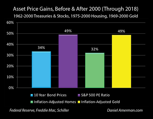
As shown above and as explored in Chapter One (link here), there is a remarkable similarity between the 34% gain that we have seen in average 10 year Treasury obligation prices in the post 2000 era, and the 32% gain in average inflation-adjusted home prices. While the specifics vary widely - as does the timing of the gains - each are responding to a domination of their markets by Federal Reserve interventions.
For those who understand those interventions, then not only do the radical changes in bond and housing prices become rational, but so do the changes in stock and gold prices. On the other hand, if the underlying causality is missed, then we just have four investment markets, each of which are inexplicably outside their historic price ranges simultaneously, by a degree that should be statistically improbable in any one category, let alone all four together.
Given that stock and bond investments along with home equity comprise the great majority of the net worth of most investors - this means that understanding this underlying shared causality becomes critical for informed decision making.
Another issue is that of amplification. The Fed has pivoted early, rates are still very low, and as explored in such chapters as 8, 11 and 13, in the event of another recession the Fed will likely quickly force the lowest thirty year mortgage rates ever seen in the United States. This would take the affordability graph and move it to an entirely different place within a very short time, perhaps within a few months.
We are in a different place with home prices than where we have ever been before - the fundamentals are working differently. We may be on the verge of a very quick trip to somewhere that is even more different, with results that may seem unexpected and improbable for those are not following the underlying causality. This could lead to swift and major changes in home prices across America like we have never seen before. Hopefully this analysis was helpful to you in understanding why that could be the case.
*********************************************
Daniel R. Amerman, CFA
Website: http://danielamerman.com/
E-mail: mail@the-great-retirement-experiment.com
Daniel R. Amerman, Chartered Financial Analyst with MBA and BSBA degrees in finance, is a former investment banker who developed sophisticated new financial products for institutional investors (in the 1980s), and was the author of McGraw-Hill's lead reference book on mortgage derivatives in the mid-1990s. An outspoken critic of the conventional wisdom about long-term investing and retirement planning, Mr. Amerman has spent more than a decade creating a radically different set of individual investor solutions designed to prosper in an environment of economic turmoil, broken government promises, repressive government taxation and collapsing conventional retirement portfolios
© 2019 Copyright Dan Amerman - All Rights Reserved
Disclaimer: This article contains the ideas and opinions of the author. It is a conceptual exploration of financial and general economic principles. As with any financial discussion of the future, there cannot be any absolute certainty. What this article does not contain is specific investment, legal, tax or any other form of professional advice. If specific advice is needed, it should be sought from an appropriate professional. Any liability, responsibility or warranty for the results of the application of principles contained in the article, website, readings, videos, DVDs, books and related materials, either directly or indirectly, are expressly disclaimed by the author.
© 2005-2022 http://www.MarketOracle.co.uk - The Market Oracle is a FREE Daily Financial Markets Analysis & Forecasting online publication.


