Stock Market Bullishness is Paradoxically a Warning Signal
Stock-Markets / Stock Markets 2010 Oct 19, 2010 - 04:59 AM GMTBy: Brian_Bloom
 One reason that charts are important is that they facilitate a view of the financial world that enables one to cut through all the background waffle. Fundamental analysis anticipates what “should be”. Technical analysis reflects what “is” – whether it should be or not.
Below are a few charts which reflect that what “is” is not reflecting what “should be”. We can shout as loudly as we like but facts are facts.
Chart 1(courtesy stockcharts.com) is a 3% X 3 box reversal of the 30 year yield. The blue line shows that the long dated yield is in a rising trend. (Ignoring day-to-day trading static).
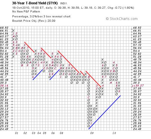
Chart 2 (also a 3% X 3 box reversal P&F chart, courtesy stockcharts.com) is of the US Dollar
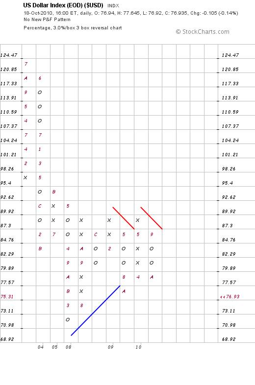
The most objective description of the pattern reflected above is that the dollar index has been in a trading range since 2004; with an upside resistance at 87 and a downside support at around 70-75. Given that these two extremities allow for a 20% movement within the extremities of the range, traders have been able to make great profits both on the buy side and on the sell side.
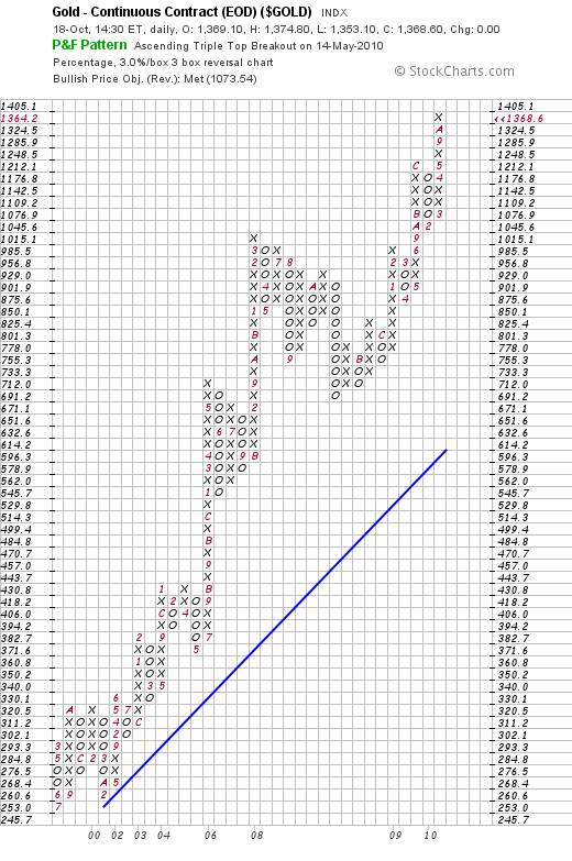
Chart 3 is a 3% X 3 box reversal chart of the gold price. It shows that gold has clearly been in a bull trend since 2002
Now let’s look at some of the “should be” arguments:
Gold “should be” rising, because the dollar is collapsing.
Well, let’s look at a longer term, time related chart of the dollar index, courtesy DecisionPoint.com
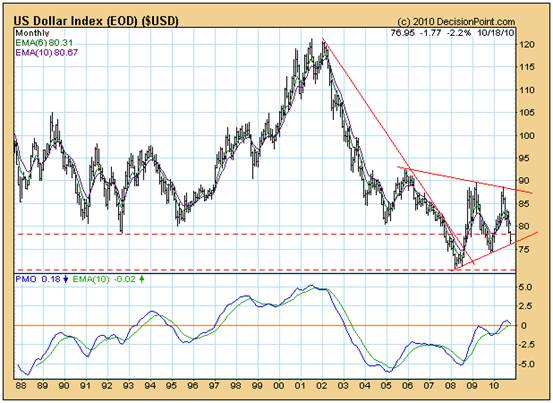
Clearly, it “peaked” in 2002. Arguable, it “bottomed” in 2008. Note the rising PMO bottoms between 2005 and 2008 versus the falling index bottoms between those two years. Note the rising PMO tops between 2009/10 and the falling index tops between those same years.
The conclusion to be drawn from the above has no correlation with what “should” have been happening. The fact is that the gold price was rising while the US Dollar Index was in a trading range. Therefore, the reason that the gold price was rising was not solely attributable to a falling dollar, if at all.
Importantly, this argument does not flow from the analyst talking to his book. It flows from an assessment of what has actually been happening. The fact is that the Dollar Index is tracking above its RISING trend line and cannot be argued to be in a bear trend unless/until the index penetrates that rising trend line on the downside.
So, why has the gold price been rising?
Is the market worried about inflation?
Well, below is a chart (courtesy DecisionPoint.com) which shows the direction of 30 year bond yield since long before the gold price began to rise.
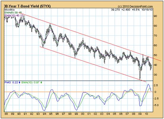
The gold price began to rise from about 2000. The long bond yield has been in a falling trend that dates back over a decade preceding the commencement of the rising gold price. The most plausible argument that could be made in relation to the above chart is that the patterns are reflecting a culmination of the bear trend but there is, as yet, no sign that the yields are about to enter a bull trend.
Now let’s look at the Dow Jones Industrial Index.
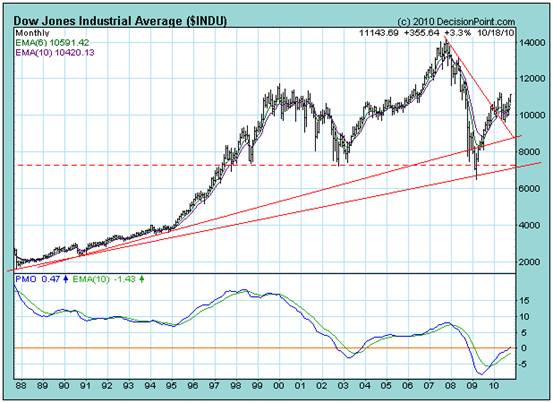
A few months ago, this analyst made the observation that the 200 day moving average most likely reflected a RESISTANCE level – offering resistance to further upside.
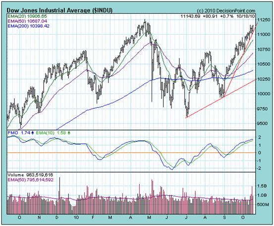
Clearly, in terms of the above chart, I was wrong. Remember, we are not talking about what “should” be happening here. What “is” happening is that the Dow Jones Industrial Index is now tracking above it 200 day moving average and the shorter term moving averages are rising.
Why is the DJIA rising?
If the DJIA was anticipating inflation, then the long dated yields would be rising. They are not.
There is no obvious answer arising from the above information.
The facts are these: The gold price is rising even though the dollar index is not “collapsing” (taking a long term view). And the Dow Jones Industrial Index is strong even though the long dated yield is not reflecting the anticipation of inflation.
Interim Conclusion
Rightly or wrongly, “the market” is taking the view that the worst of the financial crisis is behind us.
Analyst Comment
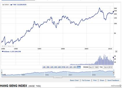
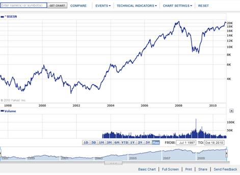
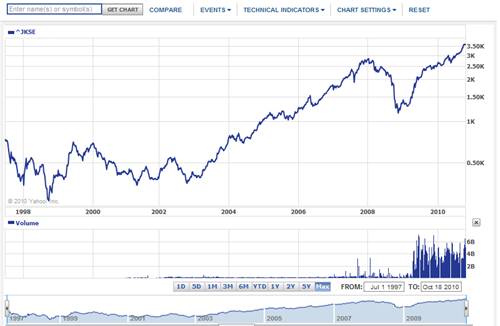
In a world economy which has now become globalised, a substantial proportion of the earnings of the Dow Industrial companies is generated outside the US’s borders. What the market appears to have concluded is that the centre of gravity of the world economy has shifted to the East – as can be seen from the following charts (courtesy Yahoo.com)
Hong Kong has recently broken up from a triangle
India has been rising and is now sitting at a potentially bearish (technically speaking, given the falling volumes) double top.
The Jakarta market has broken to a new high and is unarguably bullish
But, before we get carried away, we should probably take a long, hard look at what is “really” happening in the markets in the East.
For example, both the Hong Kong market and the Indian market have been rising on falling volume. This is not bullish.
Let’s not confine our attention to Asia. Let’s look at the BRIC markets beyond India.
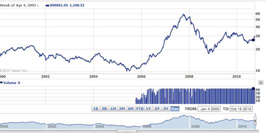
The market in China has reached the apex of a triangle, as can be seen from the chart below. Technically, the jury is still out.
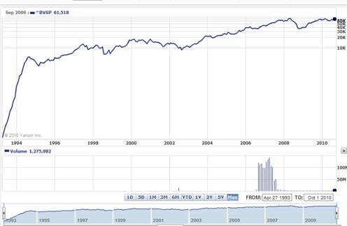
The market in Brazil is showing a potential double top:
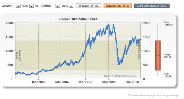
The chart below (courtesy http://www.tradingeconomics.com/Economics/Stock-Market.aspx?Symbol=RUB ) shows that the Russian market (like the Chinese market) is reaching the apex of a triangle.
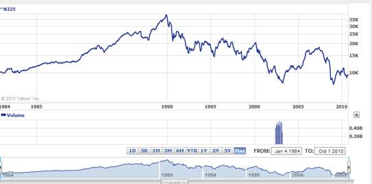
Finally, if we look at the chart of the Japanese market it shows no signs of coming alive following decades of zombie behaviour:
For reasons that may be summarised as “economic driver” related, let’s now take a look at a chart of the price of natural gas. Readers should bear in mind that, given the fact that peak oil has passed, the next generation of energy (that will drive the world economy in the coming twenty odd years) is very likely to be natural gas. If the gas price is showing signs of robustness, perhaps it can be argued that the gas price is a proxy for buoyant economic times ahead. The chart below – of the monthly price of natural gas – is courtesy http://futures.tradingcharts.com/chart/NG/M
TFC Commodity Charts
Natural Gas (NG, NYMEX)
Monthly Price Chart
Oops! The price of natural gas has been falling on rising volume. Arguably, producers have been hedging future production and buyers of forward contracts have not been showing a predisposition to want to load up on the long side. Not a good sign.
What about the oil price?
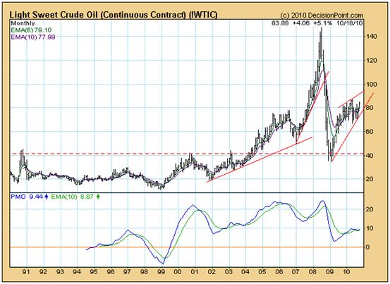
The chart above, courtesy DecisionPointg.com is showing a fascinating “diamond” pattern.
Objectively, one cannot make a call before the breakout, but the shape of this particular chart suggests that the breakout – when it comes – will very possibly be violent. It could just as easily scream up as collapse. The reason for the anticipated violence revolves around the extremities of the high and low peaks. The oil price has been VERY volatile. Against this background it is unlikely to remain docile.
The most “reasonable” conclusion that can be drawn from all of the above is that professional investors have, rightly or wrongly, shifted their attention away from the moribund USA economy and towards the (apparently) robust emerging economies and markets. However, given that the Brazilian, Russian and Chinese markets are all approaching points of decision; and given that there is technical evidence to support the view that some Asian markets have been “floating” up on falling volume, the technical picture cannot be argued (yet) to be bullish. To the contrary, on balance, the technical evidence surrounding the movement of the gold price and the US Dollar Index suggests that professional investor behaviour in particular has been skewed towards trading as opposed to investing. Behind the scenes, the prices of the drivers of the world economy – oil and natural gas – have not been validating an expectation of buoyant economic times ahead. If the oil price screams up it will likely be because of supply interruptions; which will have economically disruptive consequences. Similarly, a collapse in the oil price will also have extremely negative implications. Unfortunately, because the world has become oriented towards quarterly profits, long term planning has fallen by the wayside. Whilst natural gas “should” be taking over from oil, the motor car companies have been slow in migrating away from the reliance of their products on gasoline. Replacing coal with natural gas is a “nice” thought but it will not drive the world economy unless the manufacturing infrastructure adapts to embrace natural gas. The concept of an electric car that will pull up at a service station to top up with natural gas generated electricity is not one that is supported by any evidence that it will be practically achievable in the short term. For example, if this analyst is to travel by car from Sydney to Melbourne, how precisely, will he fill up the batteries? Will he have to extend his travel time by one extra day to allow for time to recharge the batteries? If the battery needs to be replaced, where is the evidence that motor car manufacturers are anticipating this development? We need to come down to earth in our expectations.
Overall Conclusion
Paradoxically, this analyst views the recent bullishness of the markets as a warning that, behind the scenes, the behaviour of businesses and investors has not been adapting to cope with the realities of life. The doggedly persistent emphasis on short term trading – disconnected from the reality of what actually drives the world economy - is becoming a source of serious concern. The only bright spot has been the rising gold price which, because there is no across the board evidence to validate the widely held “belief” that either broad dollar price inflation or a dollar collapse is on the cards, might be pointing to the quiet emergence of a positive new thought paradigm at some point in the foreseeable future. But, in the real world, whilst many professionals are now becoming optimistic, this analyst is not yet ready to embrace such an attitude.
Brian Bloom
Author, Beyond Neanderthal
By Brian Bloom
Once in a while a book comes along that ‘nails’ the issues of our times. Brian Bloom has demonstrated an uncanny ability to predict world events, sometimes even before they are on the media radar. First he predicted the world financial crisis and its timing, then the increasing controversies regarding the causes of climate change. Next will be a dawning understanding that humanity must embrace radically new thought paradigms with regard to energy, or face extinction.
Via the medium of its lighthearted and entertaining storyline, Beyond Neanderthal highlights the common links between Christianity, Judaism, Islam, Hinduism and Taoism and draws attention to an alternative energy source known to the Ancients. How was this common knowledge lost? Have ego and testosterone befuddled our thought processes? The Muslim population is now approaching 1.6 billion across the planet. The clash of civilizations between Judeo-Christians and Muslims is heightening. Is there a peaceful way to diffuse this situation or will ego and testosterone get in the way of that too? Beyond Neanderthal makes the case for a possible way forward on both the energy and the clash of civilizations fronts.
Copies of Beyond Neanderthal may be ordered via www.beyondneanderthal.com or from Amazon
Copyright © 2010 Brian Bloom - All Rights Reserved
Disclaimer: The above is a matter of opinion provided for general information purposes only and is not intended as investment advice. Information and analysis above are derived from sources and utilising methods believed to be reliable, but we cannot accept responsibility for any losses you may incur as a result of this analysis. Individuals should consult with their personal financial advisors.
Brian Bloom Archive |
© 2005-2022 http://www.MarketOracle.co.uk - The Market Oracle is a FREE Daily Financial Markets Analysis & Forecasting online publication.


