


U.S. Treasury Hidden Trickery in Mortgage Backed Security Recoveries
Interest-Rates / Credit Crisis Bailouts Aug 19, 2011 - 12:55 AM GMTBy: Aftab_Singh

 Right on schedule, the US Treasury received around $11 billion from the proceeds of Mortgage-backed Securities sales last Thursday. Moreover, the US Treasury released an update on the MBS portfolio wind down titled; ‘Taxpayers Recoveries Reach 70 Percent Milestone‘. The title left us thinking; hmmm… sort of… Here, I highlight the hidden confiscation involved with this particular piece of trickery and present the usual daily treasury statement charts.
First of all, let’s review how this ‘wind down’ has progressed since its inception earlier this year. The following chart shows the day-by-day dollar amounts deposited into the US Treasury’s coffers under the category of ‘GSE MBS Purchase Program Income‘ (government sponsored enterprise mortgage-backed securities purchase program income):
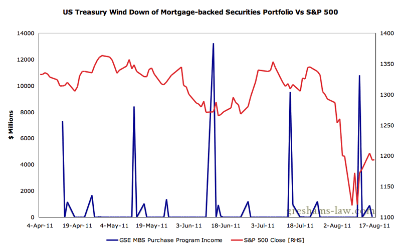
Deposits Received into the US Treasury's Coffers as part of the Wind Down of its MBS PortfolioSource: US Treasury
As can be seen above, the US Treasury usually makes a large sale towards the end of the second week of each month. This month was no exception; the US Treasury received around $10.8 billion into its coffers last Thursday. Now let’s review a few parts of the update:
Treasury has now recovered more than 70 percent ($159.5 billion) of its original $225 billion investment in MBS, which it made during 2008 and 2009 through authority provided to it by Congress under the Housing and Economic Recovery Act of 2008. These MBS purchases helped stabilize the financial markets and preserve access to mortgage credit during a period of unprecedented market stress.
The MBS market has improved considerably since Treasury purchased these securities. Based on current market conditions, Treasury expects to make a profit for taxpayers on this investment. [Our Emphasis.]
The last statement strikes us as laughable. Let’s leave aside the notion that the US Treasury has taken upon itself the task of ‘investing’ for taxpayers (!), and just focus on the trickery embedded in the last sentence.
They were nice enough to plot the Treasury’s holdings of MBSs over the past few years:
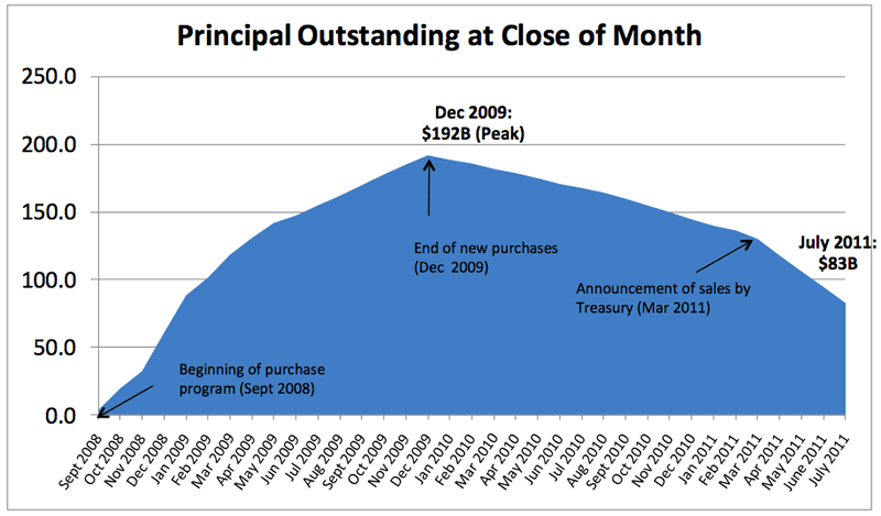
US Treasury holdings of GSE MBS. Source: US Treasury
With dollars that were forcibly taken from taxpayers, the US Treasury ‘invested’ in Agency-guaranteed Mortgage-backed securities. By and large, they swapped dollars for MBSs from September 2008 to December 2009, and then swapped MBSs back for dollars from Dec 2009 to present. The only questions are; what was a dollar? And what is a dollar?
As can be seen on the chart below, the Fed’s balance sheet has changed drastically from September 2008 to today. The notion that ‘profit’ can be meaningfully calculated with the dollar has become quite preposterous. Federal Reserve Notes have become irredeemable claims upon qualitatively and quantitatively different assets. In other words, the Fed has expanded its balance sheet, and has done so in favor of different assets.
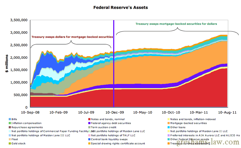
Federal Reserve Balance Sheet over the period where the US Treasury has been involved in the MBS market. Source: Federal Reserve
First of all, the total size of the Fed’s balance sheet has increased over three times:
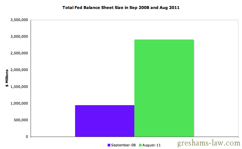
Total Size of the Fed's Balance Sheet in Sep 2008 and Aug 2011Source: Federal Reserve
Moreover, the composition of that balance sheet has changed from this:
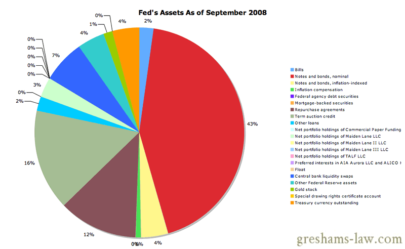
Composition of the Federal Reserve's Assets as of September 2008. Source: Federal Reserve
To this:
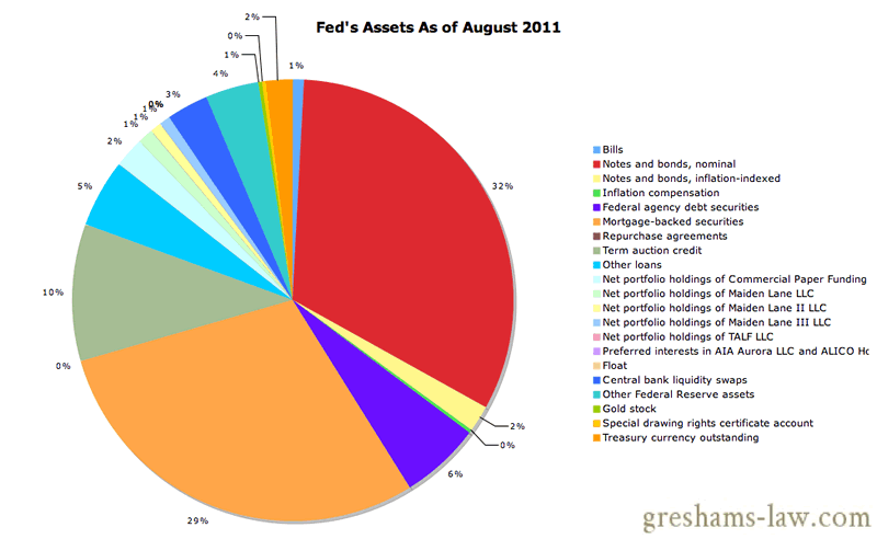
Composition of the Federal Reserve' Assets as of August 2011 Source: Federal Reserve
Hmmm… does one notice anything different? Perhaps the big pile of Mortgage-backed securities sitting on the Fed’s balance sheet?
The US Treasury swapped dollars for Mortgage-backed securities at a time when dollars were irredeemable claims upon the portfolio of assets shown in the first pie chart above. Subsequently, the Federal Reserve went on a balance sheet expansion-spree and diluted each dollar in existence in favor of Mortgage-backed securities. And now that the dollar prices of Mortgage-backed securities have miraculously levitated because the denominator (the dollar) was changed in favor of MBSs, they say:
The MBS market has improved considerably since Treasury purchased these securities. Based on current market conditions, Treasury expects to make a profit for taxpayers on this investment. [Our Emphasis.]
This is as silly as saying: ‘I am 1.8 meters tall. So since 1m = 3.28 ft, I am 5.9 feet tall. But now, I hereby declare that 1 meter is equal to 30 feet. And now look how much I have grown; I used to be 5.9 feet and now I am 54 feet tall!‘
These supposed gains made on the US Treasury’s MBS holdings were made at the expense of dollar holders. So, even if one were to accept that the US Treasury ‘made a profit for taxpayers’, one would also have to acknowledge that such a ‘profit’ was sourced from the taxpayers. We end up with something rather similar to the shenanigans tried by the Regent of France in John Law’s time:
To some, this kind of thing may seem harmless; after all, why does it matter if dollar-holding taxpayers get a haircut if they then get to ‘profit’ afterwards? There are many reasons as to why this is not harmless, but for now I quote Henry Hazlitt’s lucid explanation in ‘Economics in One Lesson‘:
There is a still further factor which makes it improbable that the wealth created by government spending will fully compensate for the wealth destroyed by the taxes imposed to pay for that spending. It is not a simple question, as so often supposed, of taking something out of the nation’s right-hand pocket to put into its left-hand pocket. The government spenders tell us, for example, that if the national income is $200,000,000,000 (they are always generous in fixing this figure) then government taxes of $50,000,000,000 a year would mean that only 25 per cent of the national income was being transferred from private purposes to public purposes. This is to talk as if the country were the same sort of unit of pooled resources as a huge corporation, and as if all that were involved were a mere bookkeeping transaction. The government spenders forget that they are taking the money from A in order to pay it to B. Or rather, they know this very well; but while they dilate upon all the benefits of the process to B, and all the wonderful things he will have which he would not have had if the money had not been transferred to him, they forget the effects of the transaction on A. B is seen; A is forgotten.
The Usual Charts:
Onto the usual charts then. The total operating balance of the US Treasury has remained at low levels over the past week; rising from just over $16 billion last Wednesday to only $21.5 billion as of Tuesday (latest).
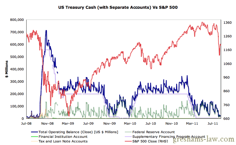
US Treasury Cash Vs S&P 500. Source: US Treasury
As mentioned in previous updates:
On the shorter-term timeframe, we notice a peculiar lagged correlation between the US equity indices and the total operating balance of the US Treasury. The lagged property means that this indicator has the capacity to be predictive. We generally don’t pay much attention to such kinds of analysis, but we indulge in this particular one because it is way out of the mainstream… The broad thesis is that net government spending is bullish for asset prices (on a lagged basis) and net accumulations of cash are bearish for asset prices (on a lagged basis). For a more detailed interpretation of these charts see here.
At the moment, these charts are suggesting the US equities could do ok over the next week and a half.
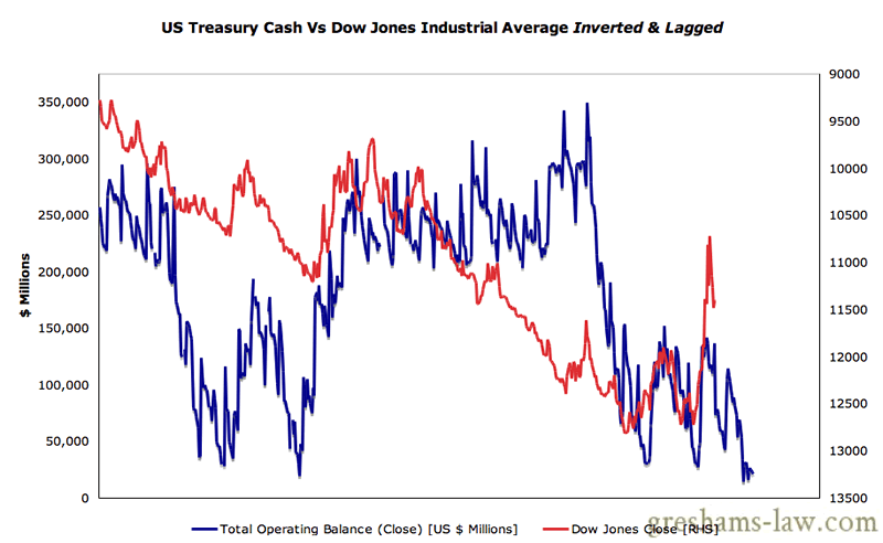
US Treasury Cash Vs Dow Jones Industrial Average Lagged & Inverted. Source: US Treasury
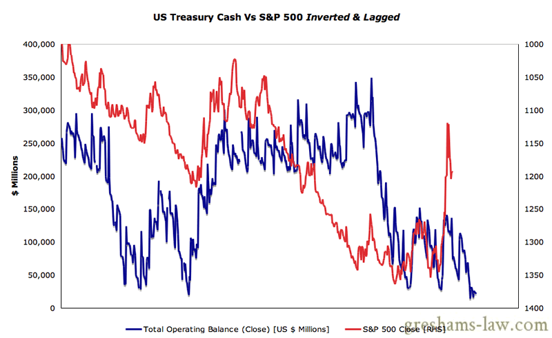
US Treasury Cash Vs S&P 500 Lagged & Inverted - . Source: US Treasury
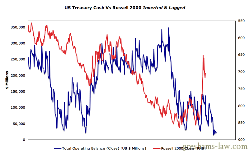
US Treasury Cash Vs Russell 2000 Lagged & Inverted - Click to enlarge. Source: US Treasury
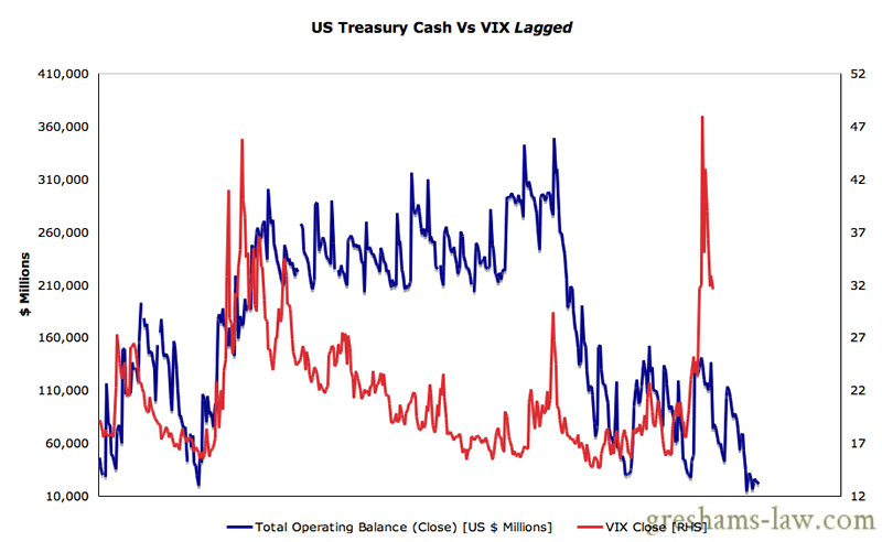
US Treasury Cash Vs VIX Lagged - Source: US Treasury
Aftab Singh is an independent analyst. He writes about markets & political economy at http://greshams-law.com .
© 2011 Copyright Aftab Singh - All Rights Reserved
Disclaimer: The above is a matter of opinion provided for general information purposes only and is not intended as investment advice. Information and analysis above are derived from sources and utilising methods believed to be reliable, but we cannot accept responsibility for any losses you may incur as a result of this analysis. Individuals should consult with their personal financial advisors.
© 2005-2022 http://www.MarketOracle.co.uk - The Market Oracle is a FREE Daily Financial Markets Analysis & Forecasting online publication.