


Gold Compared to Past Bubbles
Commodities / Gold and Silver 2012 Feb 07, 2012 - 03:36 AM GMTBy: Willem_Weytjens

 Bubbles Come, Bubbles Go.
The chart below shows us the “classic bubble pattern”.
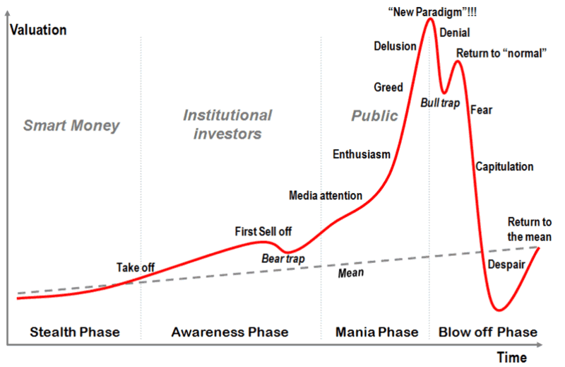
Most money is made during the latest phases of any bubble, as price goes nearly vertical.
When something goes straight up, I tend to get worried. All good things come to an end, eventually.
When something goes straight down, I am looking for ways to enter the market, as bad things come to an end as well… Eventually.
Imagine you invest in an asset that has a similar pattern as the one above.. When do you Sell if you are in a bubble? How do you even know whether you are in a bubble or not?
The first thing I look at, is sentiment. If sentiment is uberbullish, I become fearful.
If sentiment is uber Bearish, I get greedy.
The second thing I look at, is price action. When I see something is going straight up, I start to worry.
However, sometimes price goes up too hard, too fast. Below, I will show you a couple of examples:
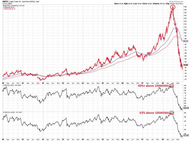
1) Oil in 2008*:
- at some point, Oil was trading 40%+ above the 50 weeks EMA.
- Oil was also trading 63% above the 100 weeks EMA.
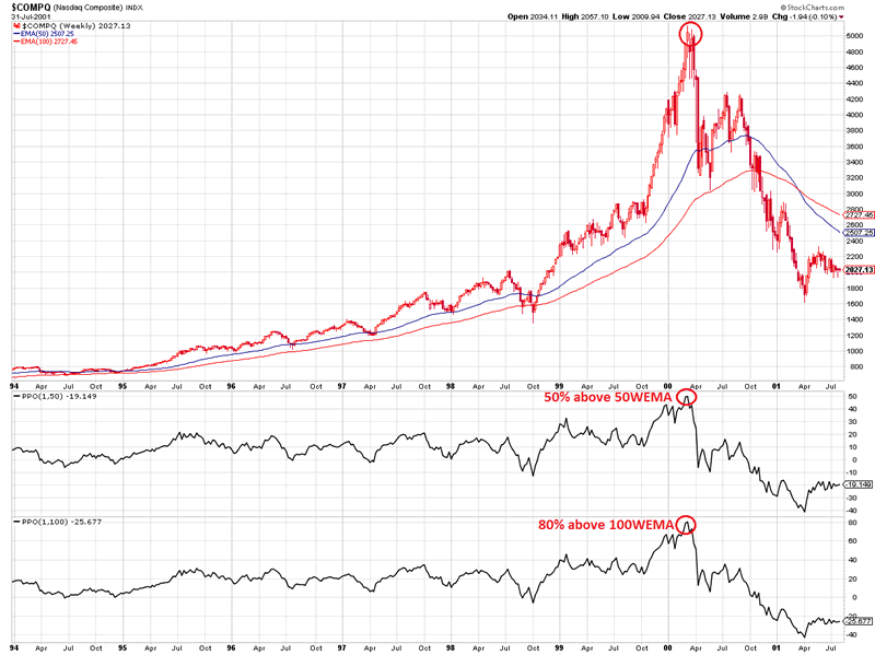
2) Nasdaq in 2000*:
- at some point, the Nasdaq was trading 50%+ above the 50 weeks EMA.
- it was also trading 80% above the 100 weeks EMA.
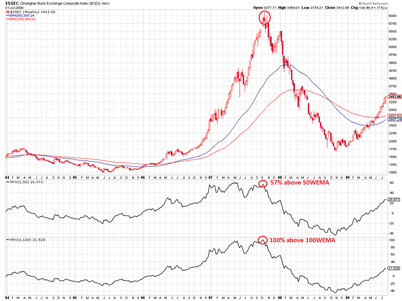
3) Chinese Shanghai index in 2007*:
- at some point, the index was trading 57%+ above the 50 weeks EMA.
- it was also trading 100% above the 100 weeks EMA.
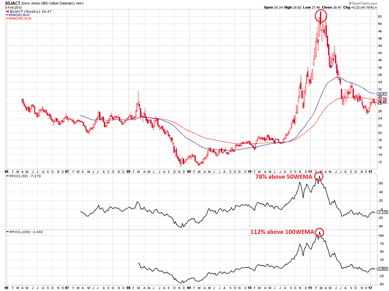
4) Cotton in 2011*:
- at some point, Cotton was trading 78%+ above the 50 weeks EMA.
- it was also trading 112% above the 100 weeks EMA.
Every bubble ended the same way: they all came back down sharply.
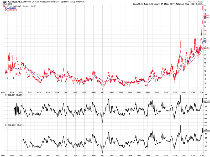
One bubble that is currently forming in my opinion is the relative price of Natural Gas to the price of Oil.
As we can see in the chart below, the ratio of Oil to Natural Gas fluctuated between roughly 6 and 14 from 1990 to 2009.
However, from then on, the ratio broke out of this range, and is now going vertical.
Recently, the ratio was trading 65% above its 50 weeks EMA and about 90% above its 100 weeks EMA.
Someday, I expect this ratio to come back down*.
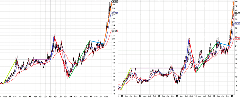
However, when we look at the charts below* – where I plotted the Silver price on the left hand side, and Oil-to-NaturalGas ratio on the right hand side – we can see very similar patterns.
Please notice that this similarity is currently at the point when silver was trading around $31.
Silver had a small pullback and then rallied all the way to almost $50, so if the similarities between the two patterns continue to hold, Natural Gas could still get a LOT cheaper compared to Oil.
That could mean:
- rising Oil Prices
- falling Gas Prices
- a mix of the two above
- rising Oil and Natural Gas prices, whereby Oil rises faster
- falling Oil and Natural Gas Prices, whereby Natural Gas falls faster.
With that in mind, let’s have a look at the Gold price.
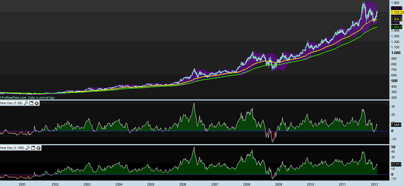
The next chart shows Gold in the 1970′s**.
At the peak, price was trading 118.32% above the 50WEMA, and 170.04% above the 100WEMA.
WOW!
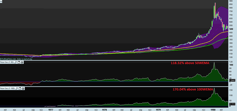
Currently, Gold is only trading 7,54% above the 50WEMA and 17.71% above the 100WEMA, so compared to 1980, Gold is NOWHERE near a Bubble**.
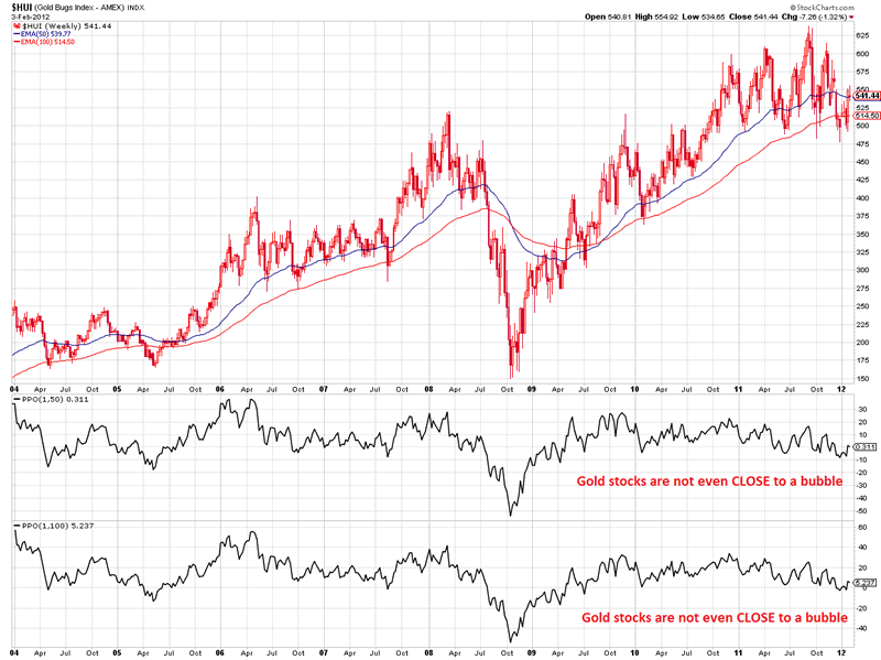
The same counts for Mining stocks, as measured by the HUI Index*, as it is trading roughly AT the 50WEMA and only 5% above the 100WEMA:
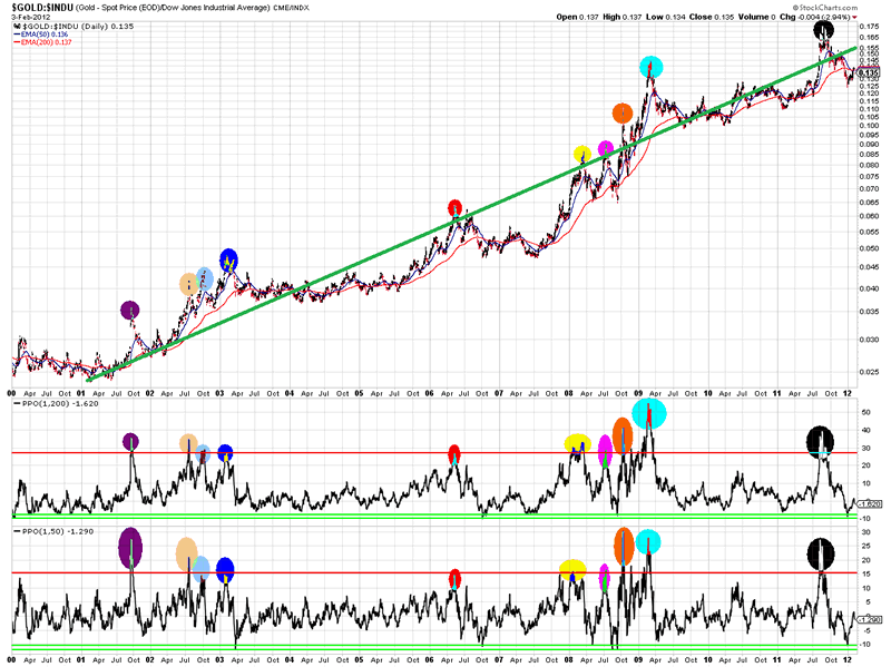
When we look at the Gold-to-Dow Jones ratio*, we can spot a nice uptrend, but nowhere near going vertical.
However, when we look at the last 12 years, we can see that when price was 30%+ above the 200WEMA or 15%+ above the 50WEMA, it was time to be cautious.
On the other hand, when the ratio was 10% below the 50WEMA and 200WEMA, this offered some nice buying opportunities:
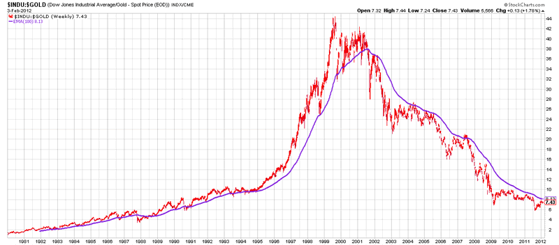
When we look at the following chart, we can see that, as long as the DowJones-to-Gold ratio was above the purple line (100WEMA), stocks were in a Bull market, while in 2001, they entered a bear market when measured in “real currency”, and will continue to be in a “real” bear market as long as the purple line is not broken to the upside on a sustainable basis*:
I like to make comparisons of assets as I think history often rhymes, so here’s another one which I have shown more than once.
It’s Gold in 2006 vs Gold Now**:
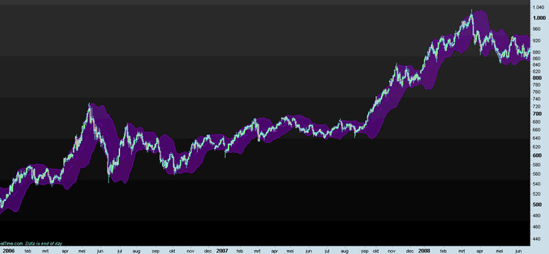
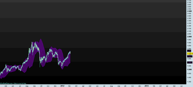
In case you don’t see the similarities, here’s an overlay study**:
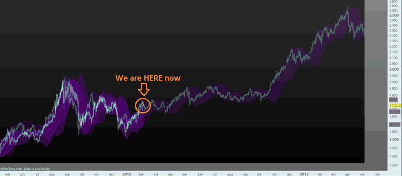
If 2006 is any guide, Gold could consolidate throughout the summer, before taking off sharply into 2013.
Of course, that is, as long as the comparison holds.
Good luck investing.
For more articles, trading Updates, Nightly Reports and much more, please visit www.profitimes.com and feel free to sign up for our services!
Willem Weytjens
www.profitimes.com
© 2012 Copyright Willem Weytjens - All Rights Reserved
Disclaimer: The above is a matter of opinion provided for general information purposes only and is not intended as investment advice. Information and analysis above are derived from sources and utilising methods believed to be reliable, but we cannot accept responsibility for any losses you may incur as a result of this analysis. Individuals should consult with their personal financial advisors.
© 2005-2022 http://www.MarketOracle.co.uk - The Market Oracle is a FREE Daily Financial Markets Analysis & Forecasting online publication.