Analysis of Gold and the XAU Index Ratio Charts
Commodities / Metals & Mining Feb 26, 2007 - 09:24 PM GMTBy: Tim_Wood
It has been a while since I have talked about ratio analysis and because of a few developments of late, I thought that this may be a good time to do so. First, let me begin by explaining to those that may not understand, a ratio chart is calculated by simply dividing one stock or commodity by another.
This in effect then shows us the "Relative Strength" of the two. We can then take this analysis one step further by comparing the ratio chart to the underlying stock or commodity and even applying indicators to the equation. Let's take a look at a few examples.
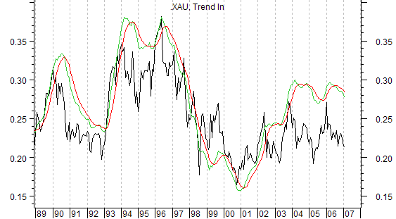
To begin with, below I have a monthly XAU/Gold ratio chart along with my Trend Indicator. When price is moving up on this chart it is telling us that gold stocks are out performing physical gold. When price is moving down, the opposite is, of course, true. As an example of this, let's look at the period between the May 1996 top and the August 1998 top. During this timeframe gold fell from roughly 410 to 271 or 35%. All the while, the XAU fell from 150 to 51 or 66%. So, as this chart suggested, the XAU was the weaker of the two. If we take the bullish period between October 2000 and May 2002, gold advanced from 266 to 331 or some 24%. But, during that same period, the XAU advanced from 41 to 84, which was up some 105%. As this chart suggested during that timeframe, the XAU was the strongest.

The next question comes with knowing when a turn has actually occurred. The best answer for this comes with my Trend Indicator, which is plotted in green and red. When the green line is above the red line, we know that price is in a confirmed up trend and in that environment the gold stocks will be stronger than gold. The flip side of this equation is of course that when the red line is above the green line gold will be stronger than the stocks. So, we know based on this long-term monthly chart that we are now in an environment in which gold is stronger than the gold stocks. Since January 2006, when this chart peaked, gold is up some 19% while the XAU is actually down over 5%.
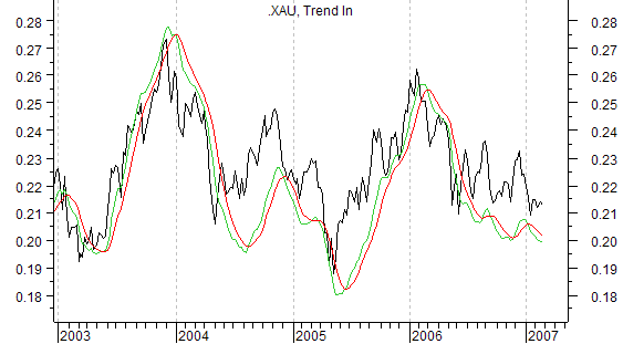
Now let's zoom in a little and look at this same chart on an intermediate-term basis. Here too we find that we have been in a downtrend throughout most of 2006 with a couple of brief and failing breaks to the upside. When looking at this level we see that since January we have been in an environment in which the intermediate-term has also been moving lower. This then is in alignment with the longer-term monthly chart so both levels are moving in the same direction.

We could look at the daily chart as well, but that level is so noisy that it would drive you nuts trying to watch it and personally I had rather stay focused on the intermediate and long-term charts. This allows me to identify a trend and stay with it rather than to be confused by the short-term noise, which in turn tends to cause you to lose focus on the intermediate and longer term trends that we should be the most concerned about anyway. But, let me also add that we can use this same ratio analysis on a quarterly chart in order to identify very long-term trends and trend changes.
We can also look at divergences between ratio charts and the underlying commodity to gain valuable insight surrounding the development of important tops and bottoms. Of late I have received questions about gold verses gold stocks. By simply watching the Trend Indicator on this ratio chart we can know when gold is favored over gold stocks and vice versa. Since early 2006 we have been in an environment in which gold has been favored over gold stocks. Until the weekly Trend Indicator turns back up above its red line, this will not change. If/when this occurs, the next step will be to see if the longer-term monthly Trend Indicator turns up as well. Then and only then will the environment change in the favor of gold stocks.
So, no doubt about it, ratio charts are a very valuable tool, especially when combined with my Trend Indicator and the meaning of this data is extracted from the charts. This analysis can be even further expanded to tell us when corrections are expected to occur in the underlying metal itself and when the sailing is all clear. That analysis can then be compared to other technical work to provide an even more complete picture. So, I have decided that I will make this type of analysis available in my newsletter and in my web based updates. I will be expanding on this analysis in the coming days and in the next newsletter. If you would like to know more about this type of analysis, how it can even be further expanded to gain even more insight and to remain up to date on these developments, then perhaps you should consider Cycles News & Views.
I also do quantitative analysis with a special focus on the 4-year cycle in the stock market. Plus, I cover the dollar, gold, bonds as well as other key markets such as oil, gasoline and copper at important turn points. Get the technical and statistical facts and know when significant turns come based on the ever so important Cycle Turn Indicator.
By Tim Wood
Cyclesman.com
Tim Wood specialises in Dow Theory and Cycles Analysis - If you are interested in a statistical and technical based source that also utilizes Dow theory and provides statistical probabilities as to what should occur, then Cycles News & Views may be for you. I also provide web-based updates giving short and intermediate-term turn points on the stock market, gold, bonds and the dollar, utilizing my Trend and Cycle turn Indictors. A subscription also includes short-term updates three nights a week. Please see www.cyclesman.com/testimonials.htm .
© 2005-2022 http://www.MarketOracle.co.uk - The Market Oracle is a FREE Daily Financial Markets Analysis & Forecasting online publication.


