


Gold and Silver Price Trend Forecast Progress Report
Commodities / Gold and Silver 2013 Jul 26, 2013 - 10:45 AM GMTBy: Peter_Degraaf

 This chart courtesy Federal Reserve Bank of St. Louis shows the US Monetary Base continues to rise exponentially. This is one of five major (along with many minor) central banks that are daily adding to the money supply of the world. This madness is causing investors to hedge against chaos and price inflation. Precious metals will benefit.

“When national debts have once accumulated to a certain degree, there is scarce, I believe a single instance of their having been fairly and completely paid. The liberation of the public revenue if it has ever been brought about at all, has always been brought about by a bankruptcy, sometimes by an avowed one but always by a real one, though frequently by a pretended payment.” … (Adam Smith).
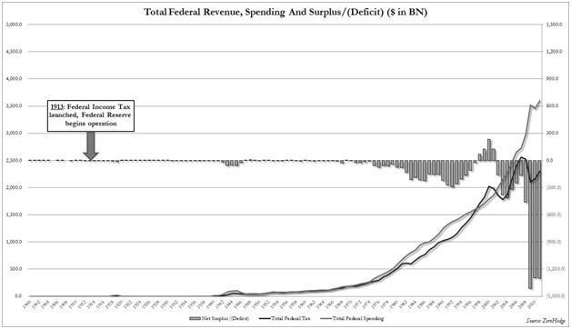
This chart courtesy Zerohedge.com shows the wide gap that exists in US Government’s spending (red), and revenue (blue). The result is record deficits (green bars). Historically government deficits have coincided with a bull market in gold and silver, due to the fact that deficits are covered with printing press money.
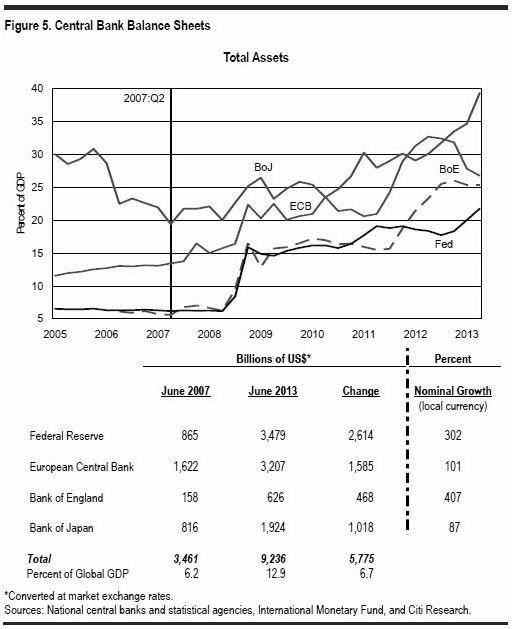
This next chart courtesy Zerohedge.com shows the world's major central banks continue to inflate the combined money supply.
”No paper money system has ever lasted. All have ended in failure and disaster and this present system will end the same way. No matter what efforts are exerted on behalf of paper money.” …(D. R. Schoon).
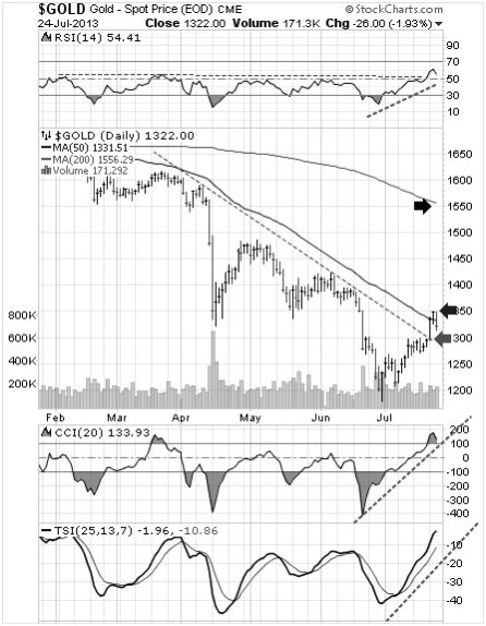
Featured is the daily gold chart. Price broke out at $1300 on Monday and on Wednesday the breakout was being tested by the gold bears. The supporting indicators are positive (green lines). The RSI at the top of the chart shows a breakout above ‘50’ for the first time this year. A convincing close above the blue arrow sets up a target at the black arrow. Our ‘Gold Direction Indicator’ is bullish at 74%.
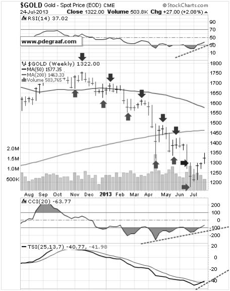
Featured is the weekly gold chart. The green arrows point to bottoms in the 7 – 8 week gold cycle. The purple arrows point to tops. The goal is to buy near the bottoms and take partial profits near the tops – not easy, but that is the goal. The breakout at the blue arrow revealed that this is week #4 in the latest cycle. The supporting indicators (green lines) are suggesting higher prices are ahead.
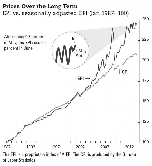
This chart courtesy AIER.ORG shows the Everyday Price Index (blue), compared to the US CPI index (green). The CPI excludes food and energy (who needs those anyway), as being too volatile. The EPI is more realistic and it is warning that price inflation is ongoing. Investors and anyone with money in the bank should add to their stash of gold and silver to protect themselves from this price inflation. Funds on deposit at banks are being eroded as price inflation exceeds interest.
“Invest in inflation; it’s the only thing that’s going up!” …(Will Rogers).
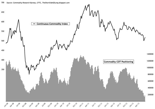
This chart courtesy Short Side of Long shows hedge funds have the least exposure to commodities since the credit crisis of 2008. From a contrarian perspective this is quite bullish for commodities and especially for silver and gold.
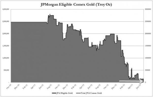
The gold stash in JPMorgan's vault keeps dropping. According to Zerohedge.com the total which was 3 million ounces two years ago is now down to just 436 thousand ounces.
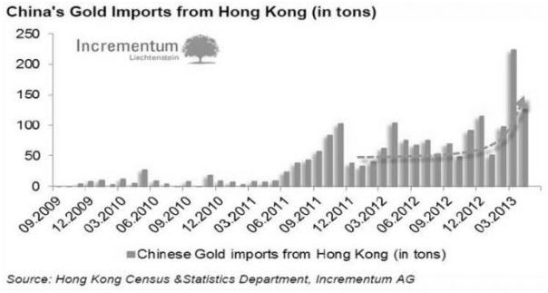
This chart courtesy sources listed, shows the demand for gold into China via Hong Kong remains robust.
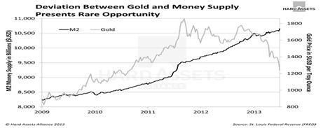
This chart courtesy Hard Assets Alliance 2013 shows the coincidence between US M2 and the price of gold. The coincidence is currently out of sync, and unless M2 should suffer a very rapid decline, (not likely), the expectation is for gold to rise above M2 again.
“To live beyond your means today is to live below them tomorrow.” ( Hans F. Sennholz).
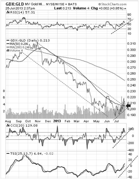
Featured is the index that compares GDX, (the gold miners ETF), to GLD (the gold bullion ETF). Historically, whenever the miners outperformed bullion, the trend for both was upward bound. Price is in the process of breaking out at the blue arrow. A close above 0.22 will confirm the breakout and marks the July low as the bottom in the correction. The supporting indicators are positive.
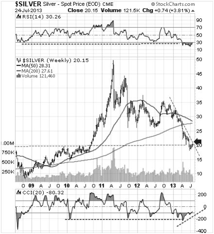
Featured is the weekly silver chart. Price is trying to turn up at lateral support near 20.00. Confirmation for the bottom in the 22 month old correction will come once price breaks out at the blue arrow. The supporting indicators are oversold and ready to turn up.
"Back in the 1970s when I liked silver over gold, there was ten times as much silver above ground as there was gold. Despite that, we made twice as much money on silver as we did on gold. Now the ratio has changed. Industrial use has so depleted our silver inventory that US government now owns none. There is six times more gold above ground than silver, which is by far the scarcer of the two metals. So why is gold many times more expensive than silver? Because 99.9% of the people in the world think gold is much rarer than silver. But they are wrong, dead wrong. Sooner or later the supply/demand equation will favor silver and narrow the pricing gap between the two metals." …(Howard Ruff)
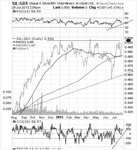
Featured is the index that compares SIL (the silver producers ETF) to GDX (the ETF made up primarily of gold producers). Despite the low silver prices, this index has favored silver producers for the past 12 months!!! This is very bullish for silver producers and for silver as well!!! The index is building a bullish chart pattern and a breakout at the blue arrow will set the stage for further gains on the part of SIL over GDX.
Happy trading!
By Peter Degraaf
Peter Degraaf is an on-line stock trader with over 50 years of investing experience. He issues a weekend report on the markets for his many subscribers. For a sample issue send him an E-mail at itiswell@cogeco.net , or visit his website at www.pdegraaf.com where you will find many long-term charts, as well as an interesting collection of Worthwhile Quotes that make for fascinating reading.
© 2013 Copyright Peter Degraaf - All Rights Reserved
DISCLAIMER:Please do your own due diligence. Investing involves taking risks. I am not responsible for your investment decisions.
Peter Degraaf Archive |
© 2005-2022 http://www.MarketOracle.co.uk - The Market Oracle is a FREE Daily Financial Markets Analysis & Forecasting online publication.