Gold and Silver Ratio Signals Much Higher Silver Prices
Commodities / Gold and Silver 2013 Aug 28, 2013 - 10:26 AM GMTBy: Hubert_Moolman
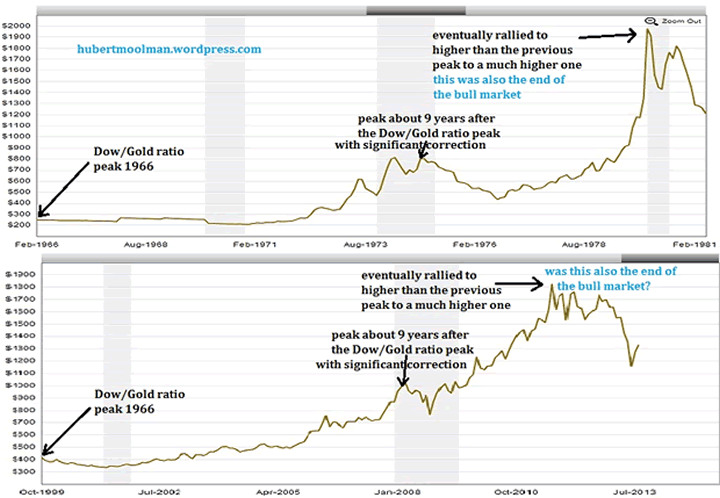
 It is natural to compare the current precious metals' bull market with that of the 70s, since there are many similarities between the two. Below is a comparison which illustrates some of the similarities between the two bull markets:

All charts are generated at macrotrends.net
The top chart is gold (inflation-adjusted) from 1966 to1981, and the bottom is gold (inflation adjusted) from 1999 to 2013. It is evident that both gold bull markets, started sometime after a major peak in the Dow/Gold ratio. They both had an important peak about nine years after the Dow/Gold ratio peak, which was followed by a significant correction.
After the peak and correction, the price eventually went higher to a far greater peak, which in the case of the 70s chart was the end of the bull market. Knowingly, or unknowingly, these similarities are probably the reasons why many think that the gold and silver bull markets ended in 2011, with the peaks in that year.
Does it mean that the bull market is indeed over, since gold and silver did not rally higher than the 2011 peaks, in 2012 and up to now in 2013? Especially since the above charts seem to suggest so.
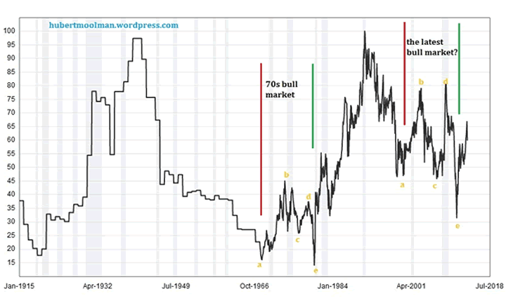
The Gold/Silver ratio appears to provide some answers to this question. Below, is a 100-year Gold/Silver ratio chart:

On the chart, I have indicated the period of the 70s and latest bull market, between red and green lines. Notice how similar the patterns (marked a to e) are during these two periods, again illustrating how reasonable it is to compare the two bull markets. However, this chart also shows why those who believe that the bull market is over are probably very wrong.
Although, the patterns are similar, they do not exist in a similar context in relation to the long-term movements of the Gold/Silver ratio chart. The 70s pattern formed more towards the bottom of the 100-year range of this ratio, whereas the recent pattern formed more towards the top.
More importantly, the 70s pattern formed at or just after a major bottom (1968) in the ratio, whereas the recent pattern formed just after a major top. This means the 70s pattern was formed during an uptrend in the ratio, and it was, therefore, more likely that the ratio would continue higher over the years following the pattern. The recent pattern is formed during a downtrend in the ratio and; therefore, there are likely greater forces at work putting downward pressure on the ratio.
This compares favourably to the positive fundamentals of the silver (and gold) market, since there is nothing to suggest that paper (money) is now safe, and much less riskier than gold and silver. The massive debts that lurk behind the fiat currencies (including the US dollar) are representative of these great forces that will keep more people preferring gold over these debt-ridden currencies.
Point e of the 70's pattern is where gold and silver made significant all-time nominal highs, much higher than any previous highs. On the recent pattern only gold made an all-time nominal high, higher (but not much higher) than any previous highs. Silver only equalled its 1980 all-time nominal high. This is a major non-confirmation which signals that although the two patterns played out in a similar manner, it does not mean that point e in the recent one is the end of the gold and silver bull market just like in 1980.
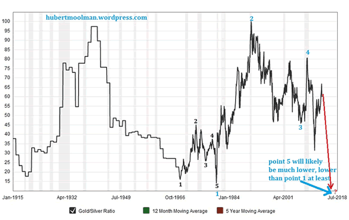
However, why did we not get the final blow-off rally for silver, to a price much higher than any precious nominal high? Again, it can be best explained by looking at the Gold Silver ratio. Below, is the same 100-year Gold/Silver ratio chart:

However, here I show a more relevant comparison to the 70s bull market (pattern). On the chart, I have marked the 70s bull market with points 1 to 5. Instead of comparing it to the latest bull market, starting in 1999, I compare it to the period starting in 1980, when silver peaked in January of that year to now (which I have market 1 to 4, with point 5 still to come). If point 5 occurs lower than 15 (as illustrated), we will have a very accurate fractal (pattern), similar to the one of the 70s (but bigger).
This is a more relevant comparison since both patterns starts from a major peak in silver, 1968 and 1980, respectively. Both patterns started at the bottom of the 100-year range of this ratio, in fact, at a major bottom (1968 & 1980).
The current pattern has not completed yet, and it would suggest that it will only complete at a point much lower than a ratio of 15. Such a completion of the pattern is consistent with the bullish fundamentals of silver (and gold) in relation to paper money - understanding that a lower ratio will likely mean higher gold and silver prices.. Furthermore, it is consistent with the scenario that we are in a downtrend in the ratio; therefore, being, more likely to go lower over the next couple of years. A recent comparison of the relationship between the silver and Dow bull markets tell the same story.
For more silver and gold analysis and guidance, see my Long-term Silver Fractal Report or subscribe to my Premium Service.
Warm regards and God bless,
Hubert
http://hubertmoolman.wordpress.com/
You can email any comments to hubert@hgmandassociates.co.za
© 2013 Copyright Hubert Moolman - All Rights Reserved
Disclaimer: The above is a matter of opinion provided for general information purposes only and is not intended as investment advice. Information and analysis above are derived from sources and utilising methods believed to be reliable, but we cannot accept responsibility for any losses you may incur as a result of this analysis. Individuals should consult with their personal financial advisors.
© 2005-2022 http://www.MarketOracle.co.uk - The Market Oracle is a FREE Daily Financial Markets Analysis & Forecasting online publication.


