


Stocks Secular Bull and Bear Markets
Stock-Markets / Stock Markets 2013 Sep 02, 2013 - 12:24 PM GMTBy: PhilStockWorld

 Courtesy of Doug Short.Was the March 2009 low the end of a secular bear market and the beginning of a secular bull? Without crystal ball, we simply don’t know.
One thing we can do is examine the past to broaden our understanding of the range of possibilities. An obvious feature of this inflation-adjusted is the pattern of long-term alternations between up-and down-trends. Market historians call these “secular” bull and bear markets from the Latin word saeculum “long period of time” (in contrast to aeternus “eternal” — the type of bull market we fantasize about).
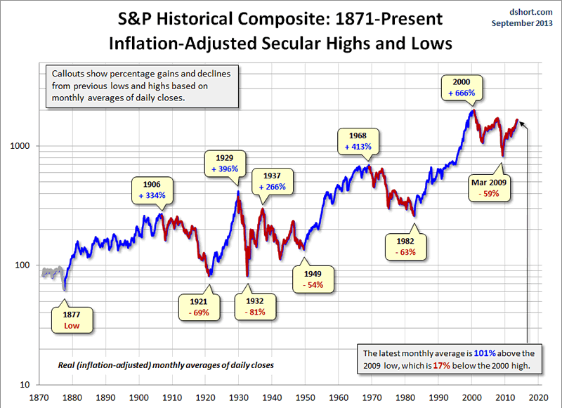
The key word on the chart above is secular. The implicit rule I’m following is that blue shows secular trends that lead to new all-time real highs. Periods in between are secular bear markets, regardless of their cyclical rallies. For example, the rally from 1932 to 1937, despite its strength, remains a cycle in a secular bear market. At its peak in 1937, the index was 29% below the real all-time high of 1929. For a scholarly study of secular bear markets, which highlights the same key turning points, see Russell Napier’s Anatomy of the Bear: Lessons from Wall Street’s Four Great Bottoms.
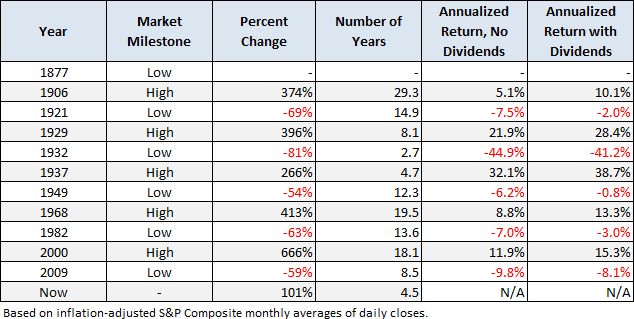
If we study the data underlying the chart, we can extract a number of interesting facts about these secular patterns (note that for the table below I am including the 1932-1937 rally):
The annualized rate of growth from 1871 through the end of July (using extrapolated CPI data for the most recent month) is 2.13%. If that seems incredibly low, remember that the chart shows “real” price growth, excluding inflation and dividends. If we factor in the dividend yield, we get an annualized return of 6.75%. Yes, dividends make a difference. Unfortunately that has been less true during the past three decades than in earlier times. When we let Excel draw a regression through the data, the slope is an even lower annualized rate of 1.74% (see the regression section below for further explanation).
If we added in the value lost from inflation, the “nominal” annualized return comes to 8.97% — the number commonly reported in the popular press. But for a more accurate view of the purchasing power of the market dollars, we’ll stick to “real” numbers.
Since that first trough in 1877 to the March 2009 low:
- Secular bull gains totaled 2075% for an average of 415%.
- Secular bear losses totaled -329% for an average of -65%.
- Secular bull years total 80 versus 52 for the bears, a 60:40 ratio.
This last bullet probably comes as a surprise to many people. The finance industry and media have conditioned us to view every dip as a buying opportunity. If we realize that bear markets have accounted for about 40% of the highlighted time frame, we can better understand the two massive selloffs of the 21st century.
Based on the real (inflation-adjusted) S&P Composite monthly averages of daily closes, the S&P is 101% above the 2009 low, which is still 17% below the 2000 high.
Add a Regression Trend Line
Let’s review the same chart, this time with a regression trend line through the data.
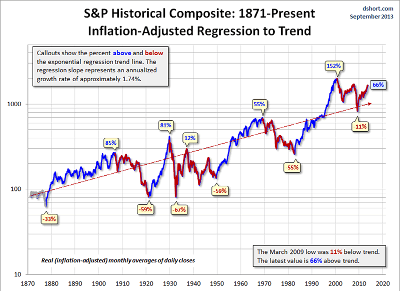
This line is a “best fit” that essentially divides the monthly values so that the total distance of the data points above the line equals the total distance below. The slope of this line, an annualized rate of 1.74%, approximates that number. Remember that 2.13% annualized rate of growth since 1871? The difference is the current above-trend market value
The chart below creates a channel for the S&P Composite. The two dotted lines have the same slope as the regression, as calculated in Excel, with the top of the channel based on the peak of the Tech Bubble and the low is based on the 1932 trough.
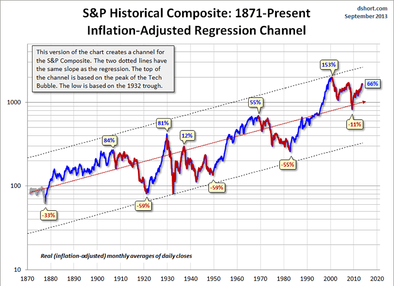
Historically, regression to trend often means overshooting to the other side. The latest monthly average of daily closes is 66% above trend after having fallen only 11% below trend in March of 2009. Previous bottoms were considerably further below trend.
Will the March 2009 bottom be different? Only time will tell.
For a more optimistic view, see Chris Puplava’s February assertion that The Secular Bear Market in Stocks Is Over, over three months before the index hit a new all-time high. Chris’s commentary includes some interesting demographic analysis based on the ratio of the higher earning, bigger spending age 35-49 cohort to less financially empowered age 20-34 cohort. Unfortunately this ratio is being savagely trumped by a far more powerful demographic shift: The ratio of the elderly (65 and over) to the peak earning cohort (age 45-54). The next chart, based on Census Bureau historical data and mid-year population forecasts to 2050, illustrates this rather amazing shift.
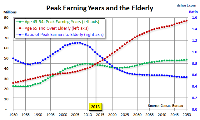
The year 2013 is an inflection point in the chart above, with the elderly cohort dramatically increasing in numbers. The ratio of the two, the blue line in the chart, peaked in 2007 and began its long rollover in 2008, coincident with the beginning of the last recession. We have many years to go before this ratio approximately levels out around 2030.
Even more disturbing is the elderly dependency ratio, the label given by demographers to the ratio of the 65 and older population to the productive workforce, which for developed economies is usually identified as ages 20-64. The next chart illustrates the elderly dependency ratio with Census Bureau forecasts to 2050. Note that in this chart I’ve followed the general practice in demographic research of multiplying the percent by 100 (e.g., the mid-year 2013 elderly dependency ratio is 23.3% x 100 = 23.3).
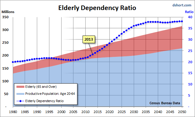
As the chart painfully illustrates, the elderly dependency ratio is in the early stages of a relentless rise that doesn’t begin to level out until around 2036, over two decades from now. Given the unprecedented demographic headwinds for today’s investors, I’m unable to share the Chris’s confidence that the US is now in a new secular bull market.
Notes: For readers unfamiliar with the S&P Composite Index (a splice of historical data different from the S&P Composite 1500), see this article for an explanation.
Since the market data for this commentary is based on the monthly averages of daily closes, I should point out that the real (inflation-adjusted) all-time high in 2000 occurred in August 2000. The nominal daily-closing high in 2000 occurred on March 27th at 1,527.46, but that was an unusually volatile month, and the average of nominal daily closes for that month was much lower at 1,442.21. Inflation-adjustment to the latest dollar value puts that August all-time real high around 2,002.
- Phil
Philip R. Davis is a founder of Phil's Stock World (www.philstockworld.com), a stock and options trading site that teaches the art of options trading to newcomers and devises advanced strategies for expert traders. Mr. Davis is a serial entrepreneur, having founded software company Accu-Title, a real estate title insurance software solution, and is also the President of the Delphi Consulting Corp., an M&A consulting firm that helps large and small companies obtain funding and close deals. He was also the founder of Accu-Search, a property data corporation that was sold to DataTrace in 2004 and Personality Plus, a precursor to eHarmony.com. Phil was a former editor of a UMass/Amherst humor magazine and it shows in his writing -- which is filled with colorful commentary along with very specific ideas on stock option purchases (Phil rarely holds actual stocks). Visit: Phil's Stock World (www.philstockworld.com)
© 2013 Copyright PhilStockWorld - All Rights Reserved Disclaimer: The above is a matter of opinion provided for general information purposes only and is not intended as investment advice. Information and analysis above are derived from sources and utilising methods believed to be reliable, but we cannot accept responsibility for any losses you may incur as a result of this analysis. Individuals should consult with their personal financial advisors.
PhilStockWorld Archive |
© 2005-2022 http://www.MarketOracle.co.uk - The Market Oracle is a FREE Daily Financial Markets Analysis & Forecasting online publication.