


Inflation, Stealth Taxes Consume Stock Gains & Retirement Plans
Personal_Finance / Inflation Sep 13, 2013 - 07:35 AM GMTBy: Dan_Amerman

 Why is there a fundamental mismatch between stock market performance as reported in financial headlines – and the actual retirement behavior of the many millions of Americans who own those stocks in their portfolios?
Using 15 years of stock market performance data and the type of analysis tools used by sophisticated wealth management professionals, we will solve that mystery in this research-based tutorial. The results may come as a major surprise, even for well read and financially literate investors who have been buying stocks for decades.
On the one hand, stocks have been in a sustained rally, with the markets recovering from the depths of 2008 and 2009 and finally moving on to all new highs. This should have created enormous wealth for tens of millions of long-term retirement investors who have stock-heavy investment portfolios in their retirement accounts.
Yet at the very same time, according to recently released government data as reported in Bloomberg and the Washington Post, the fastest growing group of workers in the United States is older than age 65, up 67% in 10 years, and their average weekly pay has climbed from $502 to $825 over that time.
Over a decade, there has been a three-part change in behavior among those aged 65 and older, with a reduction in the percentage of those retiring, an increase in full time work rather than part time work, and incomes that are higher than those of all workers on average. So people with higher wages than the rest of the population are not only not retiring, they are increasingly not slowing down either, but are continuing full time jobs.
Now where the mystery comes in, is that people who are older than 65 with successful careers and good incomes are the exact same people who would be expected to have substantial stock portfolios in their retirement accounts. So if stocks have in fact been creating so much wealth in recent years, why is it that the same segment of the population that owns the largest amount of those stocks are in practice the same group that is changing their retirement behavior in order to prolong their careers and keep their full income coming in?
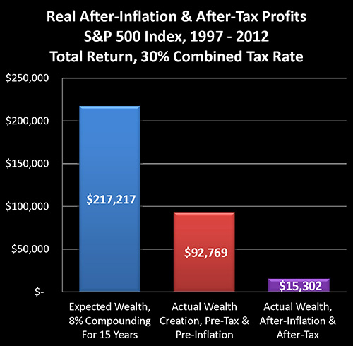
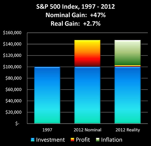
The explanation of the mystery can be found in the graph above, which is based upon historical performance of the Standard & Poor's 500 index from the end of 1997 through the end of the 2012, as well as official US government inflation statistics for those same 15 years. As such, the graph should act as a reasonable proxy for the real world long term performance results achieved by tens of millions of American investors during those years.
Based on an assumed starting portfolio value of $100,000, the blue bar reflects expectations for the compounding of wealth through stock investment. It assumes an 8% average return – which has been a quite common assumption, particularly 15 years ago.
The red bar shows actual real-world performance on a total return basis, with price movements in the S&P 500 index, dividend payments and the reinvestment of dividend payments. It is much lower than expectations, but still substantially positive.
The purple bar shows what really matters – the purchasing power of average stock market investments on an after-tax and after-inflation basis. As shown above, in the real world for many millions of investors, the purchasing power of long term stock market profits has been virtually non-existent. If we compare what really matters – which is what money will buy for us on an after-tax basis – then real gains are a mere 7% of expected wealth gains.
The purple bar is what reconciles the mystery, and explains the divergence between the headline illusion of major profits and the reality of actual after-tax purchasing power in retirement that is currently driving the behavior of millions of investors.
As we will explore, the ultimate bottom line number of what our investments will buy for us after we've paid our taxes has been dominated by something that few average individual investors fully understand, which is the powerful and deceptive relationship between inflation and taxes.
What may come as a particular surprise is that these dramatic results are entirely based upon the officially reported 2.42% average rate of inflation over the 15 years. If our personal experience with increases in prices leads us to suspect a higher real inflation rate, then real world performance becomes even worse than what is shown herein.
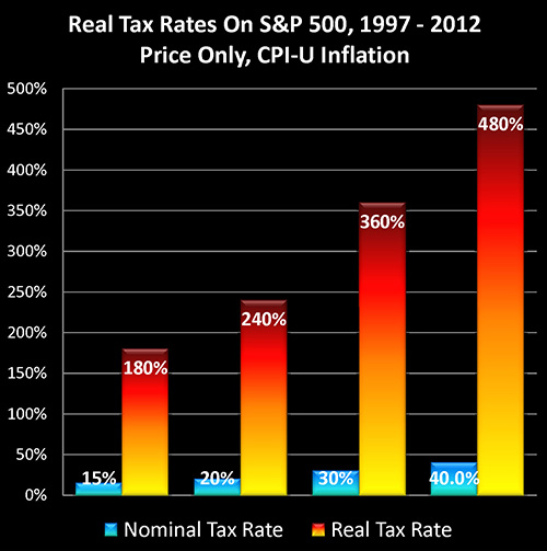
As shown in the above graph, inflation creates "Stealth Taxes" on stocks, which are far higher than stated tax rates, and which slash real after-tax stock returns. These hidden taxes aren't a line item in either brokerage statements or tax returns, but they have in fact consumed much of the purchasing power of long-term investment profits – and retirement plans – for an entire nation.
Three Levels Of Illusion
When it comes to long-term stock performance since the late 1990s, while paper gains may look impressive, there are in fact three levels of illusion, as covered in three interrelated articles of mine. This is the third article in the series, and can be read on its own without having read the other two, but the complete picture can best be seen when all three are considered together.
The first level of illusion has to do with real price gains. And as explored in, "How Financial Reality Is Hidden By Commonly Used Theory And Jargon", in point of fact when it comes to the two largest components of net worth for US citizens – stocks and home values – real changes in price levels have been negative for the 22 out of 40 years studied between 1972 and 2012.
http://danielamerman.com/articles/2013/JargonD.html
The second level of illusion is discussed in "Creating Wealth With Stocks: Expectations Versus The New Reality", which is when we look at the long-term compounding of wealth in the stock market since the end of 1997, while on the surface the results look reasonably good, the bottom line was actually a failure to deliver 65% of the results that were expected by long-term investors as well as pension funds.
http://danielamerman.com/articles/2013/StockWealthD.html
Having two thirds of their expected pre-tax wealth gains go missing for 15 years in the critical later years of their working career is, in reality-based terms, a major explanation for why so many people are no longer retiring when they had expected to, despite decades of disciplined savings and investments.
The third illusion has to do with what real tax rates are on after-inflation income.
To understand what is happening, let's begin by taking a look at the graph and chart below for the Standard & Poor's 500 between the end of 1997 and the end of 2012.
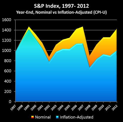
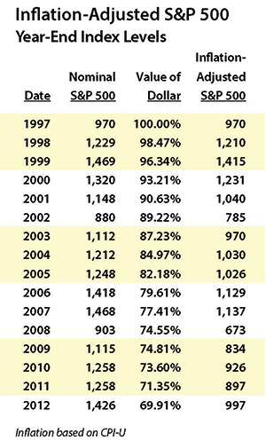
The Standard & Poor's 500 at the end of 1997 had a value of 970, and by the end of 2012 had reached a value of 1426 (as shown in yellow), which was in nominal terms a quite impressive gain of 47%. However, once we adjust for changes in the purchasing power of the dollar, then using official US government inflation statistics (the CPI-U as calculated by the Bureau of Labor Statistics), a dollar by the end of 2012 would only purchase what 69.9 cents would have purchased 15 years before. So when we take our ending index value of 1426, and we adjust for the change in purchasing power, our ending purchasing power is only 997 (as shown in blue), or a gain of 27.
Out of what appears to be a 47% gain, then, once we adjust for the changing purchasing power of the dollar, only 2.7% of the gain turns out to be real. And the remaining 44.3% was really just illusion in the form of inflation. We basically just maintained our purchasing power and came out a slight bit ahead. (The previously linked "How Financial Reality Is Hidden By Commonly Used Theory And Jargon" has much more on this illusion.)
However, even though it is governmental monetary and fiscal policy that creates inflation, the Internal Revenue Service does not recognize the existence of inflation when it comes to taxes on investment gains.
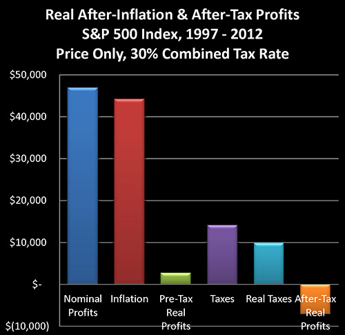
Assuming we started with an initial investment of $100,000, if the stocks in our portfolio performed exactly like the stocks comprising the S&P 500, then on a price-only basis our ending portfolio value would have been $146,965. Subtracting the initial investment leaves us with $46,965 in profits, as shown in the dark blue bar on the above graph and line (2) on the chart.
When we take the declining purchasing power of the dollar into account, it turns out that $44,228 of our "profit", is really just keeping up with inflation. (The red bar and line 3.) To find this number we start with our ending portfolio balance of $146,965, and we adjust for inflation by multiplying by 69.91%, for an end result of $102,737, which is the real value of our portfolio in inflation-adjusted dollars, with the difference between $146,965 and $102,737 being $44,228.
After adjusting for inflation, we find that our real profits (pretax) are in fact only $2,737, as shown in the green bar and line 4. (We can derive this number by either subtracting the inflation number in line 3 from the nominal profits in line 2, or simply by taking our ending $102,737 inflation-adjusted portfolio value, and subtracting our initial $100,000 investment.)
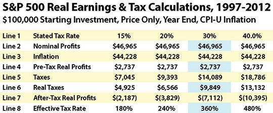
The four right-hand columns in the chart are for varying tax rate assumptions, on a combined state and federal basis. We will be using the assumption of a 30% tax rate for this walk-through.
Now even though inflation is caused by the government through a combination of fiscal and monetary policy, the Internal Revenue Service does not recognize inflation as a deduction. Therefore, it treats the entire $46,965 shown in line 2 as being taxable income. When we apply a 30% tax rate (assumed combined federal and state marginal rates) to this, we come up with $14,089 in taxes due, as shown in line 5, as well as the purple bar of the graph.
Because we are looking at real profits in inflation-adjusted terms (the value of the dollar at the end of 1997), we need to also look at taxes in terms of 1997 dollars in order to keep an "apples to apples" comparison. Multiplying the 2012 taxes by our inflation deflator of 69.9%, gives us real taxes of $9,849, as shown in line 6 and the aqua colored bar.
When we subtract these inflation-adjusted taxes (line 6) from our inflation-adjusted income (line 4), we find that the real after-inflation and after-tax bottom line is a loss of $7,112. On a reality basis, then, we didn't make 47% – but rather we lost 7% of our original investment.
A 100% income tax rate on real (after-inflation) profits would have taken our entire 2.7% in real profits, leaving us at breakeven. With a 7% loss, however, we did worse than break even. Therefore, our real tax rate must actually be higher than 100% of our real income.
When we divide real taxes (line 6), into real income (line 4), we get the real tax rate on real income. For our 30% tax rate example, then, we divide $9,849 in inflation-adjusted taxes by $2,737 of inflation-adjusted income, and perhaps to our surprise, we find that our real tax rate is 360%, as shown in line 8 of the chart, and also illustrated in the graph above.
As further shown in the chart and graph, for the 15 years analyzed and looking at actual price changes in the Standard & Poor's 500 index, a 15% stated tax rate translated into a real tax rate of 180%, while a 20% stated tax rate translated into a 240% real tax rate, and a 40% marginal (federal and state) stated tax rate became a 480% real tax rate.
Fully taking inflation and stock index price changes into account, the real impact of the increase in the long-term capital gains tax rate in the United States wasn't to go from 15% to 20%, but rather from 180% to 240%.
The real tax rates may look fantastically high when compared to stated tax rates, but the source is easy to see – once we know what to look for. Simply return to our "Real After-Inflation And After-Tax Profits" graph and visually compare the towering size of the red "Inflation" bar, to the thin little sliver of the green "Pre-Tax Real Profits" bar.

It's not just that impressive looking price gains were almost entirely based on the destruction of the value of the dollar hiding miniscule real returns, but worse – that illusion of income is fully taxable. The red bar in the graph above is every bit as taxable as the green bar. And once income taxes are paid on the towering phantom income of inflation, the result is that all of our real income was taken by the government, and a great deal more besides.
So when inflation-based "profits" widely exceed real profits, there is a compounding effect on real tax rates that greatly exceeds the stated increase in tax rates. Which is why real capital gains tax rates rose by 60% for the period analyzed, rather than the stated 5% increase.
If financial reality is defined (as it should be) as what our investment profits will buy for us after we've paid our taxes, then for the 15 years analyzed – reality simply hasn't been working the way most investors think it has been.
The second half of the article is linked below. In this next half we:
Provide an alternative way of understanding - and verifying - the results;
Explore three real world factors that may materially change the results for individual investors; and
Discuss two major implications of this type of analysis for investors.
Daniel R. Amerman, CFA
Website: http://danielamerman.com/
E-mail: mail@the-great-retirement-experiment.com
Daniel R. Amerman, Chartered Financial Analyst with MBA and BSBA degrees in finance, is a former investment banker who developed sophisticated new financial products for institutional investors (in the 1980s), and was the author of McGraw-Hill's lead reference book on mortgage derivatives in the mid-1990s. An outspoken critic of the conventional wisdom about long-term investing and retirement planning, Mr. Amerman has spent more than a decade creating a radically different set of individual investor solutions designed to prosper in an environment of economic turmoil, broken government promises, repressive government taxation and collapsing conventional retirement portfolios
© 2013 Copyright Dan Amerman - All Rights Reserved
Disclaimer: This article contains the ideas and opinions of the author. It is a conceptual exploration of financial and general economic principles. As with any financial discussion of the future, there cannot be any absolute certainty. What this article does not contain is specific investment, legal, tax or any other form of professional advice. If specific advice is needed, it should be sought from an appropriate professional. Any liability, responsibility or warranty for the results of the application of principles contained in the article, website, readings, videos, DVDs, books and related materials, either directly or indirectly, are expressly disclaimed by the author.
© 2005-2022 http://www.MarketOracle.co.uk - The Market Oracle is a FREE Daily Financial Markets Analysis & Forecasting online publication.