


Preparing for Obama’s 2015 Budget
Politics / Government Spending Mar 04, 2014 - 10:19 AM GMTBy: F_F_Wiley


The goal that was identified by Simpson-Bowles was to reduce the deficit as a percentage of GDP to below 3%, but what our budget projection shows is that over the course of the next ten years (or in ten years) the percentage will actually be below 2%. So we’ve made substantial progress in reducing the deficit. - White House deputy press secretary Josh Earnest, offering a preview of Obama’s 2015 budget proposal to be unveiled tomorrow
There’s so much wrong with that statement that we won’t even bother to correct it. Nor do we plan to pick through the budget proposal to see just how they cooked the books to show a deficit below 2% of GDP in 2024.
No one really believes the numbers anyway, right?
Rather than analyzing projections that we already know are defective, we’ll try to counter the propaganda with an updated version of “The Chart That Every Taxpayer Deserves To See.”
If you missed our earlier version, we start with budget projections from the Congressional Budget Office, and then we make a series of adjustments to bring them into the real world.
There are two reasons to pick on CBO projections (even as we leave the White House’s numbers alone):
- Their faults are less obvious but just as fatal as the flaws in White House projections.
- Despite those fatal flaws, they’re widely broadcast and rarely questioned by either the mainstream media or mainstream economists.
Moreover, the media normally shows both White House and CBO budget projections in proportion to GDP, which is standard but isn’t always the best way to think about it. GDP percentages are too abstract – you can’t hold them in your hand and look at them. You can hold dollars, though, and that’s where the chart below comes in.
Using the CBO budget outlook released in February, we updated our estimates for how many dollars we’ll need to offset the national debt, on a per-taxpayer basis:
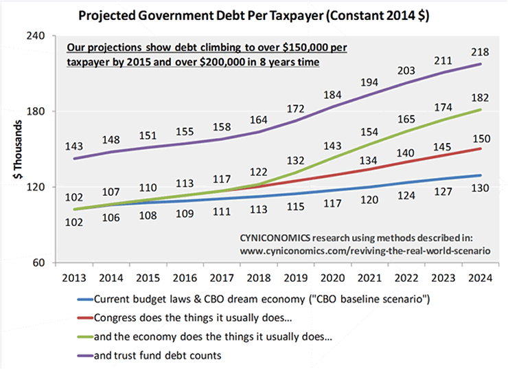
As shown, each taxpayer’s share of the debt will soon clear $150,000 on its way to over $200,000 in eight years time. These numbers are adjusted for the CBO’s inflation projections, so that $200,000 in 2022 has the same value as $200,000 today. Worse still, the figure grows faster and faster the further out you look, as we showed after the CBO published its long-term outlook last September.
Needless to say, our public finances are a mess, notwithstanding the misinformation you’ll hear tomorrow.
When President Obama rolls out his proposed budget, you’ll hear boasts about improvements in the deficit since the depths of the Great Recession. You’ll also hear claims that those improvements are easily sustained; that a much talked about “grand bargain” on long-term debt reduction can wait.
But once you see through the phony numbers in government projections, it’s clear that we’re on a path from a stupidly high debt burden to a much higher burden. Washington would need to find some leadership and foresight to change that path, and there’s no sign of that happening anytime soon.
What are those faint, dotted lines for?
The first time we published “The Chart That Every Taxpayer Deserves To See,” we went all activist and included a draft letter to your congressional rep.
This time, we overlaid some dotted lines showing where you can fold the chart to make a killer paper airplane. Your kids may not want to think about the grim message just yet, but they can at least hurl it around the living room and get familiar with it. It’ll be a big part of their future.
What’s more, by turning your debt bill into a cheap toy, you can show the same level of seriousness about fiscal risks that you find in your elected officials.
Methodology
Our projections are based entirely on data found in CBO and other government reports, but put together in a more honest and sensible way.
F.F. Wiley
F.F. Wiley is a professional name for an experienced asset manager whose work has been included in the CFA program and featured in academic journals and other industry publications. He has advised and managed money for large institutions, sovereigns, wealthy individuals and financial advisors.
© 2014 Copyright F.F. Wiley - All Rights Reserved
Disclaimer: The above is a matter of opinion provided for general information purposes only and is not intended as investment advice. Information and analysis above are derived from sources and utilising methods believed to be reliable, but we cannot accept responsibility for any losses you may incur as a result of this analysis. Individuals should consult with their personal financial advisors.
© 2005-2022 http://www.MarketOracle.co.uk - The Market Oracle is a FREE Daily Financial Markets Analysis & Forecasting online publication.