AUD-NZD – Who Will Win The Bledisloe Currency Cup?
Currencies / Forex Trading May 28, 2014 - 03:45 PM GMTBy: Austin_Galt
 While the Kiwi’s dominate the rugby version, just how does their currency stack up against that of the Wallabies? There’s no better place to start than the yearly chart to get the big picture so let’s take a look.
YEARLY CHART

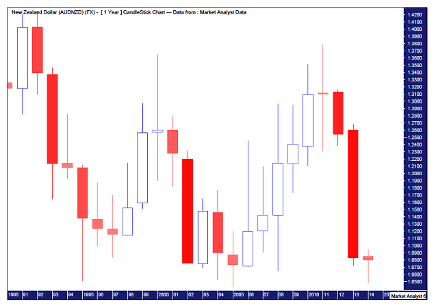
Well, the last few years have seen the Kiwi completely dominate the Aussie. Sound familiar? But looking back over the last 25 years it really has been a battle royale with both currencies going back and forth against each other.
While the AUD got hammered against the NZD in 2013, after a bit of downside follow through in early 2014, it is now fighting back. The AUDNZD bounced off long term support failing to break the all time low set in 2005 at $1.0434. This looks to have setup a massive triple bottom. So from that alone one could deduce that the coming years will see the AUDNZD head back up and trade within the big sideways formation.
Let’s gather more evidence and have a look at the monthly chart.
MONTHLY CHART

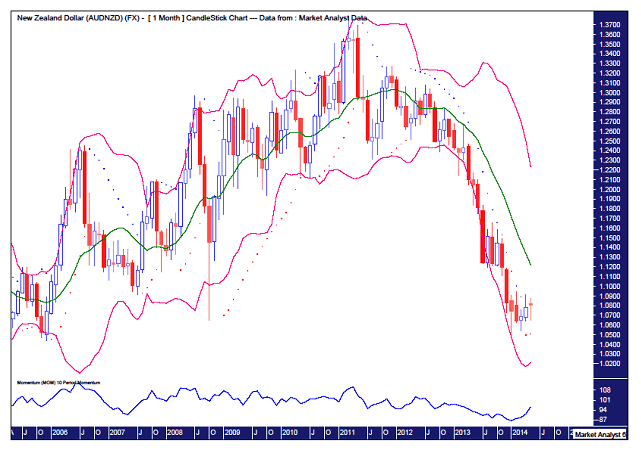
I have added a Momentum indicator below the main chart which shows an extremely low reading. Basically the downtrend had run out of puff. It’s rare to get such a low reading so a low of some sort was to be expected.
I have also added a Parabolic Stop and Reverse (PSAR) indictor as denoted by the dots. It can be seen that the dots to the upside held the whole leg down from April 2012. It was only back in April this year that price finally broke to the upside which would be a signal for the bears to cover short positions. Now that in itself is not the greatest of buy signals coming off a bear trend. But it is a piece of the puzzle.
Also, it can be seen that while price clung to the lower Bollinger band during this downtrend, it has only recently moved away from it. Generally when a clear move away from one band happens, we can expect a move to the middle band at the least and often the upper band. Now keep in mind this is the monthly chart so don’t expect this to happen overnight.
So currently the evidence gathered is pointing to further upside. Let’s take a look at the weekly chart to see if the evidence from that confirms the monthly and yearly conclusions.
WEEKLY CHART

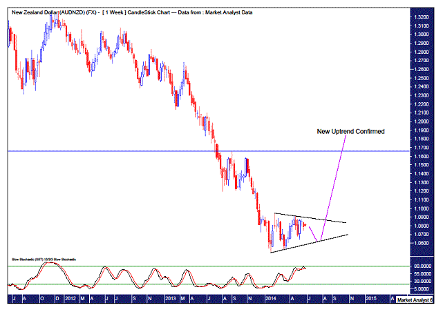
I have added a Stochastic indicator which has gone from low readings up to high readings since the 2014 low at $1.049 was set. However, while this good move up by the stochastic indicator was made, it can be seen that price hasn’t really been doing much. The stochastic looks like it’s about to roll over so perhaps we can expect this toing and froing of price to continue in the coming weeks. This may see price head back down to test the support line I have drawn. If price is repelled here then a more substantial move higher could follow that which takes out the previous swing high at $1.165.
I still want to see more evidence that a decent move up can be expected so let’s nail it down by having a look at the daily chart.
DAILY CHART

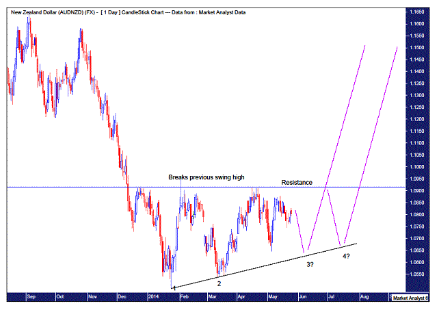
There are some interesting observations to be made here. Firstly, we can see that after the 2014 low was made (1), price rallied and spiked up briefly to $1.0945 which broke the previous swing high of $1.0913 set in December 2013. I see this quite often after bear trends. It is one of the first signs of a coming bull trend. Price then declined making a higher low at $1.0537(2). Since then price has rallied up to and been rejected at resistance. So now we can assume price will come down for another test at support. The monthly analysis suggests this support will hold and another higher low will form.
After a low at point 3 we could expect another rally up to the resistance level. But will it crack through this time? Maybe. Maybe not. Personally, I’ll be looking to go long at point 3 but I suspect that price will be rejected once again at the resistance line. If so, then price comes back down one more time setting up a fourth higher low and a solid launch pad from which to explode up and through the resistance level on the fourth attempt. This scenario would also fit in superbly with Gann’s teachings in that fourth attempts at resistance (or support) are generally successful while if they are not successful , in this case breaking support, it is a very bullish sign.
So this may all take some time to play out but from the analysis done we can see a generally clear path of the future outlined. That is, it’s time for a Wallaby comeback!
Bio
I have studied charts for over 20 years and currently am a private trader. Several years ago I worked as a licensed advisor with a well known Australian stock broker. While there was an abundance of fundamental analysts there seemed to be a dearth of technical analysts, at least ones that had a reasonable idea of things. So my aim here is to provide my view of technical analysis that is both intriguing and misunderstood by many. I like to refer to it as the black magic of stock market analysis.
Please register your interest in my website coming soon. Any questions or suggestions, please contact austingalt@hotmail.com
© 2014 Copyright Austin Galt - All Rights Reserved
Disclaimer: The above is a matter of opinion provided for general information purposes only and is not intended as investment advice. Information and analysis above are derived from sources and utilising methods believed to be reliable, but we cannot accept responsibility for any losses you may incur as a result of this analysis. Individuals should consult with their personal financial advisors.
© 2005-2022 http://www.MarketOracle.co.uk - The Market Oracle is a FREE Daily Financial Markets Analysis & Forecasting online publication.


