


AUD NZD Taking The Forex Bull By The Horns
Currencies / Forex Trading Jul 20, 2014 - 12:40 PM GMTBy: Austin_Galt

 Since my last AUDNZD report, the false break low of 1.062 has been confirmed by a sharp move higher. The nature of the move looks very impulsive. As I have said in previous reports, I am very bullish about the long term prospects of the AUDNZD and so therefore will be on the lookout for opportunities to average up into my existing long position. One such opportunity may be about to present itself this week. Let’s take a look beginning with the daily chart.
DAILY CHART
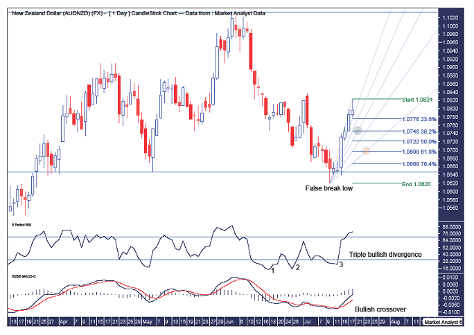
The marginal break of the May low and subsequent reversal setting up a false break low is clear to see. This low was accompanied by a triple bullish divergence in the Relative Strength Indicator (RSI) which is very bullish while the explosion higher a few days after the low saw a crossover of averages in the Moving Average Convergence Divergence (MACD) indicator. Another bullish sign with the blue line now well above the red line.
Last Friday price hit a weekly high of 1.0824 before retreating. This retreat may extend into next week and provide another entry opportunity for the bulls. To help me pinpoint the coming pullback low (well that’s what I’m assuming it will be), I have added Fibonacci retracement levels from the recent false break low to last week’s high. Now considering how impulsive last week’s move up appears, I don’t expect the pullback to go too deep. In fact, I’d be surprised if price trades lower than the 50% level at 1.0722. Lower than this would signify some weakness in the up move and it certainly looks, at face value, anything but weak! Personally, I much prefer price to find support around the 38.2% level which stands at 1.0746. That was also Thursday’s low so perhaps price can come back and clip that low before turning back up.
I have also added a Fibonacci Fan to help with the process. The scenario I favour most is price pulling back to the 38.2% level in the first part of the week where the retracement level intersects with the 50% fan angle. This is denoted by the green highlighted circle. An alternative which alludes to the weaker setup is price pulling back to the 61.8% level where it intersects the 76.4% fan angle which is denoted by the orange highlighted circle. I don’t favour this scenario but it’s certainly possible.
Now let’s move onto the weekly chart.
WEEKLY CHART
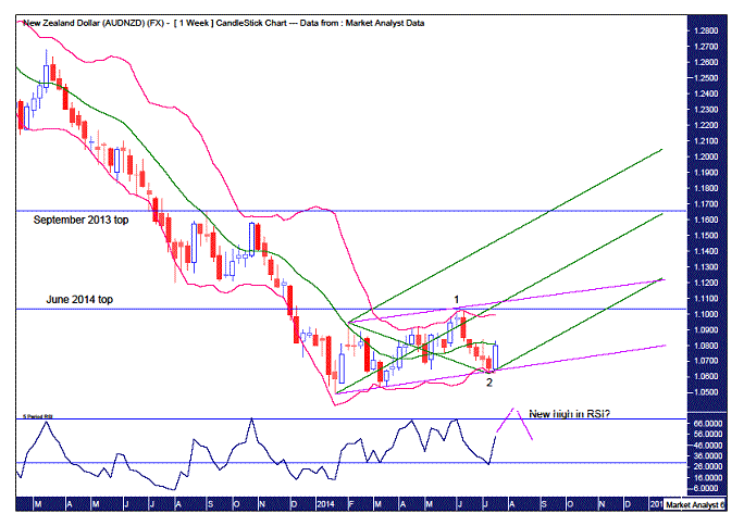
Ok, quite a few lines on this chart. Let’s break them down. The two parallel pink lines represent the uptrend channel and shows price bouncing off the lower uptrend line last week. I have added some Bollinger Bands and we can see how price topped recently in June at the upper band before pulling all the way back to the lower band and putting in that false break low. The bounce off these two structures is impressive and looks solid to the eye.
I have applied a couple of Elliott Wave annotations in order to provide some clarity to the trend. I like to keep things simple when it comes to Elliott Wave Theory. I once watched an Elliott Wave expert analyse a chart and after delving into all the subdivisions – I, ii, iii, iv, v and a,b,c,d,e – I just zoned out. Before he was done I was sure there was a z in there somewhere! So once he had clued up all his evidence he revealed the only option was for price to go up. Price going down was impossible as it would break several Elliott Wave rules. Well, sure enough, price then proceeded to do the “impossible”. Price went down. I’m sure there’s a lesson there somewhere.
Anyway, I digress. I have denoted the recent June high as 1, the end of first wave, while the recent July low is 2, the end of the second corrective wave. That implies that the impulsive Wave 3 has just begun and like most third waves, fireworks can be expected. It wouldn’t surprise to see price continuing to explode higher now breaking both the June high and the upper pink trend line in short order.
I have also drawn an Andrew’s Pitchfork which refers to the parallel green lines. If price really is in a strong position, which I suspect, then we could surmise that price may well trade quite quickly up into the top half of the pitchfork before the uptrend stabilises.
The September 2013 top is another key level but we may have to wait until next year to see that resistance level busted. Let’s move on.
MONTHLY CHART
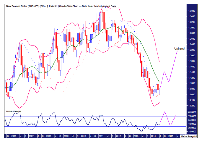
I have again added Bollinger Bands to this monthly chart. I showed this chart in my report a couple of months ago. Price continues to move away from the lower band. It found some resistance just short of the middle band. However, the move down was held by the Parabolic Stop and Reverse (PSAR) support which is denoted by the dots. Nice. This leads me to believe price can now bust higher making its way to the upper band. Just where that will be is not yet known. Possibly around the 1.14 level. Who knows? All in good time. And what normally follows its first hit at the upper band is a pullback which may end at the middle band or even lower band. Currently I favour the middle band due to the current strength being exhibited. But we’re getting ahead of ourselves here. Let’s just wait for price to hit the upper band and then we can reassess things.
I have also added a RSI and I expect the end of the first stage of this monthly rally to be accompanied by a strong RSI reading above the 70 level. Subsequent RSI highs after that may then be weaker as the trend matures.
Finally, now that it looks like a big move up is at hand, I wanted to have another look at the yearly chart to see where the whole uptrend may end. This is probably being a bit presumptive but I’m an optimist!
YEARLY CHART
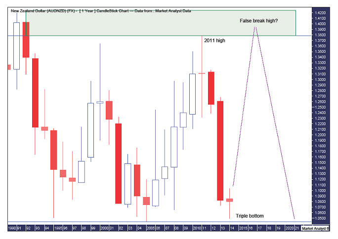
As I noted in a previous report, it looks like we have a massive triple bottom in place. So we can assume that a big bounce is likely. This is backed up by the daily, weekly and monthly analysis. So where can we expect this uptrend to finally top out? Well, my opinion is that over the next few years, price will shoot up and clip the 2011 high which stands at 1.3789. I like false break bottoming and topping formations and perhaps we’ll get one here. If so, the high should fall somewhere between the 2011 high and the 1992 high of 1.4253. This area is denoted by the green highlighted rectangle.
And with a false break top in place, perhaps price then comes all the way back down to test the triple bottom. But as Gann noted, double and triple bottoms generally don’t end trends and the fourth attempt at support or resistance is generally successful. But that’s way too far down the track to worry about now. This is, after all, the yearly chart no less.
Assuming the analysis to be correct, with price currently around the 1.08 level, we really are in a position to take the bull by the horns here and take full advantage of what looks like a big play at hand.
Bio
I have studied charts for over 20 years and currently am a private trader. Several years ago I worked as a licensed advisor with a well known Australian stock broker. While there was an abundance of fundamental analysts there seemed to be a dearth of technical analysts, at least ones that had a reasonable idea of things. So my aim here is to provide my view of technical analysis that is both intriguing and misunderstood by many. I like to refer to it as the black magic of stock market analysis.
Please register your interest in my website coming soon. Any questions or suggestions, please contact austingalt@hotmail.com
© 2014 Copyright Austin Galt - All Rights Reserved
Disclaimer: The above is a matter of opinion provided for general information purposes only and is not intended as investment advice. Information and analysis above are derived from sources and utilising methods believed to be reliable, but we cannot accept responsibility for any losses you may incur as a result of this analysis. Individuals should consult with their personal financial advisors.
© 2005-2022 http://www.MarketOracle.co.uk - The Market Oracle is a FREE Daily Financial Markets Analysis & Forecasting online publication.