Gold, Silver, Dow and VIX Market Updates
Stock-Markets / Financial Markets 2014 Aug 14, 2014 - 12:26 PM GMTBy: Austin_Galt
 Since my last report on gold and silver, both commodities have bounced from their lows. Does that mean the pullback low is in? Yes and no. Gold looks safe while silver looks shaky. Let’s examine both commodities price charts.
Let’s begin with gold.
GOLD DAILY CHART
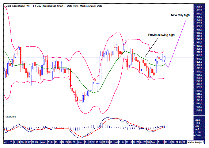
We can see a nice rally in gold which took out the previous swing high of US$1312.1. That’s a good sign. For the bulls anyway. Price now looks to be retreating.
I have added Bollinger Bands which shows price moving from the lower band up to the higher band. Nice. During a trend change to an uptrend, price normally retreats after the first hit to the upper band. A move back down to the middle band can be expected and sometimes to the lower band. Personally, I feel in this case a move to the middle band will be sufficient. This currently stands a bit under US$1300.
I have added a Moving Average Convergence Divergence (MACD) indicator which appears in bullish mode with the blue line above the red line. This little retreat should not alter that so perhaps we could expect higher prices shortly, obviously after the pullback is done. I’m still targeting a new rally high.
GOLD WEEKLY CHART
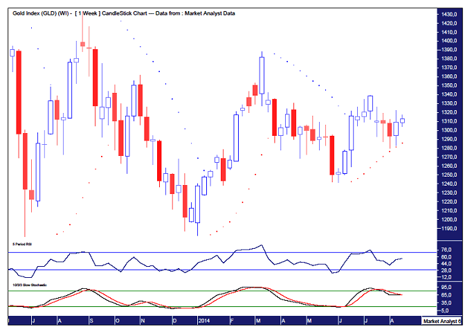
I have added a Relative Strength Indicator (RSI) and a Stochastic indicator. Both are currently at levels just inside bullish territory above the 50 line. The Stochastic, while still trending down, looks to be threatening a bullish crossover. The RSI looks to be trending up although it is inconclusive. A move higher would certainly be of no surprise going by these indicators.
I have also added a Parabolic Stop and Reverse (PSAR) indicator which still appears in bullish mode with the dots still below price. Currently the dots are at US$1286 while next week will probably be around US$1291. Breaking those dots might spell the end of the rally. I doubt that will happen though.
Now let’s move on to silver.
SILVER DAILY CHART
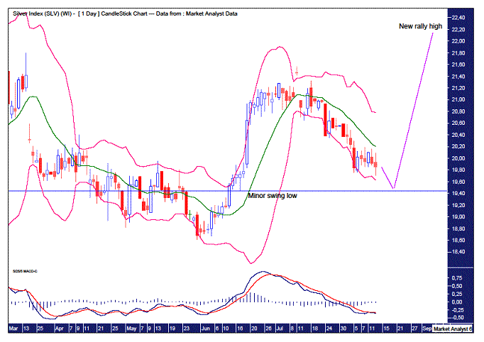
The first thing that stands out is that the silver price really hasn’t gone on with the job the way gold has since its recent low. The price action has clearly been weaker than that of gold. And just today price clipped its recent low before reversing back up. But I don’t like it.
I have added a MACD indicator and unlike gold, the MACD here is still in bearish mode with the red line above the blue line. A bullish crossover certainly looks to be on the horizon shortly but the bias currently has to be given to lower prices.
I have added Bollinger Bands and we can see price recently moved away from the lower band but seems to have turned back down just shy of the middle band. So perhaps we could surmise that price has lower to go and will head back to the lower band.
I still favour a big rally is set to commence. If that is to happen then this current pullback surely has to end soon. But where? I have drawn a horizontal line which pertains to a previous minor swing low made on the 17th June at US$19.44. I would not like to see that low broken so perhaps price can pull up a bit above there, possibly around the US$19.50 level. Let’s see.
SILVER WEEKLY CHART
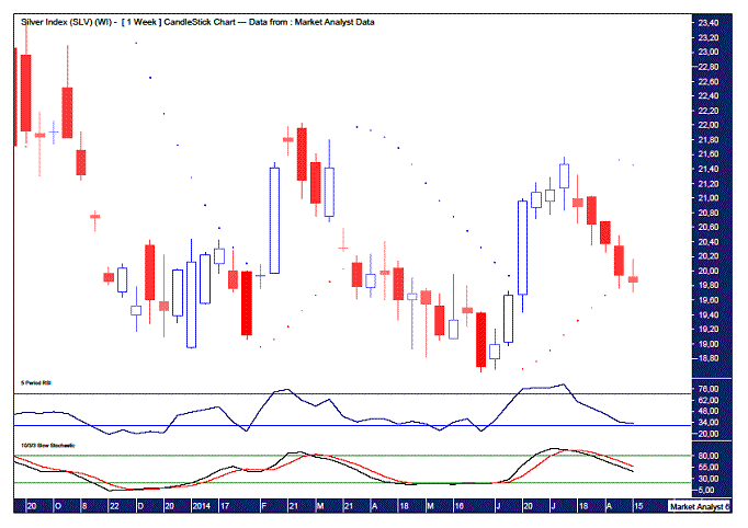
I have added a RSI and Stochastic indicator and unlike gold, silver is showing weak readings in both. Sure, a move higher would not look out of place shortly but at this moment in time, bias still has to be given to the downside.
The PSAR shows its dots were busted to the downside last week which augurs for lower prices. A move to new pullback lows next week would perhaps be sufficient to wash out the rest of the negativity. Then perhaps silver can play catch up with gold with a rally aimed at taking out recent highs.
Now I wanted to show the daily charts of the Dow Jones Industrials Index and the Volatility Index (VIX) as there may be something to take away from them.
DOW DAILY CHART
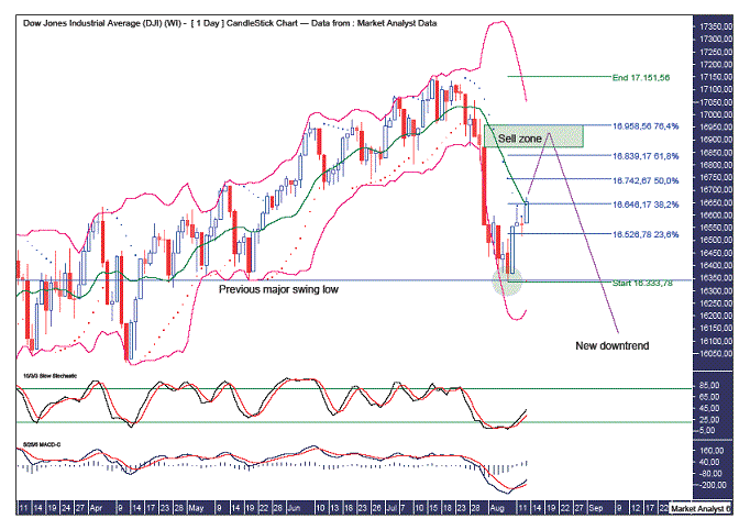
I showed this chart in my recent Dow update a couple of days ago. In that update I outlined my view that this current rally is a bear market rally. But let’s run through it again as there is also some new information to process.
Firstly, a little nugget of information that increases my confidence that a new bear market has begun is that the recent low at 16333 clipped the previous major swing low of 16341 from the 20th May which is denoted by the horizontal line. This can be seen in the green highlighted circle. It wasn’t by much but that doesn’t matter. I’ve noticed this little setup umpteen times when a new trend is beginning.
So, since that clipping of the previous low, price has rallied and has hit some potentially importance resistance. What is it?
I have added Bollinger Bands and it can be seen price has moved away from the lower band and has now hit the middle band. This middle band is often where price turns back down in a bear market. But that is generally when the bear market is already banging along nicely. This bear market is only in its infancy, if it is even a bear market of course.
The other potentially important resistance comes from the Fibonacci retracement levels of the move down from all time high to recent low. Price has now hit the 38.2% retracement level. It is normal for bear market rallies to hit this level, but once again, generally when the bear market is already in full gear. This bear market is just starting its engines, assuming my analysis is correct of course!
So, if the rally doesn’t end here, why not and where is the rally likely to end?
Firstly, I have added a PSAR which shows the dots being busted to the upside. That is one sign that higher prices are likely but it doesn’t give me any clues of how high.
Secondly, I have added Stochastic and MACD indicators. Both can be seen to be trending up nicely and more upside likely before they threaten bearish crossovers.
Thirdly, the first rally in a new bear market generally makes a deep retracement at least to the popular 61.8% level and often to the oft forgotten 76.4% level. These levels stand at 16839 and 16958 respectively.
Finally, the first rally in a bear market often rallies back up to the upper Bollinger Band which keeps in line with a deep retracement. The upper band looks to be honing in on that 76.4% level and should be right around that area by next week.
I have drawn a green highlighted rectangle which I’ve labelled Sell zone. This is the area from the high of the bearish candle on the 31st July which stands at 16869 up to the 76.4% level at 16958. This is the area where I expect the rally to terminate and where I intend to average up current short positions. I am looking for the rally to end next week on the 19th or 20th of August. I then expect a steep plunge to commence.
VIX DAILY CHART
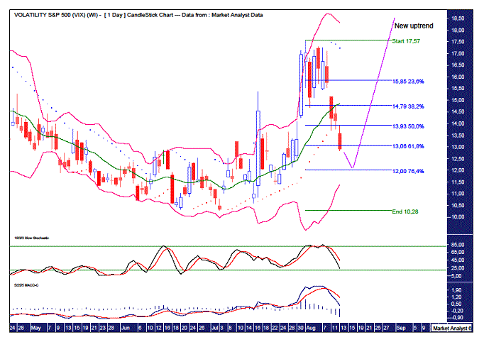
This chart of the VIX is just about the flip side of the Dow chart. I have added RSI and Stochastic indicators with both trending down and not looking like crossing over to the bullish cause just yet.
Price recently busted to the downside the dots of the PSAR indicator signifying lower prices are likely.
I have added Fibonacci retracement levels of the upleg from the recent major low to recent high. And as this is the first major pullback in a new bull market, I’m expecting a deep retracement back to around the 76.4% level which stands at 12.
I have also added Bollinger Bands and it can be seen price has retreated from the upper band hitting the middle band seemingly on its way to the lower band. This lower band should be right around the 76.4% next week.
So, perhaps the Dow tops out around the same time as silver puts in a pullback low and gold a higher low. And the VIX looks likely to also put in a higher low. Then, whatever causes the Dow to start plunging will also be one of the key reasons for gold and silver to start rallying hard. Well, as hard as a bear rally can rally. And the VIX should rise as things heat up and get volatile.
Not sure what the fundamental reason of all this will be. There is certainly no shortage of geopolitical tensions around the world. The world certainly seems like a powder keg at the moment and I expect the fireworks display to commence shortly. Something to ponder anyway.
And as always, it’s just my opinion!
Bio
I have studied charts for over 20 years and currently am a private trader. Several years ago I worked as a licensed advisor with a well known Australian stock broker. While there was an abundance of fundamental analysts there seemed to be a dearth of technical analysts, at least ones that had a reasonable idea of things. So my aim here is to provide my view of technical analysis that is both intriguing and misunderstood by many. I like to refer to it as the black magic of stock market analysis.
Please register your interest in my website coming soon. Any questions or suggestions, please contact austingalt@hotmail.com
© 2014 Copyright Austin Galt - All Rights Reserved
Disclaimer: The above is a matter of opinion provided for general information purposes only and is not intended as investment advice. Information and analysis above are derived from sources and utilising methods believed to be reliable, but we cannot accept responsibility for any losses you may incur as a result of this analysis. Individuals should consult with their personal financial advisors.
© 2005-2022 http://www.MarketOracle.co.uk - The Market Oracle is a FREE Daily Financial Markets Analysis & Forecasting online publication.


