Gold Bullish Inverse Head and Shoulders Pattern
Commodities / Gold and Silver 2015 Jan 19, 2015 - 09:18 PM GMTBy: Clive_Maund
 Nothing has been done to address the structural inadequecies and distortions that lead to the 2008 financial crisis - instead our leaders have resorted to the procrastination made possible by turning to drugs, specifically Quantitative Easing, which has enabled them to clamp interest rates at 0 to prevent the already unserviceable debt load from compounding out of sight. Spearheaded by the US, this money printing policy has now become standard practice around the world, with Europe and Japan following suit in a big way. The notion put about that all this newly printed money can somehow be contained within banks is nonsense as demonstrated by the soaring prices of stockmarkets in developing markets until recently and in various asset bubbles like the boiling London and New York Real Estate markets.
This global procrastination worked until recently, but now this reckless and economically suicidal policy is visibly coming apart at the seams - it didn't work for Robert Mugabe's Zimbabwe and it won't for anyone else either because it is a flawed scheme to avoid facing up to the consequences and fallout from one's actions. The only reason that the ship hasn't sunk so far is complex financial engineering that has enabled the rot at the heart of the system to be obfuscated for as long as possible, but now the markets have gotten control of the ball and things look set to get ugly fast.
Of course, no-one really wants them to grasp the nettle and seriously attempt to rectify the mistakes of the past, because they have left it so late to do this that it would lead to an earth shaking deflationary implosion that would economically lay waste most of the planet. This being so they have no choice but to continue with more of the same, and any attempt by the Fed to resist the inevitable QE4 will lead to the markets getting it in an arm lock and forcing it to comply and cough up. This process has already started as deflationary forces have been gaining ascendency. A symptom of these gathering deflationary forces is the crash in oil prices, and the failure of key support in copper about a week ago, which threatens to crash too unless something is done. The big question is when will they (the Fed) capitulate and reverse course - will they do so immediately to keep the game in play, or will they let the US stockmarkets crash first, so that they can use it as a justification for their actions? Europe, which is already being ravaged by deflation, has already surrendered and is preparing to do massive QE, which is why the euro is so weak.
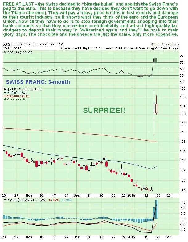
Last week we had the bombshell development of the Swiss abandoning their Franc peg to the euro. This was a development with grave implications. They know that this move will severely damage their exports and tourism industries, but they have done it because they realize that it is better to take to the lifeboats now than go down with the Titanic (the euro). This was a major vote of no confidence in the euro that has kicked out an important prop from under it - and it's nice to see the Swiss going back to their independent mountain ways - now all they have to do is kick out the international snoopers spying on bank accounts to restore the confidence of the global tax dodging community.
If you are starting to think "When is this guy going to get to the point and start writing about gold" I ask you to bear with me, because all this has profound implications for the future course of Precious Metals prices.
Now, if you are an investor in dollar based assets you might be thinking "Great - the markets crash, and a tidal wave of money floods into the US seeking safe haven in Treasuries, driving up the dollar and the value of my dollar assets even more like in 2008". This is likely true up to a point, but the key to understanding the looming massive uptrend in gold and silver is to grasp that at some point, in the face of collapsing markets, the Fed will do an about face and announce QE4 - when this happens the overinflated dollar will cave in as global rebalancing starts.
Here's another point in relation to the looming gold and silver mega-uptrend. Most investors, looking at the chart of the dollar index, think "How impressive and wonderful the mighty dollar is, advancing like that after 3 QE programs!" but what we need to remember is that it is simply "king of hell", a temporary best of a bad bunch. All major currencies are being inflated away to oblivion, with QE programs around the world vying with each other for supremacy. First the US started the whole process as a way of getting out from under the financial crisis of 2008, then, inspired by this, Abe of Japan followed suit with his "beat that!" mega-QE challenge, and while admittedly his audacious QE plan will indeed be hard to beat, it is sure to inspire imitation.
Where is all this leading? - as we have already observed, it is way too late to revert to the financial rectitude of decades past - you know, doing old-fashioned things like balancing the books, and buying stuff with money that you have actually saved beforehand. Any attempt to do this would trigger a ballistic increase in interest rates, and bring the global economy to a dead stop. So instead they have no choice but to print and print and "the piper will be paid" by ordinary people, the middle and lower classes, getting poorer and poorer as their wages fail to keep up with ever rising asset prices. In a way this is poetic justice, because voters have always voted for politicians who lied to them and indulged their insistent and childlike "I want it all, I want it now" demands at the cost of future generations.
So, currencies will continue to spiral towards the plughole, including the US dollar, which we can expect to be rudely kicked off its perch when the Fed backpedals and announces its next QE program, QE4. As in the 70's, but on a vastly greater scale, investors will increasingly look to stores of value, like gold and silver, as currencies' purchasing power withers.
That's enough background, now let's proceed to look at the charts.
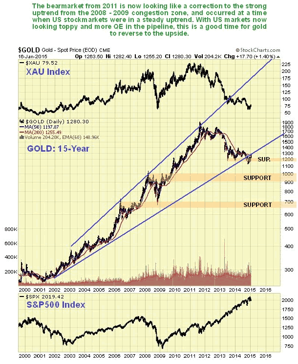
Starting with the 15-year chart for gold we can see that the bearmarket of the past several years looks like a correction to the strong advance from 2009. Given the magnitude of the rise in the dollar in recent months, gold has held up remarkably well, and has even climbed back well above the support level that failed late in October. On this chart we can also see a big reason for the weakness of gold over the past several years - the continuing advance in the broad stockmarket, shown at the bottom of the chart, which is sucked in hot money, and we can also see the rotten performance of Precious Metals stocks at the same time on the XAU index shown at the top of the chart, which are now very undervalued relative to gold.
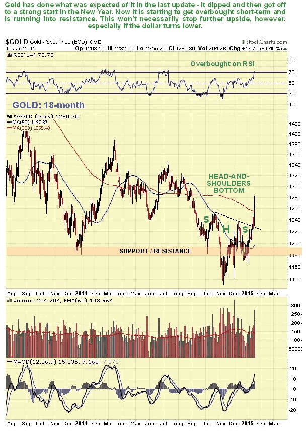
On its 18-month chart we can see in more detail how gold has performed well in recent weeks, rising well above the support level that failed late in October at $1180. It has followed almost exactly the predicted path set out for it in the last Gold Market update posted on 14th December, although it got to its present level somewhat faster than we expected. On this chart we can also see that it is getting overbought short-term, so a minor reaction soon is possible.
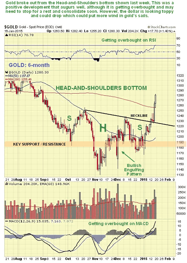
On its 6-month chart we can see that the pattern of the past several months looks like a down sloping Head-and-Shoulders bottom, which it has certainly broken clear out of to the upside over the past week.
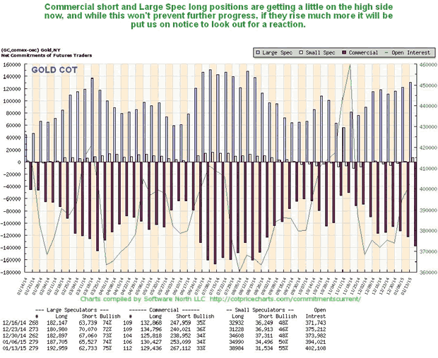
Now we will take a look at various indicators for gold, starting with its latest COTs. These show that Commercial short and Large Spec long positions are starting to get to a rather high level - not enough to preclude further advance - but enough to put us on notice that we should not be surprised to see a consolidation or correction to the recent advance before much longer.
The Hedgers chart, which is a form of COT chart, is in middling ground and doesn't give us much of a clue regarding immediate direction, although it makes plain that there is room for a sizeable move in either direction now.
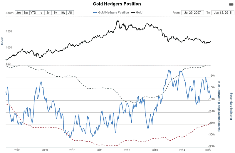
Chart courtesy of www.sentimentrader.com
The Gold Optix or optimism chart still looks quite strongly bullish. There is certainly plenty of room for a big rise by gold on this chart.
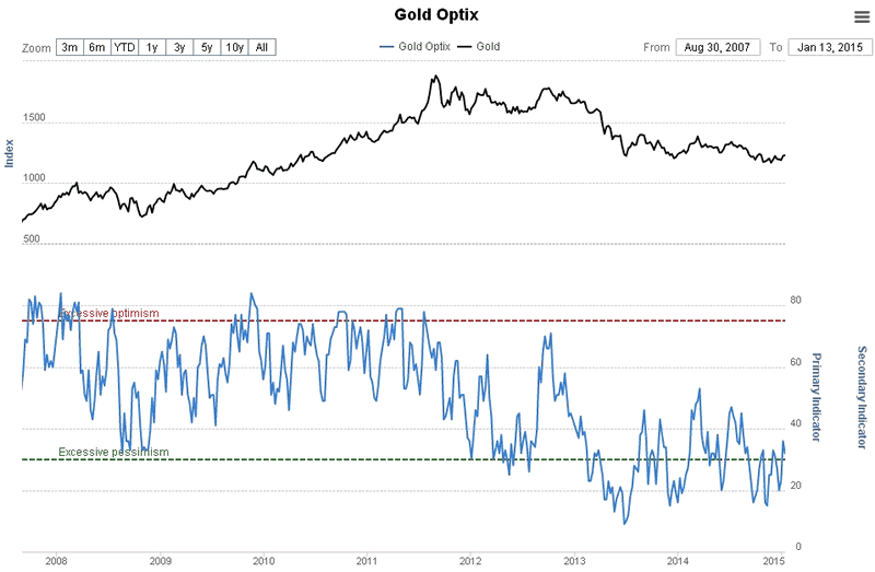
Chart courtesy of www.sentimentrader.com
The normally wrong Rydex Traders still have extremely low holdings in Precious Metals assets, although they are just starting to be attracted back in by rising prices. The chart below shows this and also makes clear that gold has huge upside potential before the Rydex traders holdings start to be a cause for concern.
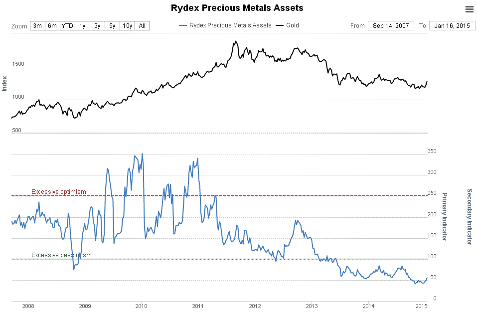
Chart courtesy of www.sentimentrader.com
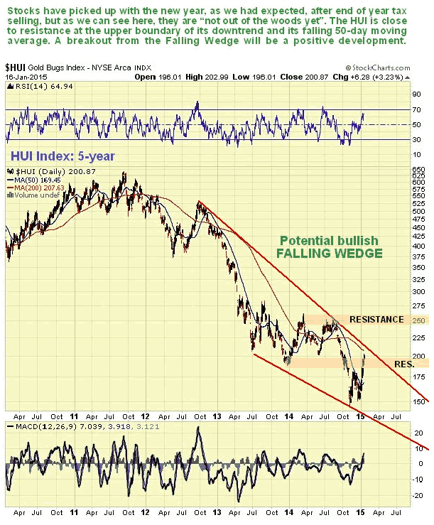
As noted above, gold stocks are way undervalued relative to gold, and the HUI index lost over 75% of its value at its 2011 highs by last December, as shown on its 5-year chart below. We bought a range of big gold stocks in December in expectation of a New Year rally, which is what we have seen. This strategy has paid off and while we could see a short-term reaction back from resistance near to the falling 200-day moving average, overall the picture for the sector is brightening.
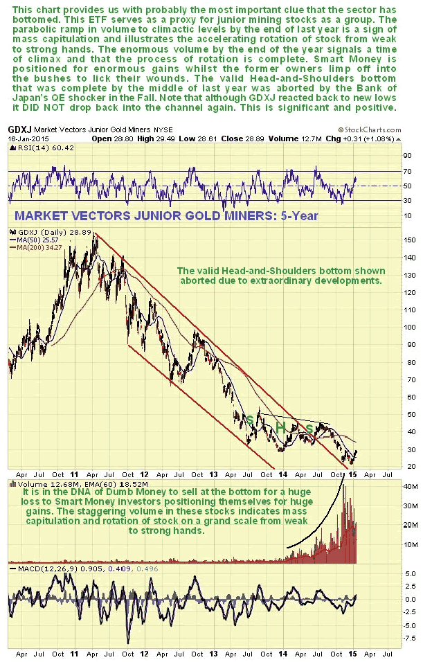
The 5-year arithmetic chart for the Market Vectors Gold Miners ETF, GDXJ is actually much more useful in alerting us to the underlying condition of this sector, which is now VERY bullish. What makes this clear is firstly the breakout from the downtrend, but of much more decisive importance is the explosion of volume last year to massive levels, as Dumb Money finally capitulated and handed over its stock en masse at rock bottom prices to Smart Money. This is why we are getting the high quality juniors on board now as fast as we can - prices are already starting to rise, and it shouldn't be long before the sector takes off strongly higher.
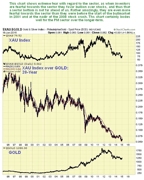
The 20-year chart for the XAU large gold and silver stock index divided by the price of gold shows extreme fear with respect to the sector which indicates that we are close to a major bottom. This is because when investors are fearful towards the sector, they favor gold bullion over gold stocks, because they are scared that gold stocks will approach 0, but reason (correctly) that this will never happen to gold itself. So the lower this ratio is, the more positive it is for the sector, since the majority are always wrong.
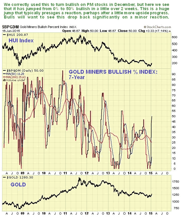
In the space of two weeks investors have gone from being 0% bullish on gold stocks to 50%, a huge jump, as we can see on the Gold Miners Bullish Percent Index shown below. This puts us on notice that we should not be surprised to see some short-term corrective action in PM stocks, either consolidation or a reaction which should be minor.
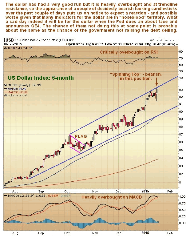
Of crucial importance to the outlook for gold is the dollar. As we can see on its 6-month chart the dollar has risen to hit a trendline target in an overbought condition, where a couple of toppy looking candlesticks have appeared over the past couple of trading days. It could go into reverse here or very soon, and various indicators suggest that this is likely. However, a market crash would be expected to trigger a final swansong spike, as in 2008.
After its latest rally the dollar hedgers chart, which is a form of COT chart, is showing readings in "nosebleed" territory - at a record level by a wide margin, and considerably worse than at the dollar peak associated with the 2008 market crash.
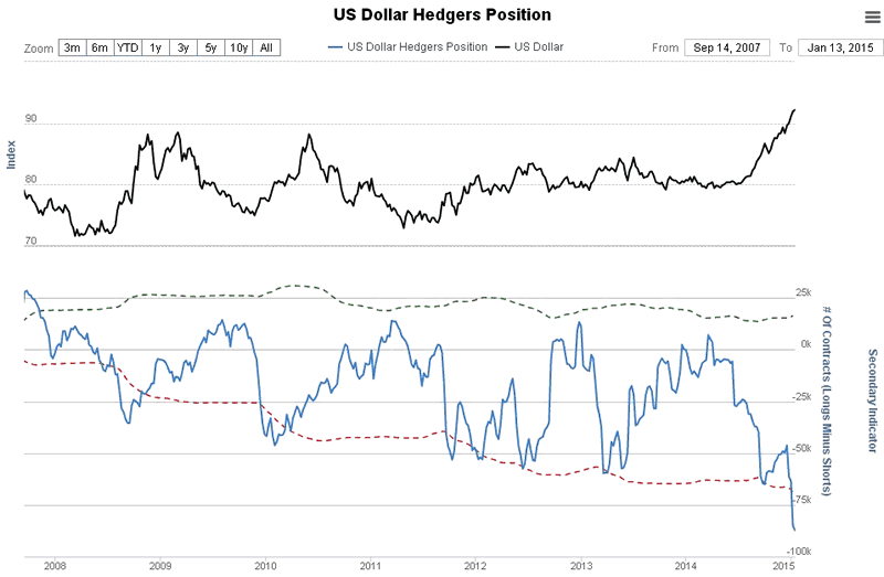
Chart courtesy of www.sentimentrader.com
Likewise, optimism on the dollar is at record "nosebleed" levels. Taken together these indicators suggest that we are either at or close to an important top. This implies that a shock reversal in Fed policy may be closer at hand than most people think.
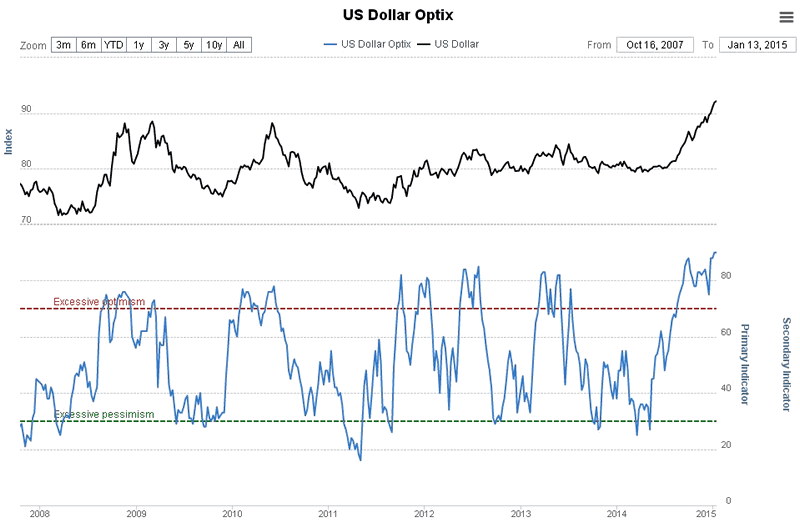
Chart courtesy of www.sentimentrader.com
The dollar and the US stockmarkets have been in a "virtuous circle" feeding off each other for a long time now. The appreciation of the dollar has attracted money from moribund countries and regions around the world, like Europe, who see price appreciation of stocks and other investments magnified by currency appreciation. This attracts more money which drives both the dollar and stocks higher still. The positive background fuelling all this is that the Fed has been scaling back on QE while other countries and regions, like Japan, and soon Europe, have been stepping up QE. What the charts above are telling us is that at some point and perhaps not very far into the future "the music is going to stop", and you sure don't want to be around if that happens. If the Fed were to reverse course and announce QE, the dollar and stockmarkets won't just drop, they will crater. This could even happen, ironically, when Europe announces its huge QE package soon - why? - because the markets know this is going to happen and have been moving to discount it - this is why the dollar has been forging ahead. So it could be a case of "Sell on the news."
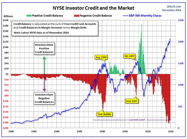
To see just how dangerous the current situation is with respect US stockmarkets, take a look at the following chart - and draw your own conclusions.
By Clive Maund
CliveMaund.com
For billing & subscription questions: subscriptions@clivemaund.com
© 2015 Clive Maund - The above represents the opinion and analysis of Mr. Maund, based on data available to him, at the time of writing. Mr. Maunds opinions are his own, and are not a recommendation or an offer to buy or sell securities. No responsibility can be accepted for losses that may result as a consequence of trading on the basis of this analysis.
Mr. Maund is an independent analyst who receives no compensation of any kind from any groups, individuals or corporations mentioned in his reports. As trading and investing in any financial markets may involve serious risk of loss, Mr. Maund recommends that you consult with a qualified investment advisor, one licensed by appropriate regulatory agencies in your legal jurisdiction and do your own due diligence and research when making any kind of a transaction with financial ramifications.
Clive Maund Archive |
© 2005-2022 http://www.MarketOracle.co.uk - The Market Oracle is a FREE Daily Financial Markets Analysis & Forecasting online publication.


