


US Dollar Forex Pairs and Gold Chartology
Currencies / US Dollar Mar 15, 2015 - 08:24 AM GMT

 When you look at these different currencies you will see some massive topping patterns that reversed their bull markets. You will also see they still have a long ways to go to the downside before this bear market is over. If that is the case then the US dollar has a long ways to go in its bull market.
Lets start with the CAD which broke down from a blue triangle consolidation pattern on Tuesday of this week.
Canadian Dollar Daily Chart
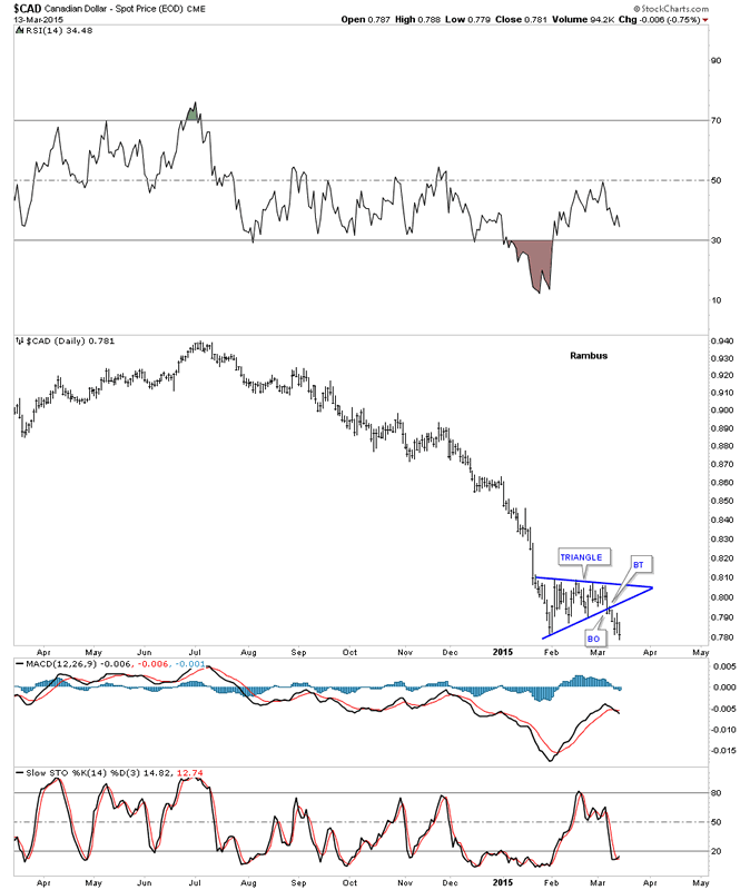
A long term daily chart that puts the little triangle in perspective which looks like it's just starting another impulse move down.
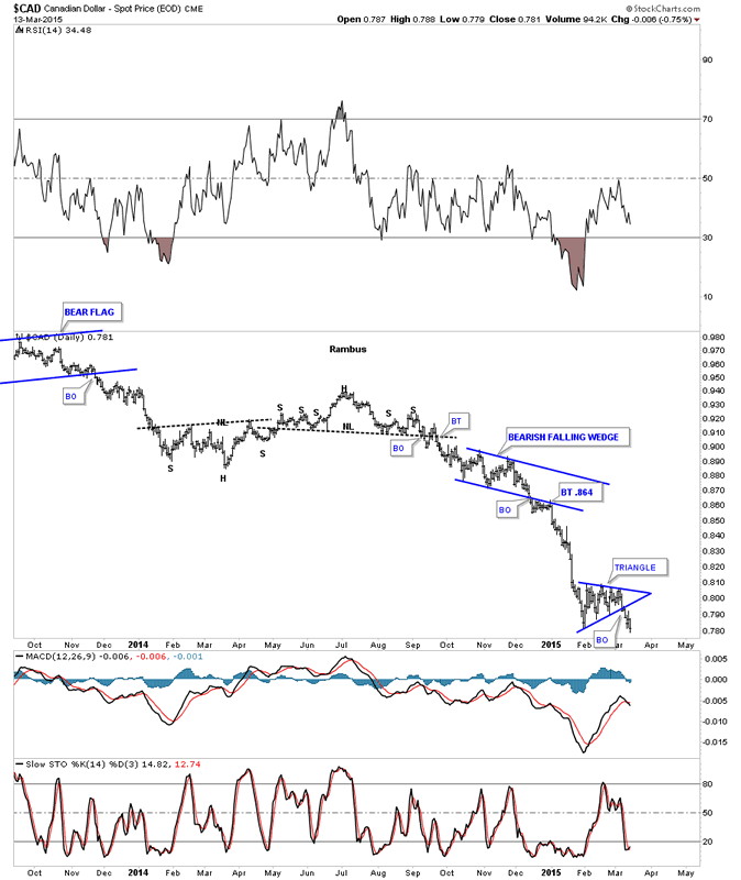
Canadian Dollar Daily Chart 2
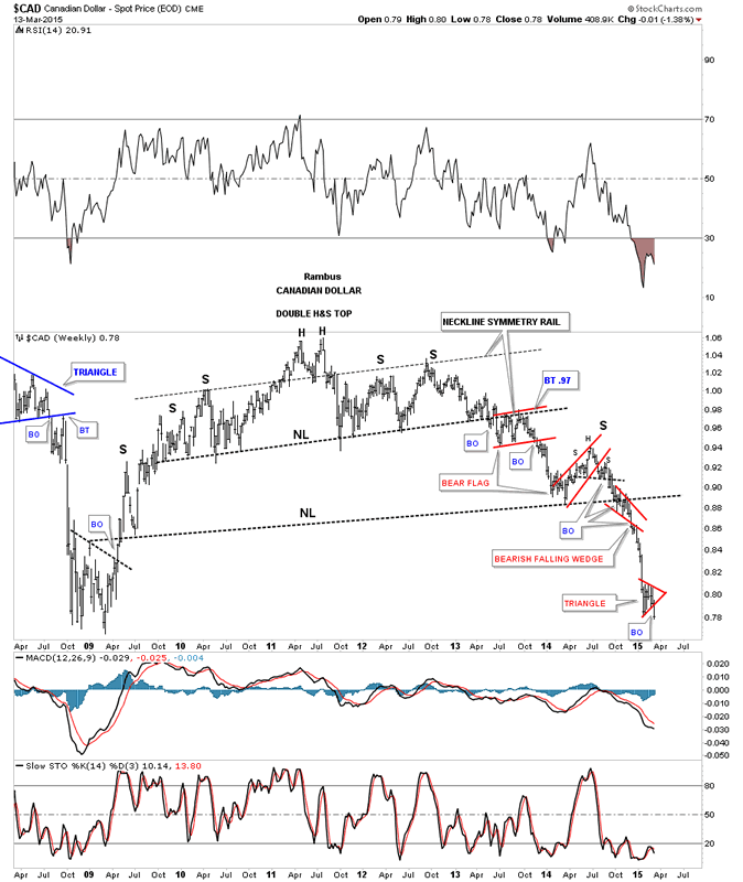
The long term weekly chart for CAD shows the massive H&S top and the little red triangle that broke out this week.
Canadian Dollar Weekly Chart
The NZD daily chart.
New Zealand Dollar Daily Chart
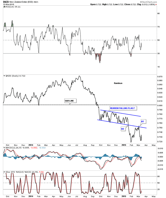
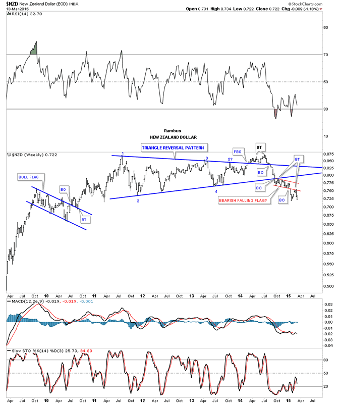
The weekly chart for NZD shows its bull market top was a 5 point triangle reversal pattern. Eight weeks ago it broke out of a little red bearish falling flag with a backtest two weeks ago.
New Zealand Dollar Weekly Chart
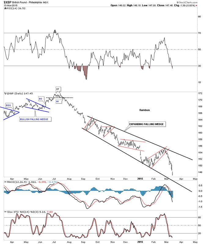
The daily chart for the XBP shows it has been trading in an expanding downtrend channel since late last summer.
British Pound Daily Chart
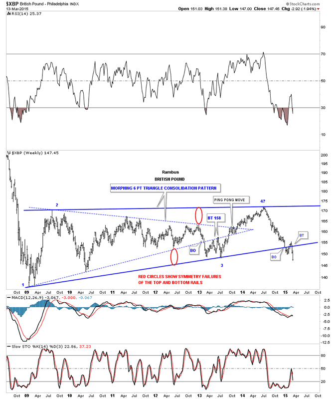
The weekly chart shows it breaking out of a multi year bearish rising wedge with the breakout and backtest completed two weeks ago.
British Pound Weekly Chart
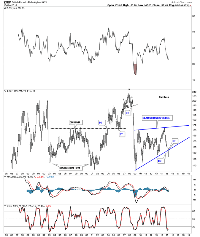
The long term monthly chart shows the entire history for the XBP and the breakout that is occurring this month out of the bearish rising wedge.
British Pound Monthly Chart
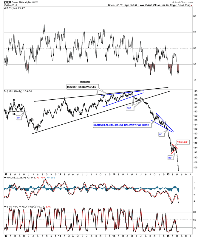
Lets now take a look at everyone's favorite currency the XEU that actually has been one of the easiest currencies to call as the daily chart below shows. Nice clean patterns with nice clean breakouts.
Euro Daily Chart
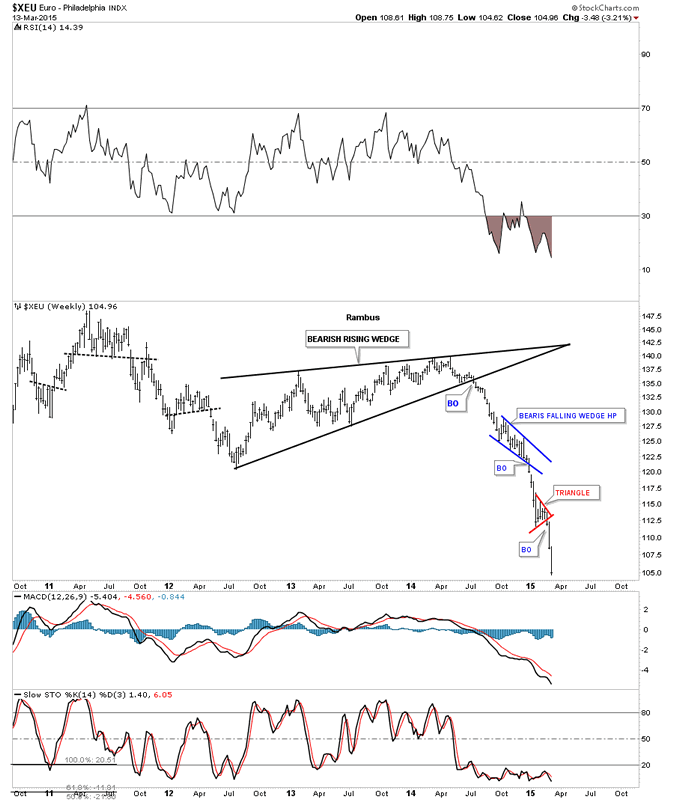
This weekly chart shows the price action since it broke out of the black bearish rising wedge.
Euro Weekly Char
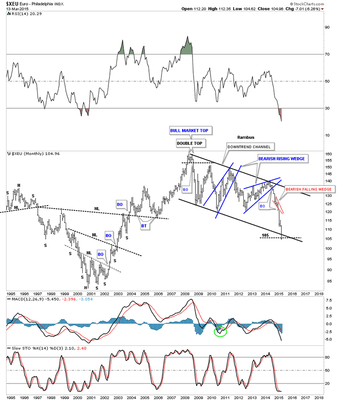
This first monthly chart shows the XEU cracking the bottom rail of the downtrend channel.
Euro Monthly Chart
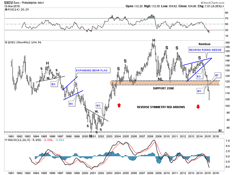
This next very long term monthly chart for the XEU shows a massive H&S top in place with the right shoulder being the bearish rising wedge we looked at on the daily chart. You can see the XEU made an attempt last month at a backtest to the brown shaded S&R zone. This is the type of chart that can show reverse symmetry. The rally back in the early 2000's was pretty vertical which means there is a very good possibility that we'll see something similar coming back down. This is an extremely bearish looking chart IMHO.
Euro Monthly Chart 2
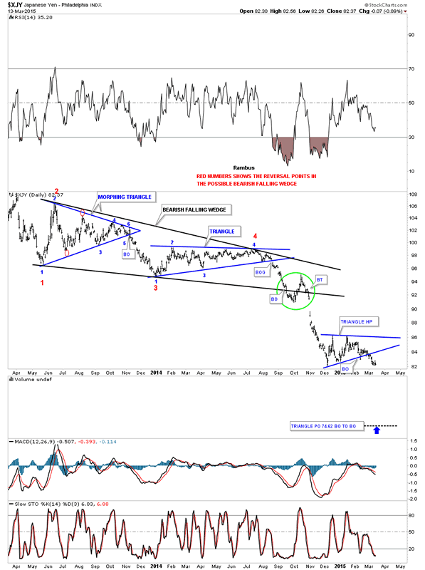
Now lets look at a daily chart for the XJY that shows the beautiful black bearish falling wedge that was made up of two different consolidation patterns. Note the breakout of the smaller blue triangle consolidation pattern about 2 weeks ago.
Japanese Yen Daily Chart
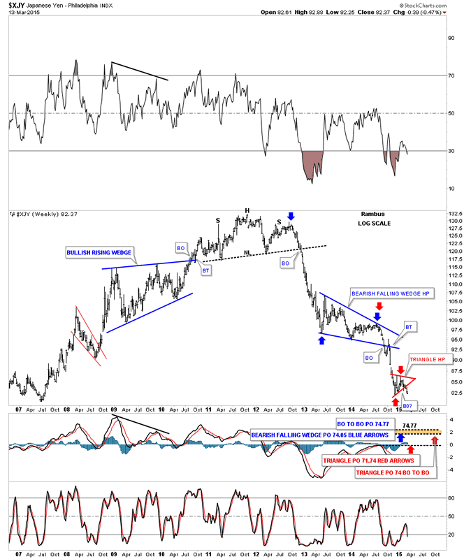
The weekly chart shows the bearish falling wedge as a halfway pattern to the downside. I've measured it from 4 different perspectives which shows the 74 area maybe a good target to shoot for. Again you can see the little red triangle that I just showed you on the daily chart above and how it fits into the bigger picture.
Japanese Yen Weekly Chart
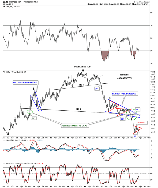
The last weekly chart for the XJY shows you the massive H&S top and the blue bearish falling wedge as the right shoulder. Some of you may remember when the neckline was breaking down and I put the green circle around the BO area to show you the breakout gap and backtest. There is also a green circle on the left side of the chart which I labeled as a reverse symmetry gap, one on the way up and one on the way down at almost at the exact same price.
Japanese Yen Weekly Chart 2
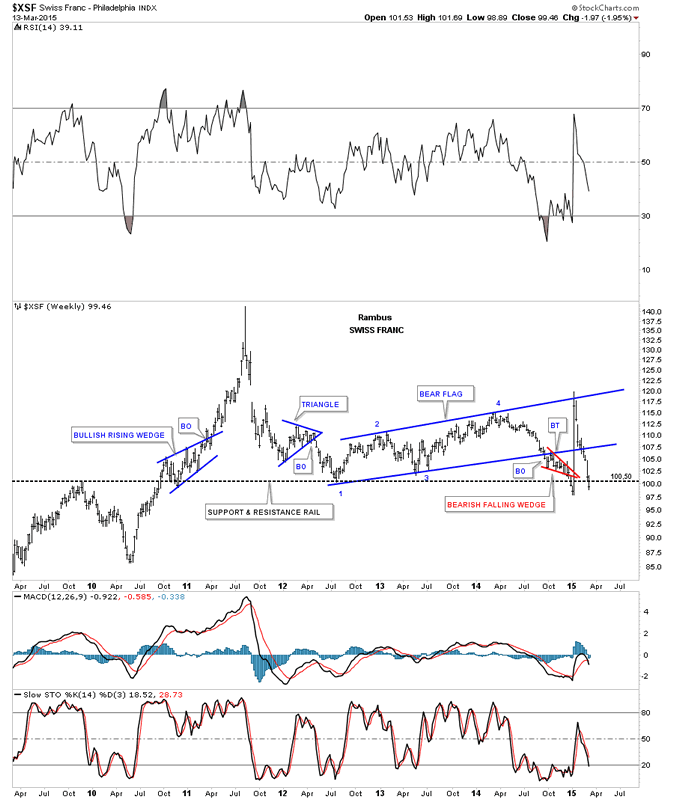
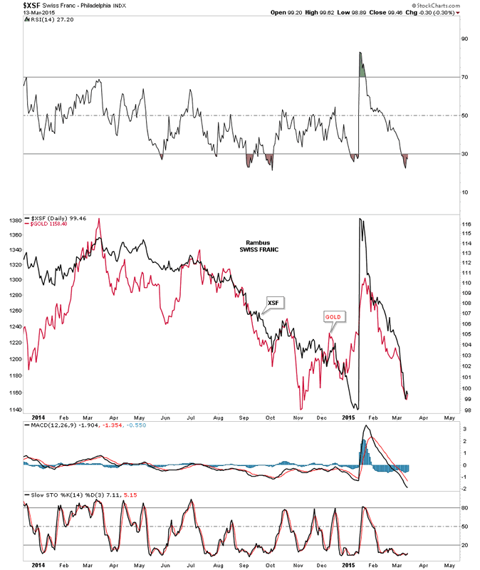
The last currency we'll look at is a weekly chart for XSF that shows it made a big blue bear flag that broke to the downside and formed the little red bearish falling wedge. That little red falling wedge was showing up on just about every currency I watch. I don't have to tell you what that huge spike was that was made on January 5th of this year. Note how the top rail of the blue bear flag stopped that spike high and now the price action has reversed symmetry back down and has just broken back below the long term support and resistance line.
Swiss Franc Weekly Char
This last chart for the XSF I overlaid gold on top so you can see the correlation that sometimes is pretty good and at other times not so good. Since the spike high in the XSF the correlation has been pretty close. It's never perfect but it does give you a feel for how they track each other.
Swiss Franc and Gold Daily Charts
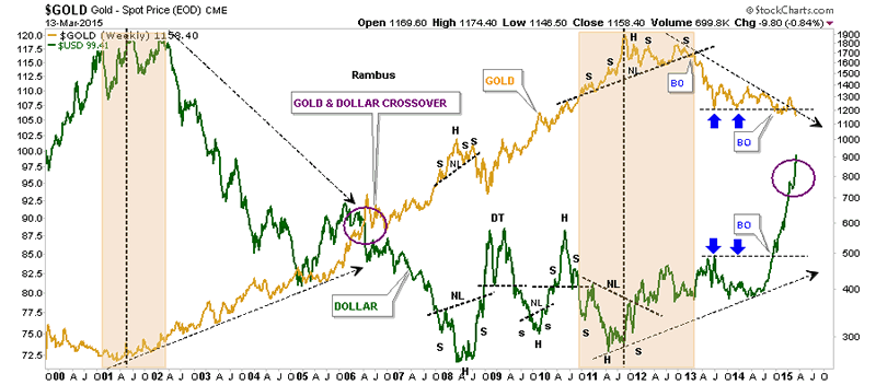
This last chart I've been showing for a very long time that has gold overlaid on top of the US dollar. Generally they have a pretty close inverse correlation but not always. The purple circle on the right side of the chart is where I thought the two would meet similar to the crossover in 2006, purple circle. As you can see gold has been holding up pretty well vs how strong the US dollar has been. This just goes to show you there are no absolutes when it comes to the markets. All the best...Rambus
Gold and US Dollar Weekly Charts
All the best
Gary (for Rambus Chartology)
FREE TRIAL - http://rambus1.com/?page_id=10
© 2015 Copyright Rambus- All Rights Reserved
Disclaimer: The above is a matter of opinion provided for general information purposes only and is not intended as investment advice. Information and analysis above are derived from sources and utilising methods believed to be reliable, but we cannot accept responsibility for any losses you may incur as a result of this analysis. Individuals should consult with their personal financial advisors.
© 2005-2022 http://www.MarketOracle.co.uk - The Market Oracle is a FREE Daily Financial Markets Analysis & Forecasting online publication.