


The US Dollar and the Precious Metals Complex
Commodities / Gold and Silver 2015 May 21, 2015 - 05:13 AM GMT

 The first chart I would like to show you today is the long term monthly chart for the US Dollar I showed you a week or two ago. It was coming into contact with the top rail of a massive 30 year falling wedge at 93.50. I also drew in a neckline extension rail taken from the H&S top that formed back in 2000 which came in at 92. I put the little brown box to show you where I was hoping to find support. So far the top rail is doing its thing by reversing its role to what had been resistance to now support once it was broken to the upside. This is a critical test taking place right here which so far the US dollar bulls are winning.
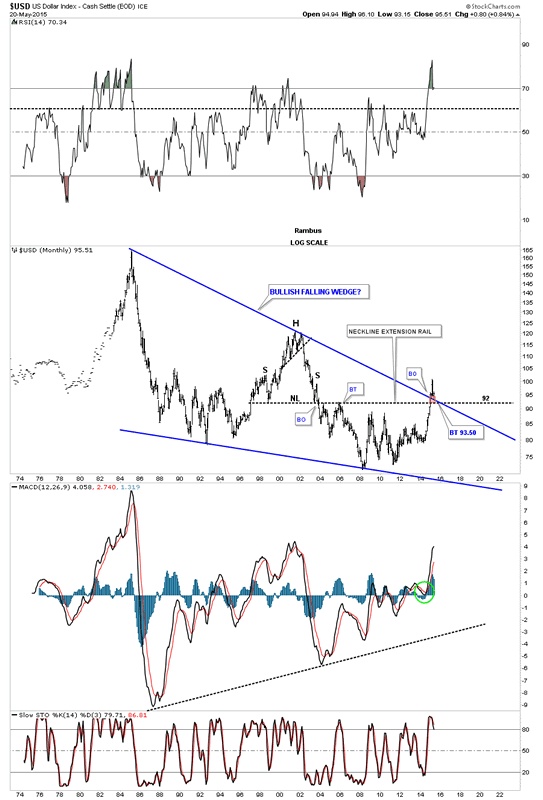
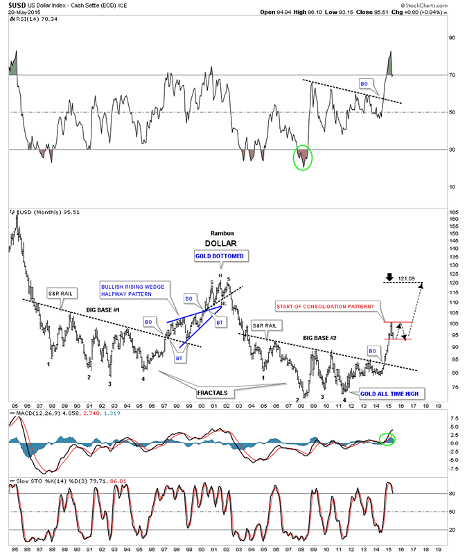
The next chart for the US Dollar is the old fractal chart which shows you the breakout from the massive base last year and the impulse move that followed. After a big move like that a stock needs to consolidate for a period of time to work off the overbought condition. If the initial low is in, as shown by the chart above, then we should have at least a top and bottom for the next consolidation pattern to trade between as shown by the two red horizontal trendlines. There is no way to know what type of consolidation pattern the dollar may build out but this is a perfect place for some type of consolidation pattern develop. This means we should now see a rally up toward the old high and at least one more decline after that to get our minimum of four reversal points. Just playing with the potential red trading range, if I measure from the breakout point of the massive base #2 to the recent high and take that measurement and add it to the breakout point of the top red rail, it would give us a price objective back up to the 2000 high around the 120 area. This is just speculation on my part because we don’t know if the top red rail will be a horizontal trendline giving us a rectangle or if it will slope down a bit giving us a triangle. Either way if this area proves out to be a consolidation zone the old high in 2000 at 120 should come back into play.
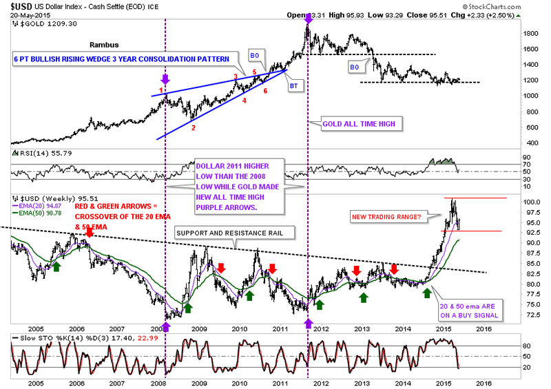
Below is a combo chart that has gold on top and the US dollar on the bottom. If the dollar is going to consolidate this recent rally phase how will that affect the price of gold? As you can see gold is basically trading closer to the lower end of its support line while the dollar has some room to run to the upside before it reaches to the top red rail of its new trading range. Will the dollar rally force gold below its support line? It will be interesting to see how this plays out over the coming weeks and months. This chart below gave me my first good clue that the US dollar’s bear market was coming to an end. You can see the big divergence that occurred in 2011, vertical dashed purple line, to the dollar bottom in 2008 which was much higher. Gold started its near parabolic rise in 2008 when the US dollar was making its bear market low. Gold finally topped out in September 2011 with the US dollar making a higher low vs the 2008 low. That was a huge divergence, purple arrows.
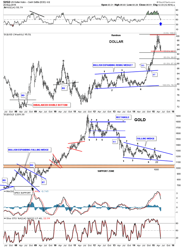
Below is a weekly combo chart for the US dollar and gold that shows the US dollar almost retraced 38% of its breakout rally. Gold shows you why this correction has been so painful as it’s now trying to put in its 7th reversal point to the upside which is just wearing everyone down, bulls and bears alike. As you can see gold is trading right in the center of it’s falling wedge, in the middle of no man’s land.
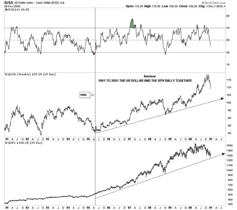
I know some of you are wondering if the stock markets can rally with the US dollar rallying also. Below is another combo chart that has the US dollar on top and the SPX on the bottom. This combo chart shows the price action from the 1995 to the 2000 secular bull market top for both the dollar and the SPX. So the answer to that question is yes.
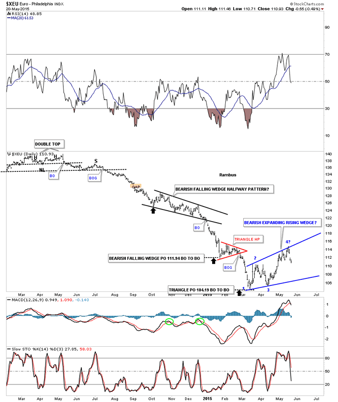
Now I would like to show you a daily chart for the XEU that has been in counter trend rally mode since the March low as the US dollar has been correcting. This chart shows that the XEU has been carving out a bearish expanding rising wedge which it just started its fourth reversal point down. If the XEU is topping then the US dollar is bottoming which I showed you on the charts above. This is a big deal as it will most likely have a negative impact on commodities in general.
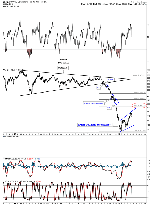
Lets now look at the GNX commodities index which had a massive decline similar to what the XEU chart above looked like. Putting 2 and 2 together it looks like the GNX is also building out an expanding rising wedge formation. Just like the XEU chart above it’s starting its 4th reversal point down. Keep in mind the pattern won’t be complete until the bottom rail is hit. As you can see it has failed to reach the 38% retrace of its big decline which will probably fool a lot of folks looking for a minimum 38% retrace by just coming up shy.
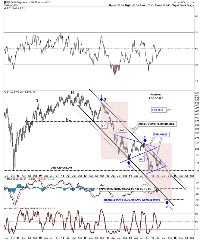
Next lets look at a few charts for the HUI I haven’t shown you in awhile. Some of you may remember this weekly chart for the HUI that I showed late last year when the price action was approaching the outer black dashed trendline. If you recall we went short up there and I said to hang on for dear life as it was going to be a bumpy ride. I had no idea it was going to be this bumpy of a ride. As you can see the HUI came all the way back down to the old low at 150 where I thought it would finally break through after testing it twice already but here we are again testing the top black dashed outside trendline again. I can make a case that the HUI is building out another triangle just below the one above. I’ve been showing you a H&S consolidation pattern on the GDM but either one will work. The pink shaded area still shows the time and price objective for the bottom if it comes to fruition.
Below is the same setup using the H&S pattern as the consolidation pattern.
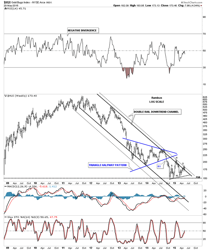
Below is a long term weekly chart that shows all the blue consolidation patterns that formed during the bull market years on the left side of the chart. Notice how when the blue triangles broke out during the bull market years the HUI wasted little time in rallying up to the next high. Looking at the right hand side of the chart you can see the bear market decline. Where I made a mistake was thinking that when the blue triangle broke down that the next impulse move down would take place right then and there after maybe a quick backtest just like the blue triangle consolidation patterns during the bull market. There is still no doubt that this bear market is still progressing.
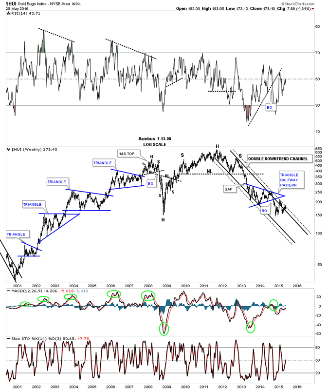
There is another piece of the puzzle I’m still trying to figure out. Normally when you have a nice clean consolidation pattern like the blue triangle on the chart above you get the breakout with a possible backtest and then the impulse move down. This hasn’t happened. Normally when there is a failed move out of a consolidation pattern it tells you that the consolidation pattern is either going to morph into a bigger pattern or another consolidation pattern will form just below like we have right now. Many times you can then put those two patterns together to create a bigger consolidation pattern. The other possible scenario is that there will be a trendline that separates the two consolidation patterns with one on top and one below. There is a chart pattern called fanlines. Normally after the third fanline is broken to the downside the pattern is complete. Below is a monthly chart for the HUI that has three fanlines starting at the 2000 low. Note how fanline #3 separates our two triangles. Normally you will see a backtest to the underside of the above fanline before the price action breaks down. That is what the possible red triangle is doing.
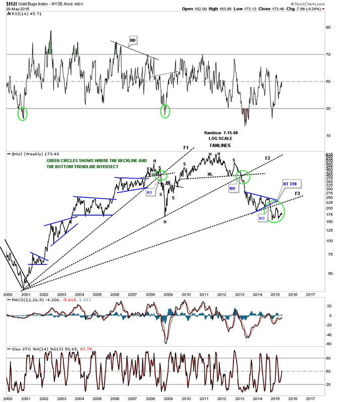
A weekly line chart showing the fanlines.
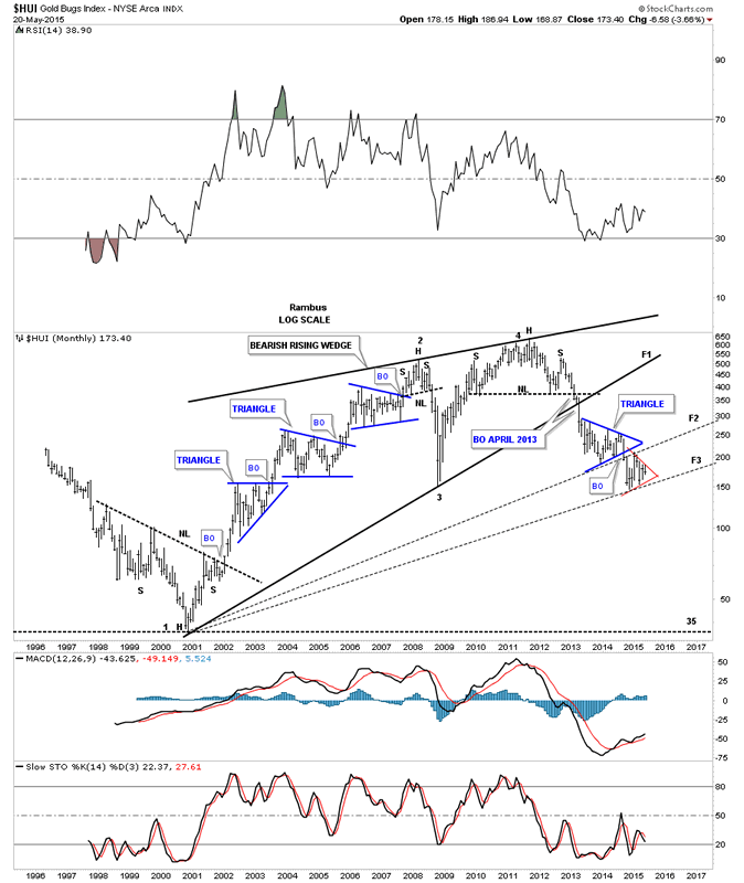
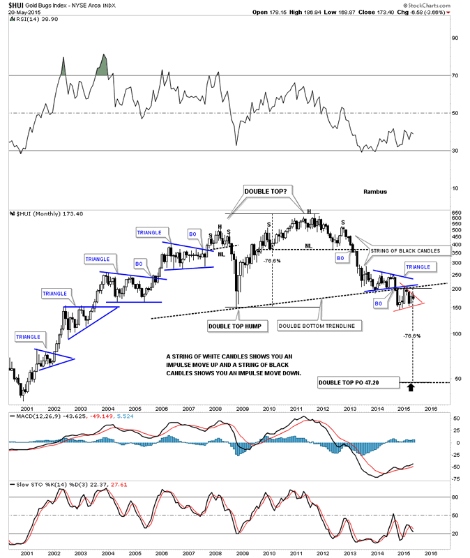
Lets look at one last chart for the HUI which is a long term monthly look that shows you a completely different possibility. If you recall the HUI built out a H&S top back in 2008 and we got the major impulse move down followed by a near vertical move up. That move ended at the head of the massive H&S top we watched develop before it broke down. What we have are two H&S tops separated by a pretty strong move between them. WHAT IF, the HUI is building out a massive double top formation reversing the 11 year bull market. If I start the double bottom trendline from the 2008 crash low and extend it all the way to the right side of the chart, putting it between the two consolidation patterns, it makes sense. Will it play out I don’t know but it’s a possibility. Time to get this posted. All the best…Rambus
All the best
Gary (for Rambus Chartology)
FREE TRIAL - http://rambus1.com/?page_id=10
© 2015 Copyright Rambus- All Rights Reserved
Disclaimer: The above is a matter of opinion provided for general information purposes only and is not intended as investment advice. Information and analysis above are derived from sources and utilising methods believed to be reliable, but we cannot accept responsibility for any losses you may incur as a result of this analysis. Individuals should consult with their personal financial advisors.
© 2005-2022 http://www.MarketOracle.co.uk - The Market Oracle is a FREE Daily Financial Markets Analysis & Forecasting online publication.