USD Daily, Weekly, Monthly & Conclusions
Currencies / US Dollar Jun 26, 2015 - 02:29 PM GMTBy: Gary_Tanashian
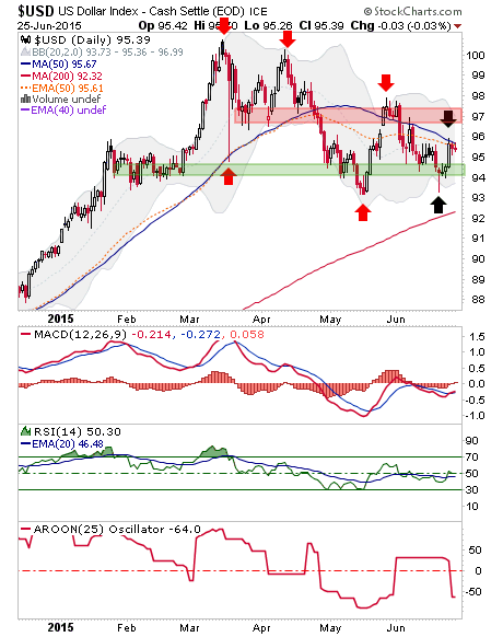
 USD has been in correction since the hysterical March top. The daily chart shows a series of lower highs and lower lows that was interrupted last week when USD failed to make a lower low, Hammered and bounced… right to the EMA and SMA 50’s.
So we remain on watch for a) a higher high or b) a lower low. It’s very simple. As it stands, the near-term is bearish until it proves bullish, not the other way around. That is because the existing trend is down (AROON, bottom Panel).

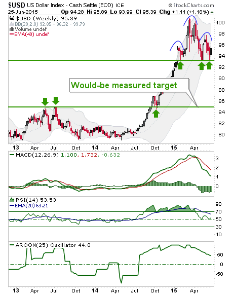
USD weekly is interesting as its price remains above initial support, it’s oscillators are still positive, but it is forming an ugly looking pattern with a target of 85, to be activated if the support area around 93 fails.

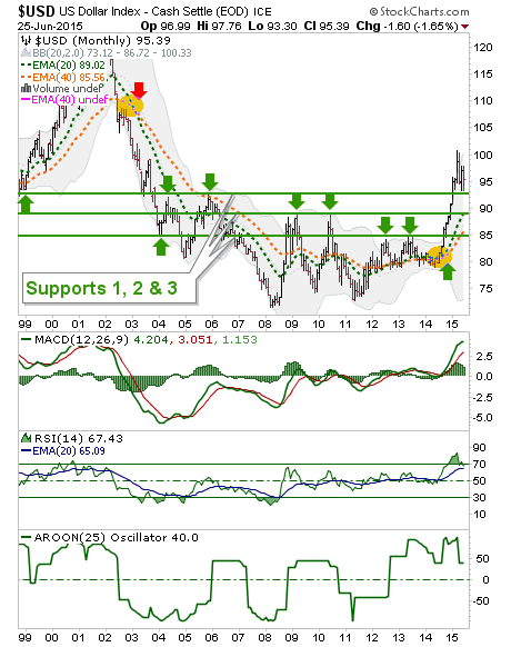
USD monthly shows the 3 support levels that can contain Uncle Buck’s correction. So again, the ugly weekly pattern is key because if current support is lost, the buck is probably going to eventually work its way down to 85 based on pattern measurement.
Note however, the moving averages (EMA’s 20 & 40) that have crossed for the first definitive bull signal since they crossed down in 2003. Such a signal is not likely to be undone any time soon and so it is likely that USD is in a cyclical bull market.

Bottom Line
USD daily is in a downtrend but is bouncing. A higher high to May would put it back on a bullish path. A lower low to June would break the weekly chart’s neckline support.
This in turn would activate a measured target of 85, which would put a big bounce in the step of the beaten down commodity sector and general ‘inflation trade’, including precious metals* and certain US and global markets that benefit from a weaker dollar (to varying degrees).
On the big picture (monthly), Uncle Buck is still bullish. A hit of 85 down the road would be a ‘buy’ on USD, which would mean a ‘sell’ on commodities, certain global markets and the whole constellation of items that are generally anti-USD. But that could come after a cyclical bounce (and an extended trade) in the anti-USD stuff that could fool people into thinking the commodity bull has resumed.
The daily chart is the gatekeeper for all of this, so we should wait for its signal.
* As always, we note that the best scenario for a real bull market in the gold stock sector is economic contraction and gold’s out performance to commodities. So the dynamics of any such inflation trade would have to be watched closely to determine whether the gold sector would be a ‘sell’ on the rally or whether it is at the beginning of a new bull market. The gold stock sector is very capable of doing well on the big picture with a strong USD, which is just what USD’s big picture view happens to be.
Subscribe to NFTRH Premium for your 25-35 page weekly report, interim updates (including Key ETF charts) and NFTRH+ chart and trade ideas or the free eLetter for an introduction to our work. Or simply keep up to date with plenty of public content at NFTRH.com and Biiwii.com.
By Gary Tanashian
© 2015 Copyright Gary Tanashian - All Rights Reserved
Disclaimer: The above is a matter of opinion provided for general information purposes only and is not intended as investment advice. Information and analysis above are derived from sources and utilising methods believed to be reliable, but we cannot accept responsibility for any losses you may incur as a result of this analysis. Individuals should consult with their personal financial advisors.
Gary Tanashian Archive |
© 2005-2022 http://www.MarketOracle.co.uk - The Market Oracle is a FREE Daily Financial Markets Analysis & Forecasting online publication.


