


Dr. Copper is Speaking, are you Listening? ...
Commodities / Copper Aug 18, 2015 - 05:52 PM GMT

 Copper is an important commodity when it comes to the health of the world economies and how it does often reflects how strong or weak the economy is. Its been awhile since we took an indepth look at Dr. Copper to see how healthy it is so tonight we'll look at a few charts starting with a daily look.
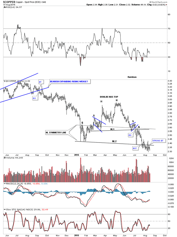
The daily chart for Copper is showing it has completed a double headed, double H&S top, which is having a somewhat ugly breakout and backtest of the lower neckline #2. The smaller H&S #1 was picture perfect complete with a small blue expanding falling wedge for the left shoulder and a blue bearish rising wedge as the right shoulder. H&S #2 was very symmetrical as shown by the neckline symmetry line which shows the height for the left and right shoulders. Outside of the messy breakout and backtest, which happens sometimes, this chart is still very bearish looking.
Daily Copper Chart
To really get a feeling for what is taking place with Copper we need to look at the longer term charts that are far less likely to morph into something else. Once a multi year pattern is finished building out the odds are very high that it'll complete its measured move at a minimum and often times the move will go much further. With really big tops, like most of the commodities and the precious metals complex have built out since they peaked out in 2011, are prime examples of what I mean. These multi year tops have led to a four year bear market in most cases.
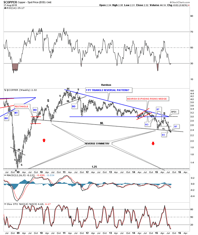
Copper's bear market started in early 2011 with just a small H&S top on the weekly chart which ended up being the first reversal point in a multi year seven point blue triangle reversal pattern. Note the breakout and backtest to the bottom blue rail confirming the bear market top was in place. After the initial move down Copper had a bigger backtest to the bottom rail of the blue triangle reversal pattern again confirming the blue triangle as a reversal pattern to the downside. Note the big backtest has taken on the formation of a H&S consolidation pattern which is the same H&S consolidation pattern I just showed you on the daily chart above. It is also very similar to the one I've been showing you on the SLV chart. What is also very interesting here is that neckline #2 on the daily chart above is just a very small part of a massive H&S neckline that goes all the way back to the lows made back in 2010 which is creating an even bigger reversal pattern. One last note on the weekly chart below. Notice how strong and near vertical the rally was after the 2008 crash low. This sets up a very good possibility that we may see a similar move down only in reverse, reverse symmetry, as show by the red arrows. There really isn't much in the way of support until the 2008 crash low is hit around the 1.25 area.
Weekly Copper Chart
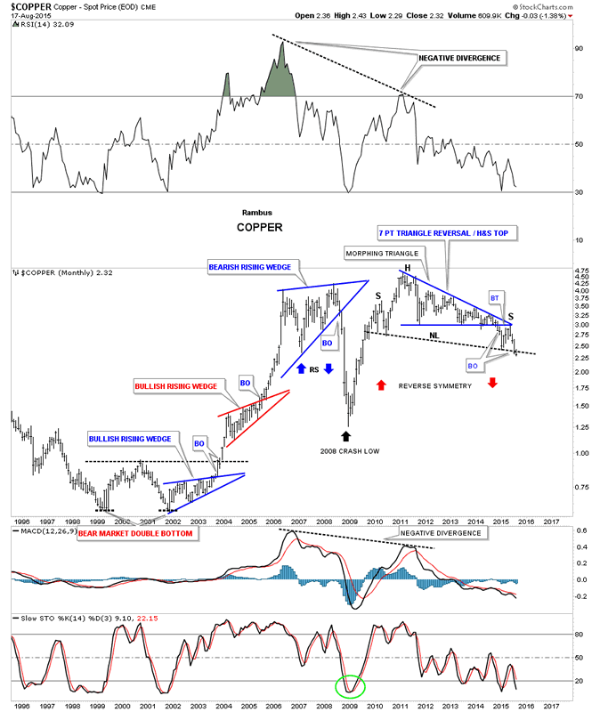
The monthly chart really takes out the noise and gives you a nice clear picture of the two massive topping patterns, the seven point triangle reversal pattern and now the even bigger H&S top. Keep in mind I was one of the strongest bulls during the bull market years which started with a large double bottom reversal pattern. I have shown you many times in the past when you see a bullish rising wedge form in an uptrend you know that uptrend is very strong. Normally a consolidation pattern will form a sideways pattern or slope down against the uptrend,such as a bull flag but when you see a pattern slope in the same direction of the trend its a very powerful signal. As you can see Copper formed two bullish rising wedges during its bull market run that ended with a bearish rising wedge reversal pattern. The top was a reversal pattern because the price action broke below the bottom rail unlike the bullish rising wedges where the price action broke above the top rails.
Monthly Copper Chart
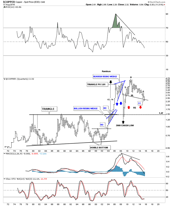
The last chart for Copper is a quarterly chart which shows the entire history going all the way back to 1972. Copper built out a massive 25 year triangle base that finally launched its bull market of a lifetime. The way to measure a pattern like this is to measure the first two reversal points in the triangle. You then add that distance to the breakout point to get your price objective. As you can see that massive triangle based called for a price objective up to the 3.81 area as shown by the black arrow at the top of the chart. The top of the massive 25 year triangle ended up offering support during the 2008 crash that reversed symmetry down as shown by the blue arrows. The crash was so hard that the price action actually ate into some of the support that the top rail had. There is a good chance that our current impulse move down that is just now breaking down from the massive H&S top may take the price action even lower than the 2008 crash low as that part of support is now gone. At any rate Copper is at a very interesting point right now on the daily chart all the way out to the long term quarterly chart.
Quarterly Copper Chart
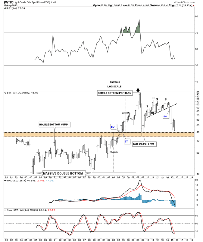
I know you're probably thinking that the price objective for copper is just a fluke and that it's impossible for Chartology to show such a thing especially on such a long term chart. I would like to show you another very important commodity which is oil. This quarterly chart goes all the way back to 1982 which shows the huge trading range oil was in until it finally broke out in 2004 which launched its bull market of a lifetime. Oil created a massive double bottom as its launch pad. As I showed you on the quarterly chart for Copper I measured the double bottom base and added that measurement to the breakout point and got a price objective up to 146.15 which was about .85 cents shy of 147 its all time high. Just like Copper oil to found support at the top of the old highs during the 2008 crash.
Light Crude Oil Quarterly Chart
As you are well aware of there are no absolutes when it comes to the markets but Chartology at least gives us a road map we can follow that lets us know if we're in a bull or bear market which is the most important thing to understand when trading the markets. The bull market in commodities ended in 2011 and the bear market began which is still ongoing to this day.
All the best
Gary (for Rambus Chartology)
FREE TRIAL - http://rambus1.com/?page_id=10
© 2015 Copyright Rambus- All Rights Reserved
Disclaimer: The above is a matter of opinion provided for general information purposes only and is not intended as investment advice. Information and analysis above are derived from sources and utilising methods believed to be reliable, but we cannot accept responsibility for any losses you may incur as a result of this analysis. Individuals should consult with their personal financial advisors.
© 2005-2022 http://www.MarketOracle.co.uk - The Market Oracle is a FREE Daily Financial Markets Analysis & Forecasting online publication.